
Descriptive statistics in R
- Introduction
- Data
- Minimum and maximum
- Range
- Mean
- Median
- First and third quartile
- Interquartile range
- Standard deviation and variance
- Summary
- Coefficient of variation
- Mode
- Correlation
- Contingency table
- Barplot
- Histogram
- Boxplot
- Dotplot
- Scatterplot
- Line plot
- QQ-plot
- Density plot
- Correlation plot
- Advanced descriptive statistics
- Conclusion

Introduction
This article explains how to compute the main descriptive statistics in R and how to present them graphically. To learn more about the reasoning behind each descriptive statistics, how to compute them by hand and how to interpret them, read the article “Descriptive statistics by hand”.
To briefly recap what have been said in that article, descriptive statistics (in the broad sense of the term) is a branch of statistics aiming at summarizing, describing and presenting a series of values or a dataset. Descriptive statistics is often the first step and an important part in any statistical analysis. It allows to check the quality of the data and it helps to “understand” the data by having a clear overview of it. If well presented, descriptive statistics is already a good starting point for further analyses. There exists many measures to summarize a dataset. They are divided into two types:
- location measures and
- dispersion measures
Location measures give an understanding about the central tendency of the data, whereas dispersion measures give an understanding about the spread of the data. In this article, we focus only on the implementation in R of the most common descriptive statistics and their visualizations (when deemed appropriate). See online or in the above mentioned article for more information about the purpose and usage of each measure.
Data
We use the dataset iris throughout the article. This dataset is imported by default in R, you only need to load it by running iris:
dat <- iris # load the iris dataset and renamed it datBelow a preview of this dataset and its structure:
head(dat) # first 6 observations## Sepal.Length Sepal.Width Petal.Length Petal.Width Species
## 1 5.1 3.5 1.4 0.2 setosa
## 2 4.9 3.0 1.4 0.2 setosa
## 3 4.7 3.2 1.3 0.2 setosa
## 4 4.6 3.1 1.5 0.2 setosa
## 5 5.0 3.6 1.4 0.2 setosa
## 6 5.4 3.9 1.7 0.4 setosastr(dat) # structure of dataset## 'data.frame': 150 obs. of 5 variables:
## $ Sepal.Length: num 5.1 4.9 4.7 4.6 5 5.4 4.6 5 4.4 4.9 ...
## $ Sepal.Width : num 3.5 3 3.2 3.1 3.6 3.9 3.4 3.4 2.9 3.1 ...
## $ Petal.Length: num 1.4 1.4 1.3 1.5 1.4 1.7 1.4 1.5 1.4 1.5 ...
## $ Petal.Width : num 0.2 0.2 0.2 0.2 0.2 0.4 0.3 0.2 0.2 0.1 ...
## $ Species : Factor w/ 3 levels "setosa","versicolor",..: 1 1 1 1 1 1 1 1 1 1 ...The dataset contains 150 observations and 5 variables, representing the length and width of the sepal and petal and the species of 150 flowers. Length and width of the sepal and petal are numeric variables and the species is a factor with 3 levels (indicated by num and Factor w/ 3 levels after the name of the variables). See the different variables types in R if you need a refresh.
Regarding plots, we present the default graphs and the graphs from the well-known {ggplot2} package. Graphs from the {ggplot2} package usually have a better look but it requires more advanced coding skills (see the article “Graphics in R with ggplot2” to learn more). If you need to publish or share your graphs, I suggest using {ggplot2} if you can, otherwise the default graphics will do the job.
Tip: I recently discovered the ggplot2 builder from the {esquisse} addins. See how you can easily draw graphs from the {ggplot2} package without having to code it yourself.
All plots displayed in this article can be customized. For instance, it is possible to edit the title, x and y-axis labels, color, etc. However, customizing plots is beyond the scope of this article so all plots are presented without any customization. Interested readers will find numerous resources online.
Minimum and maximum
Minimum and maximum can be found thanks to the min() and max() functions:
min(dat$Sepal.Length)## [1] 4.3max(dat$Sepal.Length)## [1] 7.9Alternatively the range() function:
rng <- range(dat$Sepal.Length)
rng
## [1] 4.3 7.9gives you the minimum and maximum directly. Note that the output of the range() function is actually an object containing the minimum and maximum (in that order). This means you can actually access the minimum with:
rng[1] # rng = name of the object specified above## [1] 4.3and the maximum with:
rng[2]## [1] 7.9This reminds us that, in R, there are often several ways to arrive at the same result. The method that uses the shortest piece of code is usually preferred as a shorter piece of code is less prone to coding errors and more readable.
Range
The range can then be easily computed, as you have guessed, by subtracting the minimum from the maximum:
max(dat$Sepal.Length) - min(dat$Sepal.Length)## [1] 3.6To my knowledge, there is no default function to compute the range. However, if you are familiar with writing functions in R , you can create your own function to compute the range:
range2 <- function(x) {
  range <- max(x) - min(x)
  return(range)
}

range2(dat$Sepal.Length)
## [1] 3.6which is equivalent than \(max - min\) presented above.
Mean
The mean can be computed with the mean() function:
mean(dat$Sepal.Length)## [1] 5.843333Tips:
- if there is at least one missing value in your dataset, use
mean(dat$Sepal.Length, na.rm = TRUE)to compute the mean with the NA excluded. This argument can be used for most functions presented in this article, not only the mean - for a truncated mean, use
mean(dat$Sepal.Length, trim = 0.10)and change thetrimargument to your needs
Median
The median can be computed thanks to the median() function:
median(dat$Sepal.Length)## [1] 5.8or with the quantile() function:
quantile(dat$Sepal.Length, 0.5)## 50%
## 5.8since the quantile of order 0.5 (\(q_{0.5}\)) corresponds to the median.
First and third quartile
As the median, the first and third quartiles can be computed thanks to the quantile() function and by setting the second argument to 0.25 or 0.75:
quantile(dat$Sepal.Length, 0.25) # first quartile## 25%
## 5.1quantile(dat$Sepal.Length, 0.75) # third quartile## 75%
## 6.4You may have seen that the results above are slightly different than the results you would have found if you compute the first and third quartiles by hand. It is normal, there are many methods to compute them (R actually has 7 methods to compute the quantiles!). However, the methods presented here and in the article “descriptive statistics by hand” are the easiest and most “standard” ones. Furthermore, results do not dramatically change between the two methods.
Other quantiles
As you have guessed, any quantile can also be computed with the quantile() function. For instance, the \(4^{th}\) decile or the \(98^{th}\) percentile:
quantile(dat$Sepal.Length, 0.4) # 4th decile## 40%
## 5.6quantile(dat$Sepal.Length, 0.98) # 98th percentile## 98%
## 7.7Interquartile range
The interquartile range (i.e., the difference between the first and third quartile) can be computed with the IQR() function:
IQR(dat$Sepal.Length)## [1] 1.3or alternatively with the quantile() function again:
quantile(dat$Sepal.Length, 0.75) - quantile(dat$Sepal.Length, 0.25)## 75%
## 1.3As mentioned earlier, when possible it is usually recommended to use the shortest piece of code to arrive at the result. For this reason, the IQR() function is preferred to compute the interquartile range.
Standard deviation and variance
The standard deviation and the variance is computed with the sd() and var() functions:
sd(dat$Sepal.Length) # standard deviation## [1] 0.8280661var(dat$Sepal.Length) # variance## [1] 0.6856935Remember from the article descriptive statistics by hand that the standard deviation and the variance are different whether we compute it for a sample or a population (see the difference between sample and population). In R, the standard deviation and the variance are computed as if the data represent a sample (so the denominator is \(n - 1\), where \(n\) is the number of observations). To my knowledge, there is no function by default in R that computes the standard deviation or variance for a population.
Tip: to compute the standard deviation (or variance) of multiple variables at the same time, use lapply() with the appropriate statistics as second argument:
lapply(dat[, 1:4], sd)## $Sepal.Length
## [1] 0.8280661
##
## $Sepal.Width
## [1] 0.4358663
##
## $Petal.Length
## [1] 1.765298
##
## $Petal.Width
## [1] 0.7622377The command dat[, 1:4] selects the variables 1 to 4 as the fifth variable is a qualitative variable and the standard deviation cannot be computed on such type of variable. See a recap of the different data types in R if needed.
Summary
You can compute the minimum, \(1^{st}\) quartile, median, mean, \(3^{rd}\) quartile and the maximum for all numeric variables of a dataset at once using summary():
summary(dat)## Sepal.Length Sepal.Width Petal.Length Petal.Width
## Min. :4.300 Min. :2.000 Min. :1.000 Min. :0.100
## 1st Qu.:5.100 1st Qu.:2.800 1st Qu.:1.600 1st Qu.:0.300
## Median :5.800 Median :3.000 Median :4.350 Median :1.300
## Mean :5.843 Mean :3.057 Mean :3.758 Mean :1.199
## 3rd Qu.:6.400 3rd Qu.:3.300 3rd Qu.:5.100 3rd Qu.:1.800
## Max. :7.900 Max. :4.400 Max. :6.900 Max. :2.500
## Species
## setosa :50
## versicolor:50
## virginica :50
##
##
## Tip: if you need these descriptive statistics by group use the by() function:
by(dat, dat$Species, summary)## dat$Species: setosa
## Sepal.Length Sepal.Width Petal.Length Petal.Width
## Min. :4.300 Min. :2.300 Min. :1.000 Min. :0.100
## 1st Qu.:4.800 1st Qu.:3.200 1st Qu.:1.400 1st Qu.:0.200
## Median :5.000 Median :3.400 Median :1.500 Median :0.200
## Mean :5.006 Mean :3.428 Mean :1.462 Mean :0.246
## 3rd Qu.:5.200 3rd Qu.:3.675 3rd Qu.:1.575 3rd Qu.:0.300
## Max. :5.800 Max. :4.400 Max. :1.900 Max. :0.600
## Species
## setosa :50
## versicolor: 0
## virginica : 0
##
##
##
## ------------------------------------------------------------
## dat$Species: versicolor
## Sepal.Length Sepal.Width Petal.Length Petal.Width Species
## Min. :4.900 Min. :2.000 Min. :3.00 Min. :1.000 setosa : 0
## 1st Qu.:5.600 1st Qu.:2.525 1st Qu.:4.00 1st Qu.:1.200 versicolor:50
## Median :5.900 Median :2.800 Median :4.35 Median :1.300 virginica : 0
## Mean :5.936 Mean :2.770 Mean :4.26 Mean :1.326
## 3rd Qu.:6.300 3rd Qu.:3.000 3rd Qu.:4.60 3rd Qu.:1.500
## Max. :7.000 Max. :3.400 Max. :5.10 Max. :1.800
## ------------------------------------------------------------
## dat$Species: virginica
## Sepal.Length Sepal.Width Petal.Length Petal.Width
## Min. :4.900 Min. :2.200 Min. :4.500 Min. :1.400
## 1st Qu.:6.225 1st Qu.:2.800 1st Qu.:5.100 1st Qu.:1.800
## Median :6.500 Median :3.000 Median :5.550 Median :2.000
## Mean :6.588 Mean :2.974 Mean :5.552 Mean :2.026
## 3rd Qu.:6.900 3rd Qu.:3.175 3rd Qu.:5.875 3rd Qu.:2.300
## Max. :7.900 Max. :3.800 Max. :6.900 Max. :2.500
## Species
## setosa : 0
## versicolor: 0
## virginica :50
##
##
## where the arguments are the name of the dataset, the grouping variable and the summary function. Follow this order, or specify the name of the arguments if you do not follow this order.
If you need more descriptive statistics, use stat.desc() from the package {pastecs}:
library(pastecs)
stat.desc(dat)
## Sepal.Length Sepal.Width Petal.Length Petal.Width Species
## nbr.val 150.00000000 150.00000000 150.0000000 150.00000000 NA
## nbr.null 0.00000000 0.00000000 0.0000000 0.00000000 NA
## nbr.na 0.00000000 0.00000000 0.0000000 0.00000000 NA
## min 4.30000000 2.00000000 1.0000000 0.10000000 NA
## max 7.90000000 4.40000000 6.9000000 2.50000000 NA
## range 3.60000000 2.40000000 5.9000000 2.40000000 NA
## sum 876.50000000 458.60000000 563.7000000 179.90000000 NA
## median 5.80000000 3.00000000 4.3500000 1.30000000 NA
## mean 5.84333333 3.05733333 3.7580000 1.19933333 NA
## SE.mean 0.06761132 0.03558833 0.1441360 0.06223645 NA
## CI.mean.0.95 0.13360085 0.07032302 0.2848146 0.12298004 NA
## var 0.68569351 0.18997942 3.1162779 0.58100626 NA
## std.dev 0.82806613 0.43586628 1.7652982 0.76223767 NA
## coef.var 0.14171126 0.14256420 0.4697441 0.63555114 NAYou can have even more statistics (i.e., skewness, kurtosis and normality test) by adding the argument norm = TRUE in the previous function. Note that the variable Species is not numeric, so descriptive statistics cannot be computed for this variable and NA are displayed.
Coefficient of variation
The coefficient of variation can be found with stat.desc() (see the line coef.var in the table above) or by computing manually (remember that the coefficient of variation is the standard deviation divided by the mean):
sd(dat$Sepal.Length) / mean(dat$Sepal.Length)## [1] 0.1417113Mode
To my knowledge there is no function to find the mode of a variable. However, we can easily find it thanks to the functions table() and sort():
tab <- table(dat$Sepal.Length) # number of occurrences for each unique value
sort(tab, decreasing = TRUE) # sort highest to lowest
##
## 5 5.1 6.3 5.7 6.7 5.5 5.8 6.4 4.9 5.4 5.6 6 6.1 4.8 6.5 4.6 5.2 6.2 6.9 7.7
## 10 9 9 8 8 7 7 7 6 6 6 6 6 5 5 4 4 4 4 4
## 4.4 5.9 6.8 7.2 4.7 6.6 4.3 4.5 5.3 7 7.1 7.3 7.4 7.6 7.9
## 3 3 3 3 2 2 1 1 1 1 1 1 1 1 1table() gives the number of occurrences for each unique value, then sort() with the argument decreasing = TRUE displays the number of occurrences from highest to lowest. The mode of the variable Sepal.Length is thus 5. This code to find the mode can also be applied to qualitative variables such as Species:
sort(table(dat$Species), decreasing = TRUE)##
##     setosa versicolor  virginica
## 50 50 50or:
summary(dat$Species)## setosa versicolor virginica
## 50 50 50Correlation
Another descriptive statistics is the correlation coefficient.
The correlation measures the linear relationship between two variables, and it can be computed with the cor() function:
cor(dat$Sepal.Length, dat$Sepal.Width)## [1] -0.1175698Computing correlation in R and interpreting the results deserve a detailed explanation, so I wrote an article covering correlation and correlation test.
Contingency table
table() introduced above can also be used on two qualitative variables to create a contingency table. The dataset iris has only one qualitative variable so we create a new qualitative variable just for this example. We create the variable size which corresponds to small if the length of the petal is smaller than the median of all flowers, big otherwise:
dat$size <- ifelse(dat$Sepal.Length < median(dat$Sepal.Length),
  "small", "big"
)
Here is a recap of the occurrences by size:
table(dat$size)##
## big small
## 77 73We now create a contingency table of the two variables Species and size with the table() function:
table(dat$Species, dat$size)##
## big small
## setosa 1 49
## versicolor 29 21
## virginica 47 3or with the xtabs() function:
xtabs(~ dat$Species + dat$size)## dat$size
## dat$Species big small
## setosa 1 49
## versicolor 29 21
## virginica 47 3The contingency table gives the number of cases in each subgroup. For instance, there is only one big setosa flower, while there are 49 small setosa flowers in the dataset.
To go further, we can see from the table that setosa flowers seem to be smaller in size than virginica flowers. In order to check whether size is significantly associated with species, we could perform a Chi-square test of independence since both variables are categorical variables. See how to do this test by hand and in R.
Note that Species are in rows and size in column because we specified Species and then size in table(). Change the order if you want to switch the two variables.
Instead of having the frequencies (i.e.. the number of cases) you can also have the relative frequencies (i.e., proportions) in each subgroup by adding the table() function inside the prop.table() function:
prop.table(table(dat$Species, dat$size))##
## big small
## setosa 0.006666667 0.326666667
## versicolor 0.193333333 0.140000000
## virginica 0.313333333 0.020000000Note that you can also compute the percentages by row or by column by adding a second argument to the prop.table() function: 1 for row, or 2 for column:
# percentages by row:
round(prop.table(table(dat$Species, dat$size), 1), 2) # round to 2 digits with round()
##
## big small
## setosa 0.02 0.98
## versicolor 0.58 0.42
## virginica 0.94 0.06# percentages by column:
round(prop.table(table(dat$Species, dat$size), 2), 2) # round to 2 digits with round()##
## big small
## setosa 0.01 0.67
## versicolor 0.38 0.29
## virginica 0.61 0.04See the section on advanced descriptive statistics for more advanced contingency tables.
Mosaic plot
A mosaic plot allows to visualize a contingency table of two qualitative variables:
mosaicplot(table(dat$Species, dat$size),
  color = TRUE,
  xlab = "Species", # label for x-axis
  ylab = "Size" # label for y-axis
)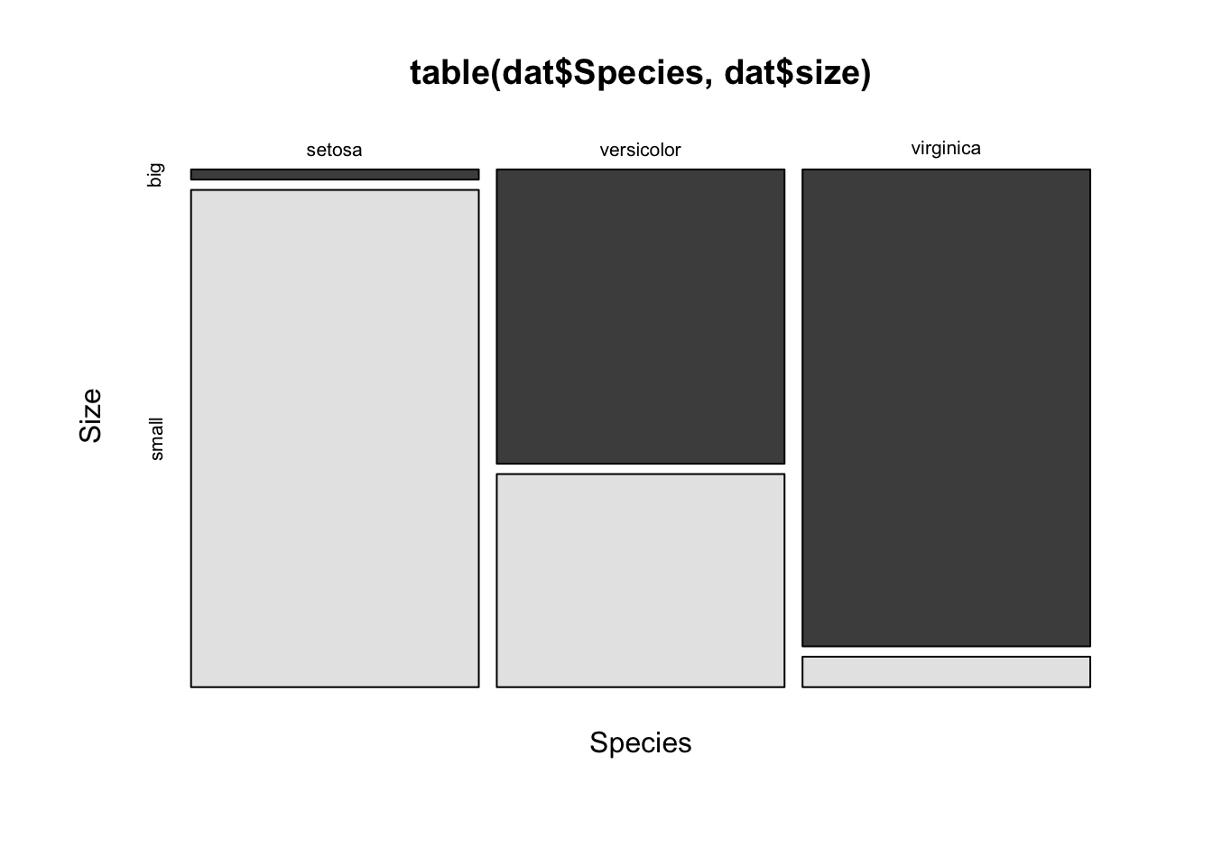
The mosaic plot shows that, for our sample, the proportion of big and small flowers is clearly different between the three species. In particular, the virginica species is the biggest, and the setosa species is the smallest of the three species (in terms of sepal length since the variable size is based on the variable Sepal.Length).
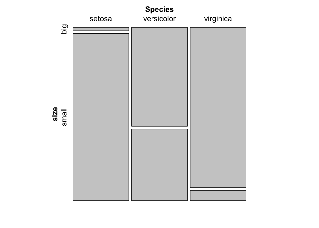
For your information, a mosaic plot can also be done via the mosaic() function from the {vcd} package:
library(vcd)

mosaic(~ Species + size,
  data = dat,
  direction = c("v", "h")
)
Barplot
Barplots can only be done on qualitative variables (see the difference with a quantitative variable here). A barplot is a tool to visualize the distribution of a qualitative variable. We draw a barplot of the qualitative variable size:
barplot(table(dat$size)) # table() is mandatory
You can also draw a barplot of the relative frequencies instead of the frequencies by adding prop.table() as we did earlier:
barplot(prop.table(table(dat$size)))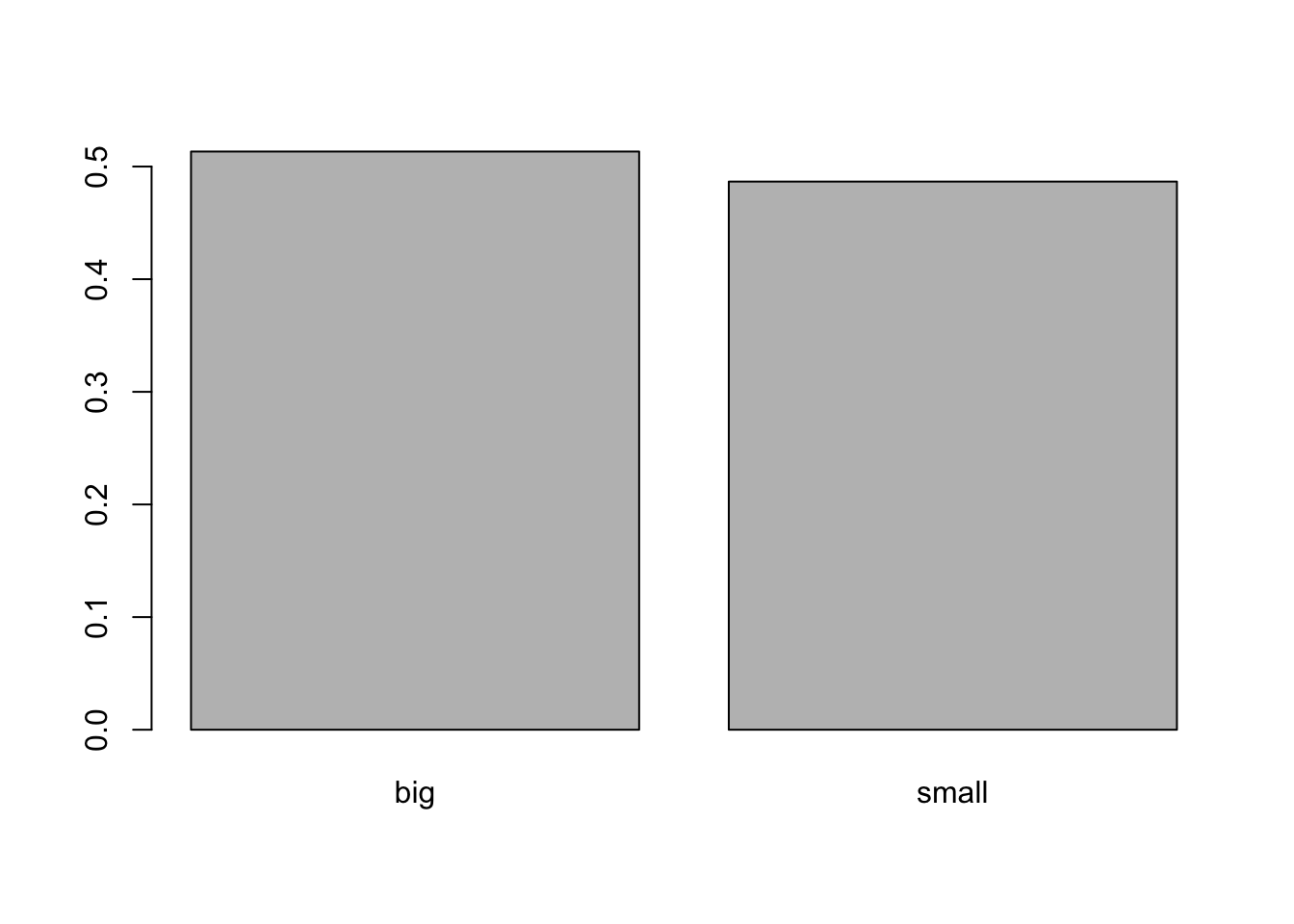
In {ggplot2}:
library(ggplot2) # needed each time you open RStudio
# The package ggplot2 must be installed first

ggplot(dat) +
  aes(x = size) +
  geom_bar()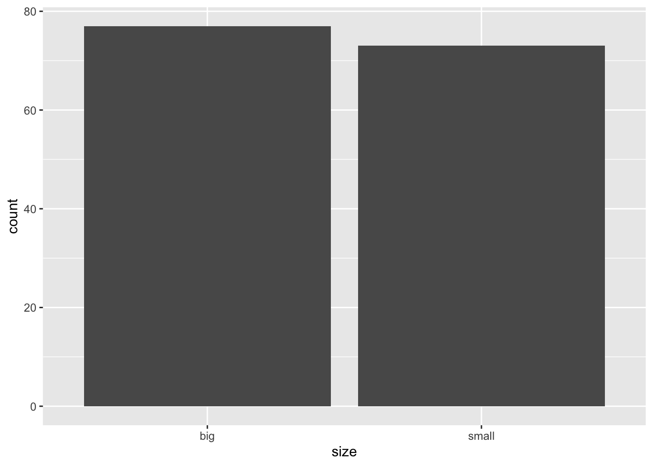
Histogram
A histogram gives an idea about the distribution of a quantitative variable. The idea is to break the range of values into intervals and count how many observations fall into each interval. Histograms are a bit similar to barplots, but histograms are used for quantitative variables whereas barplots are used for qualitative variables. To draw a histogram in R, use hist():
hist(dat$Sepal.Length)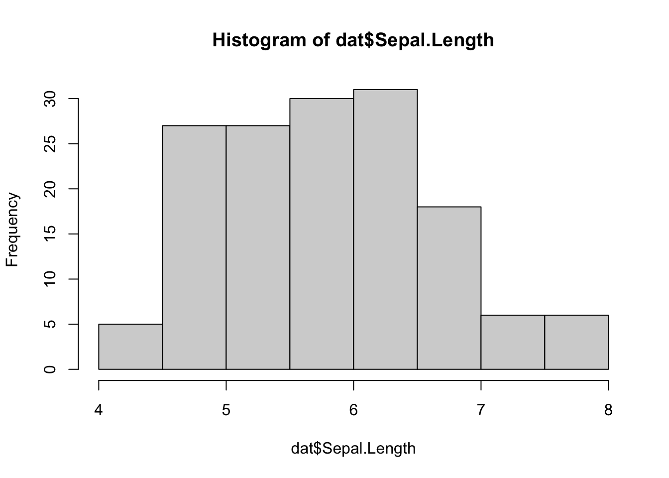
Add the arguments breaks = inside the hist() function if you want to change the number of bins. A rule of thumb (known as the square-root rule) is that the number of bins should be the rounded value of the square root of the number of observations. The dataset includes 150 observations so in this case the number of bins can be set to 12.
In {ggplot2}:
ggplot(dat) +
  aes(x = Sepal.Length) +
  geom_histogram()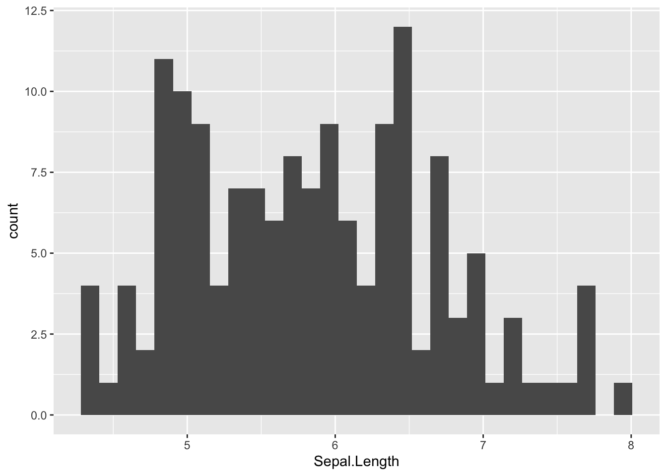
By default, the number of bins is 30. You can change this value with geom_histogram(bins = 12) for instance.
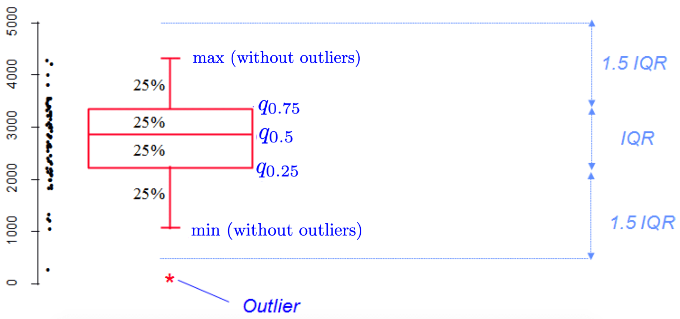
Boxplot
Boxplots are really useful in descriptive statistics and are often underused (mostly because it is not well understood by the public). A boxplot graphically represents the distribution of a quantitative variable by visually displaying five common location summary (minimum, median, first/third quartiles and maximum) and any observation that was classified as a suspected outlier using the interquartile range (IQR) criterion.
The IQR criterion means that all observations above \(q_{0.75} + 1.5 \cdot IQR\) or below \(q_{0.25} - 1.5 \cdot IQR\) (where \(q_{0.25}\) and \(q_{0.75}\) correspond to first and third quartile respectively) are considered as potential outliers by R. The minimum and maximum in the boxplot are represented without these suspected outliers.
Seeing all these information on the same plot help to have a good first overview of the dispersion and the location of the data. Before drawing a boxplot of our data, see below a graph explaining the information present on a boxplot:
Now an example with our dataset:
boxplot(dat$Sepal.Length)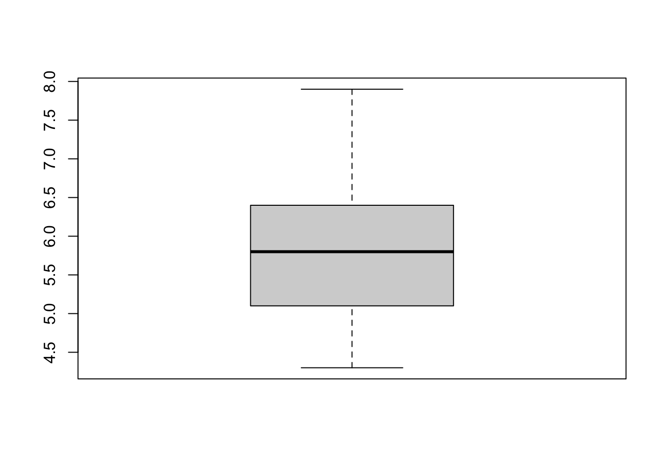
Boxplots are even more informative when presented side-by-side for comparing and contrasting distributions from two or more groups. For instance, we compare the length of the sepal across the different species:
boxplot(dat$Sepal.Length ~ dat$Species)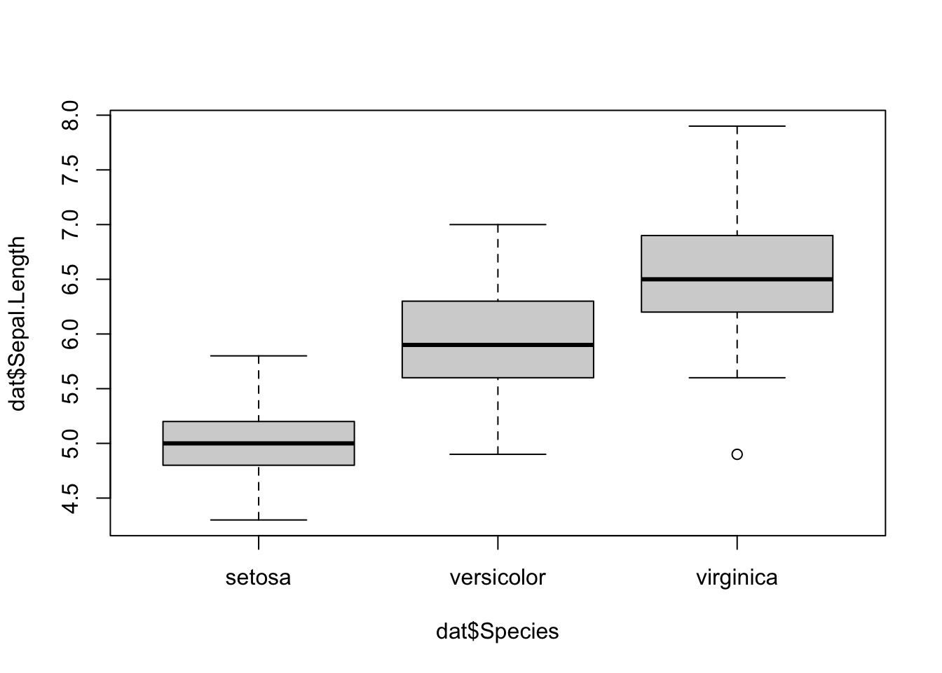
In {ggplot2}:
ggplot(dat) +
  aes(x = Species, y = Sepal.Length) +
  geom_boxplot()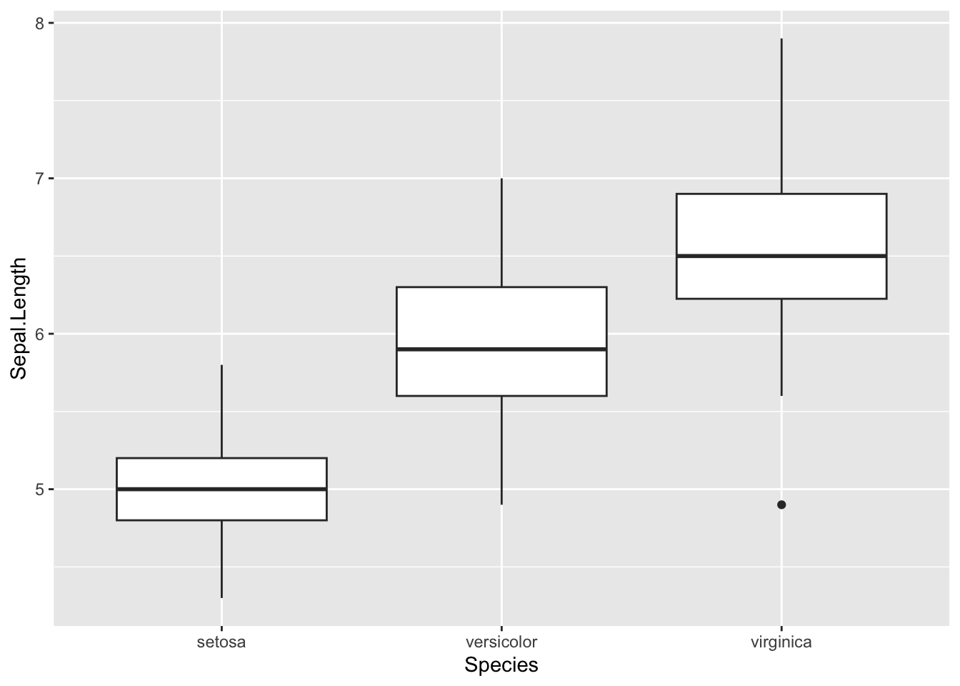
Dotplot
A dotplot is more or less similar than a boxplot, except that:
- observations are represented as points
- it does not easily tell us about the median, first and third quartiles.
library(lattice)

dotplot(dat$Sepal.Length ~ dat$Species)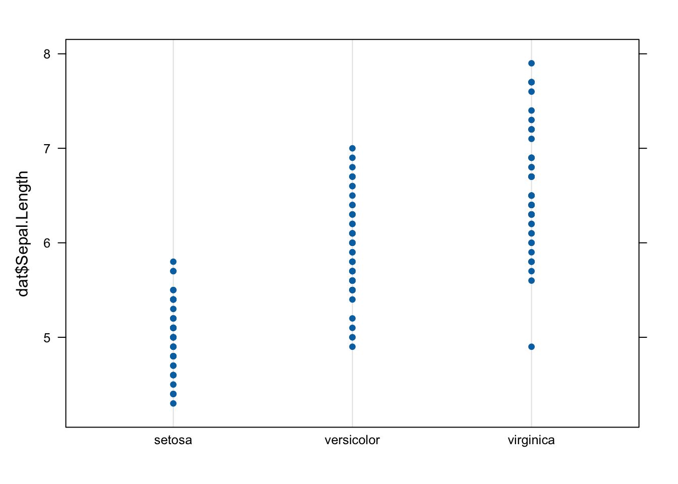
In {ggplot2}:
ggplot(dat) +
  aes(x = Species, y = Sepal.Length) +
  geom_dotplot(binaxis = "y", stackdir = "center")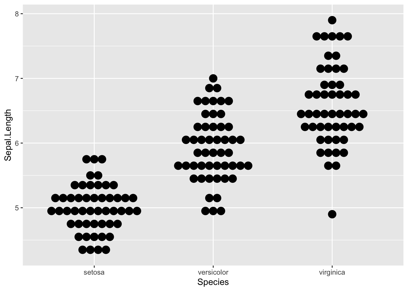
The advantage of using {ggplot2} over {lattice} for this plot is that we can easily see the mode.
Note that a dotplot is particularly useful when there are a limited number of observations, whereas a boxplot is more appropriate with large datasets.
Scatterplot
Scatterplots allow to check whether there is a potential link between two quantitative variables. For this reason, scatterplots are often used to visualize a potential correlation between two variables. For instance, when drawing a scatterplot of the length of the sepal and the length of the petal:
plot(dat$Sepal.Length, dat$Petal.Length)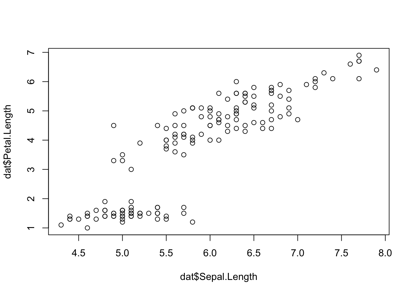
There seems to be a positive association between the two variables.
In {ggplot2}:
ggplot(dat) +
  aes(x = Sepal.Length, y = Petal.Length) +
  geom_point()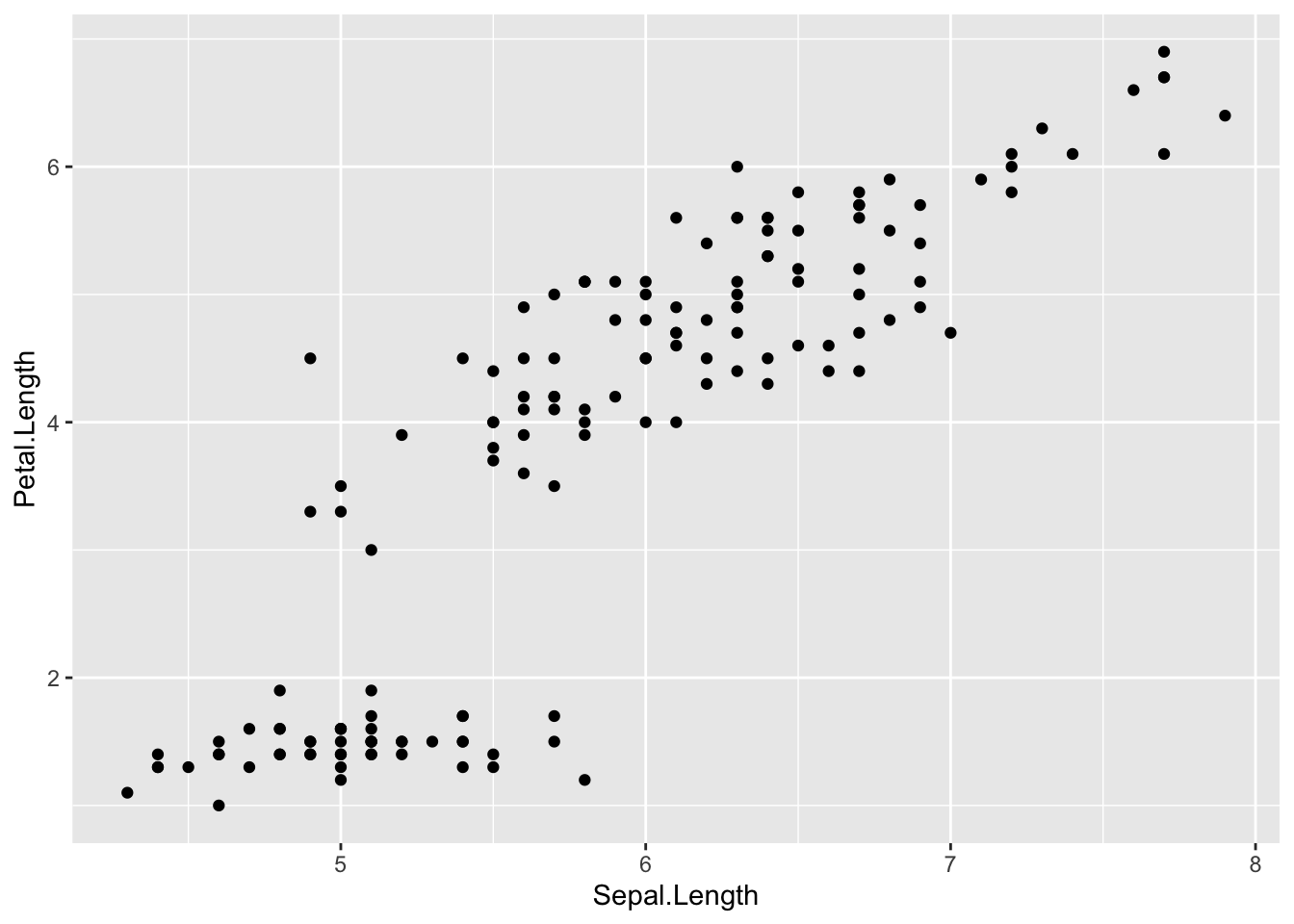
Like boxplots, scatterplots are even more informative when differentiating the points according to a factor, in this case the species:
ggplot(dat) +
  aes(x = Sepal.Length, y = Petal.Length, colour = Species) +
  geom_point() +
  scale_color_hue()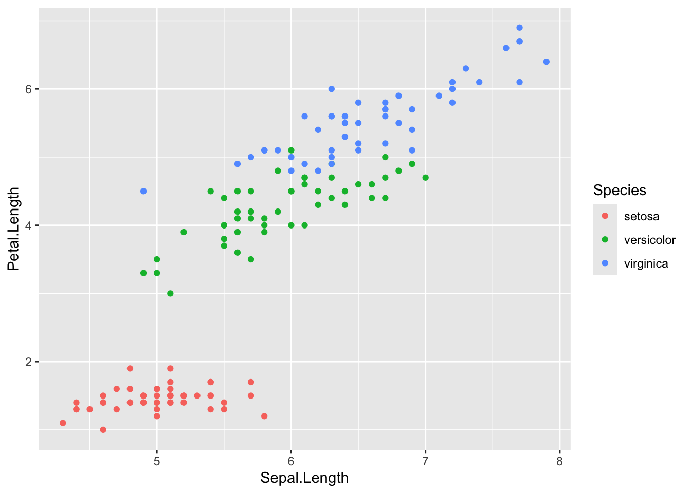
Line plot
Line plots, particularly useful in time series or finance, can be created by adding the type = "l" argument in the plot() function:
plot(dat$Sepal.Length,
  type = "l"
) # "l" for line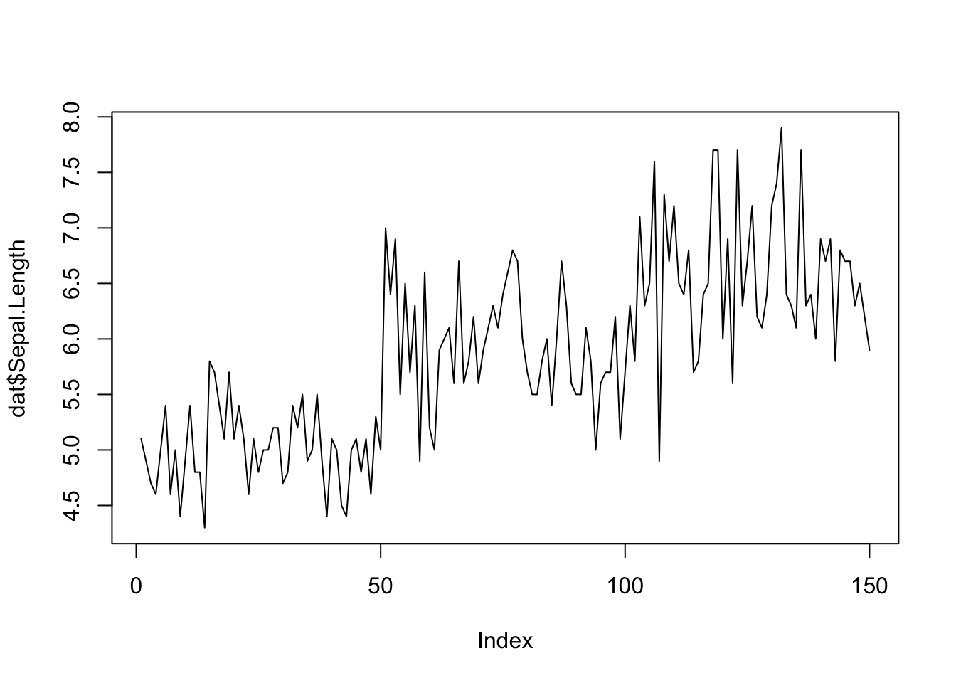
QQ-plot
For a single variable
In order to check the normality assumption of a variable (normality means that the data follow a normal distribution, also known as a Gaussian distribution), we usually use histograms and/or QQ-plots.1 See an article discussing about the normal distribution and how to evaluate the normality assumption in R if you need a refresh on that subject.
Histograms have been presented earlier, so here is how to draw a QQ-plot:
# Draw points on the qq-plot:
qqnorm(dat$Sepal.Length)
# Draw the reference line:
qqline(dat$Sepal.Length)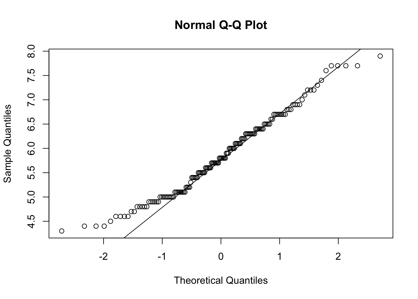
Or a QQ-plot with confidence bands with the qqPlot() function from the {car} package:
library(car) # package must be installed first
qqPlot(dat$Sepal.Length)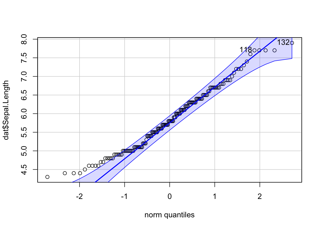
## [1] 132 118If points are close to the reference line (sometimes referred as Henry’s line) and within the confidence bands, the normality assumption can be considered as met. The bigger the deviation between the points and the reference line and the more they lie outside the confidence bands, the less likely that the normality condition is met. The variable Sepal.Length does not seem to follow a normal distribution because several points lie outside the confidence bands. When facing a non-normal distribution, the first step is usually to apply the logarithm transformation on the data and recheck to see whether the log-transformed data are normally distributed. Applying the logarithm transformation can be done with the log() function.
In {ggpubr}:
library(ggpubr)
ggqqplot(dat$Sepal.Length)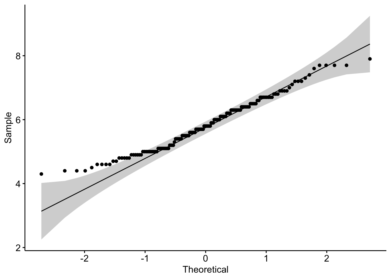
By groups
For some statistical tests, the normality assumption is required in all groups. One solution is to draw a QQ-plot for each group by manually splitting the dataset into different groups and then draw a QQ-plot for each subset of the data (with the methods shown above). Another (easier) solution is to draw a QQ-plot for each group automatically with the argument groups = in the function qqPlot() from the {car} package:
qqPlot(dat$Sepal.Length, groups = dat$size)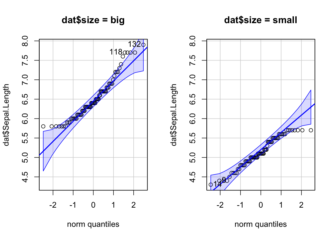
In {ggplot2}:
qplot(
  sample = Sepal.Length, data = dat,
  col = size, shape = size
)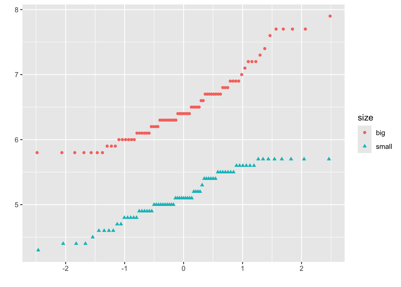
It is also possible to differentiate groups by only shape or color. For this, remove one of the argument col or shape in the qplot() function above.
Density plot
Density plot is a smoothed version of the histogram and is used in the same concept, that is, to represent the distribution of a numeric variable. The functions plot() and density() are used together to draw a density plot:
plot(density(dat$Sepal.Length))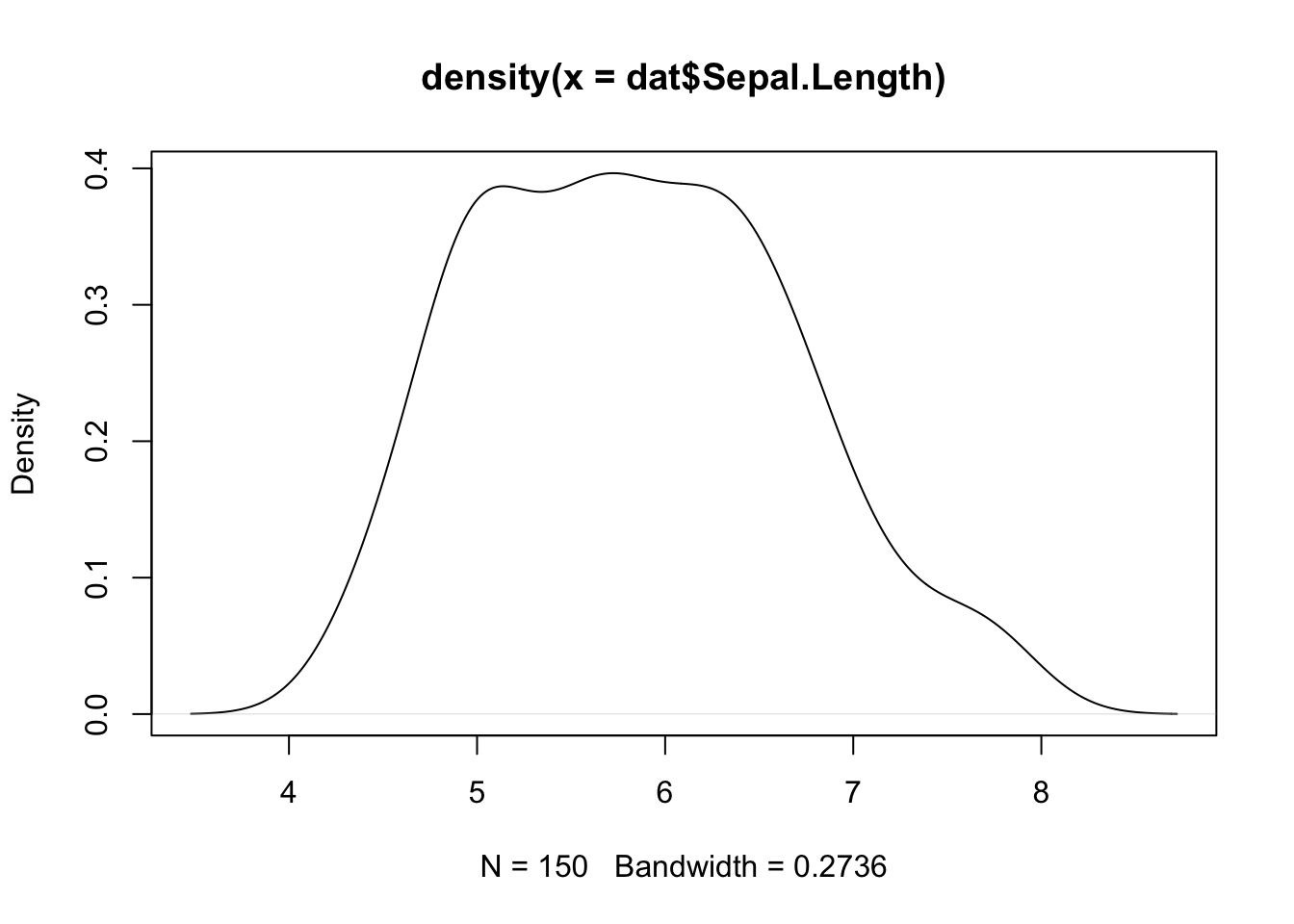
In {ggplot2}:
ggplot(dat) +
  aes(x = Sepal.Length) +
  geom_density()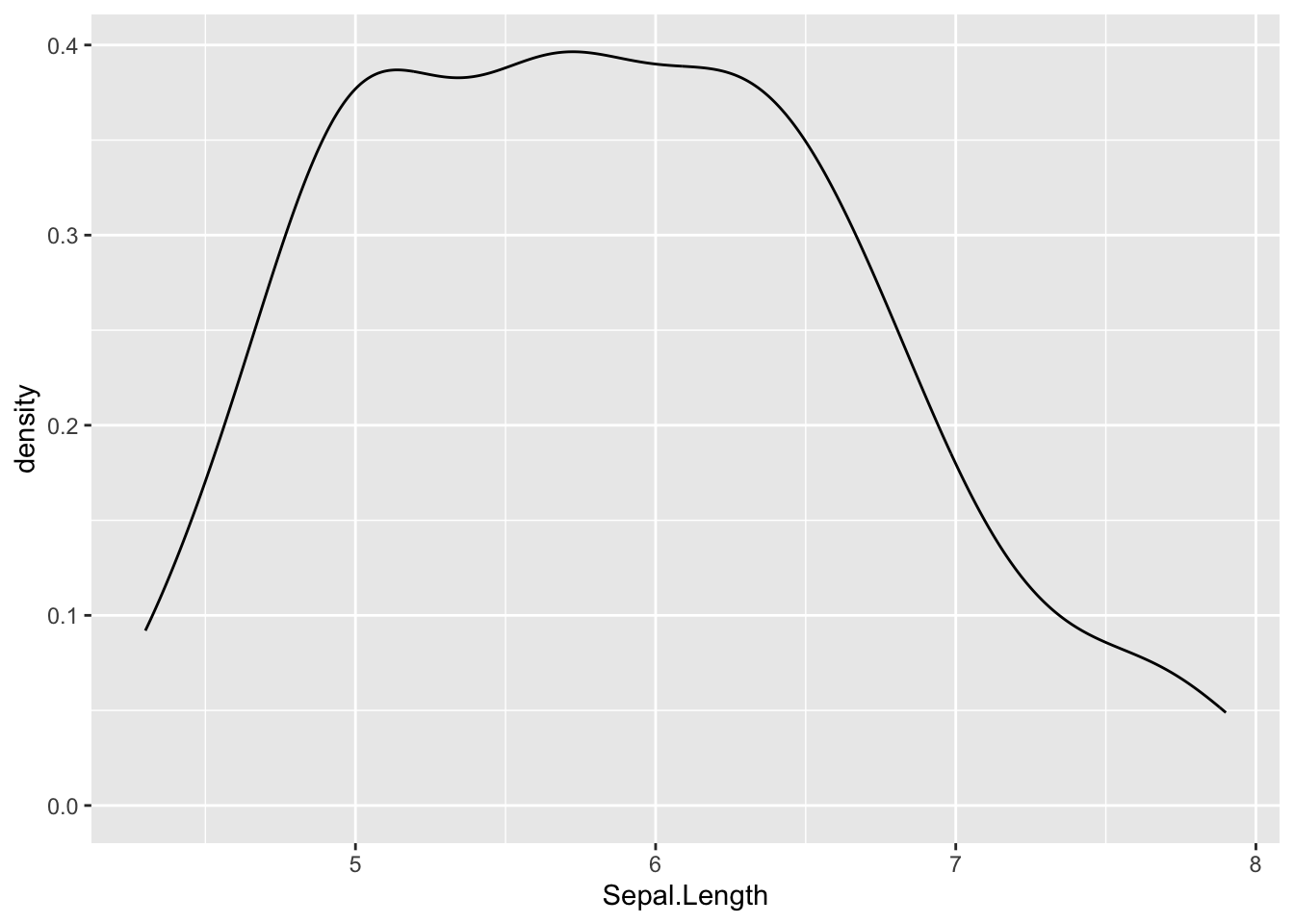
Correlation plot
The last type of descriptive plot is a correlation plot, also called a correlogram. This type of graph is more complex than the ones presented above, so it is detailed in a separate article. See how to draw a correlogram to highlight the most correlated variables in a dataset.
Advanced descriptive statistics
We covered the main functions to compute the most common and basic descriptive statistics. There are, however, many more functions and packages to perform more advanced descriptive statistics in R. In this section, I present some of them with applications to our dataset.
{summarytools} package
One package for descriptive statistics I often use for my projects in R is the {summarytools} package. The package is centered around 4 functions:
freq()for frequencies tablesctable()for cross-tabulationsdescr()for descriptive statisticsdfSummary()for dataframe summaries
A combination of these 4 functions is usually more than enough for most descriptive analyses. Moreover, the package has been built with R Markdown in mind, meaning that outputs render well in HTML reports. And for non-English speakers, built-in translations exist for French, Portuguese, Spanish, Russian and Turkish.
I illustrate each of the 4 functions in the following sections. Outputs that follow display much better in R Markdown reports, but in this article I limit myself to the raw outputs as the goal is to show how the functions work, not how to make them render well. See the setup settings in the vignette of the package if you want to print the outputs in a nice way in R Markdown.2
Frequency tables with freq()
The freq() function produces frequency tables with frequencies, proportions, as well as missing data information.
library(summarytools)
freq(dat$Species)
## Frequencies
## dat$Species
## Type: Factor
##
## Freq % Valid % Valid Cum. % Total % Total Cum.
## ---------------- ------ --------- -------------- --------- --------------
## setosa 50 33.33 33.33 33.33 33.33
## versicolor 50 33.33 66.67 33.33 66.67
## virginica 50 33.33 100.00 33.33 100.00
## <NA> 0 0.00 100.00
## Total 150 100.00 100.00 100.00 100.00If you do not need information about missing values, add the report.nas = FALSE argument:
freq(dat$Species,
  report.nas = FALSE # remove NA information
)
## Frequencies
## dat$Species
## Type: Factor
##
## Freq % % Cum.
## ---------------- ------ -------- --------
## setosa 50 33.33 33.33
## versicolor 50 33.33 66.67
## virginica 50 33.33 100.00
## Total 150 100.00 100.00And for a minimalist output with only counts and proportions:
freq(dat$Species,
  report.nas = FALSE, # remove NA information
  totals = FALSE, # remove totals
  cumul = FALSE, # remove cumuls
  headings = FALSE # remove headings
)
##
## Freq %
## ---------------- ------ -------
## setosa 50 33.33
## versicolor 50 33.33
## virginica 50 33.33Cross-tabulations with ctable()
The ctable() function produces cross-tabulations (also known as contingency tables) for pairs of categorical variables. Using the two categorical variables in our dataset:
ctable(
  x = dat$Species,
  y = dat$size
)
## Cross-Tabulation, Row Proportions
## Species * size
## Data Frame: dat
##
## ------------ ------ ------------ ------------ --------------
## size big small Total
## Species
## setosa 1 ( 2.0%) 49 (98.0%) 50 (100.0%)
## versicolor 29 (58.0%) 21 (42.0%) 50 (100.0%)
## virginica 47 (94.0%) 3 ( 6.0%) 50 (100.0%)
## Total 77 (51.3%) 73 (48.7%) 150 (100.0%)
## ------------ ------ ------------ ------------ --------------Row proportions are shown by default. To display column or total proportions, add the prop = "c" or prop = "t" arguments, respectively:
ctable(
  x = dat$Species,
  y = dat$size,
  prop = "t" # total proportions
)
## Cross-Tabulation, Total Proportions
## Species * size
## Data Frame: dat
##
## ------------ ------ ------------ ------------ --------------
## size big small Total
## Species
## setosa 1 ( 0.7%) 49 (32.7%) 50 ( 33.3%)
## versicolor 29 (19.3%) 21 (14.0%) 50 ( 33.3%)
## virginica 47 (31.3%) 3 ( 2.0%) 50 ( 33.3%)
## Total 77 (51.3%) 73 (48.7%) 150 (100.0%)
## ------------ ------ ------------ ------------ --------------To remove proportions altogether, add the argument prop = "n". Furthermore, to display only the bare minimum, add the totals = FALSE and headings = FALSE arguments:
ctable(
  x = dat$Species,
  y = dat$size,
  prop = "n", # remove proportions
  totals = FALSE, # remove totals
  headings = FALSE # remove headings
)
##
## ------------ ------ ----- -------
## size big small
## Species
## setosa 1 49
## versicolor 29 21
## virginica 47 3
## ------------ ------ ----- -------This is equivalent than table(dat$Species, dat$size) and xtabs(~ dat$Species + dat$size) performed in the section on contingency tables.
To display results of the Chi-square test of independence, add the chisq = TRUE argument:3
ctable(
  x = dat$Species,
  y = dat$size,
  chisq = TRUE, # display results of Chi-square test of independence
  headings = FALSE # remove headings
)
##
## ------------ ------ ------------ ------------ --------------
## size big small Total
## Species
## setosa 1 ( 2.0%) 49 (98.0%) 50 (100.0%)
## versicolor 29 (58.0%) 21 (42.0%) 50 (100.0%)
## virginica 47 (94.0%) 3 ( 6.0%) 50 (100.0%)
## Total 77 (51.3%) 73 (48.7%) 150 (100.0%)
## ------------ ------ ------------ ------------ --------------
##
## ----------------------------
## Chi.squared df p.value
## ------------- ---- ---------
## 86.0345 2 0
## ----------------------------The p-value is close to 0 so we reject the null hypothesis of independence between the two variables. In our context, this indicates that species and size are dependent and that there is a significant relationship between the two variables.
It is also possible to create a contingency table for each level of a third categorical variable thanks to the combination of the stby() and ctable() functions. There are only 2 categorical variables in our dataset, so let’s use the tabacco dataset which has 4 categorical variables (i.e., gender, age group, smoker, diseased). For this example, we would like to create a contingency table of the variables smoker and diseased, and this for each gender:
stby(
  list(
    x = tobacco$smoker, # smoker and diseased
    y = tobacco$diseased
  ),
  INDICES = tobacco$gender, # for each gender
  FUN = ctable # ctable for cross-tabulation
)
## Cross-Tabulation, Row Proportions
## smoker * diseased
## Data Frame: tobacco
## Group: gender = F
##
## -------- ---------- ------------- ------------- --------------
## diseased Yes No Total
## smoker
## Yes 62 (42.2%) 85 (57.8%) 147 (100.0%)
## No 49 (14.3%) 293 (85.7%) 342 (100.0%)
## Total 111 (22.7%) 378 (77.3%) 489 (100.0%)
## -------- ---------- ------------- ------------- --------------
##
## Group: gender = M
##
## -------- ---------- ------------- ------------- --------------
## diseased Yes No Total
## smoker
## Yes 63 (44.1%) 80 (55.9%) 143 (100.0%)
## No 47 (13.6%) 299 (86.4%) 346 (100.0%)
## Total 110 (22.5%) 379 (77.5%) 489 (100.0%)
## -------- ---------- ------------- ------------- --------------Descriptive statistics with descr()
The descr() function produces descriptive (univariate) statistics with common central tendency statistics and measures of dispersion. (See the difference between a measure of central tendency and dispersion if you need a reminder.)
A major advantage of this function is that it accepts single vectors as well as data frames. If a data frame is provided, all non-numerical columns are ignored so you do not have to remove them yourself before running the function.
The descr() function allows to display:
- only a selection of descriptive statistics of your choice, with the
stats = c("mean", "sd")argument for mean and standard deviation for example - the minimum, first quartile, median, third quartile and maximum with
stats = "fivenum" - the most common descriptive statistics (mean, standard deviation, minimum, median, maximum, number and percentage of valid observations), with
stats = "common":
descr(dat,
  headings = FALSE, # remove headings
  stats = "common" # most common descriptive statistics
)
##
## Petal.Length Petal.Width Sepal.Length Sepal.Width
## --------------- -------------- ------------- -------------- -------------
## Mean 3.76 1.20 5.84 3.06
## Std.Dev 1.77 0.76 0.83 0.44
## Min 1.00 0.10 4.30 2.00
## Median 4.35 1.30 5.80 3.00
## Max 6.90 2.50 7.90 4.40
## N.Valid 150.00 150.00 150.00 150.00
## N 150.00 150.00 150.00 150.00
## Pct.Valid 100.00 100.00 100.00 100.00Tip: if you have a large number of variables, add the transpose = TRUE argument for a better display.
In order to compute these descriptive statistics by group (e.g., Species in our dataset), use the descr() function in combination with the stby() function:
stby(
  data = dat,
  INDICES = dat$Species, # by Species
  FUN = descr, # descriptive statistics
  stats = "common" # most common descr. stats
)
## Descriptive Statistics
## dat
## Group: Species = setosa
## N: 50
##
## Petal.Length Petal.Width Sepal.Length Sepal.Width
## --------------- -------------- ------------- -------------- -------------
## Mean 1.46 0.25 5.01 3.43
## Std.Dev 0.17 0.11 0.35 0.38
## Min 1.00 0.10 4.30 2.30
## Median 1.50 0.20 5.00 3.40
## Max 1.90 0.60 5.80 4.40
## N.Valid 50.00 50.00 50.00 50.00
## N 50.00 50.00 50.00 50.00
## Pct.Valid 100.00 100.00 100.00 100.00
##
## Group: Species = versicolor
## N: 50
##
## Petal.Length Petal.Width Sepal.Length Sepal.Width
## --------------- -------------- ------------- -------------- -------------
## Mean 4.26 1.33 5.94 2.77
## Std.Dev 0.47 0.20 0.52 0.31
## Min 3.00 1.00 4.90 2.00
## Median 4.35 1.30 5.90 2.80
## Max 5.10 1.80 7.00 3.40
## N.Valid 50.00 50.00 50.00 50.00
## N 50.00 50.00 50.00 50.00
## Pct.Valid 100.00 100.00 100.00 100.00
##
## Group: Species = virginica
## N: 50
##
## Petal.Length Petal.Width Sepal.Length Sepal.Width
## --------------- -------------- ------------- -------------- -------------
## Mean 5.55 2.03 6.59 2.97
## Std.Dev 0.55 0.27 0.64 0.32
## Min 4.50 1.40 4.90 2.20
## Median 5.55 2.00 6.50 3.00
## Max 6.90 2.50 7.90 3.80
## N.Valid 50.00 50.00 50.00 50.00
## N 50.00 50.00 50.00 50.00
## Pct.Valid 100.00 100.00 100.00 100.00Data frame summaries with dfSummary()
The dfSummary() function generates a summary table with statistics, frequencies and graphs for all variables in a dataset. The information shown depends on the type of the variables (character, factor, numeric, date) and also varies according to the number of distinct values.
dfSummary(dat)## Data Frame Summary
## dat
## Dimensions: 150 x 6
## Duplicates: 1
##
## -----------------------------------------------------------------------------------------------------------
## No Variable Stats / Values Freqs (% of Valid) Graph Valid Missing
## ---- -------------- ----------------------- -------------------- --------------------- ---------- ---------
## 1 Sepal.Length Mean (sd) : 5.8 (0.8) 35 distinct values . . : : 150 0
## [numeric] min < med < max: : : : : (100.0%) (0.0%)
## 4.3 < 5.8 < 7.9 : : : : :
## IQR (CV) : 1.3 (0.1) : : : : :
## : : : : : : : :
##
## 2 Sepal.Width Mean (sd) : 3.1 (0.4) 23 distinct values : 150 0
## [numeric] min < med < max: : (100.0%) (0.0%)
## 2 < 3 < 4.4 . :
## IQR (CV) : 0.5 (0.1) : : : :
## . . : : : : : :
##
## 3 Petal.Length Mean (sd) : 3.8 (1.8) 43 distinct values : 150 0
## [numeric] min < med < max: : . : (100.0%) (0.0%)
## 1 < 4.3 < 6.9 : : : .
## IQR (CV) : 3.5 (0.5) : : : : : .
## : : . : : : : : .
##
## 4 Petal.Width Mean (sd) : 1.2 (0.8) 22 distinct values : 150 0
## [numeric] min < med < max: : (100.0%) (0.0%)
## 0.1 < 1.3 < 2.5 : . . :
## IQR (CV) : 1.5 (0.6) : : : : .
## : : : : : . : : :
##
## 5 Species 1. setosa 50 (33.3%) IIIIII 150 0
## [factor] 2. versicolor 50 (33.3%) IIIIII (100.0%) (0.0%)
## 3. virginica 50 (33.3%) IIIIII
##
## 6 size 1. big 77 (51.3%) IIIIIIIIII 150 0
## [character] 2. small 73 (48.7%) IIIIIIIII (100.0%) (0.0%)
## -----------------------------------------------------------------------------------------------------------describeBy() from the {psych} package
The describeBy() function from the {psych} package allows to report several summary statistics (i.e., number of valid cases, mean, standard deviation, median, trimmed mean, mad: median absolute deviation (from the median), minimum, maximum, range, skewness and kurtosis) by a grouping variable.
library(psych)
describeBy(
  dat,
  dat$Species # grouping variable
)
##
## Descriptive statistics by group
## group: setosa
## vars n mean sd median trimmed mad min max range skew kurtosis
## Sepal.Length 1 50 5.01 0.35 5.0 5.00 0.30 4.3 5.8 1.5 0.11 -0.45
## Sepal.Width 2 50 3.43 0.38 3.4 3.42 0.37 2.3 4.4 2.1 0.04 0.60
## Petal.Length 3 50 1.46 0.17 1.5 1.46 0.15 1.0 1.9 0.9 0.10 0.65
## Petal.Width 4 50 0.25 0.11 0.2 0.24 0.00 0.1 0.6 0.5 1.18 1.26
## Species 5 50 1.00 0.00 1.0 1.00 0.00 1.0 1.0 0.0 NaN NaN
## size 6 50 1.98 0.14 2.0 2.00 0.00 1.0 2.0 1.0 -6.65 43.12
## se
## Sepal.Length 0.05
## Sepal.Width 0.05
## Petal.Length 0.02
## Petal.Width 0.01
## Species 0.00
## size 0.02
## ------------------------------------------------------------
## group: versicolor
## vars n mean sd median trimmed mad min max range skew kurtosis
## Sepal.Length 1 50 5.94 0.52 5.90 5.94 0.52 4.9 7.0 2.1 0.10 -0.69
## Sepal.Width 2 50 2.77 0.31 2.80 2.78 0.30 2.0 3.4 1.4 -0.34 -0.55
## Petal.Length 3 50 4.26 0.47 4.35 4.29 0.52 3.0 5.1 2.1 -0.57 -0.19
## Petal.Width 4 50 1.33 0.20 1.30 1.32 0.22 1.0 1.8 0.8 -0.03 -0.59
## Species 5 50 2.00 0.00 2.00 2.00 0.00 2.0 2.0 0.0 NaN NaN
## size 6 50 1.42 0.50 1.00 1.40 0.00 1.0 2.0 1.0 0.31 -1.94
## se
## Sepal.Length 0.07
## Sepal.Width 0.04
## Petal.Length 0.07
## Petal.Width 0.03
## Species 0.00
## size 0.07
## ------------------------------------------------------------
## group: virginica
## vars n mean sd median trimmed mad min max range skew kurtosis
## Sepal.Length 1 50 6.59 0.64 6.50 6.57 0.59 4.9 7.9 3.0 0.11 -0.20
## Sepal.Width 2 50 2.97 0.32 3.00 2.96 0.30 2.2 3.8 1.6 0.34 0.38
## Petal.Length 3 50 5.55 0.55 5.55 5.51 0.67 4.5 6.9 2.4 0.52 -0.37
## Petal.Width 4 50 2.03 0.27 2.00 2.03 0.30 1.4 2.5 1.1 -0.12 -0.75
## Species 5 50 3.00 0.00 3.00 3.00 0.00 3.0 3.0 0.0 NaN NaN
## size 6 50 1.06 0.24 1.00 1.00 0.00 1.0 2.0 1.0 3.59 11.15
## se
## Sepal.Length 0.09
## Sepal.Width 0.05
## Petal.Length 0.08
## Petal.Width 0.04
## Species 0.00
## size 0.03aggregate() function
The aggregate() function allows to split the data into subsets and then to compute summary statistics for each. For instance, if we want to compute the mean for the variables Sepal.Length and Sepal.Width by Species and Size:
aggregate(cbind(Sepal.Length, Sepal.Width) ~ Species + size,
  data = dat,
  mean
)
## Species size Sepal.Length Sepal.Width
## 1 setosa big 5.800000 4.000000
## 2 versicolor big 6.282759 2.868966
## 3 virginica big 6.663830 2.997872
## 4 setosa small 4.989796 3.416327
## 5 versicolor small 5.457143 2.633333
## 6 virginica small 5.400000 2.600000summaryBy() from {doBy}
An alternative is the summaryBy() function from the {doBy} package:
# summary statistics by group
library(doBy)
summaryBy(Sepal.Length + Sepal.Width ~ Species,
  data = dat,
  FUN = summary
)
## Species Sepal.Length.Min. Sepal.Length.1st Qu. Sepal.Length.Median
## 1 setosa 4.3 4.800 5.0
## 2 versicolor 4.9 5.600 5.9
## 3 virginica 4.9 6.225 6.5
## Sepal.Length.Mean Sepal.Length.3rd Qu. Sepal.Length.Max. Sepal.Width.Min.
## 1 5.006 5.2 5.8 2.3
## 2 5.936 6.3 7.0 2.0
## 3 6.588 6.9 7.9 2.2
## Sepal.Width.1st Qu. Sepal.Width.Median Sepal.Width.Mean Sepal.Width.3rd Qu.
## 1 3.200 3.4 3.428 3.675
## 2 2.525 2.8 2.770 3.000
## 3 2.800 3.0 2.974 3.175
## Sepal.Width.Max.
## 1 4.4
## 2 3.4
## 3 3.8If you are interested in some specific descriptive statistics, you can easily specify them via the FUN argument:
summaryBy(Sepal.Length + Sepal.Width ~ Species,
  data = dat,
  FUN = c(mean, var)
)
## Species Sepal.Length.mean Sepal.Width.mean Sepal.Length.var
## 1 setosa 5.006 3.428 0.1242490
## 2 versicolor 5.936 2.770 0.2664327
## 3 virginica 6.588 2.974 0.4043429
## Sepal.Width.var
## 1 0.14368980
## 2 0.09846939
## 3 0.10400408group_by() and summarise() from {dplyr}
Another alternative is with the summarise() and group_by() functions from the {dplyr} package:
library(dplyr)

group_by(dat, Species) %>%
  summarise(
    mean = mean(Sepal.Length, na.rm = TRUE),
    sd = sd(Sepal.Length, na.rm = TRUE)
  )
## # A tibble: 3 × 3
## Species mean sd
## <fct> <dbl> <dbl>
## 1 setosa 5.01 0.352
## 2 versicolor 5.94 0.516
## 3 virginica 6.59 0.636Conclusion
Thanks for reading.
I hope this article helped you to do descriptive statistics in R. If you would like to do the same by hand or understand what these statistics represent, I invite you to read the article “Descriptive statistics by hand”.
As always, if you have a question or a suggestion related to the topic covered in this article, please add it as a comment so other readers can benefit from the discussion.
(Note that this article is available for download on my Gumroad page.)
Normality tests such as Shapiro-Wilk or Kolmogorov-Smirnov tests can also be used to test whether the data follow a normal distribution or not. However, in practice, normality tests are often considered as too conservative in the sense that for large sample size, a small deviation from the normality may cause the normality condition to be violated. For this reason, it is often the case that the normality condition is verified based on a combination of visual inspections (with histograms and QQ-plots) and formal test (Shapiro-Wilk test for instance).↩︎
Note that the
plain.asciiandstylearguments are needed for this package. In our examples, these arguments are added in the settings of each chunk so they are not visible.↩︎Note that it is also possible to compute odds ratio and risk ratio. See the vignette of the package for more information on this matter as these ratios are beyond the scope of this article.↩︎
Liked this post?
- Get updates every time a new article is published (no spam and unsubscribe anytime)
- Support the blog
- Share on:


