
Correlogram in R: how to highlight the most correlated variables in a dataset

Introduction
Correlation, often computed as part of descriptive statistics, is a statistical tool used to study the relationship between two variables, that is, whether and how strongly couples of variables are associated.
Correlations are measured between 2 variables at a time. Therefore, for datasets with many variables, computing correlations can become quite cumbersome and time consuming.
Correlation matrix
A solution to this problem is to compute correlations and display them in a correlation matrix, which shows correlation coefficients for all possible combinations of two variables in the dataset.
For example, below is the correlation matrix for the dataset mtcars (which, as described by the help documentation of R, comprises fuel consumption and 10 aspects of automobile design and performance for 32 automobiles).1 For this article, we include only the continuous variables.
dat <- mtcars[, c(1, 3:7)]
round(cor(dat), 2)
## mpg disp hp drat wt qsec
## mpg 1.00 -0.85 -0.78 0.68 -0.87 0.42
## disp -0.85 1.00 0.79 -0.71 0.89 -0.43
## hp -0.78 0.79 1.00 -0.45 0.66 -0.71
## drat 0.68 -0.71 -0.45 1.00 -0.71 0.09
## wt -0.87 0.89 0.66 -0.71 1.00 -0.17
## qsec 0.42 -0.43 -0.71 0.09 -0.17 1.00Even after rounding the correlation coefficients to 2 digits, you will conceive that this correlation matrix is not easily and quickly interpretable.
If you are using R Markdown, you can use the pander() function from the {pander} package to make it slightly more readable, but still, we must admit that this table is not optimal when it comes to visualizing correlations between several variables of a dataset, especially for large datasets.
Correlogram
To tackle this issue and make it much more insightful, let’s transform the correlation matrix into a correlation plot. A correlation plot (also referred as a correlogram or corrgram in Friendly (2002)) allows to highlight the variables that are most (positively and negatively) correlated. Below an example with the same dataset presented above:
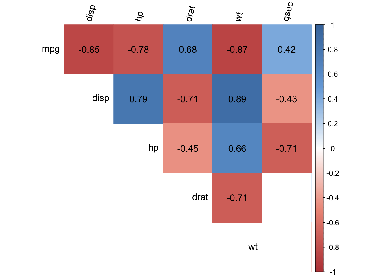
The correlogram represents the correlations for all pairs of variables. Positive correlations are displayed in blue and negative correlations in red. The intensity of the color is proportional to the correlation coefficient so the stronger the correlation (i.e., the closer to -1 or 1), the darker the boxes. The color legend on the right hand side of the correlogram shows the correlation coefficients and the corresponding colors.
As a reminder, a negative correlation implies that the two variables under consideration vary in opposite directions, that is, if one variable increases the other decreases and vice versa. A positive correlation implies that the two variables under consideration vary in the same direction, that is, if one variable increases the other increases and if one variable decreases the other decreases as well. Furthermore, the stronger the correlation, the stronger the association between the two variables.
Correlation test
Finally, a white box in the correlogram indicates that the correlation is not significantly different from 0 at the specified significance level (in this example, at \(\alpha = 5\)%) for the couple of variables. A correlation not significantly different from 0 means that there is no linear relationship between the two variables considered in the population (there could be another kind of association, but not linear).
To determine whether a specific correlation coefficient is significantly different from 0, a correlation test has been performed. Remind that the null and alternative hypotheses of this test are:
- \(H_0\): \(\rho = 0\)
- \(H_1\): \(\rho \ne 0\)
where \(\rho\) is denotes the correlation. The correlation test is based on two factors: the number of observations and the correlation coefficient. The more observations and the stronger the correlation between 2 variables, the more likely it is to reject the null hypothesis of no correlation between these 2 variables.
In the context of our example, the correlogram above shows that the variables wt (weight) and hp (horsepower) are positively correlated, while the variables mpg (miles per gallon) and wt (weight) are negatively correlated (both correlations make sense if we think about it). Furthermore, the variables wt and qsec are not correlated (indicated by a white box). Even if the correlation coefficient is -0.17 between the 2 variables, the correlation test has shown that we cannot reject the hypothesis of no correlation in the population. This is the reason the box for these two variable is white.
Although this correlogram presents exactly the same information than the correlation matrix, the correlogram presents a visual representation of the correlation matrix, allowing to quickly scan through it to see which variables are correlated and which are not.
Code
For those interested to draw this correlogram with their own data, here is the code of the function I adapted based on the corrplot() function from the {corrplot} package (thanks again to all contributors of this package):
The main arguments in the corrplot2() function are the following:
data: name of your datasetmethod: the correlation method to be computed, one of “pearson” (default), “kendall”, or “spearman”. As a rule of thumb, if your dataset contains quantitative continuous variables that have a linear relationship, you can keep the Pearson method. If you have qualitative ordinal variables or quantitative variables with a partially linear link, the Spearman method is more appropriatesig.level: the significance level for the correlation test, default is 0.05order: order of the variables, one of “original” (default), “AOE” (angular order of the eigenvectors), “FPC” (first principal component order), “hclust” (hierarchical clustering order), “alphabet” (alphabetical order)diag: display the correlation coefficients on the diagonal? The default isFALSEtype: display the entire correlation matrix or simply the upper/lower part, one of “upper” (default), “lower”, “full”tl.srt: rotation of the variable labels- (note that missing values in the dataset are automatically removed)
{ggstatsplot} package
An alternative to the correlogram presented above is possible with the ggcorrmat() function from the {ggstatsplot} package:
# load package
library(ggstatsplot)

# correlogram
ggstatsplot::ggcorrmat(
  data = dat,
  type = "parametric", # parametric for Pearson, nonparametric for Spearman's correlation
  colors = c("darkred", "white", "steelblue") # change default colors
)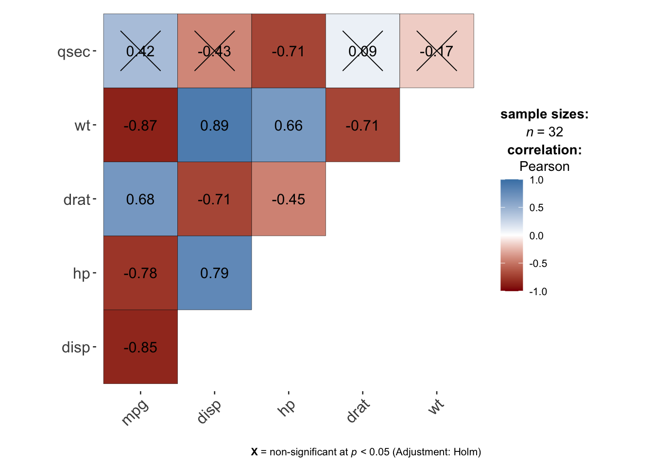
In this correlogram, the non-significant correlations (by default at the 5% significance level with the Holm adjustment method) are shown by a cross on the correlation coefficients.
The advantage of this alternative compared to the previous one is that it is directly available within a package, so you do not need to run the code of the function first in order to draw the correlogram.
{lares} package
Thanks to this article, I discovered the {lares} package which has really nice features regarding plotting correlations. Another advantage of this package is that it can be used to compute correlations with numerical, logical, categorical and date variables.
See more information about the package in this article.
All possible correlations
Use the corr_cross() function if you want to compute all correlations and return the highest and significant ones in a plot:
# devtools::install_github("laresbernardo/lares")
library(lares)

corr_cross(dat, # name of dataset
  max_pvalue = 0.05, # display only significant correlations (at 5% level)
  top = 10 # display top 10 couples of variables (by correlation coefficient)
)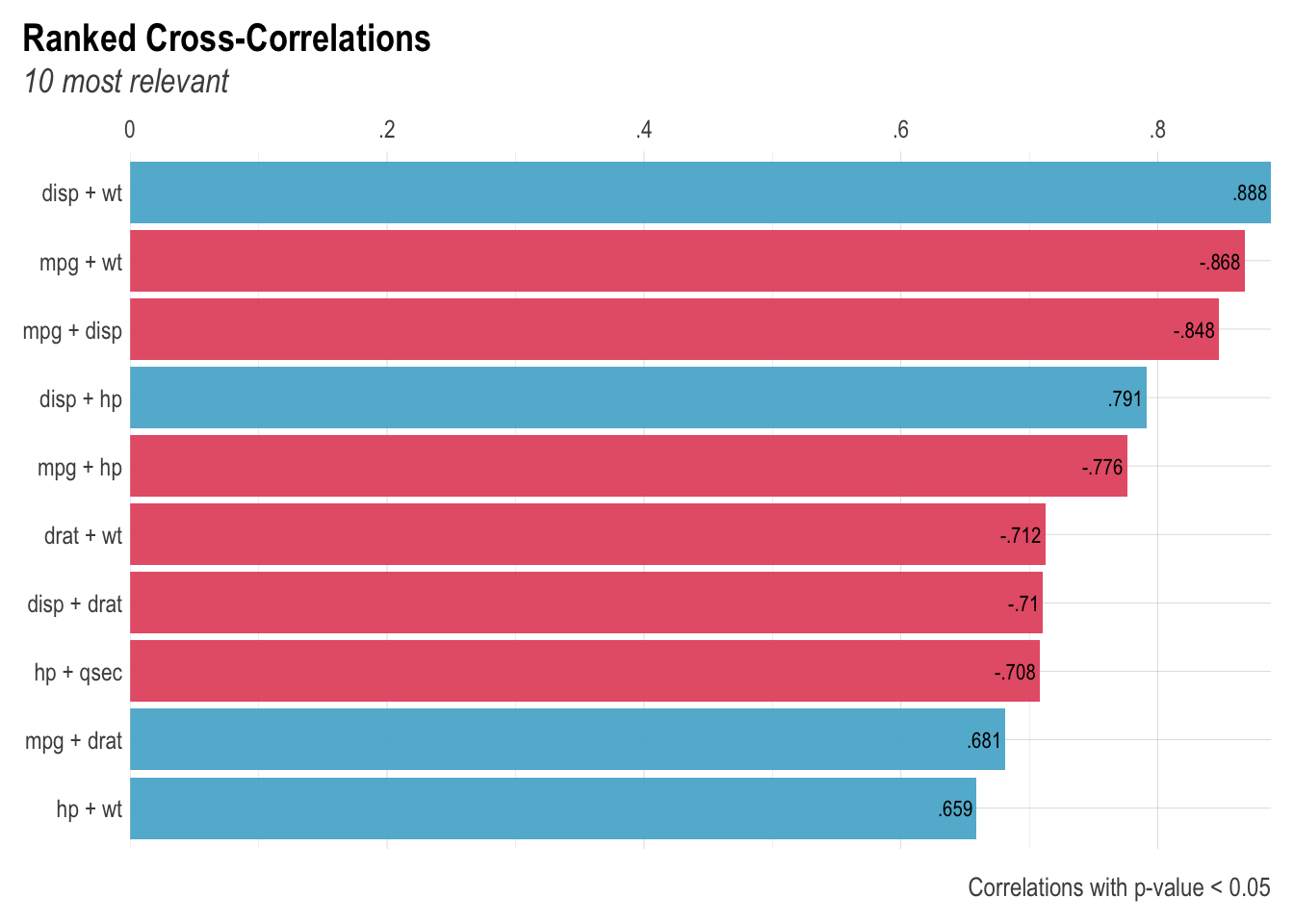
Negative correlations are represented in red and positive correlations in blue.
Correlation of one variable against all others
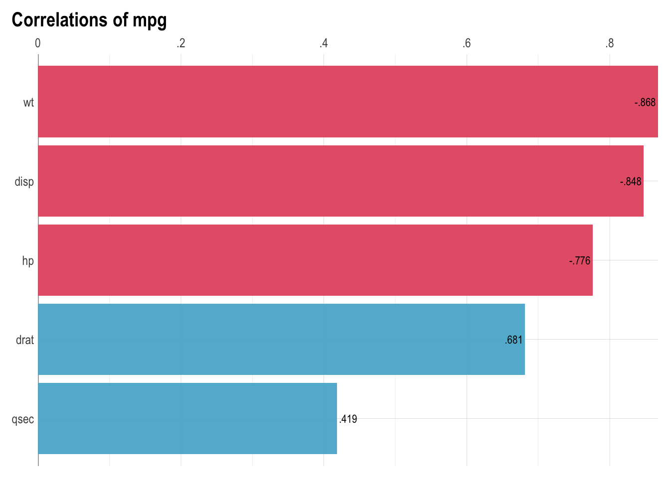
Use the corr_var() function if you want to focus on the correlation of one variable against all others, and return the highest ones in a plot:
corr_var(dat, # name of dataset
  mpg, # name of variable to focus on
  top = 5 # display top 5 correlations
)
Conclusion
Thanks for reading.
I hope this article will help you to visualize correlations between variables in a dataset and to make correlation matrices more insightful and more appealing.
If you want to learn more about this topic, see:
- how to compute correlation coefficients and perform correlation tests in R, or
- how to compute correlation coefficients by hand.
As always, if you have a question or a suggestion related to the topic covered in this article, please add it as a comment so other readers can benefit from the discussion.
References
The dataset
mtcarsis preloaded in R by default, so there is no need to import it into R. Check the article “How to import an Excel file in R” if you need help in importing your own dataset.↩︎
Liked this post?
- Get updates every time a new article is published (no spam and unsubscribe anytime)
- Support the blog
- Share on:


