
How to track the performance of your blog in R?

Introduction
Stats and R has been launched on December 16, 2019. Since the blog is officially one year old today and after having discussed the main benefits of maintaining a technical blog, I thought it would be a good time to share some numbers and thoughts about it.
In this article, I show how to analyze a blog and its blog posts with the {googleAnalyticsR} R package (see package’s full documentation). After sharing some analytics about the blog, I will also discuss about content creation/distribution and, to a smaller extent, the future plans. This is a way to share my journey as a data science blogger and a way to give you an insight about how Stats and R is doing.
I decided to share with you some numbers through the {googleAnalyticsR} package instead of the regular Google Analytics dashboards for several reasons:
- There are plenty of data analysts who are much more experienced than me when it comes to analyzing Google Analytics data via their dedicated platform
- I recently discovered the
{googleAnalyticsR}package in R and I would like to present its possibilities, and perhaps convince marketing specialists familiar with R to complement their Google Analytics dashboards with some data visualizations made in R (via some ggplot2 visualizations for instance) - I would like to automate the process such in a way that I can easily replicate the same types of analysis across the years. This will allow to see how the blog evolves throughout the years. We know that using R is a pretty good starting point when it comes to automation and replication—especially thanks to R Markdown reports
I am not an expert in the field of digital marketing, but who knows, it may still give some ideas to data analysts, SEO specialists or other bloggers on how to track the performance of their own blog or website using R. For those of you who are interested in a more condensed analysis, see my custom Google Analytics dashboard.1
Before going further, I would like to remind that I am not making a living from my blog (far from it!) and it is definitely not my goal as I do not believe that I would be the same kind of writer if it was my main occupation.
Prerequisites
As for any package in R, we first need to install it—with install.packages()—and load it—with library():2
# install.packages('googleAnalyticsR', dependencies = TRUE)
library(googleAnalyticsR)
Next, we need to authorize the access of the Google Analytics account using the ga_auth() function:
ga_auth()Running this code will open a browser window on which you will be able to authorize the access. This step will save an authorization token so you only have to do it once.
Make sure to run the ga_auth() function in a R script and not in a R Markdown document. Follow this procedure if you want to use the package and its functions in a R Markdown report or in a blog post like I did for this article.
Once we have completed the Google Analytics authorization, we will need the ID of the Google Analytics account we want to access. All the available accounts linked to your email address (after authentication) are stored in ga_account_list():
accounts <- ga_account_list()

accounts
## # A tibble: 2 × 10
## accountId account…¹ inter…² level websi…³ type webPr…⁴ webPr…⁵ viewId viewN…⁶
## <chr> <chr> <chr> <chr> <chr> <chr> <chr> <chr> <chr> <chr>
## 1 86997981 Antoine … 129397… STAN… https:… WEB UA-869… Antoin… 13318… All We…
## 2 86997981 Antoine … 218214… STAN… https:… WEB UA-869… statsa… 20812… All We…
## # … with abbreviated variable names ¹accountName, ²internalWebPropertyId,
## # ³websiteUrl, ⁴webPropertyId, ⁵webPropertyName, ⁶viewNameaccounts$webPropertyName## [1] "Antoine Soetewey" "statsandr.com"As you can see I have two accounts linked to my Google Analytics profile: one for my personal website (antoinesoetewey.com) and one for this blog.
Of course, I select the account linked to this blog:
# select the view ID by property name
view_id <- accounts$viewId[which(accounts$webPropertyName == "statsandr.com")]
Make sure to edit the code with your own property name.
We are now finally ready to use our Google Analytics data in R for a better analysis!
Analytics
Users, page views and sessions
Let’s start with some general numbers, such as the number of users, sessions and page views for the entire site. Note that for the present article, we use data over the past year, so from December 16, 2019 to December 15, 2020:
# set date range
start_date <- as.Date("2019-12-16")
end_date <- as.Date("2020-12-15")

# get Google Analytics (GA) data
gadata <- google_analytics(view_id,
  date_range = c(start_date, end_date),
  metrics = c("users", "sessions", "pageviews"),
  anti_sample = TRUE # slows down the request but ensures data isn't sampled
)

gadata
## users sessions pageviews
## 1 321940 428217 560491In its first year, Stats and R has attracted 321,940 users, who generated a total of 428,217 sessions and 560,491 page views (that is an average of 1531 page views per day).
For those unfamiliar with Google Analytics data and the difference between these metrics, remember that:
- a user is the number of new and returning people who visit your site during a set period of time
- a session is a group of user interactions with your website that take place within a given time frame
- a page view, as the name suggests, is defined as a view of a page on your site
So if person A reads three blog posts then leave the site and person B reads one blog post, your about page then leave the site, Google Analytics data will show 2 users, 2 sessions and 5 page views.
Sessions over time
In addition to the rather general metrics presented above, it is also interesting to illustrate the daily number of sessions over time in a scatterplot—together with a smoothed line—to analyze the evolution of the blog:
# get the Google Analytics (GA) data
gadata <- google_analytics(view_id,
  date_range = c(start_date, end_date),
  metrics = c("sessions"), # edit for other metrics
  dimensions = c("date"),
  anti_sample = TRUE # slows down the request but ensures data isn't sampled
)

# load required libraries
library(dplyr)
library(ggplot2)

# scatter plot with a trend line
gadata %>%
  ggplot(aes(x = date, y = sessions)) +
  geom_point(size = 1L, color = "steelblue") + # change size and color of points
  geom_smooth(color = "darkgrey", alpha = 0.25) + # change color of smoothed line and transparency of confidence interval
  theme_minimal() +
  labs(
    y = "Sessions",
    x = "",
    title = "Evolution of daily sessions",
    subtitle = paste0(format(start_date, "%b %d, %Y"), " to ", format(end_date, "%b %d, %Y")),
    caption = "Data: Google Analytics data of statsandr.com"
  ) +
  theme(plot.margin = unit(c(5.5, 15.5, 5.5, 5.5), "pt")) + # to avoid the plot being cut on the right edge
  scale_y_continuous(labels = scales::comma) # better y labels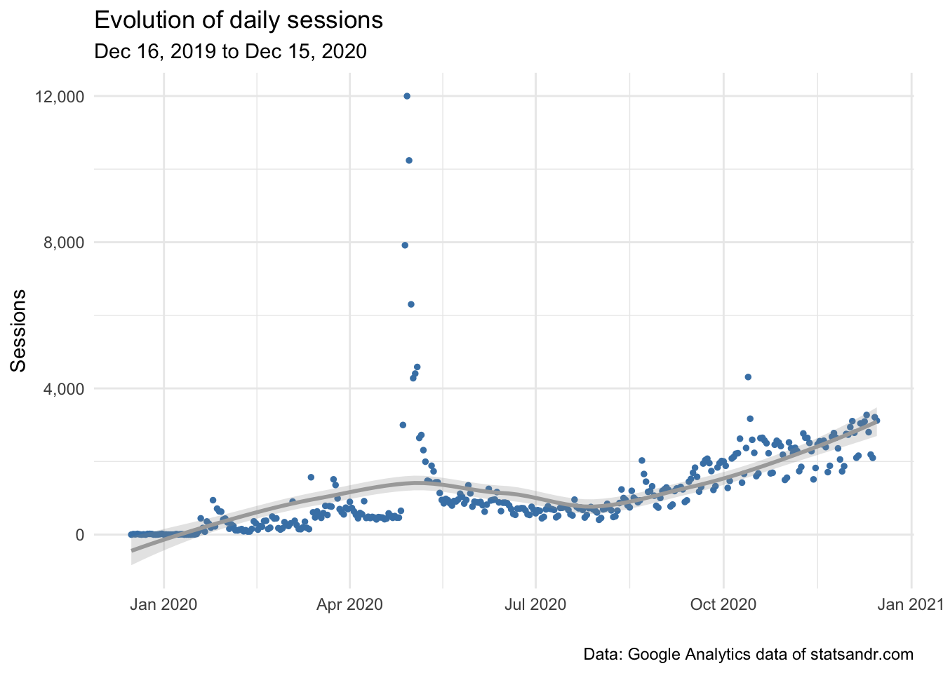
(See how to draw plots with the {ggplot2} package, or with the {esquisse} addin if you are not familiar with the package.)
As you can see, there was a huge peak of traffic around end of April, with almost 12,000 users in a single day. Yes, you read it well and there is no bug. The blog post “A package to download free Springer books during Covid-19 quarantine” went viral and generated a massive traffic for a few days. The daily number of sessions returned to a more normal level after a couple of days. We also observe an upward trend in the last months (since end of August/beginning of September), which indicates that the blog is growing in terms of number of daily sessions.
Note that I decided to focus on the number of sessions and the number of page views in this section and the following ones, but you can always change to your preferred metrics by editing metrics = c("sessions") in the code. See all available metrics provided by Google Analytics in this article.
Sessions per channel
Knowing how people come to your blog is a pretty important factor. Here is how to visualize the evolution of daily sessions per channel in a line plot:
# Get the data
trend_data <- google_analytics(view_id,
  date_range = c(start_date, end_date),
  dimensions = c("date"),
  metrics = "sessions",
  pivots = pivot_ga4("medium", "sessions"),
  anti_sample = TRUE # slows down the request but ensures data isn't sampled
)

# edit variable names
names(trend_data) <- c("Date", "Total", "Organic", "Referral", "Direct", "Email", "Social")

# Change the data into a long format
library(tidyr)
trend_long <- gather(trend_data, Channel, Sessions, -Date)

# Build up the line plot
ggplot(trend_long, aes(x = Date, y = Sessions, group = Channel)) +
  theme_minimal() +
  geom_line(aes(colour = Channel)) +
  labs(
    y = "Sessions",
    x = "",
    title = "Evolution of daily sessions per channel",
    subtitle = paste0(format(start_date, "%b %d, %Y"), " to ", format(end_date, "%b %d, %Y")),
    caption = "Data: Google Analytics data of statsandr.com"
  ) +
  scale_y_continuous(labels = scales::comma) # better y labels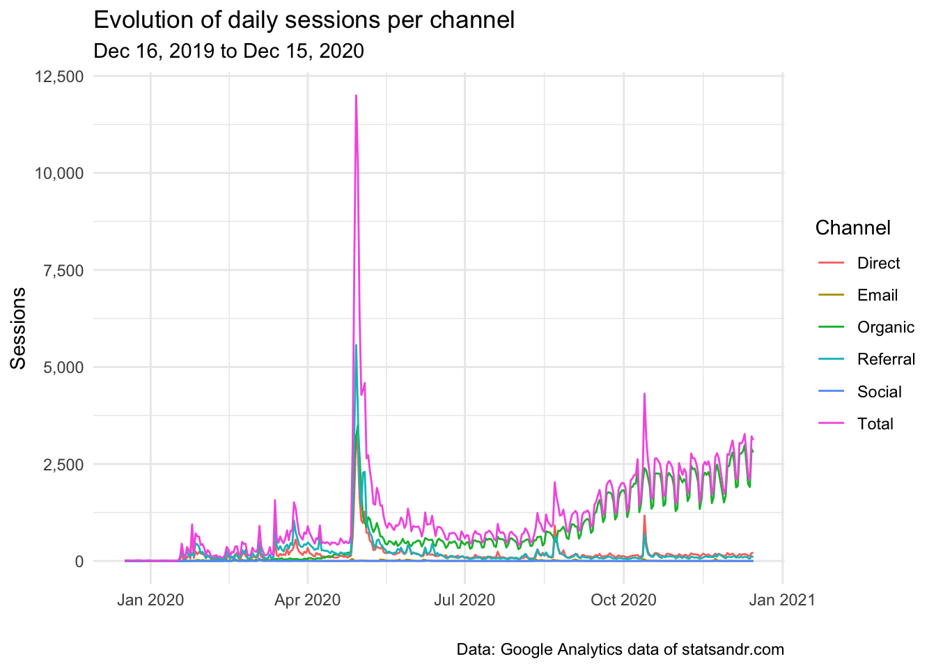
We see that a large share of the traffic is from the organic channel, which indicates that most readers visit the blog after a query on search engines (mostly Google). In my case, where most of my posts are tutorials and which help people with specific problems, it is thus not a surprise that most of my traffic comes from organic search.
We also notice some small peaks of sessions generated from the referral and direct channels, which are probably happening on the date of publication of each article.
We also see that there seems to be a recurrent pattern of ups and downs in the number of daily sessions. Those are weekly cycles, with less readers during the weekend and which indicates that people are working on improving their statistical or R knowledge mostly during the week (which actually makes sense!).
Sessions per day of week
As shown above, traffic seems to be different depending on the day of week. To investigate this further, we draw a boxplot of the number of sessions for every day of the week:
# get data
gadata <- google_analytics(view_id,
  date_range = c(start_date, end_date),
  metrics = "sessions",
  dimensions = c("dayOfWeek", "date"),
  anti_sample = TRUE # slows down the request but ensures data isn't sampled
)

## Recoding gadata$dayOfWeek following GA naming conventions
gadata$dayOfWeek <- recode_factor(gadata$dayOfWeek,
  "0" = "Sunday",
  "1" = "Monday",
  "2" = "Tuesday",
  "3" = "Wednesday",
  "4" = "Thursday",
  "5" = "Friday",
  "6" = "Saturday"
)

## Reordering gadata$dayOfWeek to have Monday as first day of the week
gadata$dayOfWeek <- factor(gadata$dayOfWeek,
  levels = c(
    "Monday", "Tuesday", "Wednesday", "Thursday", "Friday", "Saturday",
    "Sunday"
  )
)

# Boxplot
gadata %>%
  ggplot(aes(x = dayOfWeek, y = sessions)) +
  geom_boxplot() +
  theme_minimal() +
  labs(
    y = "Sessions",
    x = "",
    title = "Sessions per day of week",
    subtitle = paste0(format(start_date, "%b %d, %Y"), " to ", format(end_date, "%b %d, %Y")),
    caption = "Data: Google Analytics data of statsandr.com"
  ) +
  scale_y_continuous(labels = scales::comma) # better y labels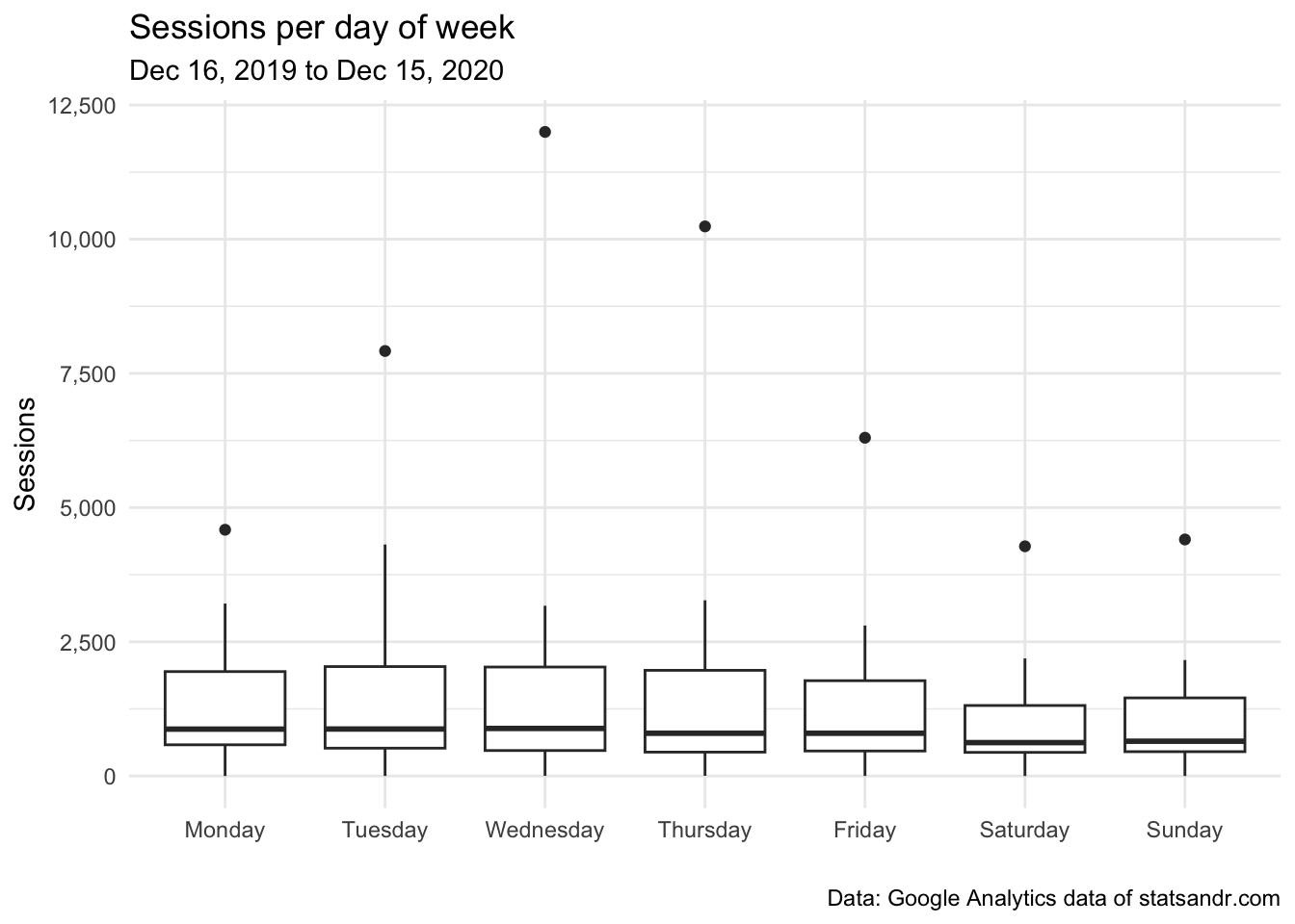
As you can see there are some outliers, probably due (in part at least) to the article that went viral. For the sake of illustration, below the same plot after removing points considered as potential outliers according to the interquartile range (IQR) criterion (i.e., points above or below the whiskers), and after a couple of visual improvements:
# boxplot
gadata %>%
  filter(sessions <= 3000) %>% # filter out sessions > 3,000
  ggplot(aes(x = dayOfWeek, y = sessions, fill = dayOfWeek)) + # fill boxplot by dayOfWeek
  geom_boxplot(varwidth = TRUE) + # vary boxes width according to n obs.
  geom_jitter(alpha = 0.25, width = 0.2) + # adds random noise and limit its width
  theme_minimal() +
  labs(
    y = "Sessions",
    x = "",
    title = "Sessions per day of week",
    subtitle = paste0(format(start_date, "%b %d, %Y"), " to ", format(end_date, "%b %d, %Y")),
    caption = "Data: Google Analytics data of statsandr.com\nPoints > 3,000 excluded"
  ) +
  scale_y_continuous(labels = scales::comma) + # better y labels
  theme(legend.position = "none") # remove legend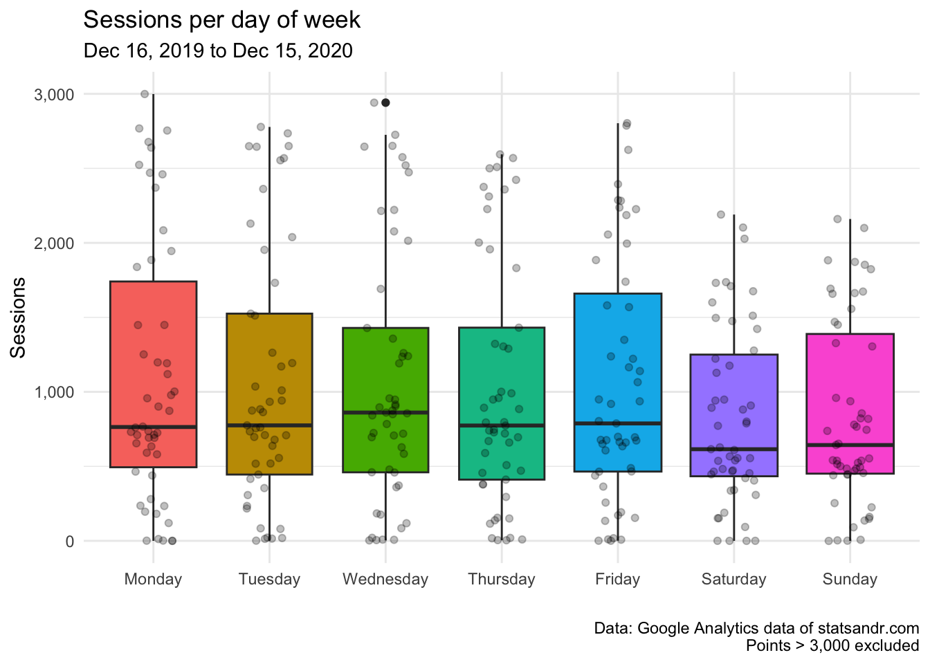
After excluding data points above 3,000, it is now easier to see that the median number of sessions (represented by the horizontal bold line in the boxes) is the highest on Wednesdays, and lowest on Saturdays and Sundays.
The difference in sessions between weekdays is, however, not as large as expected.
Sessions per day and time
We have seen the traffic per day of week. The example below shows a visualization of traffic, broken down this time by day of week and hour of day in a density plot. In this plot, the device type has also been added for more insights.
## Get data by deviceCategory, day of week and hour
weekly_data <- google_analytics(view_id,
  date_range = c(start_date, end_date),
  metrics = c("sessions"),
  dimensions = c("deviceCategory", "dayOfWeekName", "hour"),
  anti_sample = TRUE # slows down the request but ensures data isn't sampled
)

## Manipulation using dplyr
weekly_data_sessions <- weekly_data %>%
  group_by(deviceCategory, dayOfWeekName, hour)

## Reordering weekly_data_sessions$dayOfWeekName to have Monday as first day of the week
weekly_data_sessions$dayOfWeekName <- factor(weekly_data_sessions$dayOfWeekName,
  levels = c(
    "Monday", "Tuesday", "Wednesday", "Thursday", "Friday", "Saturday",
    "Sunday"
  )
)

## Plotting using ggplot2
weekly_data_sessions %>%
  ggplot(aes(hour, sessions, fill = deviceCategory, group = deviceCategory)) +
  geom_area(position = "stack") +
  labs(
    title = "Sessions per day and time",
    subtitle = paste0(format(start_date, "%b %d, %Y"), " to ", format(end_date, "%b %d, %Y")),
    caption = "Data: Google Analytics data of statsandr.com",
    x = "Time",
    y = "Sessions",
    fill = "Device" # edit legend title
  ) +
  theme_minimal() +
  facet_wrap(~dayOfWeekName, ncol = 2, scales = "fixed") +
  theme(
    legend.position = "bottom", # move legend
    axis.text = element_text(size = 7) # change font of axis text
  ) +
  scale_y_continuous(labels = scales::comma) # better y labels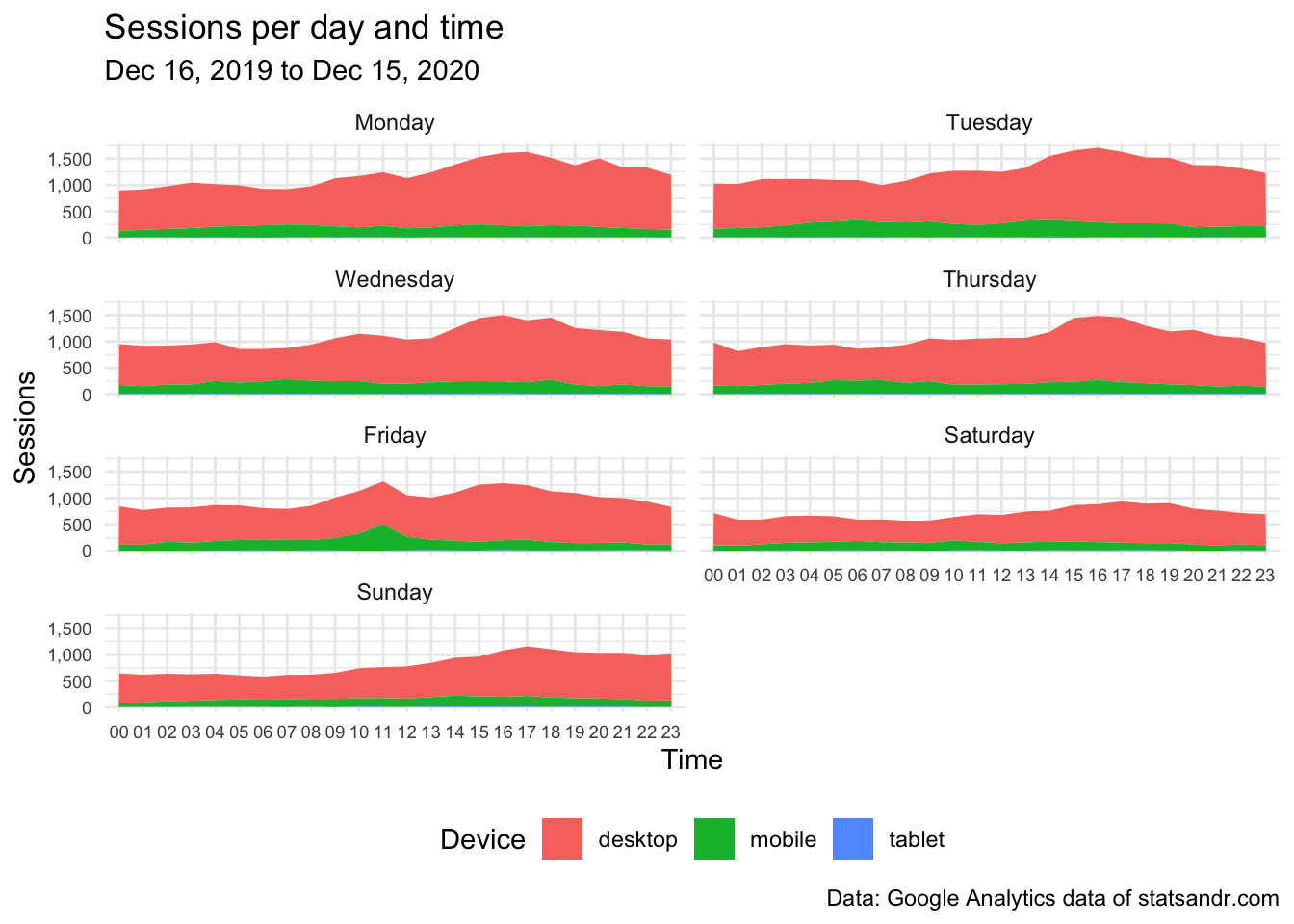
The above plot shows that:
- traffic increases in the afternoon then declines in the late evening
- traffic is the highest from Monday to Thursday, and lowest on Saturday and Sunday
In addition to that, thanks to the additional information on the device category, we also see that:
- the number of sessions on tablet is low (it is so low compared to desktop and mobile that it is not visible on the plot), and
- the number of sessions on mobile seems to be quite stable during the entire day,
- as opposed to sessions on desktop which are highest at the end of the day.
Sessions per month and year
In the following code, we create a barplot of the number of daily sessions per month and year:
# get data
df2 <- google_analytics(view_id,
  date_range = c(start_date, end_date),
  metrics = c("sessions"),
  dimensions = c("date"),
  anti_sample = TRUE # slows down the request but ensures data isn't sampled
)

# add in year month columns to dataframe
df2$month <- format(df2$date, "%m")
df2$year <- format(df2$date, "%Y")

# sessions by month by year using dplyr then graph using ggplot2 barplot
df2 %>%
  group_by(year, month) %>%
  summarize(sessions = sum(sessions)) %>%
  # print table steps by month by year
  # print(n = 100) %>%
  # graph data by month by year
  ggplot(aes(x = month, y = sessions, fill = year)) +
  geom_bar(position = "dodge", stat = "identity") +
  theme_minimal() +
  labs(
    y = "Sessions",
    x = "Month",
    title = "Sessions per month and year",
    subtitle = paste0(format(start_date, "%b %d, %Y"), " to ", format(end_date, "%b %d, %Y")),
    caption = "Data: Google Analytics data of statsandr.com"
  ) +
  scale_y_continuous(labels = scales::comma) # better y labels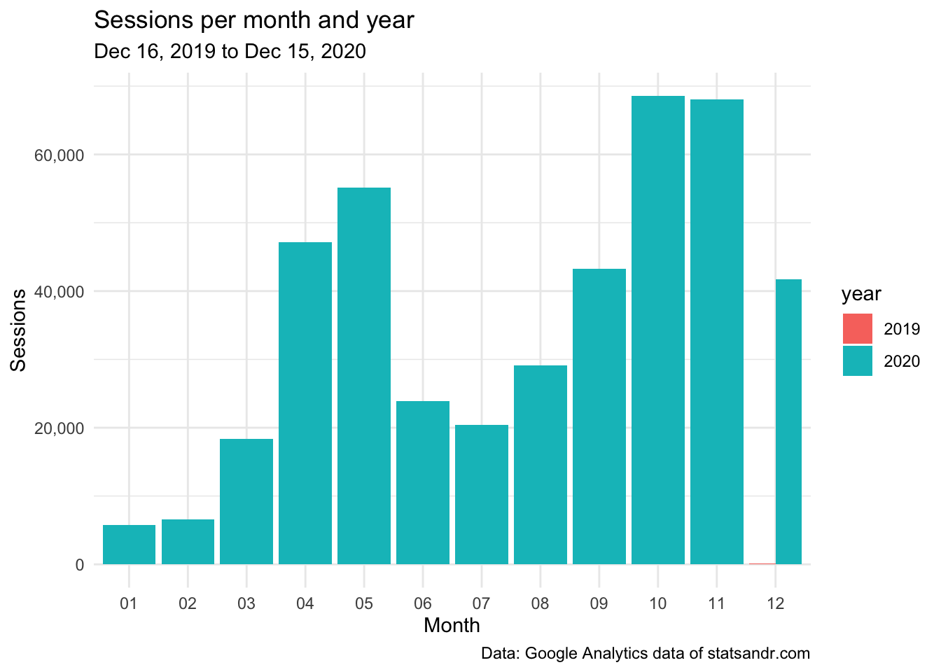
This barplot allows to easily see the evolution of the number of sessions over the months, and compare this evolution across different years.
At the moment, since the blog is online only since December 2019, the year factor is not relevant. However, I still present the visualization for other users who work on older websites, and also to remind my future self to create this interesting barplot when there will be data for more than a year.
Top performing pages
Another important factor when measuring the performance of your blog or website is the number of page views for the different pages. The top performing pages in terms of page views over the year can easily be found in Google Analytics (you can access it via Behavior > Site Content > All pages).
For the interested reader, here is how to get the data in R (note that you can change n = 7 in the code to change the number of top performing pages to display):
## Make the request to GA
data_fetch <- google_analytics(view_id,
  date_range = c(start_date, end_date),
  metrics = c("pageviews"),
  dimensions = c("pageTitle"),
  anti_sample = TRUE # slows down the request but ensures data isn't sampled
)

## Create a table of the most viewed posts
library(lubridate)
library(reactable)
library(stringr)

most_viewed_posts <- data_fetch %>%
  mutate(Title = str_trunc(pageTitle, width = 40)) %>% # keep maximum 40 characters
  count(Title, wt = pageviews, sort = TRUE)
head(most_viewed_posts, n = 7) # edit n for more or less pages to display
## Title n
## 1 A package to download free Springer b... 85684
## 2 Variable types and examples - Stats a... 44951
## 3 Descriptive statistics in R - Stats a... 43621
## 4 Outliers detection in R - Stats and R 32560
## 5 The complete guide to clustering anal... 27184
## 6 Correlation coefficient and correlati... 21581
## 7 Stats and R 16786Here is how to visualize this table of top performing pages in a barplot:
# plot
top_n(most_viewed_posts, n = 7, n) %>% # edit n for more or less pages to display
  ggplot(., aes(x = reorder(Title, n), y = n)) +
  geom_bar(stat = "identity", fill = "steelblue") +
  theme_minimal() +
  coord_flip() +
  labs(
    y = "Page views",
    x = "Title",
    title = "Top performing pages in terms of page views",
    subtitle = paste0(format(start_date, "%b %d, %Y"), " to ", format(end_date, "%b %d, %Y")),
    caption = "Data: Google Analytics data of statsandr.com"
  ) +
  scale_y_continuous(labels = scales::comma) # better y labels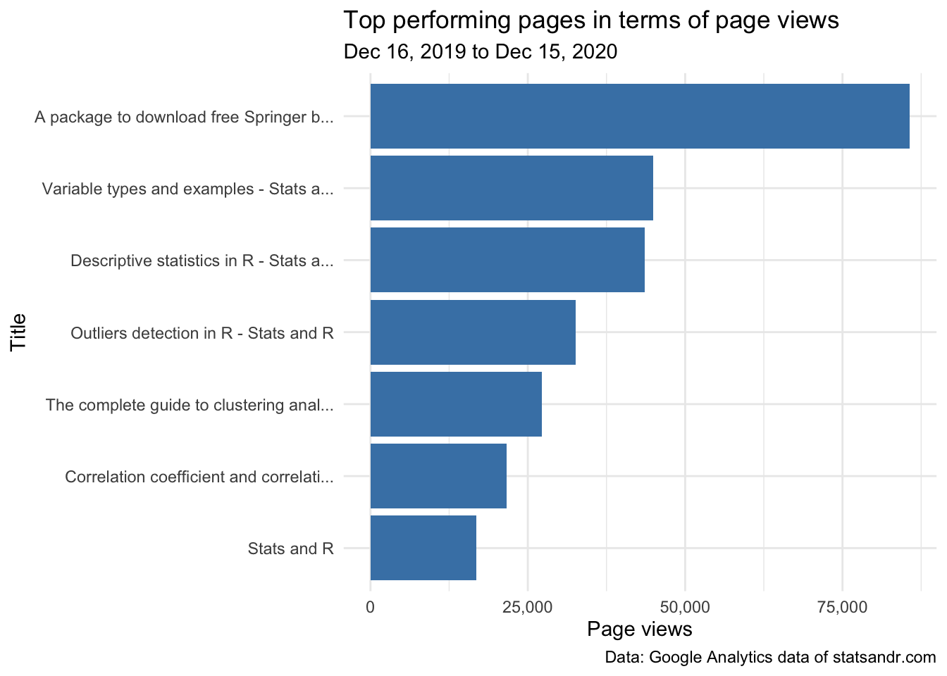
This gives me a good first overview on how posts performed in terms of page views, so in some sense, what people find useful. For instance, I never thought that the post illustrating the different types of variables that exist in statistics (ranked #2) would be so appreciated when I wrote it.
This is something I learned with this blog: at the time of writing, there are some posts which I think no one will care about (and which I mostly write as a personal note for myself), and others which I think people will find very useful. However, after a couple of weeks after publication, sometimes I realize that it is actually exactly the opposite.
Time-normalized page views
When it comes to comparing blog posts, however, this is not as simple.
Based on the above barplot and without any further analysis, I would conclude that my article about variable types is performing much better than the one about outliers detection in R.
However, if I tell you that the article on outliers detection has been published on August 11 and the one about variable types on December 30, you will agree that the comparison does not make much sense anymore since page views for these articles were counted over a different length of time. One could also argue that a recent article had less time to generate backlinks, so it is unfair to compare it with an old post which had plenty of time to be ranked high by Google.
In order to make the comparison more “fair”, we would need to compare the number of page views for each post since their date of publication. The following code does precisely this:3
- it pulls daily data for a bunch of pages,
- then tries to detect their publication date,
- time-normalizes the traffic for each page based on that presumed publication date,
- and finally, plots the daily traffic from the publication date on out, as well as overall cumulative traffic for the top n pages
# figure out when a page actually launched by finding the
# first day where the page had at least 2 unique pageviews
first_day_pageviews_min <- 2

# exclude pages that have total traffic (daily unique pageviews) that are relatively low
total_unique_pageviews_cutoff <- 500

# set how many "days since publication" we want to include in our plot
days_live_range <- 180

# set number of top pages to display
n <- 7

# Create a dimension filter object
# You need to update the "expressions" value to be a regular expression that filters to
# the appropriate set of content on your site
page_filter_object <- dim_filter("pagePath",
  operator = "REGEXP",
  expressions = "/blog/.+"
)

# Now, put that filter object into a filter clause. The "operator" argument can be AND # or OR...but you have to have it be something, even though it doesn't do anything
# when there is only a single filter object.
page_filter <- filter_clause_ga4(list(page_filter_object),
  operator = "AND"
)

# Pull the GA data
ga_data <- google_analytics(
  viewId = view_id,
  date_range = c(start_date, end_date),
  metrics = "uniquePageviews",
  dimensions = c("date", "pagePath"),
  dim_filters = page_filter,
  anti_sample = TRUE # slows down the request but ensures data isn't sampled
)

# Find the first date for each post. This is actually a little tricky, so we're going to write a
# function that takes each page as an input, filters the data to just include those
# pages, finds the first page, and then puts a "from day 1" count on that data and
# returns it.
normalize_date_start <- function(page) {
  # Filter all the data to just be the page being processed
  ga_data_single_page <- ga_data %>% filter(pagePath == page)

  # Find the first value in the result that is greater than first_day_pageviews_min. In many
  # cases, this will be the first row, but, if there has been testing/previews before it
  # actually goes live, some noise may sneak in where the page may have been live, technically,
  # but wasn't actually being considered live.
  first_live_row <- min(which(ga_data_single_page$uniquePageviews > first_day_pageviews_min))

  # Filter the data to start with that page
  ga_data_single_page <- ga_data_single_page[first_live_row:nrow(ga_data_single_page), ]

  # As the content ages, there may be days that have ZERO traffic. Those days won't show up as
  # rows at all in our data. So, we actually need to create a data frame that includes
  # all dates in the range from the "publication" until the last day traffic was recorded. There's
  # a little trick here where we're going to make a column with a sequence of *dates* (date) and,
  # with a slightly different "seq," a "days_live" that corresponds with each date.
  normalized_results <- data.frame(
    date = seq.Date(
      from = min(ga_data_single_page$date),
      to = max(ga_data_single_page$date),
      by = "day"
    ),
    days_live = seq(min(ga_data_single_page$date):
    max(ga_data_single_page$date)),
    page = page
  ) %>%
    # Join back to the original data to get the uniquePageviews
    left_join(ga_data_single_page) %>%
    # Replace the "NAs" (days in the range with no uniquePageviews) with 0s (because
    # that's exactly what happened on those days!)
    mutate(uniquePageviews = ifelse(is.na(uniquePageviews), 0, uniquePageviews)) %>%
    # We're going to plot both the daily pageviews AND the cumulative total pageviews,
    # so let's add the cumulative total
    mutate(cumulative_uniquePageviews = cumsum(uniquePageviews)) %>%
    # Grab just the columns we need for our visualization!
    select(page, days_live, uniquePageviews, cumulative_uniquePageviews)
}

# We want to run the function above on each page in our dataset. So, we need to get a list
# of those pages. We don't want to include pages with low traffic overall, which we set
# earlier as the 'total_unique_pageviews_cutoff' value, so let's also filter our
# list to only include the ones that exceed that cutoff. We also select the top n pages
# in terms of page views to display in the visualization.
library(dplyr)
pages_list <- ga_data %>%
  group_by(pagePath) %>%
  summarise(total_traffic = sum(uniquePageviews)) %>%
  filter(total_traffic > total_unique_pageviews_cutoff) %>%
  top_n(n = n, total_traffic)

# The first little bit of magic can now occur. We'll run our normalize_date_start function on
# each value in our list of pages and get a data frame back that has our time-normalized
# traffic by page!
library(purrr)
ga_data_normalized <- map_dfr(pages_list$pagePath, normalize_date_start)

# We specified earlier -- in the `days_live_range` object -- how many "days since publication" we
# actually want to include, so let's do one final round of filtering to only include those
# rows.
ga_data_normalized <- ga_data_normalized %>% filter(days_live <= days_live_range)
Now that our data is ready, we create two visualizations:
- Number of page views by day since publication: this plot shows how quickly interest in a particular piece of content drops off. If it is not declining as rapidly as the other posts, it means you are getting sustained value from it
- Cumulative number of page views by day since publication: this plot can be used to compare blog posts on the same ground since number of page views is shown based on the publication date. To see which pages have generated the most traffic over time, simply look from top to bottom (at the right edge of the plot)
Note that both plots use the {plotly} package to make them interactive so that you can mouse over a line and find out exactly what page it is (together with its values). The interactivity of the plot makes it also possible to zoom in to see, for instance, the number of page views in the first days after publication (instead of the default length of 180 days),4 or zoom in to see only the evolution of the number of page views below/above a certain threshold.
# Create first plot
library(ggplot2)

gg <- ggplot(ga_data_normalized, mapping = aes(x = days_live, y = uniquePageviews, color = page)) +
  geom_line() + # The main "plot" operation
  scale_y_continuous(labels = scales::comma) + # Include commas in the y-axis numbers
  labs(
    title = "Page views by day since publication",
    x = "Days since publication",
    y = "Page views",
    subtitle = paste0(format(start_date, "%b %d, %Y"), " to ", format(end_date, "%b %d, %Y")),
    caption = "Data: Google Analytics data of statsandr.com"
  ) +
  theme_minimal() + # minimal theme
  theme(
    legend.position = "none", # remove legend
  )

# Output the plot, wrapped in ggplotly so we will get some interactivity in the plot
library(plotly)
ggplotly(gg, dynamicTicks = TRUE)
The plot above shows again a huge spike for the post that went viral (orange line). If we zoom in to include only page views below 1500, comparison between posts is easier and we see that:
- The post on the top 100 R resources on Coronavirus (purple line) generated comparatively more traffic than the other posts in the first 50 days (\(\approx\) 1 month and 3 weeks) after publication. However, traffic gradually decreased up to the point that after 180 days (\(\approx\) 6 months), it attracted less traffic than other more performing posts.
- The post on outliers detection in R (blue line) did not get a lot of attention in the first weeks after its publication. However, it gradually generated more and more traffic up to the point that, after 60 days (\(\approx\) 2 months) after publication, it actually generated more traffic than any other post (and by a relatively large margin).
- The post on correlation coefficient and correlation test in R (green line) took approximately 100 days (\(\approx\) 3 months and 1 week) to take off, but after that it generated quite a lot of traffic. This is interesting to keep in mind when analyzing recent posts, because they may actually follow the same trend in the long run.
# Create second plot: cumulative
gg <- ggplot(ga_data_normalized, mapping = aes(x = days_live, y = cumulative_uniquePageviews, color = page)) +
  geom_line() + # The main "plot" operation
  scale_y_continuous(labels = scales::comma) + # Include commas in the y-axis numbers
  labs(
    title = "Cumulative page views by day since publication",
    x = "Days since publication",
    y = "Cumulative page views",
    subtitle = paste0(format(start_date, "%b %d, %Y"), " to ", format(end_date, "%b %d, %Y")),
    caption = "Data: Google Analytics data of statsandr.com"
  ) +
  theme_minimal() + # minimal theme
  theme(
    legend.position = "none", # remove legend
  )

# Output the plot, wrapped in ggplotly so we will get some interactivity in the plot
ggplotly(gg, dynamicTicks = TRUE)
Compared to the previous plot, this one shows the cumulative number of page views since the date of publication of the post.
Without taking into consideration the post that went viral and which, by the way, does not really generate much traffic anymore (which makes sense since the incredible campaign from Springer to offer their books for free during the COVID-19 quarantine has ended), we see that:
- The post on outliers detection has surpassed the post on top R resources on Coronavirus in terms of cumulative number of page views after around 120 days (\(\approx\) 4 months) after publication, which indicates that people are looking at this specific problem. I remember that I wrote this post because, at that time, I had to deal with the problems of outliers in R and I did not found a neat solution online. So I guess, the fact that resources on a specific topic are missing helps to attract visitors looking for an answer to their question.
- Among the remaining posts, the ranking of the most performing ones in terms of cumulative number of page views within 180 days (\(\approx\) 6 months) after publication is the following:
The analyses so far give you already a good understanding of the performance of your blog. However, for the interested readers, we show other important metrics in the following sections.
Page views by country
In the following we are interested in seeing where the traffic comes from. This is particularly interesting to get to know your audience, and even more important if you are running a business or an ecommerce.
# get GA data
data_fetch <- google_analytics(view_id,
  date_range = c(start_date, end_date),
  metrics = "pageviews",
  dimensions = "country",
  anti_sample = TRUE # slows down the request but ensures data isn't sampled
)

# table
countries <- data_fetch %>%
  mutate(Country = str_trunc(country, width = 40)) %>% # keep maximum 40 characters
  count(Country, wt = pageviews, sort = TRUE)
head(countries, n = 10) # edit n for more or less countries to display
## Country n
## 1 United States 131306
## 2 India 38800
## 3 Belgium 32983
## 4 United Kingdom 25833
## 5 Brazil 18961
## 6 Germany 17851
## 7 Spain 17355
## 8 Canada 13880
## 9 Mexico 12882
## 10 Philippines 12540To visualize this table of top countries in terms of page views in a barplot:
# plot
top_n(countries, n = 10, n) %>% # edit n for more or less countries to display
  ggplot(., aes(x = reorder(Country, n), y = n)) +
  geom_bar(stat = "identity", fill = "steelblue") +
  theme_minimal() +
  coord_flip() +
  labs(
    y = "Page views",
    x = "Country",
    title = "Top performing countries in terms of page views",
    subtitle = paste0(format(start_date, "%b %d, %Y"), " to ", format(end_date, "%b %d, %Y")),
    caption = "Data: Google Analytics data of statsandr.com"
  ) +
  scale_y_continuous(labels = scales::comma) + # better y labels
  theme(plot.margin = unit(c(5.5, 7.5, 5.5, 5.5), "pt")) # to avoid the plot being cut on the right edge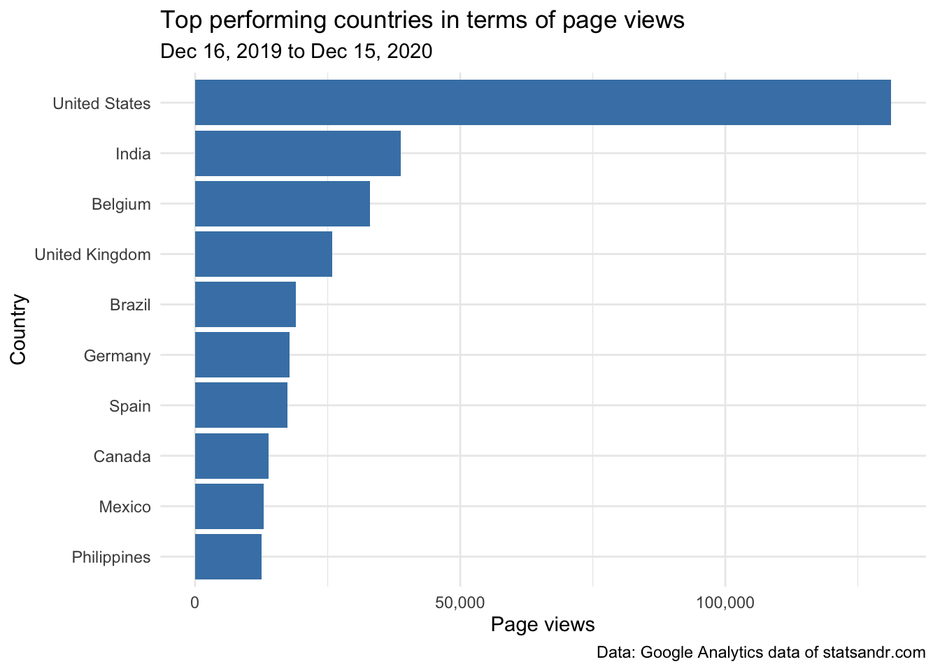
We see that readers from the US take the largest share of the number of page views (by quite a lot actually!), and Belgium (my country) comes in third place in terms of number of page views.
Given that the US population is much larger than the Belgian population (\(\approx\) 331 million people compared to \(\approx\) 11.5 million people, respectively), the above result is not really surprising. Again, for a better comparison, it would be interesting to take into consideration the size of the population when comparing countries.
Indeed, it could be that a large share of the traffic comes from a country with a large population, but that the number of page views per person (or per 100,000 inhabitants) is higher for another country. This information about top performing countries in terms of page views per person could give you insights on which country do the most avid readers come from. This is beyond the scope of this article, but you can see examples of plots which include the information on the population size in these COVID-19 visualizations. I recommend to apply the same methodology to the above plot for a better comparison.
If you are thinking about doing the extra step of including population size when comparing countries, I believe that it would be even better to take into account the information on computer access in each country as well. If we take India as example: at the time of writing this article, its population amounts to almost 1.4 billion. However, the percentage of Indian people having access to a computer is undoubtedly lower than in US or Belgium (again, at least at the moment). It would therefore make more sense to compare countries by comparing the number of page views per people having access to a computer.5
Browser information
For more technical aspects, you could also be interested in the number of page views by browser. This can be visualized with the following barplot:
# get data
browser_info <- google_analytics(view_id,
  date_range = c(start_date, end_date),
  metrics = c("pageviews"),
  dimensions = c("browser"),
  anti_sample = TRUE # slows down the request but ensures data isn't sampled
)

# table
browser <- browser_info %>%
  mutate(Browser = str_trunc(browser, width = 40)) %>% # keep maximum 40 characters
  count(Browser, wt = pageviews, sort = TRUE)

# plot
top_n(browser, n = 10, n) %>% # edit n for more or less browser to display
  ggplot(., aes(x = reorder(Browser, n), y = n)) +
  geom_bar(stat = "identity", fill = "steelblue") +
  theme_minimal() +
  coord_flip() +
  labs(
    y = "Page views",
    x = "Browser",
    title = "Which browsers are our visitors using?",
    subtitle = paste0(format(start_date, "%b %d, %Y"), " to ", format(end_date, "%b %d, %Y")),
    caption = "Data: Google Analytics data of statsandr.com"
  ) +
  scale_y_continuous(labels = scales::comma) # better y labels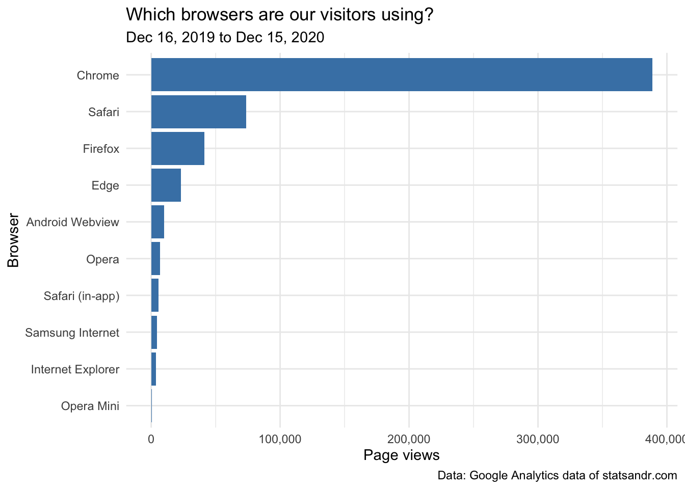
Most visits were, as expected, from Chrome, Safari and Firefox browsers.
User engagement by devices
One may also be interested in checking how users are engaged on different types of devices. To do so, we plot 3 charts describing:
- How many sessions were made from the different types of devices
- The average time on page (in seconds) by type of device
- The number of page views per session by device type
# GA data
gadata <- google_analytics(view_id,
  date_range = c(start_date, end_date),
  metrics = c("sessions", "avgTimeOnPage"),
  dimensions = c("date", "deviceCategory"),
  anti_sample = TRUE # slows down the request but ensures data isn't sampled
)

# plot sessions by deviceCategory
gadata %>%
  ggplot(aes(deviceCategory, sessions)) +
  geom_bar(aes(fill = deviceCategory), stat = "identity") +
  theme_minimal() +
  labs(
    y = "Sessions",
    x = "",
    title = "Sessions per device",
    subtitle = paste0(format(start_date, "%b %d, %Y"), " to ", format(end_date, "%b %d, %Y")),
    caption = "Data: Google Analytics data of statsandr.com",
    fill = "Device" # edit legend title
  ) +
  scale_y_continuous(labels = scales::comma) # better y labels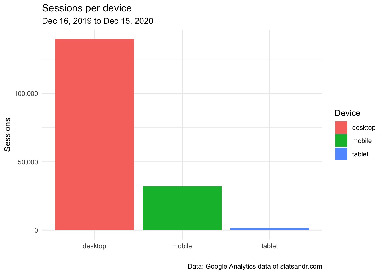
From the above plot, we see that the majority of readers visited the blog from a desktop, and a small number of readers from a tablet.
# add median of average time on page per device
gadata <- gadata %>%
  group_by(deviceCategory) %>%
  mutate(med = median(avgTimeOnPage))

# plot avgTimeOnPage by deviceCategory
ggplot(gadata) +
  aes(x = avgTimeOnPage, fill = deviceCategory) +
  geom_histogram(bins = 30L) +
  scale_fill_hue() +
  theme_minimal() +
  theme(legend.position = "none") +
  facet_wrap(vars(deviceCategory)) +
  labs(
    y = "Frequency",
    x = "Average time on page (in seconds)",
    title = "Average time on page per device",
    subtitle = paste0(format(start_date, "%b %d, %Y"), " to ", format(end_date, "%b %d, %Y")),
    caption = "Data: Google Analytics data of statsandr.com"
  ) +
  scale_y_continuous(labels = scales::comma) + # better y labels
  geom_vline(aes(xintercept = med, group = deviceCategory),
    color = "darkgrey",
    linetype = "dashed"
  ) +
  geom_text(
    aes(
      x = med, y = 25,
      label = paste0("Median = ", round(med), " seconds")
    ),
    angle = 90,
    vjust = 2,
    color = "darkgrey",
    size = 3
  )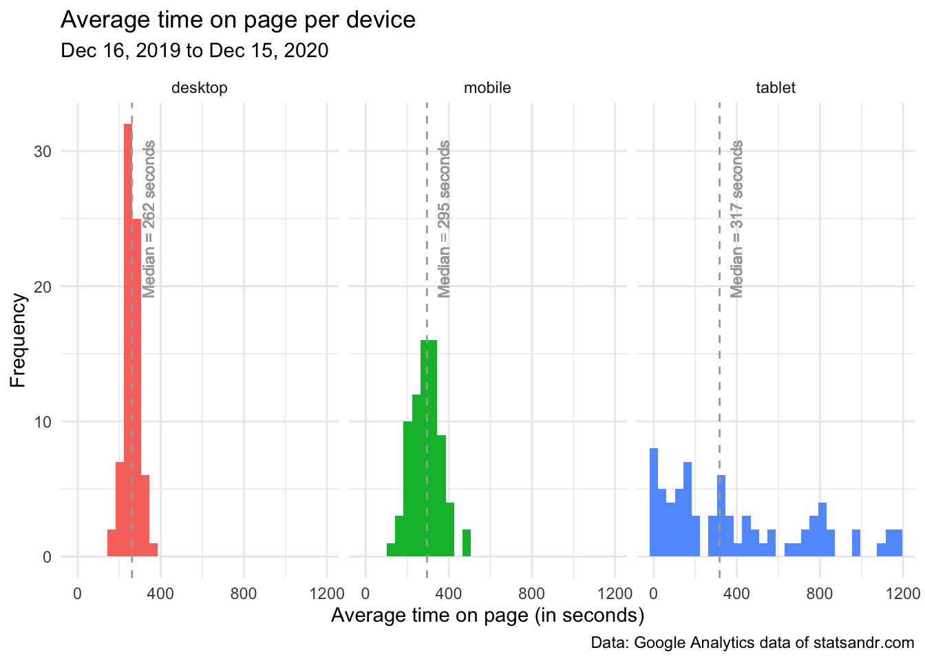
From the above plot, we see that:
- some readers on tablet have a very low average time spent on each page (see the peak around 0 second in the tablet facet)
- distributions of the average time on page for readers on desktop and mobile were quite similar, with an average time on page mostly between 100 seconds (= 1 minute 40 seconds) and 400 seconds (= 6 minutes 40 seconds)
- quite surprisingly, the median of the average time spent on page is slightly higher for visitors on mobile than on desktop (see the dashed vertical lines representing the medians in the desktop and mobile facets). This indicates that, although more people visit the blog from desktop, it seems that people on mobile spend more time per page. I find this result quite surprising given that most of my articles include R code and require a computer to run the code. Therefore, I expected that people would spend more time on desktop than on mobile because on mobile they would quickly scan the article, while on desktop they would read the article carefully and try to reproduce the code on their computer.6
Given this result, it would be interesting to also illustrate the number of page views during a session, represented by device type.
Indeed, it may be the case that visitors on mobile spend, on average, more time on each page but people on desktop visit more pages per session. We verify this via a density plot, and for better readability we exclude data points above 2.5 page views/session and we exclude visits from a tablet:
# GA data
gadata <- google_analytics(view_id,
  date_range = c(start_date, end_date),
  metrics = c("pageviewsPerSession"),
  dimensions = c("date", "deviceCategory"),
  anti_sample = TRUE # slows down the request but ensures data isn't sampled
)

# add median of number of page views/session
gadata <- gadata %>%
  group_by(deviceCategory) %>%
  mutate(med = median(pageviewsPerSession))

## Reordering gadata$deviceCategory
gadata$deviceCategory <- factor(gadata$deviceCategory,
  levels = c("mobile", "desktop", "tablet")
)

# plot pageviewsPerSession by deviceCategory
gadata %>%
  filter(pageviewsPerSession <= 2.5 & deviceCategory != "tablet") %>% # filter out pageviewsPerSession > 2.5 and visits from tablet
  ggplot(aes(x = pageviewsPerSession, fill = deviceCategory, color = deviceCategory)) +
  geom_density(alpha = 0.5) +
  scale_fill_hue() +
  theme_minimal() +
  labs(
    y = "Frequency",
    x = "Page views per session",
    title = "Page views/session by device",
    subtitle = paste0(format(start_date, "%b %d, %Y"), " to ", format(end_date, "%b %d, %Y")),
    caption = "Data: Google Analytics data of statsandr.com\nPoints > 2.5 excluded",
    color = "Device", # edit legend title
    fill = "Device" # edit legend title
  ) +
  scale_y_continuous(labels = scales::comma) + # better y labels
  geom_vline(aes(xintercept = med, group = deviceCategory, color = deviceCategory),
    linetype = "dashed",
    show.legend = FALSE # remove legend
  ) +
  geom_text(
    aes(
      x = med, y = 2.75,
      label = paste0("Median = ", round(med, 2), " page views/session"),
      color = deviceCategory
    ),
    angle = 90,
    vjust = 2,
    size = 3,
    show.legend = FALSE # remove legend
  )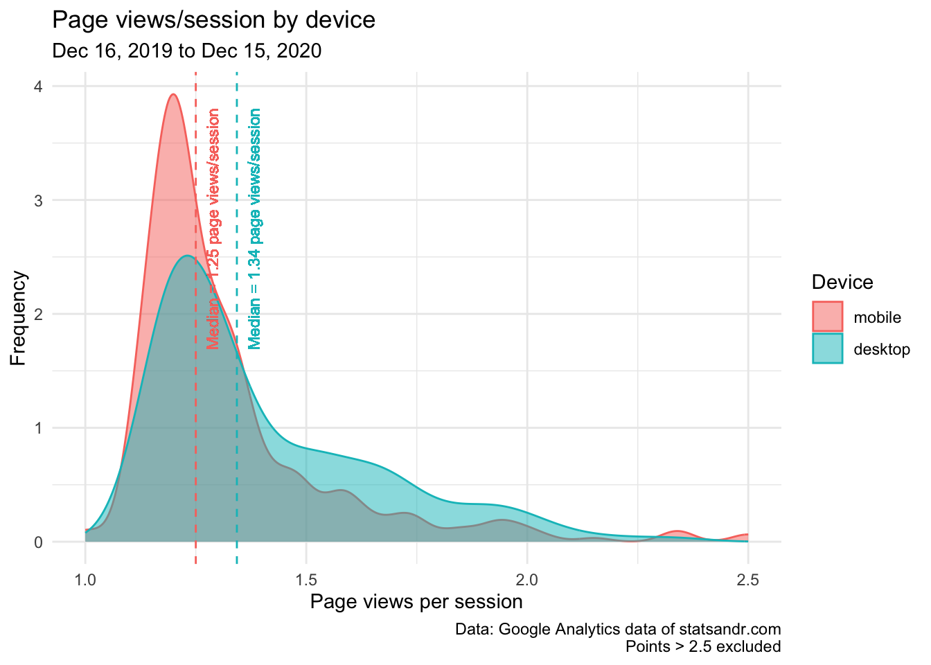
This last plot confirms our thoughts, that is, although people on mobile seem to spend more time on each page, people on desktop tend to visit more pages per session.
(One may wonder why I chose to compare medians instead of means. The main reason is that not all distributions considered here are bell-shaped (especially for data on tablet) and there are many outliers. In these cases, the mean is usually not the most appropriate descriptive statistics and the median is a more robust way to represent such data. For the interested reader, see a note on the difference between mean and median, and the context in which each measure is more appropriate.)
This is the end of the analytics section. Of course, many more visualizations and data analyses are possible, depending on the site that is tracked and the marketing expertise of the analyst. This was an overview of what is possible, and I hope it will give you some ideas to explore your Google Analytics data further. Next year, I may also include forecasts and make annual comparisons. See also some examples of other analyses in this GitHub repository and this website.
As a side note, I would like to add the following: even if tracking the performance of your blog is important to understand how you attract visitors and how they engage with your site, I also believe that looking at your Google Analytics stats too often is not optimal, nor sane.
Talking about personal experience: at the beginning of the blog I used to look very often at the number of visitors in real-time and the audience. I was kind of obsessed to know how many people were right now on my blog and I was constantly checking if it performed better than the day before in terms of number of visitors. I remember that I was spending so much time looking at these metrics in the first weeks that I felt I was wasting my time. And the time I was wasting looking at my Google Analytics stats was lost not creating good quality content for the blog, working on my thesis/classes, or other projects.
So when I realized that, I deleted the Google Analytics app from my smartphone and forced myself not to look at my stats more than once a month (just to make sure there is no critical issues that need to be fixed). From that moment onward, I stopped wasting my time on things I cannot control, and I got more satisfaction from writing articles because I was writing them for myself, not for the sake of seeing people reading them. This change was like a relief, and I am now more satisfied with my work on this blog compared to the first weeks or months.
Everyone is different and unique so I am not saying that you should do the same. However, if you feel that you look too much at your stats and sometimes lose motivation in writing, perhaps this is one potential solution.
Content
Now that we have seen how we can analyze Google Analytics data and track the performance of a website or blog in details, I would like to share some thoughts about content creation, content distribution and the future plans.
Finding topics
One of the biggest challenges I face with my blog is creating proper content. In the best case scenario, I would like to:
- create useful content
- about subjects I am really familiar with,
- which I enjoy and
- which fit into the blog.
By sharing only articles about topics I am familiar with, the writing process is easier and quicker. Indeed, most of the articles I wrote cover topics I teach at university, so a large part of the preliminary research is already done when I decide to write about it. Also (and this is not negligible), questions and incomprehension from students allow me to see the points I should focus on when writing about it, and how to present it to make it accessible and comprehensible to most people.
Moreover, by making my thoughts public, I often have the chance to confront them with other points of view, which allows me to study the topic even further. This in turn accelerates the writing process even more when writing about a related topic.
I also tend to write only about things I enjoy or I am interested in. I prefer quality over quantity, so writing an article from A to Z takes quite a long time depending on the depth of the subject. Since it takes time (even without taking into account the time spent after publication) and I have a full-time job, I really focus on topics I enjoy in order to keep seeing this blog as a source of pleasure, and not as a work or an obligation.
The fact that I write only about things I am familiar with, which I enjoy and when I have some free time (which mostly depend on the ongoing projects related to my PhD thesis) makes it hard for me to follow a defined pace for posts. This is why my writing schedule has been a bit inconsistent during this first year and is likely to be similar in the future as I do not want to be in the position to force myself to write.7
Content distribution
Even if we all agree that bloggers should write for themselves first and not for the sake of having lots of readers, it is still appreciated when your content is being read by others.
So although I do not like abusive self-promotion and I do not feel comfortable sharing my blog posts to all existing Facebook, LinkedIn and Reddit groups, somehow people need to get informed that you have written something.
For this reason, I created a Twitter account where I share new posts immediately after publishing them on the blog. In addition to posting them on Twitter, I also share the link by email to people who subscribed to the newsletter of the blog.
I also managed to get my content published on Medium through the Towards Data Science publication, R-bloggers and R Weekly. A non-negligible part of my audience comes from these referral, especially during the couple of days after publication.
By distributing the content this way, I do not feel pushy (something I want to avoid at all costs!) because people decided by themselves to receive the content I publish (e.g., they subscribed to the newsletter, they followed the blog on Twitter, they chose to read blog aggregators, etc.). So in some sense, I do not distribute my content “without their prior consent” and they can always choose not to see my posts anymore.
However, as you can see from the plot of the number of session per channel, you see that most readers come from the organic channel, so from search engines. And for this channel, apart from creating quality content (and some basic knowledge in SEO), I do not have any control on how well it is presented nor distributed to people. For this channel, it is basically search engine algorithms which decide to promote my content or not, and if they do, how well it is promoted. The only control I have regarding ranking factors is simply to create quality content.
So even if I believe that having a content distribution strategy definitely helps in reaching more people and growing your blog, it does not make everything. Creating quality content is, in my view of a beginner in SEO and marketing, the best strategy for my posts to be read.
For this very specific reason, now that I feel I have settled a decent distribution strategy, I no longer spend my energy and time on this matter.
So I just simply try to enjoy writing on my blog, and the rest will eventually follow. If not, I am still learning a lot from this blog anyway so I do not see it as wasted time.
A small note about ads
I know that an easy way to get money out of your blog is to run ads and I understand that people do it if it is profitable. However, I often find ads too intrusive or annoying and I personally do not like to read blog posts which include many ads.
To keep the reading process as enjoyable as possible, as you can see, I do not display any advertising on my blog. As long as the costs of running this website and the related open source projects (e.g., my Shiny apps, etc.) are not too high, I do not expect to include ads.
If in the future costs were to increase, I will still try to avoid putting ads as much as possible and I will try to rely on sponsorship programs & donations and on paid side projects for people who need help for their statistical analyses.
Future plans
After exactly one year of blogging, I am asking myself the following:
What do I want statsandr.com to be?
As already said, as long as I enjoy writing stuff I am passionate about on this blog, I will continue. This is very important to me.
In addition to that, I would like it to be a place to share knowledge. The field of statistics and R (and data science in general) is evolving at an extremely fast pace—and more and more people have many interesting things to say.
Moreover, I learned a lot since the launch this blog. But I learned even more when working in collaboration with someone else (see for instance these collaborations). I see so many learning opportunities when collaborating that I would love to see this blog as a place to share knowledge, but not only my knowledge.
To be more precise, I would love to hear about other researchers, statisticians, R lovers, data scientists, authors, etc. who want to collaborate with me. This could lead, in the end, to:
- a guest post if you have a good idea on what you want to write about but need a way to share it (and since you have access to my Google Analytics data in the past year through this article you have a good idea of the number of visitors who will see your content),
- a piece of content written together if you believe our skills and knowledge are complementary (see all articles for an overview of what I like to write about),
- a piece of code, a R package, a visualization or a Shiny app you want to create together (or just share),
- a book or a course on statistics and/or R,
- or anything else you have in mind (I am open to new ideas and challenges).
With this article, you see the figures and the audience of the blog. With all my articles, you can see my strengths and weaknesses.
So I will finish this section by saying that, if anyone is willing to work on something together (which does not need to be huge), you can always contact me or leave a comment at the end of this post. I am looking forward to hearing from you.
Thank you note
Last but not least, I also wanted to leave a short thank you note to the Towards Data Science, R-bloggers and R Weekly teams that have cross-posted most of my articles in their respective publications and therefore allowed me to share my thoughts to a larger—and very knowledgeable—audience.
Also, I would like to thank all active readers for their comments, constructive feedback and support so far. I am looking forward to sharing more quality content through this blog and I hope it will keep being useful to many of you, in parallel to being useful to me.
A special thanks to Mark Edmondson, the author of the {googleAnalyticsR} package and all people who wrote tutorials using the package, which were used as inspiration for this blog post. More broadly, thanks also to the open source community which is of great help in learning R.
Thanks for reading. I hope that you learned how to track the performance of your website or blog in R using the {googleAnalyticsR} package. See you next year for a second review, and in the meantime, if you maintain a blog I would be really happy to hear how you track its performance. Feel free to let me know via the comments below!
As always, if you have a question or a suggestion related to the topic covered in this article, please add it as a comment so other readers can benefit from the discussion.
Thanks to the RStudio blog for the inspiration.↩︎
See more ways to install and load R packages.↩︎
Many thanks to dartistics.com for the code. Note that for better readability of the plots, I slightly edited the code: (i) to display only the top n pages in terms of traffic instead of all pages, (ii) to change the theme to
theme_minimal()and (iii) to make the axis ticks dynamic when zooming in or out (in theggplotly()function).↩︎Note that the default period of 180 days can also be changed in the code.↩︎
This may require some assumptions if the percentage of people having access to a computer is not readily available. I believe, however, that it would still be more appropriate than just taking into account the population size—especially when comparing developed with developing countries.↩︎
At least that is what I do when I read blogs on mobile versus reading them on desktop.↩︎
Note, however, that research has shown that scheduling time for writing is a good way to productive writing (Silvia, 2019). This is why, unlike for my blog, I have set regular writing periods in my calendar (and I try to stick to it no matter how busy I am at that time) dedicated to my PhD thesis.↩︎
Liked this post?
- Get updates every time a new article is published (no spam and unsubscribe anytime)
- Support the blog
- Share on:


