
Stats and R is 2 years old!

Introduction
Stats and R has been launched exactly two years ago. Like last year, I think it is a good time to do a review of the past 12 months by sharing some figures about the audience of the blog.
This article is not about showing off my numbers, but rather a way to illustrate how to analyze your blog or your website’s traffic using Google Analytics data. Figures regarding the audience of my blog is probably useless to you (and I believe, should not be compared with). However, the code used in this post can be reused for your own blog or website (provided you also use Google Analytics to track your audience).
Note that I use the {googleAnalyticsR} R package to analyze my blog’s Google Analytics data. If you are unfamiliar with this package, see the prerequisites first.
If you have already used that package, you can select your account as followed (make sure to edit the code with your own property name):
library(googleAnalyticsR)

accounts <- ga_account_list()

# select the view ID by property name
view_id <- accounts$viewId[which(accounts$webPropertyName == "statsandr.com")]
On top of that, I also assume that you have basic knowledge of {ggplot2}—a popular R package to draw nice plots and visualizations.
Analytics
Last year, I mainly focused on the number of sessions. This year, I mainly concentrate on the number of page views to illustrate a different metrics.
For your information, a session is a group of user interactions with your website that take place within a given time frame, whereas a page view, as the name suggests, is defined as a view of a page on your site.
You can always change the metrics by editing metrics = c("pageviews") in the code below. See all available metrics provided by Google Analytics in this article.
Users and page views
As for last year’s review, let’s start with some general numbers, such as the number of users and page views for the entire site.
Note that we analyze traffic over the last year only so we extract data from December 16, 2020 to yesterday (December 15, 2021):
# set date range
start_date <- as.Date("2020-12-16")
end_date <- as.Date("2021-12-15")

# get Google Analytics (GA) data
gadata <- google_analytics(view_id,
  date_range = c(start_date, end_date),
  metrics = c("users", "pageviews"),
  anti_sample = TRUE # slows down the request but ensures data isn't sampled
)

gadata
## users pageviews
## 1 549360 876280Over this past year, Stats and R has attracted 549,360 users (number of new and returning people who visited the site), who generated a total of 876,280 page views.
That is an average of 2401 page views per day in 2021, compared to 1,531 page views per day in 2020 (an increase of 56.81%).
Page views over time
One of the first interesting metrics to analyze your blog’s audience is the evolution of traffic over time.
The daily number of page views over time can be presented in a scatterplot—together with a smoothed line—to analyze the evolution of the audience of your blog:
# get the Google Analytics (GA) data
gadata <- google_analytics(view_id,
  date_range = c(start_date, end_date),
  metrics = c("pageviews"), # edit for other metrics
  dimensions = c("date"),
  anti_sample = TRUE # slows down the request but ensures data isn't sampled
)

# load required libraries
library(dplyr)
library(ggplot2)

# scatter plot with a trend line
gadata %>%
  ggplot(aes(x = date, y = pageviews)) +
  geom_point(size = 1L, color = "steelblue") + # change size and color of points
  geom_smooth(color = "steelblue", alpha = 0.25) + # change color of smoothed line and transparency of confidence interval
  theme_minimal() +
  labs(
    y = "Page views",
    x = "",
    title = "Evolution of daily page views",
    subtitle = paste0(format(start_date, "%b %d, %Y"), " to ", format(end_date, "%b %d, %Y")),
    caption = "Data: Google Analytics data of statsandr.com"
  ) +
  theme(plot.margin = unit(c(5.5, 17.5, 5.5, 5.5), "pt")) + # to avoid the plot being cut on the right edge
  scale_y_continuous(labels = scales::comma) # better y labels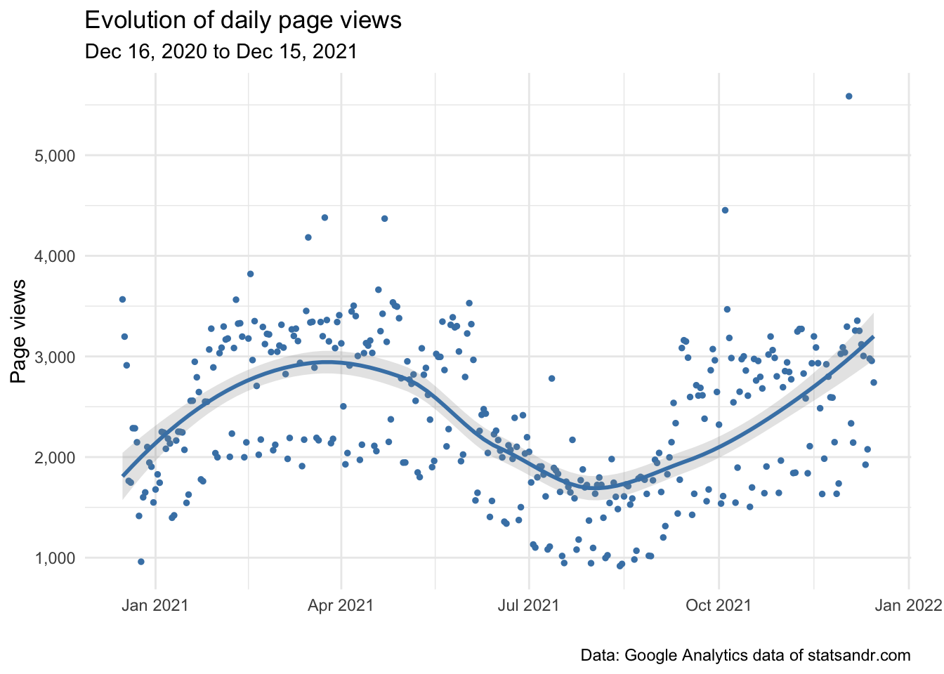
Although the number of page views varies quite a bit (with an outlier at more than 5,000 page views in a day and as low as less than 1,000 page views for some days), it seems to be cyclical with a dip during summer. It is worth noting that the same dip appeared last year, probably due to the fact that people are less likely to read posts about statistics and R during summer holidays.
So if you write about technical stuff in your blog, low numbers during summer may be expected and does not necessarily mean something is broken on your website.
Page views per channel
Knowing how people come to your blog is also a pretty important factor.
Here is how to visualize the evolution of daily page views per channel in a line plot:
# Get the data
trend_data <- google_analytics(view_id,
  date_range = c(start_date, end_date),
  dimensions = c("date"),
  metrics = "pageviews",
  pivots = pivot_ga4("medium", "pageviews"),
  anti_sample = TRUE # slows down the request but ensures data isn't sampled
)

# edit variable names
names(trend_data) <- c("Date", "Total", "Organic", "Referral", "Direct", "Email", "Social")

# Change the data into a long format
library(tidyr)
trend_long <- gather(trend_data, Channel, Page_views, -Date)

# Build up the line plot
trend_long %>%
  filter(Channel != "Total") %>%
  ggplot() +
  aes(x = Date, y = Page_views, group = Channel) +
  theme_minimal() +
  geom_line(aes(colour = Channel)) +
  labs(
    y = "Page views",
    x = "",
    title = "Evolution of daily page views per channel",
    subtitle = paste0(format(start_date, "%b %d, %Y"), " to ", format(end_date, "%b %d, %Y")),
    caption = "Data: Google Analytics data of statsandr.com"
  ) +
  scale_y_continuous(labels = scales::comma) # better y labels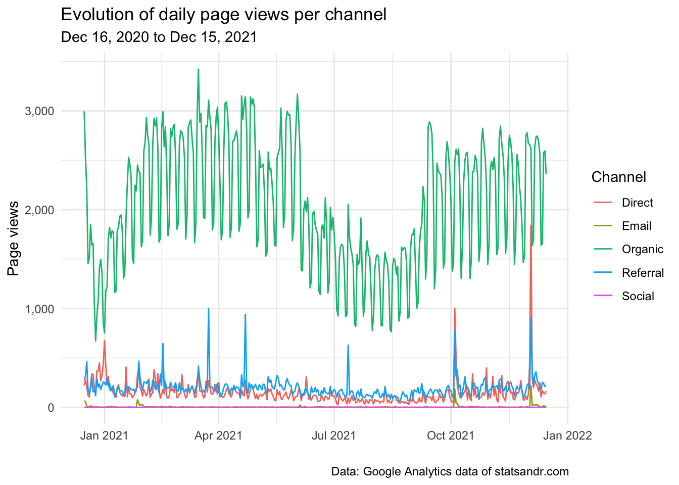
As we can see from the plot above, the large majority of page views come from the organic channel (so from search engines such as Google, Bing, etc.), with some peaks from referral (mainly from R-bloggers and RWeekly) when an article is published. (By the way, you can always subscribe to the newsletter if you want to be informed by email when a new post goes out.)
If you happen to write tutorials, you can also expect that most visitors come from the organic channel. If you are very present on social media, you will most likely attract more visitors from the social channel.
Page views per day of week and month of year
As seen in the previous plot, there are many ups and downs and traffic seems to be cyclical.
To investigate this further, we draw a boxplot of the number of page views for each day of the week:
# get data
gadata <- google_analytics(view_id,
  date_range = c(start_date, end_date),
  metrics = "pageviews",
  dimensions = c("dayOfWeek", "date"),
  anti_sample = TRUE # slows down the request but ensures data isn't sampled
)

## Recoding gadata$dayOfWeek following GA naming conventions
gadata$dayOfWeek <- recode_factor(gadata$dayOfWeek,
  "0" = "Sunday",
  "1" = "Monday",
  "2" = "Tuesday",
  "3" = "Wednesday",
  "4" = "Thursday",
  "5" = "Friday",
  "6" = "Saturday"
)

## Reordering gadata$dayOfWeek to have Monday as first day of the week
gadata$dayOfWeek <- factor(gadata$dayOfWeek,
  levels = c(
    "Monday", "Tuesday", "Wednesday", "Thursday", "Friday", "Saturday",
    "Sunday"
  )
)

# Boxplot
gadata %>%
  ggplot(aes(x = dayOfWeek, y = pageviews)) +
  geom_boxplot(fill = "steelblue") +
  theme_minimal() +
  labs(
    y = "Page views",
    x = "",
    title = "Page views per day of week",
    subtitle = paste0(format(start_date, "%b %d, %Y"), " to ", format(end_date, "%b %d, %Y")),
    caption = "Data: Google Analytics data of statsandr.com"
  ) +
  scale_y_continuous(labels = scales::comma) # better y labels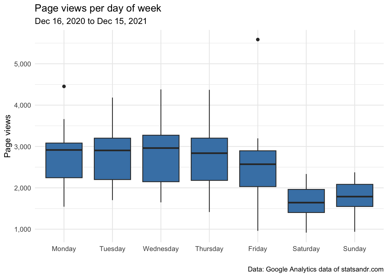
We can also compute the sum and the mean number of page views per day to have a numerical summary instead of a plot:
# compute sum
dat_sum <- aggregate(pageviews ~ dayOfWeek,
  data = gadata,
  FUN = sum
)

# compute mean
dat_mean <- aggregate(pageviews ~ dayOfWeek,
  data = gadata,
  FUN = mean
)

# combine both in one table
dat_summary <- cbind(dat_sum, dat_mean[, 2])

# rename columns
names(dat_summary) <- c("Day of week", "Sum", "Mean")

# display table
dat_summary
## Day of week Sum Mean
## 1 Monday 141115 2713.750
## 2 Tuesday 143145 2752.788
## 3 Wednesday 146472 2763.623
## 4 Thursday 140712 2706.000
## 5 Friday 128223 2465.827
## 6 Saturday 85766 1649.346
## 7 Sunday 90847 1747.058As expected, there are more readers during the week compared to the weekends.
The same analysis can be done for each month of the year instead of days of the week:
# get data
gadata <- google_analytics(view_id,
  date_range = c(start_date, end_date),
  metrics = "pageviews",
  dimensions = c("month", "date"),
  anti_sample = TRUE # slows down the request but ensures data isn't sampled
)

# Boxplot
gadata %>%
  ggplot(aes(x = month, y = pageviews)) +
  geom_boxplot(fill = "steelblue") +
  theme_minimal() +
  labs(
    y = "Page views",
    x = "Month",
    title = "Page views per month",
    subtitle = paste0(format(start_date, "%b %d, %Y"), " to ", format(end_date, "%b %d, %Y")),
    caption = "Data: Google Analytics data of statsandr.com"
  ) +
  scale_y_continuous(labels = scales::comma) # better y labels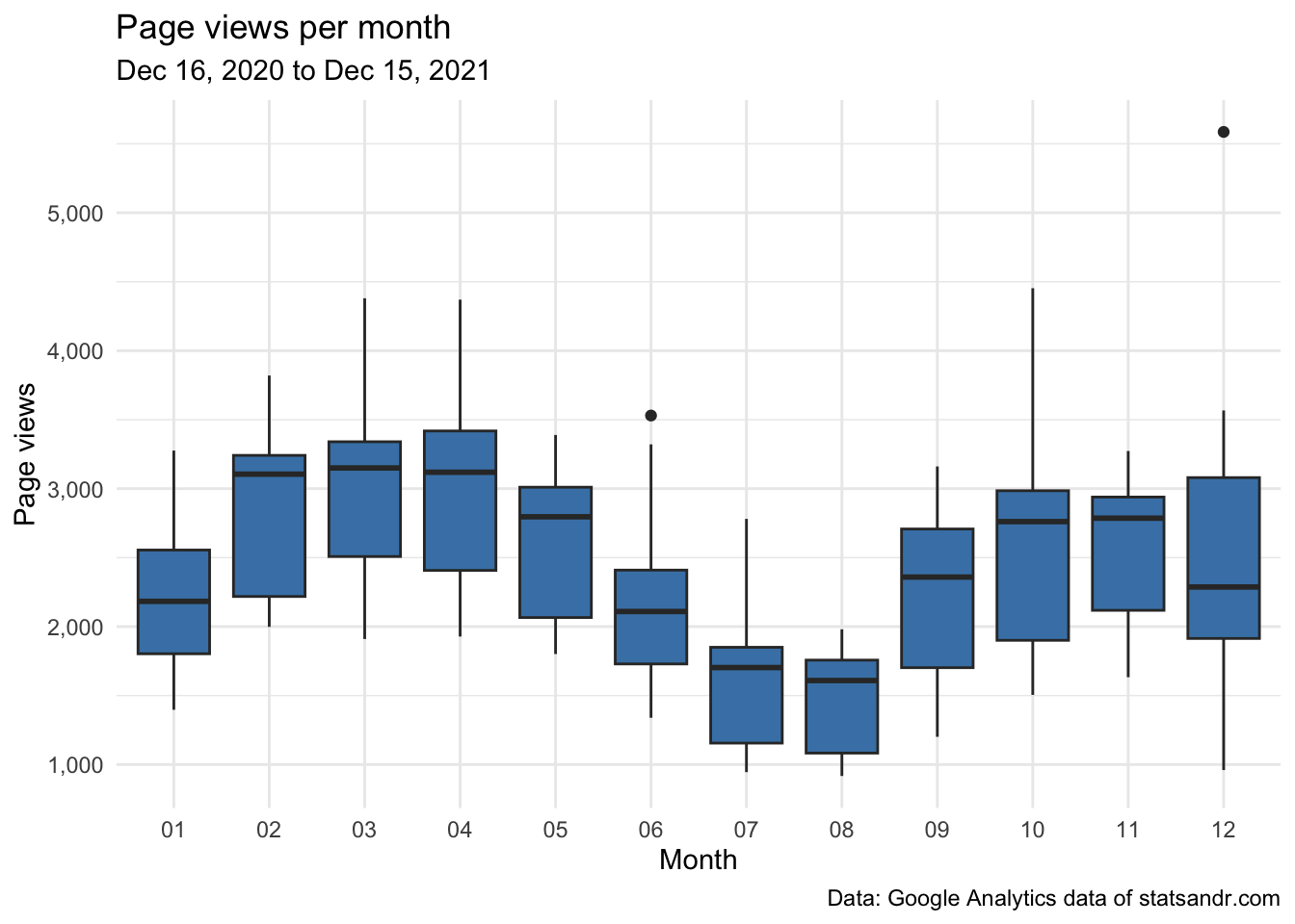
# compute sum
dat_sum <- aggregate(pageviews ~ month,
  data = gadata,
  FUN = sum
)

# compute mean
dat_mean <- aggregate(pageviews ~ month,
  data = gadata,
  FUN = mean
)

# combine both in one table
dat_summary <- cbind(dat_sum, dat_mean[, 2])

# rename columns
names(dat_summary) <- c("Month", "Sum", "Mean")

# display table
dat_summary
## Month Sum Mean
## 1 01 68534 2210.774
## 2 02 80953 2891.179
## 3 03 92629 2988.032
## 4 04 88679 2955.967
## 5 05 81739 2636.742
## 6 06 64460 2148.667
## 7 07 49772 1605.548
## 8 08 46389 1496.419
## 9 09 68046 2268.200
## 10 10 79237 2556.032
## 11 11 77745 2591.500
## 12 12 78097 2519.258From the plots and the numerical summaries, it is clear that the number of page views is not the same between the days of the week and the months of the year.
Page views per month and year
If you have data over more than a year, it could be useful to compare your monthly blog’s traffic over the years.
With the following code, we create a barplot of the number of daily page views per month and year:
# set new date range
start_date_launch <- as.Date("2019-12-16")

# get data
df2 <- google_analytics(view_id,
  date_range = c(start_date_launch, end_date),
  metrics = c("pageviews"),
  dimensions = c("date"),
  anti_sample = TRUE # slows down the request but ensures data isn't sampled
)

# add in year month columns to dataframe
df2$month <- format(df2$date, "%m")
df2$year <- format(df2$date, "%Y")

# page views by month by year using dplyr then graph using ggplot2 barplot
df2 %>%
  filter(year != 2019) %>% # remove 2019 because there are data for December only
  group_by(year, month) %>%
  summarize(pageviews = sum(pageviews)) %>%
  # print table steps by month by year
  # print(n = 100) %>%
  # graph data by month by year
  ggplot(aes(x = month, y = pageviews, fill = year)) +
  geom_bar(position = "dodge", stat = "identity") +
  theme_minimal() +
  labs(
    y = "Page views",
    x = "Month",
    title = "Page views per month and year",
    subtitle = paste0(format(start_date_launch, "%b %d, %Y"), " to ", format(end_date, "%b %d, %Y")),
    caption = "Data: Google Analytics data of statsandr.com"
  ) +
  scale_y_continuous(labels = scales::comma) # better y labels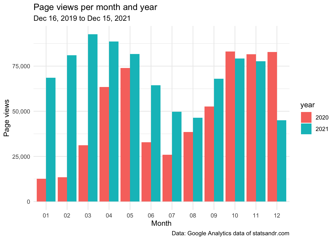
This barplot allows to easily see the evolution of the number of page views over the months, but more importantly, compare this evolution across different years.
Top performing pages
Another important factor when measuring the performance of your blog or website is the number of page views per pages.
It is true that the top performing pages in terms of page views over the year can easily be found in Google Analytics (you can access it via Behavior > Site Content > All pages).
However, for the interested reader, here is how to get the data in R (note that you can change n = 7 in the code below to change the number of top performing pages to display):
## Make the request to GA
data_fetch <- google_analytics(view_id,
  date_range = c(start_date, end_date),
  metrics = c("pageviews"),
  dimensions = c("pageTitle"),
  anti_sample = TRUE # slows down the request but ensures data isn't sampled
)

## Create a table of the most viewed posts
library(lubridate)
library(reactable)
library(stringr)

most_viewed_posts <- data_fetch %>%
  mutate(Title = str_trunc(pageTitle, width = 40)) %>% # keep maximum 40 characters
  count(Title, wt = pageviews, sort = TRUE)

head(most_viewed_posts, n = 7) # edit n for more or less pages to display
## Title n
## 1 Outliers detection in R - Stats and R 119747
## 2 Descriptive statistics in R - Stats a... 109473
## 3 Variable types and examples - Stats a... 83025
## 4 Correlation coefficient and correlati... 65703
## 5 Chi-square test of independence in R ... 62100
## 6 The complete guide to clustering anal... 40440
## 7 ANOVA in R - Stats and R 32914If like me you prefer a visualization over a table, here is how to draw this table of top performing pages in a barplot:
# plot
top_n(most_viewed_posts, n = 7, n) %>% # edit n for more or less pages to display
  ggplot(., aes(x = reorder(Title, n), y = n)) +
  geom_bar(stat = "identity", fill = "steelblue") +
  theme_minimal() +
  coord_flip() +
  labs(
    y = "Page views",
    x = "Page title",
    title = "Top performing pages in terms of page views",
    subtitle = paste0(format(start_date, "%b %d, %Y"), " to ", format(end_date, "%b %d, %Y")),
    caption = "Data: Google Analytics data of statsandr.com"
  ) +
  scale_y_continuous(labels = scales::comma) + # better y labels
  theme(plot.margin = unit(c(5.5, 17.5, 5.5, 5.5), "pt")) # to avoid the plot being cut on the right edge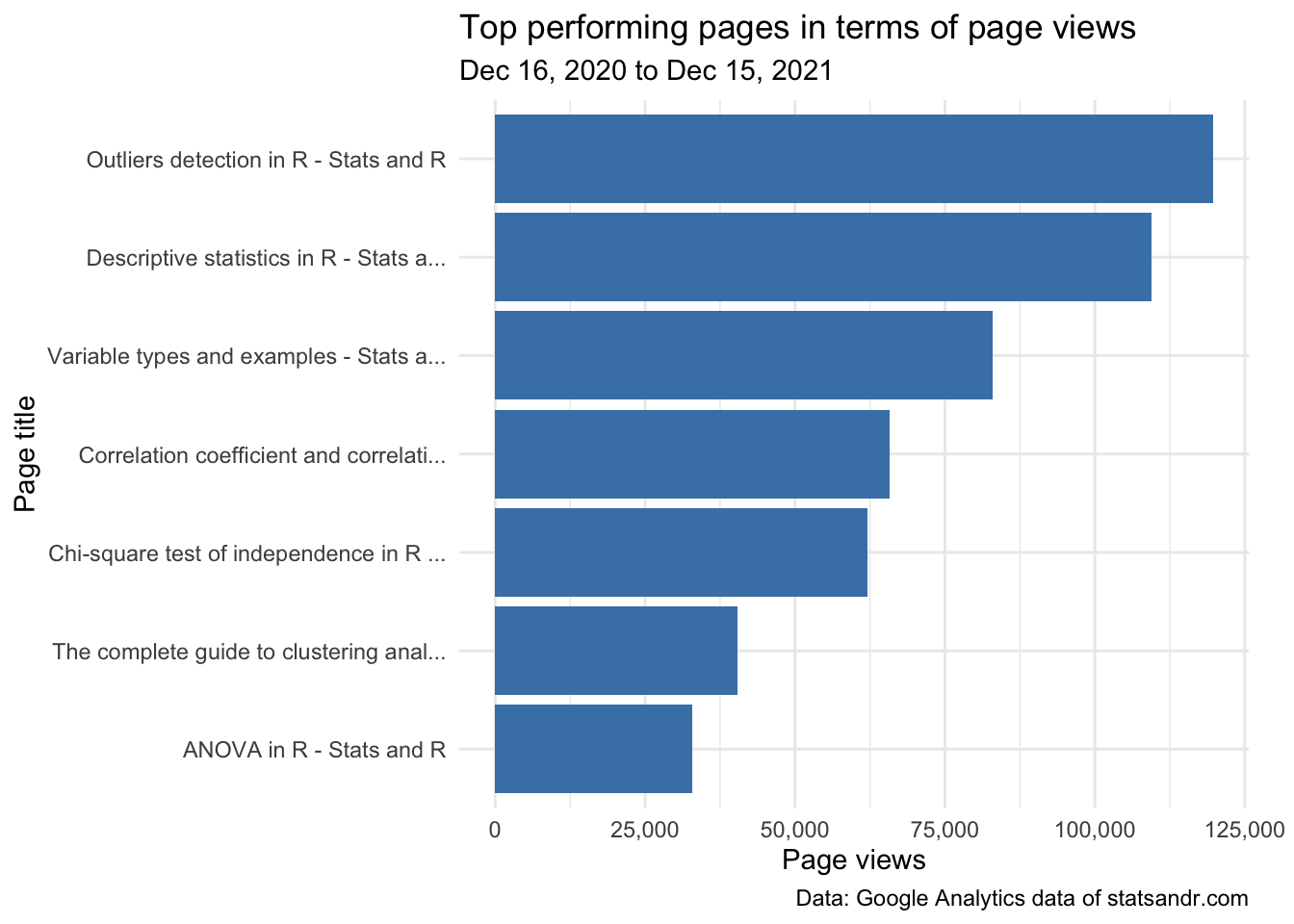
This gives me a good first overview on how posts performed in terms of page views, so in some sense, what people find useful. The top 3 articles in the past year were:
Be careful that this ranking is based on the total number of page views over the last 12 months. A recent article may thus be found at the bottom of the list simply because it collected page views over a shorter period of time compared to an old article. So it is best to avoid comparing recent articles with older ones, or you can compare articles after having “time-normalized” the number of page views. See previous year’s review for more details and illustrations of this metrics.
You could also be interested in knowing the worst performing ones (to eventually improve them or include them in higher quality posts):
tail(subset(most_viewed_posts, n > 1000),
  n = 7
)
## Title n
## 49 A guide on how to read statistical ta... 1477
## 50 About - Stats and R 1470
## 51 How to embed a Shiny app in blogdown?... 1455
## 52 About me - Stats and R 1277
## 53 One-proportion and chi-square goodnes... 1226
## 54 Running pace calculator in R Shiny - ... 1049
## 55 Shiny - Stats and R 1018Note that I intentionally excluded pages with less than 1000 views to remove deleted or hidden pages from the ranking.
Another issue with this ranking is that it may be biased due to some pages which have been duplicated (if you edited the title for example), but at least you have a broad idea of the worst performing pages.
Page views by country
Knowing the country where your readers come from may also be handy for some content creators or marketers.
Location of my readers is not really important for me because I intend to write for everyone, but this may be completely the opposite if you are selling things or running a business/ecommerce.
# get GA data
data_fetch <- google_analytics(view_id,
  date_range = c(start_date, end_date),
  metrics = "pageviews",
  dimensions = "country",
  anti_sample = TRUE # slows down the request but ensures data isn't sampled
)

# table
countries <- data_fetch %>%
  mutate(Country = str_trunc(country, width = 40)) %>% # keep maximum 40 characters
  count(Country, wt = pageviews, sort = TRUE)

head(countries, n = 10) # edit n for more or less countries to display
## Country n
## 1 United States 244752
## 2 India 71797
## 3 United Kingdom 53272
## 4 Germany 38322
## 5 Canada 33812
## 6 Belgium 26421
## 7 Australia 26225
## 8 Philippines 23193
## 9 Netherlands 21944
## 10 Brazil 17956Again, if you prefer a plot over a table, you can visualize the top countries in terms of page views in a barplot:
# plot
top_n(countries, n = 10, n) %>% # edit n for more or less countries to display
  ggplot(., aes(x = reorder(Country, n), y = n)) +
  geom_bar(stat = "identity", fill = "steelblue") +
  theme_minimal() +
  coord_flip() +
  labs(
    y = "Page views",
    x = "Country",
    title = "Top performing countries in terms of page views",
    subtitle = paste0(format(start_date, "%b %d, %Y"), " to ", format(end_date, "%b %d, %Y")),
    caption = "Data: Google Analytics data of statsandr.com"
  ) +
  scale_y_continuous(labels = scales::comma) + # better y labels
  theme(plot.margin = unit(c(5.5, 7.5, 5.5, 5.5), "pt")) # to avoid the plot being cut on the right edge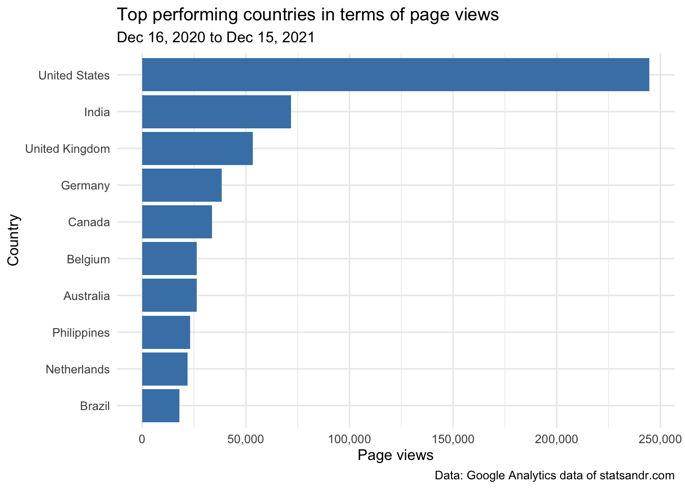
We see that a large share of readers are from the US—and Belgium (my country) comes only in \(6^{th}\) place in terms of number of page views.
Be careful that, as the number of people located in different countries differs widely, this ranking may hide some insights if you are comparing page views by countries in absolute terms. See why in this section of last year’s review.
User engagement by devices
One may also be interested in checking how users are engaged depending on device’s type. To investigate this, we plot 3 charts describing:
- How page views are distributed by type of device?
- The average time on page (in seconds) by type of device
- The number of page views per session by device type
So first, how page views are distributed by device type?
# GA data
gadata <- google_analytics(view_id,
  date_range = c(start_date, end_date),
  metrics = c("pageviews", "avgTimeOnPage"),
  dimensions = c("date", "deviceCategory"),
  anti_sample = TRUE # slows down the request but ensures data isn't sampled
)

# plot pageviews by deviceCategory
gadata %>%
  ggplot(aes(deviceCategory, pageviews)) +
  geom_bar(aes(fill = deviceCategory), stat = "identity") +
  theme_minimal() +
  labs(
    y = "Page views",
    x = "",
    title = "Page views per device",
    subtitle = paste0(format(start_date, "%b %d, %Y"), " to ", format(end_date, "%b %d, %Y")),
    caption = "Data: Google Analytics data of statsandr.com",
    fill = "Device" # edit legend title
  ) +
  scale_y_continuous(labels = scales::comma) # better y labels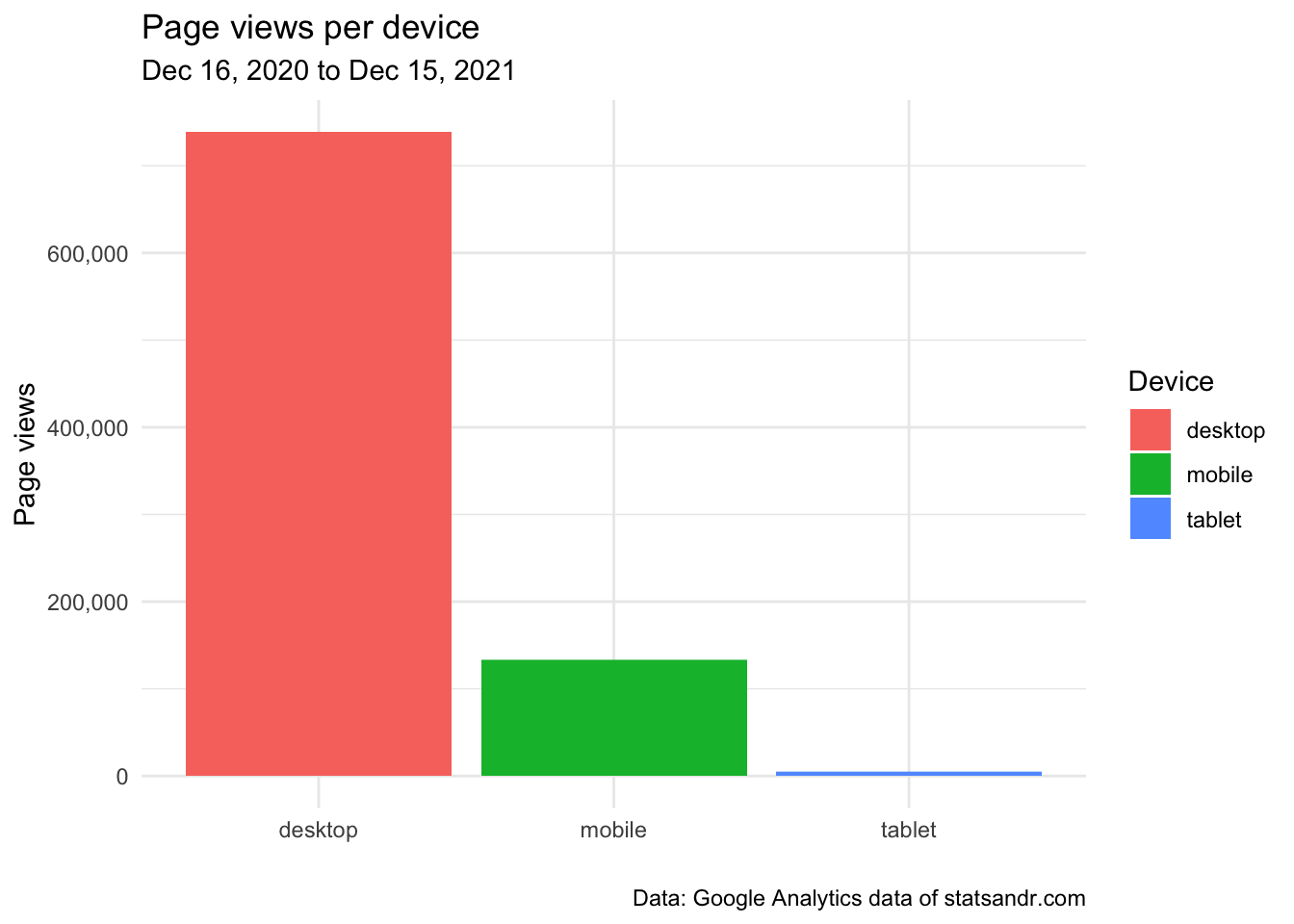
From the above plot, we see that the large majority of readers visited the blog from a desktop and only a very small proportion comes from a tablet.
This makes sense since I guess many visitors are reading my articles or tutorials while using R (which is only available on desktop).
However, this information of total number of page views per device type does not tell me anything about the time spent on each page and thus the engagement by device type. The following plot answers this question:
# add median of average time on page per device
gadata <- gadata %>%
  group_by(deviceCategory) %>%
  mutate(med = median(avgTimeOnPage))

# plot avgTimeOnPage by deviceCategory
ggplot(gadata) +
  aes(x = avgTimeOnPage, fill = deviceCategory) +
  geom_histogram(bins = 30L) +
  scale_fill_hue() +
  theme_minimal() +
  theme(legend.position = "none") +
  facet_wrap(vars(deviceCategory)) +
  labs(
    y = "Frequency",
    x = "Average time on page (in seconds)",
    title = "Average time on page per device",
    subtitle = paste0(format(start_date, "%b %d, %Y"), " to ", format(end_date, "%b %d, %Y")),
    caption = "Data: Google Analytics data of statsandr.com"
  ) +
  scale_y_continuous(labels = scales::comma) + # better y labels
  geom_vline(aes(xintercept = med, group = deviceCategory),
    color = "darkgrey",
    linetype = "dashed"
  ) +
  geom_text(
    aes(
      x = med, y = 125,
      label = paste0("Median = ", round(med), " seconds")
    ),
    angle = 90,
    vjust = 3,
    color = "darkgrey",
    size = 3
  )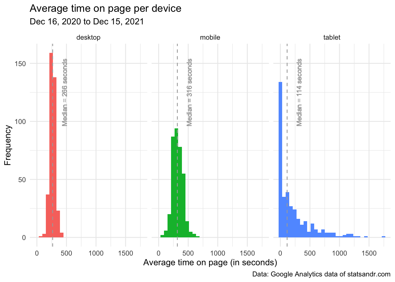
From the above plot, we see that:
- Most readers coming from a tablet actually leave the page very quickly (see the peak around 0 second in the tablet facet).
- Distributions of the average time on page for readers on desktop and mobile were quite similar, with an average time on page mostly between 125 seconds (= 2 minutes and 5 seconds) and 375 seconds (= 6 minutes and 15 seconds).
- Quite surprisingly, the median of the average time spent on page is slightly higher for visitors on mobile than on desktop (median = 316 seconds on mobile and 266 seconds on desktop, see the dashed vertical lines representing the medians in the desktop and mobile facets). This indicates that, although more people visit the blog from desktop (as shown by the total number of page views by device), it seems that people on mobile spend more time per page. I find this result quite surprising given that most of my articles include R code and require a computer to run the code. Therefore, I expected that people would spend more time on desktop than on mobile because on mobile they would quickly scan the article, while on desktop they would read the article more carefully and try to reproduce the code on their own computer. At least that is what I do when I read blogs on mobile versus reading them on desktop. What is even more intriguing, is that it was already the case last year. If someone finds similar results and have a possible explanation, I would be glad to hear from her (if possible, in the comments at the end of the article so everyone can benefit from the discussion).
- As a side note, we see that these medians are higher this year compared to last year (266, 316 and 114 seconds in 2021 compared to 190, 228 and 106 seconds in 2020 on desktop, mobile and tablet, respectively). This is somewhat encouraging because it indicates that people spend more time on each page (which is an indication, at least partially, of the quality of the blog for Google).1
Given this result, I also believe it is helpful to illustrate the number of page views during a session by device type.
In fact, it may be the case that visitors on mobile spend, on average, more time on each page but people on desktop visit more pages per session (remember that a session is a set of interactions with your website that take place within a given time frame).
We verify this belief via a density plot, and for better readability we exclude visits from tablet:
# GA data
gadata <- google_analytics(view_id,
  date_range = c(start_date, end_date),
  metrics = c("pageviewsPerSession"),
  dimensions = c("date", "deviceCategory"),
  anti_sample = TRUE # slows down the request but ensures data isn't sampled
)

# add median of number of page views/session
gadata <- gadata %>%
  group_by(deviceCategory) %>%
  mutate(med = median(pageviewsPerSession))

## Reordering gadata$deviceCategory
gadata$deviceCategory <- factor(gadata$deviceCategory,
  levels = c("mobile", "desktop", "tablet")
)

# plot pageviewsPerSession by deviceCategory
gadata %>%
  filter(deviceCategory != "tablet") %>% # filter out pageviewsPerSession > 2.5 and visits from tablet
  ggplot(aes(x = pageviewsPerSession, fill = deviceCategory, color = deviceCategory)) +
  geom_density(alpha = 0.5) +
  scale_fill_hue() +
  theme_minimal() +
  labs(
    y = "Frequency",
    x = "Page views per session",
    title = "Page views per session by device",
    subtitle = paste0(format(start_date, "%b %d, %Y"), " to ", format(end_date, "%b %d, %Y")),
    caption = "Data: Google Analytics data of statsandr.com\nDashed lines represent the medians",
    color = "Device", # edit legend title
    fill = "Device" # edit legend title
  ) +
  scale_y_continuous(labels = scales::comma) + # better y labels
  geom_vline(aes(xintercept = med, group = deviceCategory, color = deviceCategory),
    linetype = "dashed",
    show.legend = FALSE # remove legend
  )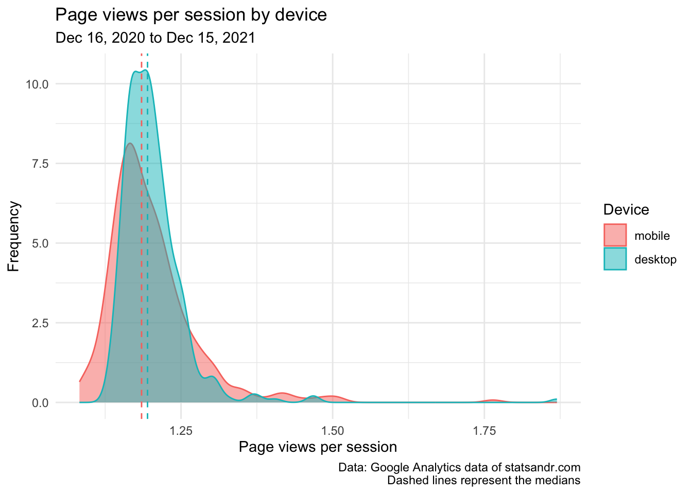
This last plot shows that readers on desktop and mobile visit approximately the same number of pages per session, as indicated by the fact that the two distributions overlap each other and are not distant from each other. It is true that the median is higher for people on desktop than on mobile, but to a very small margin only (and the difference between the two is smaller than in last year’s review).
So to summarize what we learned based on the 3 last plots, we now know that
- most readers visited the blog from desktop;
- readers on mobile spent more time on each page than readers on desktop (and even more compared to readers on tablet);
- users on desktop and mobile seem to have visited approximately the same number of pages per session.
One may wonder why I chose to compare medians instead of means. The main reason is that the median is a more robust way to represent non-normal data. For the interested reader, see a note on the difference between mean and median, and the context in which each measure is more appropriate.
Browser information
From a more technical perspective, you could also be interested in the number of page views by browser. I am personally not really interested in knowing which browser my visitors are using the most (mostly because this blog is available on all common browsers), but the most geeky among you may be so.
This information can be visualized with the following barplot:
# get data
browser_info <- google_analytics(view_id,
  date_range = c(start_date, end_date),
  metrics = c("pageviews"),
  dimensions = c("browser"),
  anti_sample = TRUE # slows down the request but ensures data isn't sampled
)

# table
browser <- browser_info %>%
  mutate(Browser = str_trunc(browser, width = 40)) %>% # keep maximum 40 characters
  count(Browser, wt = pageviews, sort = TRUE)

# plot
top_n(browser, n = 10, n) %>% # edit n for more or less browser to display
  ggplot(., aes(x = reorder(Browser, n), y = n)) +
  geom_bar(stat = "identity", fill = "steelblue") +
  theme_minimal() +
  coord_flip() +
  labs(
    y = "Page views",
    x = "Browser",
    title = "Which browsers are our visitors using?",
    subtitle = paste0(format(start_date, "%b %d, %Y"), " to ", format(end_date, "%b %d, %Y")),
    caption = "Data: Google Analytics data of statsandr.com"
  ) +
  scale_y_continuous(labels = scales::comma) # better y labels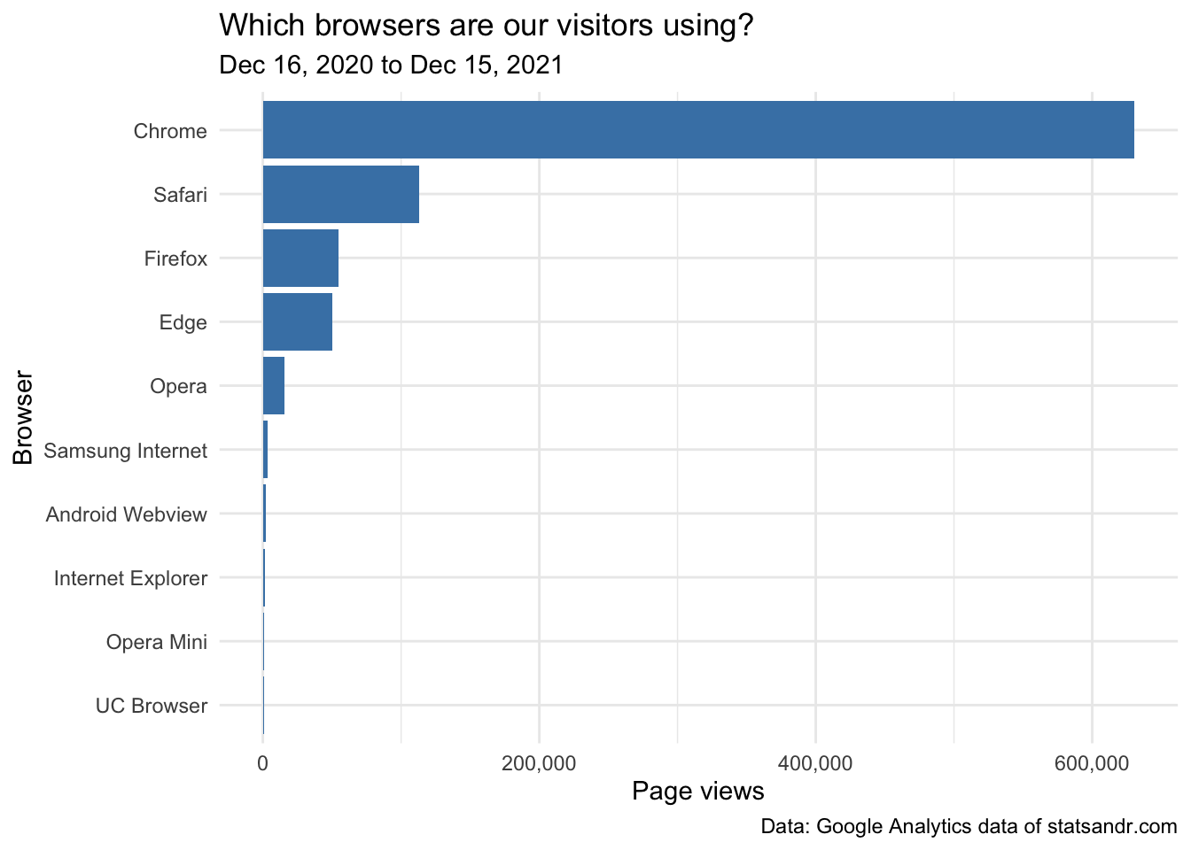
Most readers visited the site using Chrome, Safari and Firefox (this was expected since they are the most common browsers).
This was the last metrics presented in this review. Of course, many more are possible depending on your R skills (mainly, data manipulation and {ggplot2}) and your expertise in SEO or analyzing Google Analytics data. Hopefully, thanks to this review and possibly from last year too, you will be able to analyze your own blog or website using R and the {googleAnalyticsR} package. At least, this was the aim of the present article.
For those of you who are interested in a more condensed analysis, see my custom Google Analytics dashboard.2
End note
I would also like to add that these figures are not done to be compared with. Every website or blog is unique, every author is unique (with different priorities and different agendas) and more is not always better. I learn a lot thanks to this blog, I use it for personal purposes and for my students as part of my teaching tasks. I will keep writing on it as long as I enjoy it and as long as I have the time to do so, not matter how low or high the number of clicks.
Thanks to all readers of the past year, and see you in a year for another review! In the meantime, if you maintain a blog I would be really happy to hear how you track its performance.
As always, if you have a question or a suggestion related to the topic covered in this article, please add it as a comment so other readers can benefit from the discussion.
More time spend on each page is a favorable factor for Google because it means that people are reading it more carefully. If the blog or the post is of mediocre quality, users tend to bounce back quickly (known as bounce rate) and look for an answer to their question somewhere else (leading ultimately to less time spend on the page or site).↩︎
Thanks to the RStudio blog for the inspiration.↩︎
Liked this post?
- Get updates every time a new article is published (no spam and unsubscribe anytime)
- Support the blog
- Share on:


