Top 100 R resources on COVID-19 Coronavirus
- R Shiny apps and dashboards
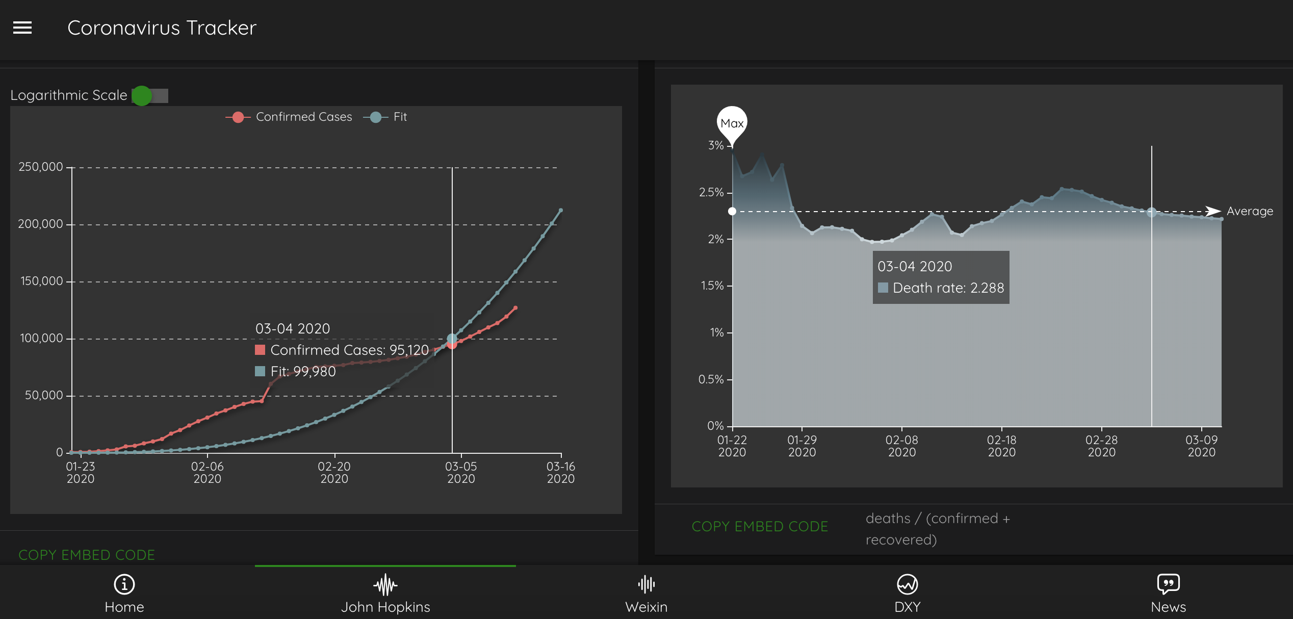
- Coronavirus tracker
- Coronavirus dashboard from the
{coronavirus} package - Visualization of Covid-19 Cases
- Modeling COVID-19 Spread vs Healthcare Capacity
- COVID-19 Data Visualization Platform
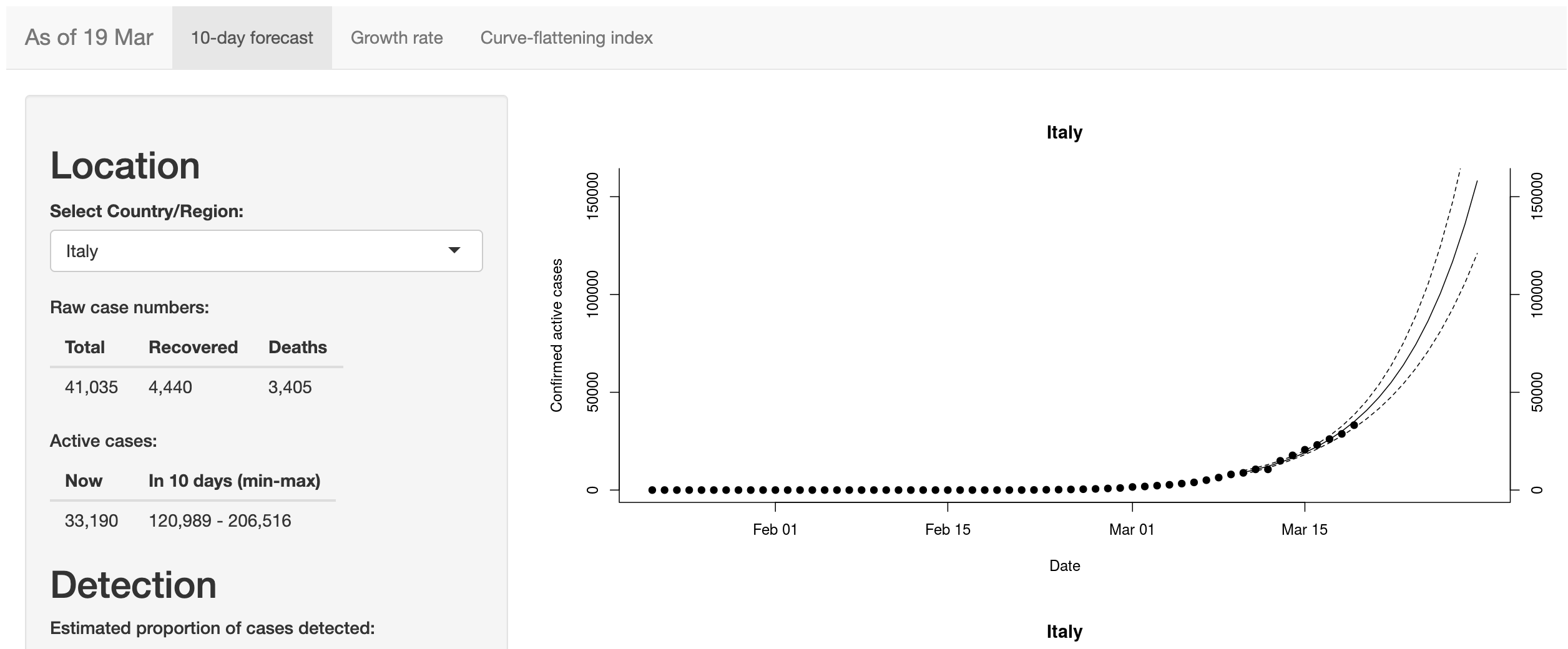
- Coronavirus 10-day forecast
- Coronavirus (COVID-19) across the world
- COVID-19 outbreak
- Flatten the Curve
- Explore the spread of Covid-19
- Governments and COVID-19
- Simulating COVID-19 Epidemic in Togo - West Africa
- Covid-19 Prediction
- Covid-19 Dashboard
- Healthcare worker deaths from novel Coronavirus (COVID-19) in the US
- Covid-19 Hospitalizations in Belgium
- COVIDMINDER: Where you live matters!
- COVID-19 Canada Data Explorer Tool
- Philippine COVID-19 Case Forecasting
- COVID-19 Case & Death Report Number Corrector
- Covid-19: the SPQEIR model
- The Belgian Covid Cases Tracker
- COVID-19 monitor
- COVID-19 Bulletin Board
- Covid-19 Statistics Displayer
- CoronaMapper
- CoronaDash
- Covidfrance
- The Impact of COVID-19 on Mobility
- Coronavirus Analysis Platform
- COVID-19 Tracker
- COVID-19 Overview
- COVID-19 Exit Strategies
- Corona Virus Statistics : COVID19
- Covid19 Data
- WHO COVID-19 Explorer
- COVID-19 Scenario Analysis Tool
- Covid-19 track
- R packages
- R code and blog posts
- Analyzing COVID-19 outbreak data with R
- COVID-19 Data Analysis with
{tidyverse}and{ggplot2} - COVID-19 cumulative observed case fatality rate over time
- Covid 19 Tracking
- Infectious diseases and nonlinear differential equations
- Epidemic modelling of COVID-19 in the UK using an SIR model
- Modeling Pandemics
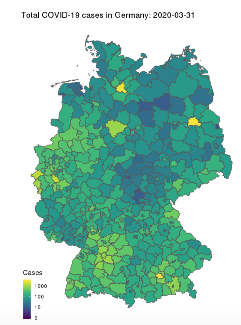
- COVID-19: The Case of Germany
- Flatten the COVID-19 Curve
- Flattening vs shrinking: the math of #FlattenTheCurve
- explainCovid19 challenge
- An R Package to explore the Novel Coronavirus
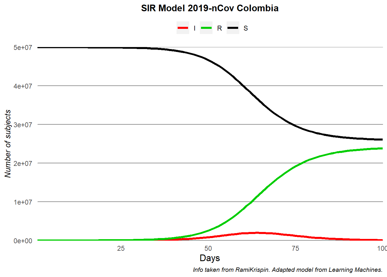
- Coronavirus model using R – Colombia
- COVID-19: The Case of Spain
- Tidying the new Johns Hopkins Covid-19 time-series datasets
- COVID-19 in Belgium
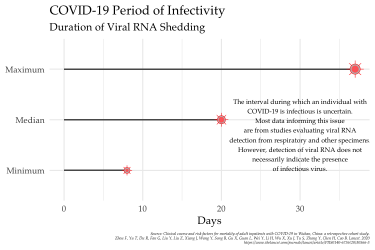
- Facts About Coronavirus Disease 2019 (COVID-19) in 5 Charts created with R and ggplot2
- Contagiousness of COVID-19 Part I: Improvements of Mathematical Fitting
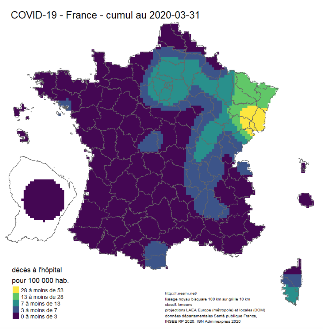
- Coronavirus : spatially smoothed decease in France and decease animation map
- Another “flatten the COVID-19 curve” simulation… in R
- Tracking Covid19 Cases Throughout NJ with R
- It’s fun to look at the YACM (Yet Another COVID Model)
- Is COVID-19 as bad as all that? Yes it probably is
- Potential Long-Term Intervention Strategies for COVID-19
- Animations in the time of Coronavirus
- COVID-19 Data and Prediction for Michigan
- Data Visualization of COVID-19 in the US
- The spread of COVID-19 across countries visualization with R
- Covid-19 and Rural Areas in the U.S
- Covid Death Rates: Is the data correct?
- COVID-19 Risk Heat Maps with Location Data, Apache Arrow, Markov Chain Modeling, and R Shiny
- COVID-19 Tracker Indonesia
- COVID-19 Projections Using Machine Learning
- COVID-19 in Belgium: is it over yet?
- COVID-19 Cases by Ethnicity
- Tennessee COVID-19 Update
- Simulating Coronavirus Outbreak in Cities with Origin-Destination Matrix and SEIR Model
- COVID-19 Population Mobility - How has human mobility changed under the COVID-19 Pandemic?
- How to Build COVID-19 Data-Driven Shiny Apps in 5 minutes
- Analyzing data from COVID19 R package
- Body Mass and Risk from COVID-19 and Influenza
- HMD – Weekly Data
- Guest posts on Chris Muir’s blog
- An R View into Epidemiology
- Articles by Rob J Hyndman
- Turkey vs. Germany: COVID-19
- Hands-on: How to build an interactive map in R-Shiny: An example for the COVID-19 Dashboard
- Modelling COVID-19 in Morocco
- SIR models with Kermack and McKendrick
- Johns Hopkins Covid-19 Data and R
- Estimating COVID-19’s \(R_t\) in Real-Time
- From static to animated time series: the tidyverse way
- Sneak peek: new Summit data tool helps clients visualize US areas that are most heavily impacted by the COVID-19 virus
- How to Reproduce Financial Times Style COVID19 Daily Reporting?
- What can tweets about contact tracing apps tell us about attitudes towards data sharing for public health?
- Visualizing COVID cases in Belgium
- A spatio-temporal analysis of the environmental correlates of COVID-19 incidence in Spain
- Covid-19 Analysis
- A Simple Way to Gather all Coronavirus Related Data with R
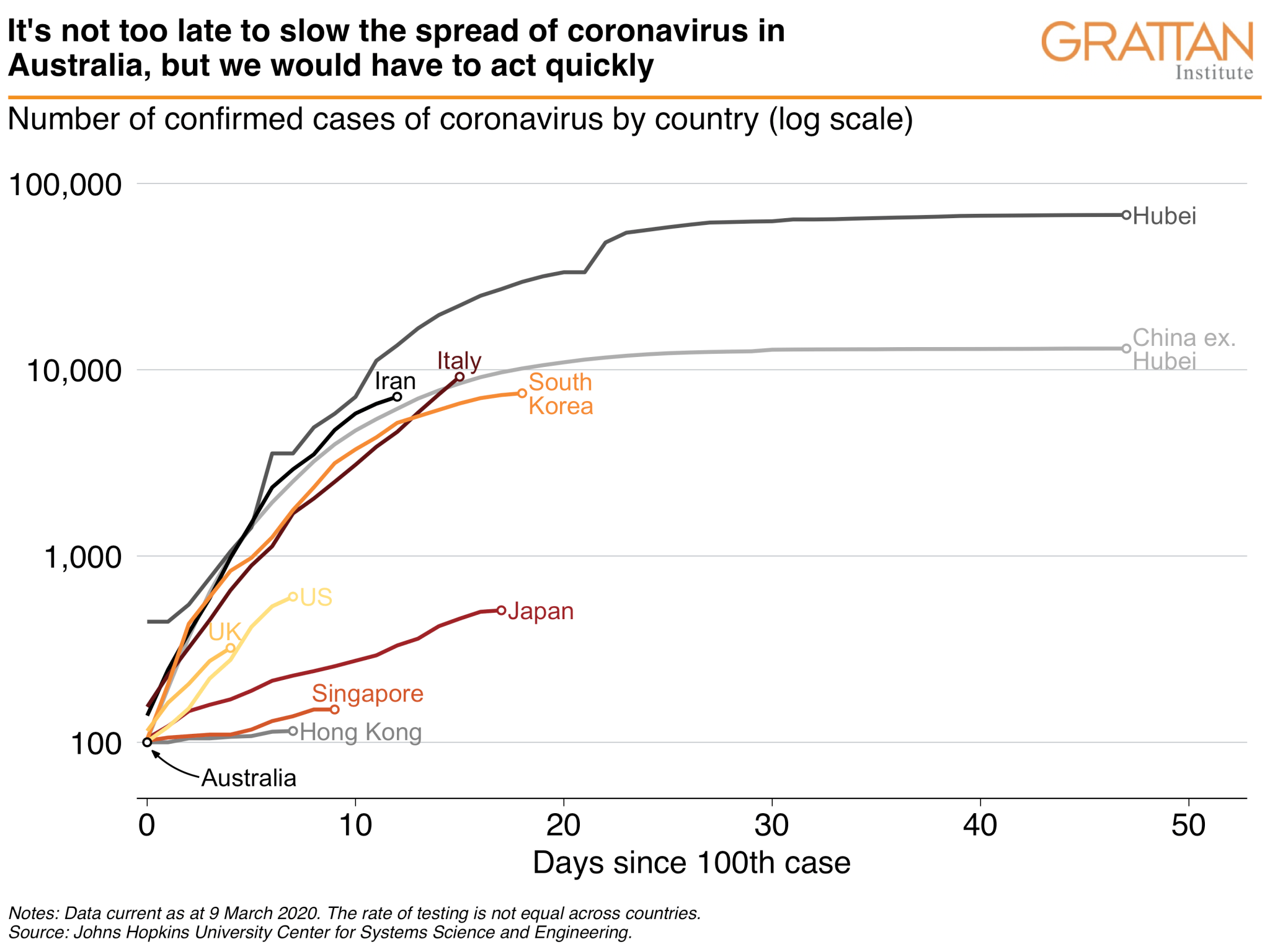
- Australian governments can choose to slow the spread of coronavirus, but they would need to act immediately
- Does Covid raise everyone’s relative risk of dying by a similar amount? More evidence
- Tracking Coronavirus: Building Parameterized Reports to Analyze Changing Data Sources
- Mapping NZ cases of COVID-19
- Visualize the Pandemic with R #COVID-19
- Exploring the Temporal Evolution of COVID-19 Cases in the United States
- R Data Analysis: COVID-19
- GA COVID-19 Reports
- Corona in Belgium
- The Coronavirus in Italy from the Twitter’s Point of View
- Use R and Tidycensus to Look at COVID-19 Risk Factors
- Animating U.S. COVID-19 hotspots over time
- Understanding COVID19 in Connecticut. It takes a town
- Data
- Other lists or collections of resources
- Non-english resources
- Conclusion
- References

Warning: Some links or resources may have been moved or deleted, and are thus not accessible anymore. If you are the author and would like to update the URL, feel free to contact me so I can update the link.
The Coronavirus is a serious concern around the globe. With its expansion, there are also more and more online resources about it. This article presents a selection of the best R resources on the COVID-19 virus.
This list is by no means exhaustive. I am not aware of all R resources available online about the Coronavirus, so please feel free to let me know in the comments or by contacting me if you believe that another resource (R package, Shiny app, R code, blog posts, datasets, etc.) deserves to be on this list.
R Shiny apps and dashboards
Visualization of Covid-19 Cases
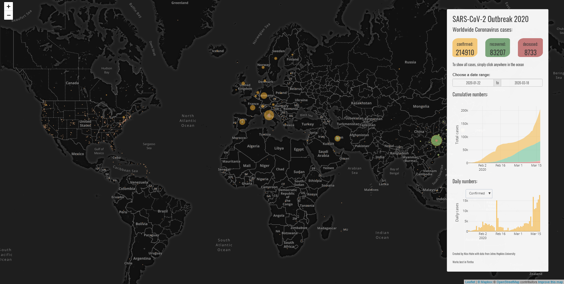
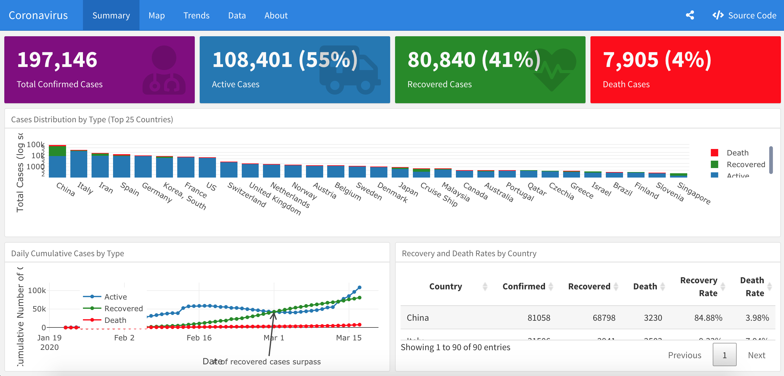
Developed by Nico Hahn, this Shiny app uses leaflet, plotly and the data from Johns Hopkins University to visualize the outbreak of the novel Coronavirus and shows data for the entire world or singular countries.
The code is available on GitHub.
Modeling COVID-19 Spread vs Healthcare Capacity
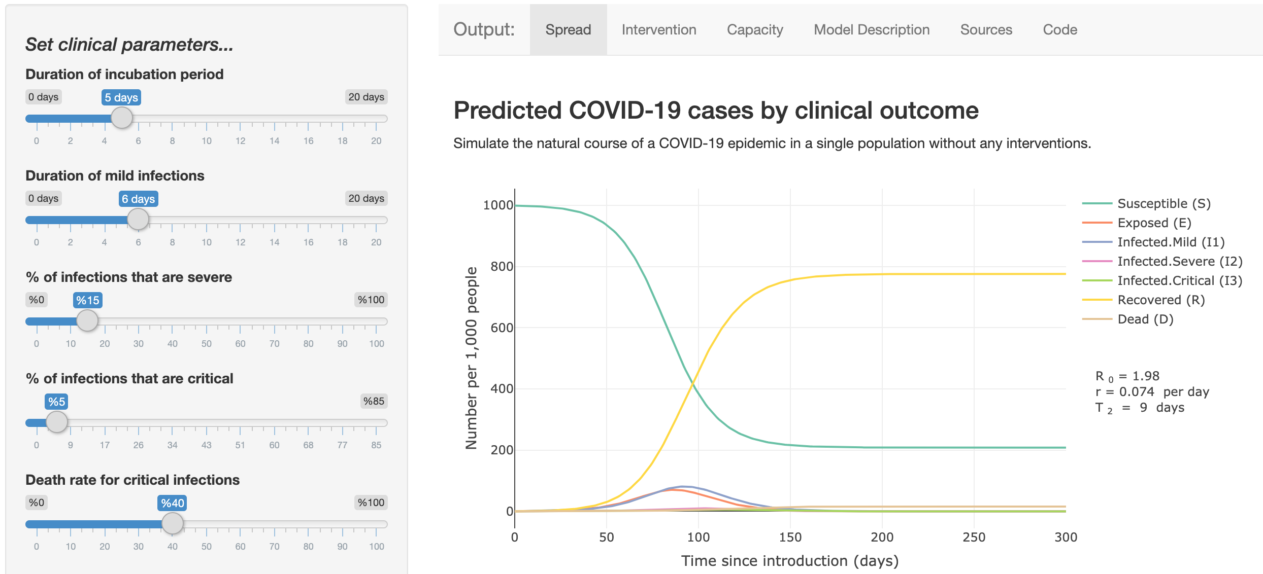
Developed by Dr. Alison Hill, this Shiny app uses an epidemiological model based on the classic SEIR model to describe the spread and clinical progression of COVID-19. It includes different clinical trajectories of infection, interventions to reduce transmission, and comparisons to healthcare capacity.
The code is available on GitHub.
COVID-19 Data Visualization Platform
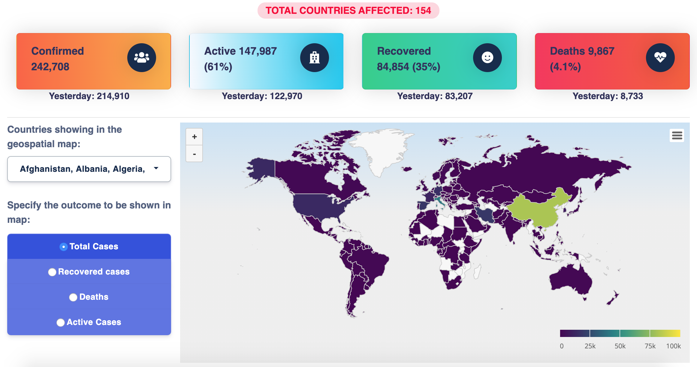
Developed by Shubhram Pandey, this Shiny app provides a clear visualization of Covid19 impact all over the world and it also provides a sentiment analysis using natural language processing from Twitter.
The code is available on GitHub.
COVID-19 outbreak
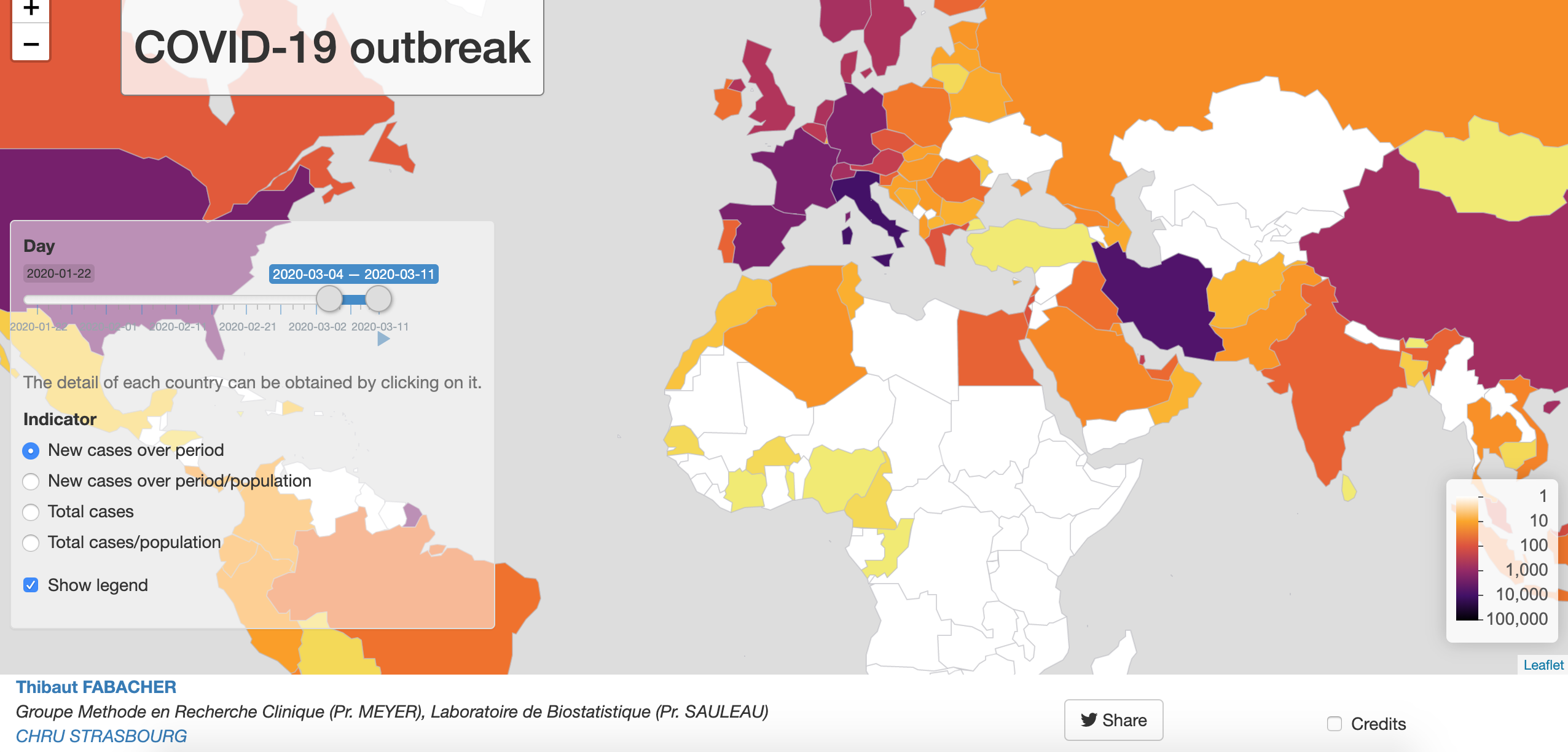
Developed by Dr. Thibaut Fabacher in collaboration with the department of Public Health of the Strasbourg University Hospital and the Laboratory of Biostatistics and Medical Informatics of the Strasbourg Medicine Faculty, this Shiny app shows an interactive map for global monitoring of the infection. It focuses on the evolution of the number of cases per country and for a given period in terms of incidence and prevalence.
The code is available on GitHub and this blog post discusses it in more detail.
Flatten the Curve
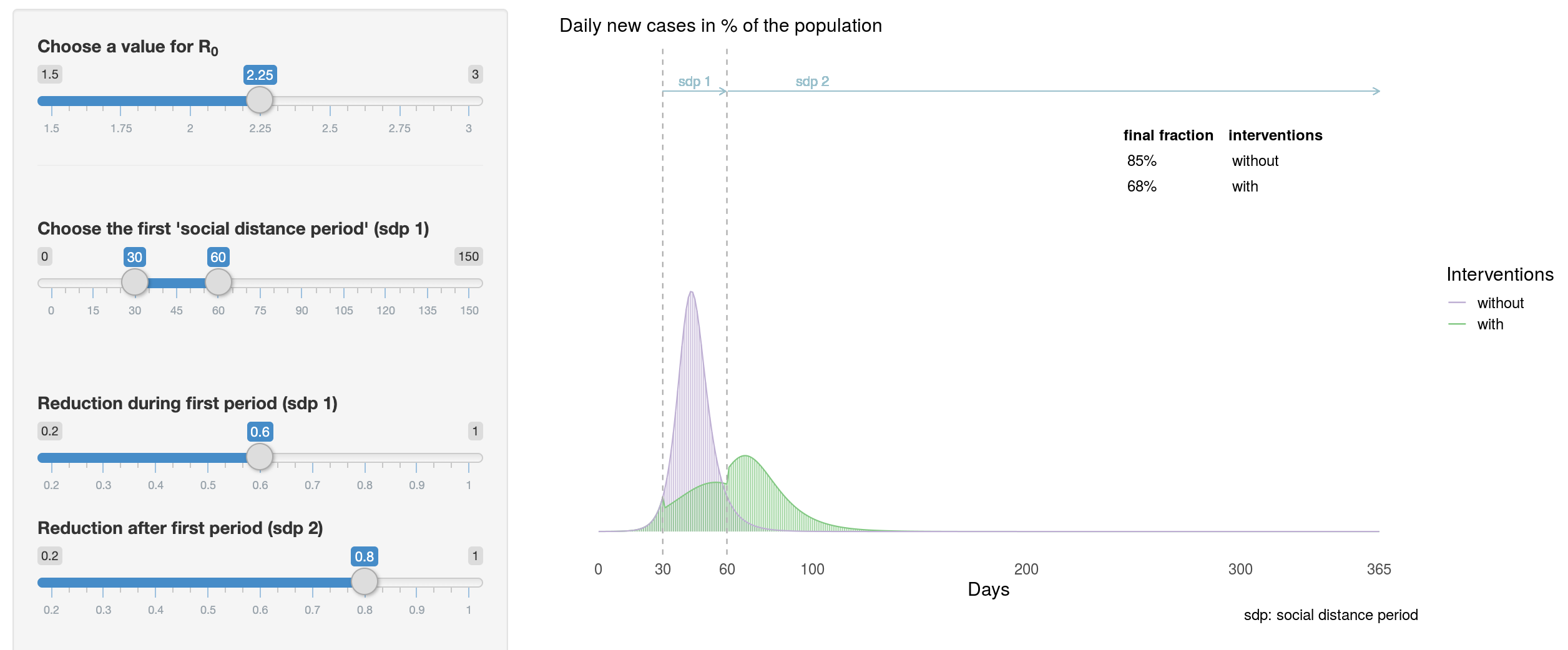
Developed by Tinu Schneider, this Shiny app illustrates, in an interactive way, the different scenarios behind the #FlattenTheCurve message.
The app has been built upon Michael Höhle’s article and the code is available on GitHub.
Explore the spread of Covid-19
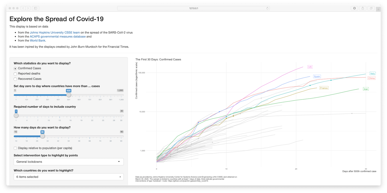
Developed by Joachim Gassen, this Shiny app allows you to visualize confirmed, recovered cases and reported deaths for several countries via one summary graph.
The Shiny app is based on data from:
- Johns Hopkins University CSSE team on the spread of the SARS-CoV-2 virus
- ACAPS governmental measures database
- World Bank
This blog post explains the Shiny app in further details and in particular the {tidycovid19} R package behind it.
Governments and COVID-19
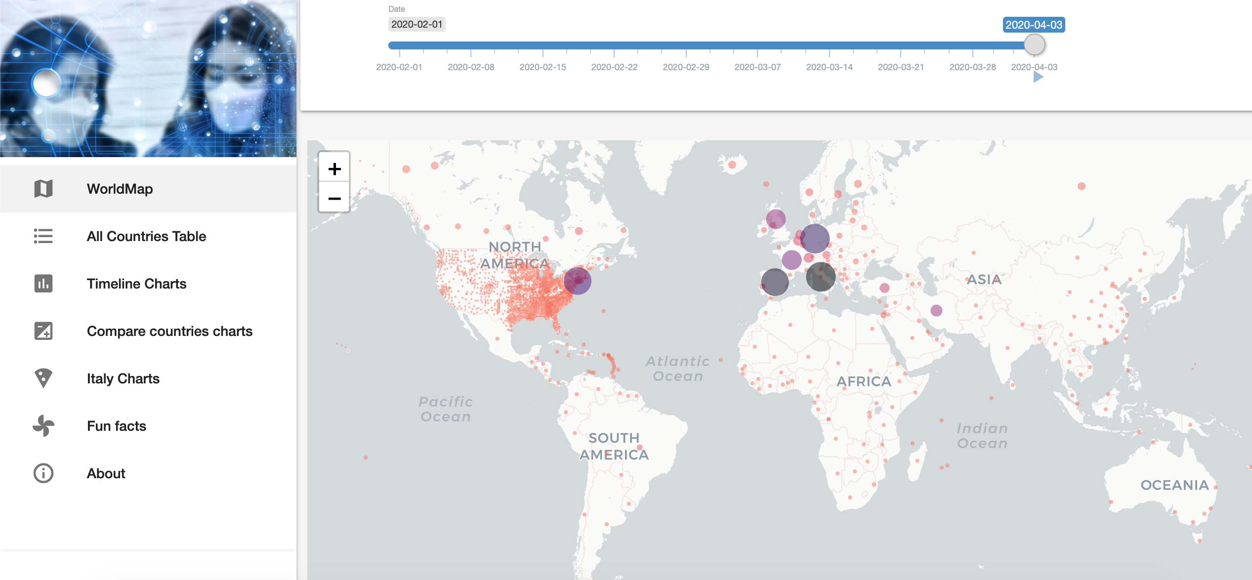
Developed by Sebastian Engel-Wolf, this Shiny app presents in a elegant way the following measurements:
- Maximum time of exponential growth in a row
- Days to double infections
- Exponential growth today
- Confirmed cases
- Deaths
- Population
- Confirmed cases on 100,000 inhabitants
- Mortality rate
The code is available on GitHub and this article explains it in further details.
Simulating COVID-19 Epidemic in Togo - West Africa
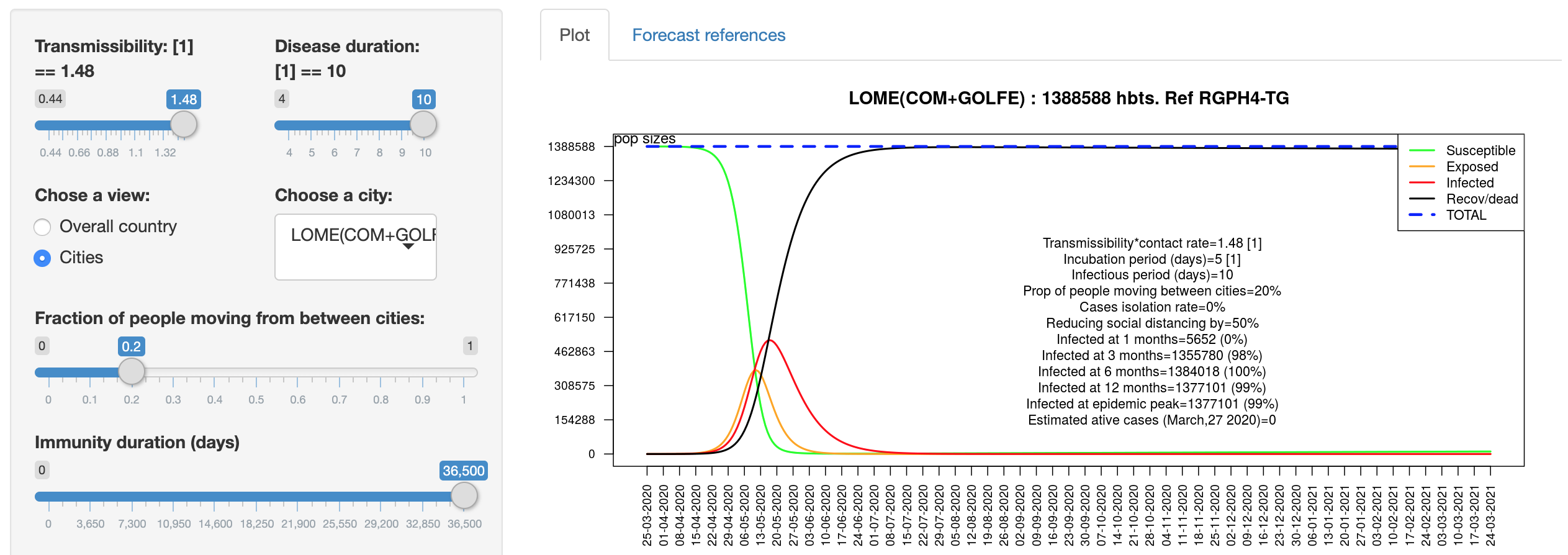
Developed by Dr. Kankoé Sallah, this Shiny app uses SEIR metapopulation model with mobility between catchment areas to describe country level spread of COVID-19 and the impact of interventions in Togo, West Africa.
Covid-19 Prediction
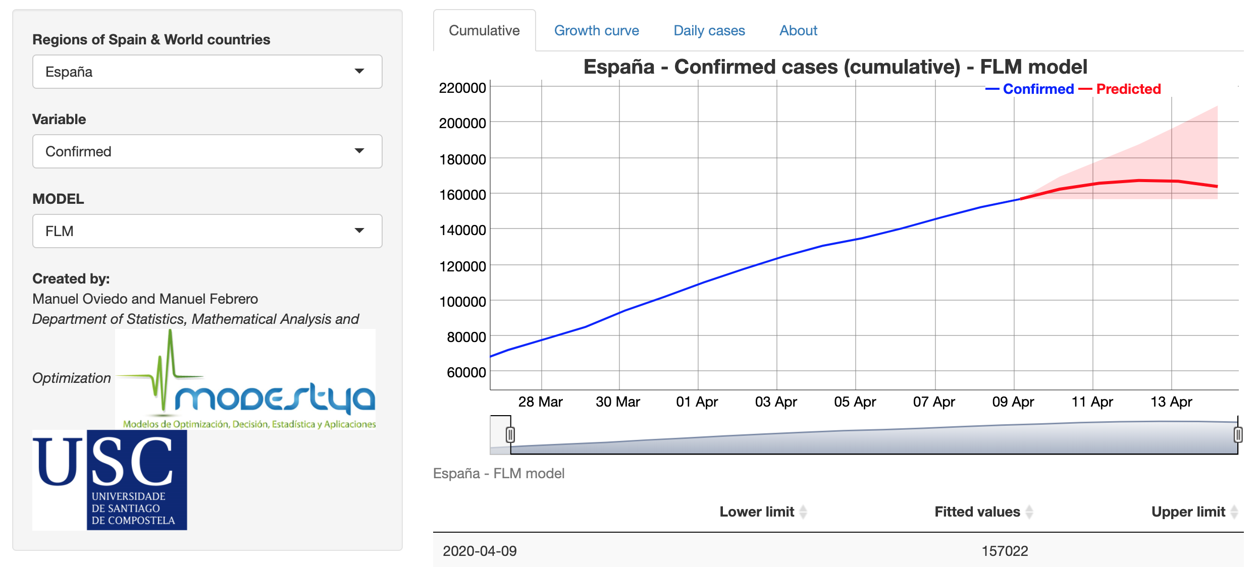
Developed by Manuel Oviedo and Manuel Febrero (Modestya research group of the University of Santiago de Compostela), this Shiny app predicts the growth rate at 5-day horizon using the evolution during the last 15 days of growth rate. Three functional regression models are fitted and re-estimated when new data is available. The app also shows an interactive plot and table for the expected number of accumulated cases and new daily cases to each horizon (for confirmed and deaths responses) by country (from Johns Hopkins CSSE) and Spanish region (from ISCII).
See an explanation of the methodology in the About tab.
Covid-19 Dashboard
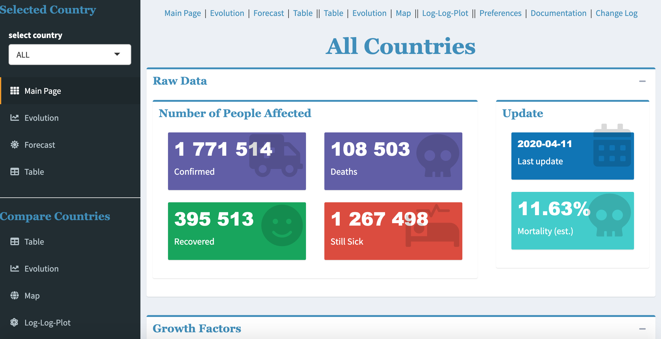
Developed by Philippe De Brouwer, this dashboard displays several key measures regarding the outbreak of the virus (by country or for all countries combined), together with some forecasts, a world map and other interactive plots.
Covid-19 Hospitalizations in Belgium
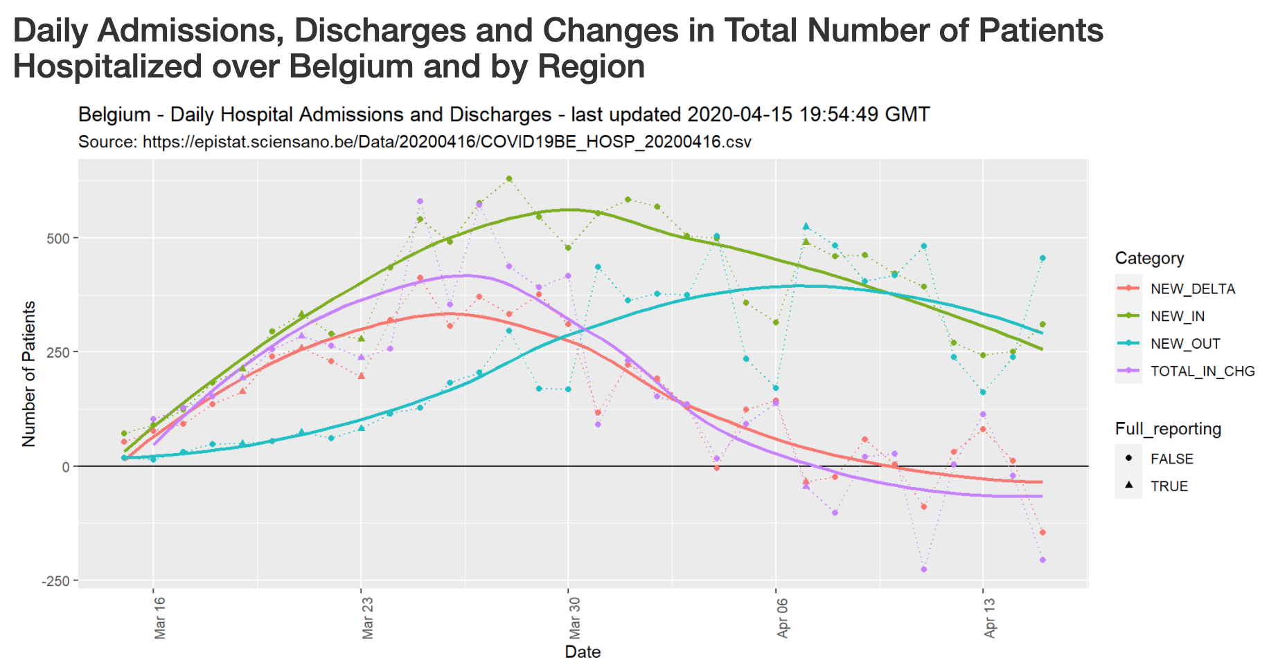
Developed by Jean-Michel Bodart, this dashboard provides an overview of the evolution of Covid-19-related hospitalizations in Belgium, by region and province.
The code is available on GitHub.
COVIDMINDER: Where you live matters!
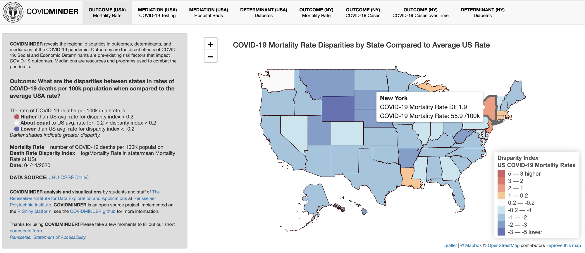
Developed by The Rensselaer Institute for Data Exploration and Applications, this Shiny app reveals the regional disparities in outcomes, determinants and medications (e.g., mortality rates, test cases, diabetes, and hospital beds) across United States, with a special focus on New York.
This blog post explains the Shiny app in more detail and the code is available on GitHub.
COVID-19 Canada Data Explorer Tool
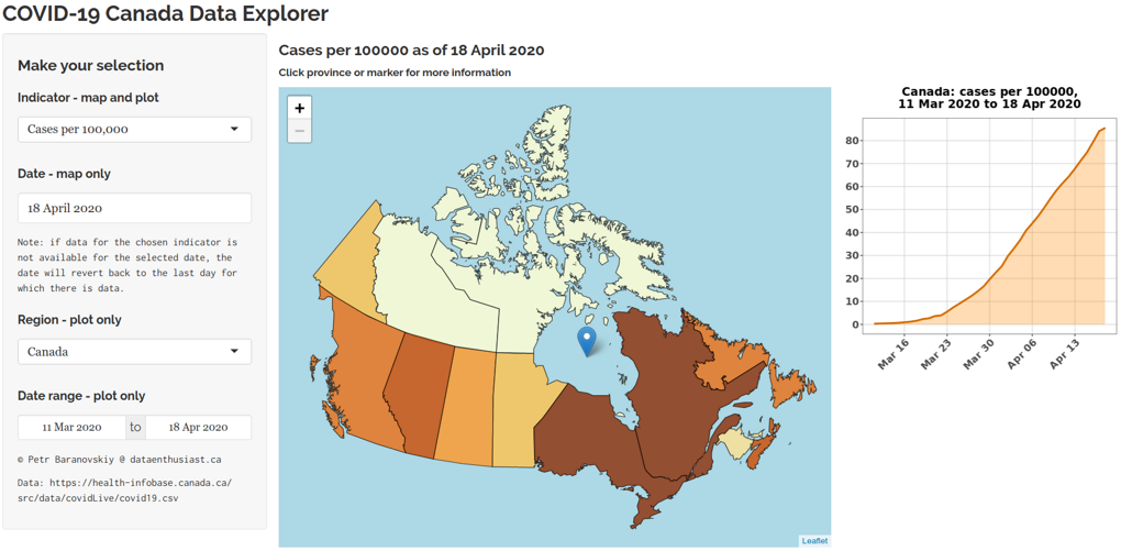
Developed by Petr Baranovskiy from Data Enthusiast’s Blog, this Shiny app processes the official dataset available from the Government of Canada and shows several indicators related to the SARS-CoV-2 epidemic in Canada.
This blog post details the application in further detail.
Philippine COVID-19 Case Forecasting
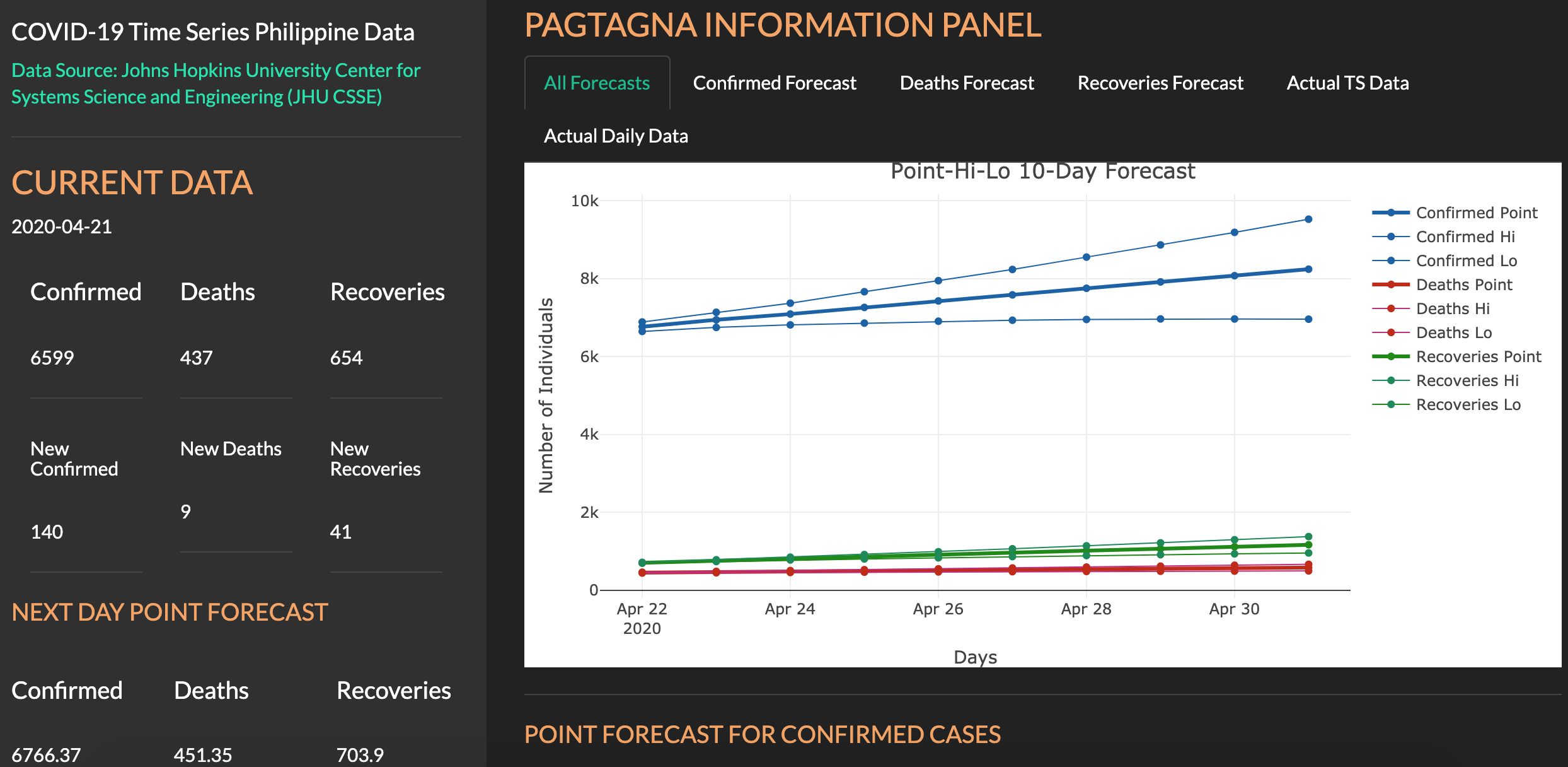
Developed by Jamal Kay Rogers and Yvonne Grace Arandela, this Shiny app provides a 5-day forecast of confirmed positive, deaths, and recoveries of COVID-19 cases in The Philippines.
The app also delivers graphical plots of a 10-day forecast and the daily and cumulated cases of COVID-19 in The Philippines. The data source is Johns Hopkins University Center for Systems Science and Engineering (JHU CSSE).
COVID-19 Case & Death Report Number Corrector

Developed by Matt Maciejewski, this Shiny app focuses on the correction of underreported Covid-19 case and death counts using a reference country based on Lachmann et al. (2020), and via a multiplicative estimator for total deaths and cases. The estimator will be turned into a posterior prediction once data becomes available.
The app is explained in more detail in this article and the code of the Shiny app can be found on GitHub.
Covid-19: the SPQEIR model
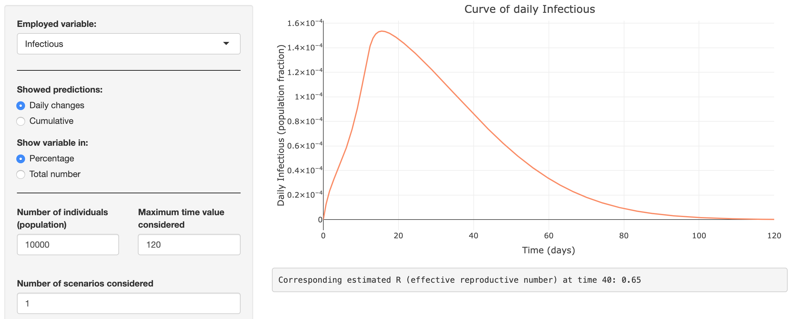
Developed by several researchers from the Luxembourg Centre for Systems Biomedicine (LCSB) of the University of Luxembourg, the KU Leuven and the UGent, this Shiny app uses the new SPQEIR model to simulate the impact of various suppression strategies (social distancing, lockdown, protection, etc.) on the development of COVID-19.
The Belgian Covid Cases Tracker
![]()
Developed by Patrick Sciortino, this Shiny app aims at estimating the curve of true Covid-19 cases based on the idea that a hospitalized case in time t informs us about an infection that took place a few days earlier.
COVID-19 monitor
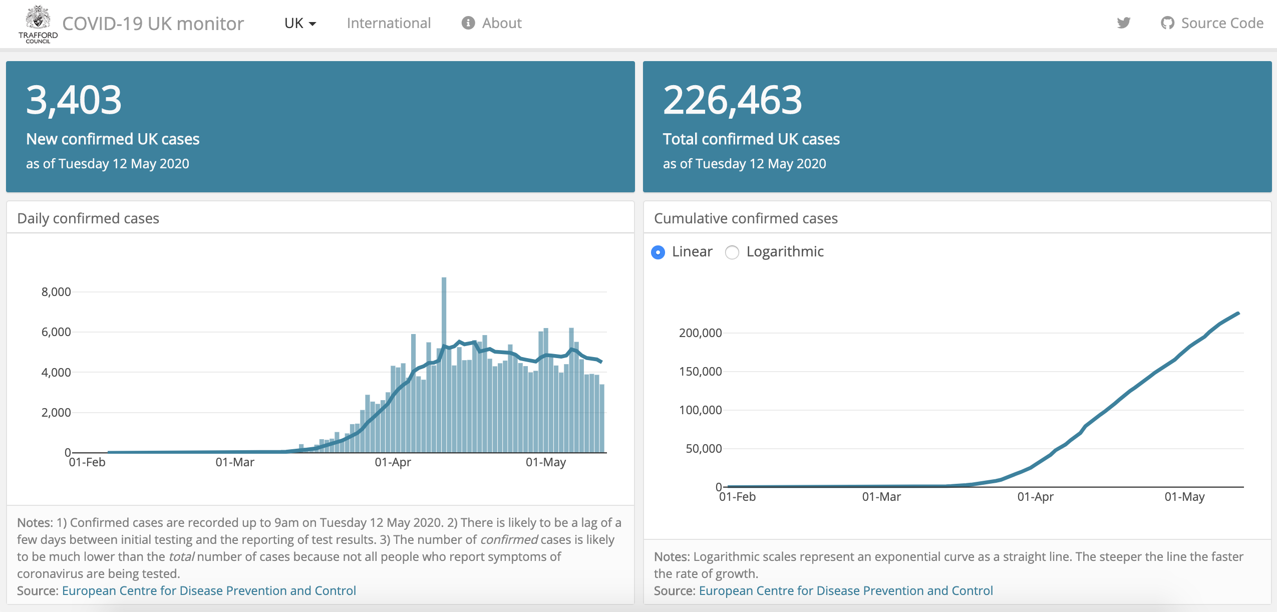
Developed by Trafford Data Lab, this Shiny app visualizes daily confirmed Coronavirus cases and deaths in the UK.
It uses the following data sources:
- European Centre for Disease Prevention and Control
- Public Health England
- Blavatnik School of Government, Oxford University
The code can be found on GitHub.
COVID-19 Bulletin Board
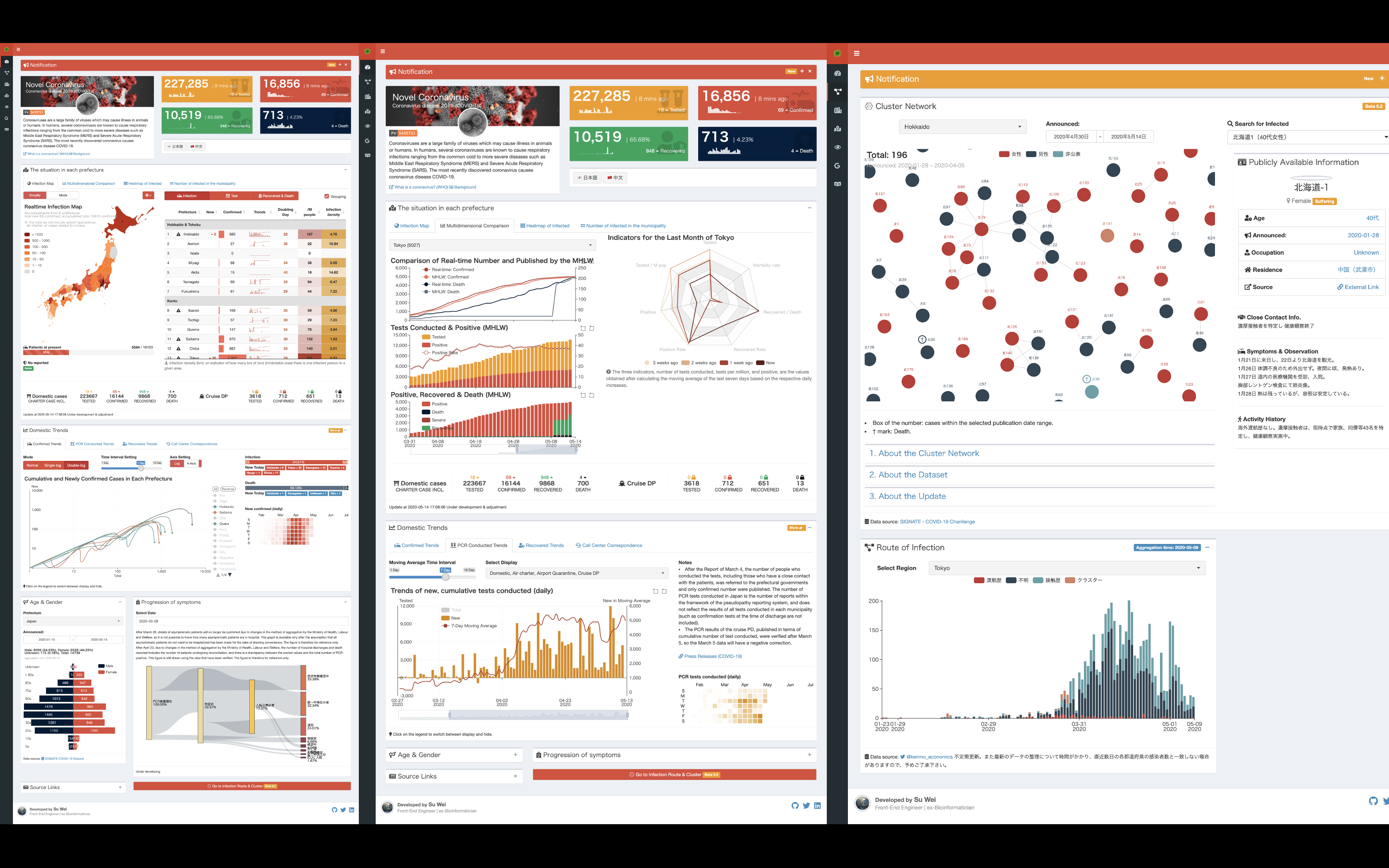
Developed by Wei Su, this dashboard shows real-time visualization of the COVID-19 epidemic in Japan. It mainly shows various indicators including, but not limited to, PCR test, positive confirmed, hospital discharge and death, as well as trends in each prefecture in Japan. There are also a variety of charts such as cluster network, new confirmed cases in log scale for users’ reference.
The dashboard is based on this Japanese version (developed by the same author). The code can be found on GitHub.
Covid-19 Statistics Displayer
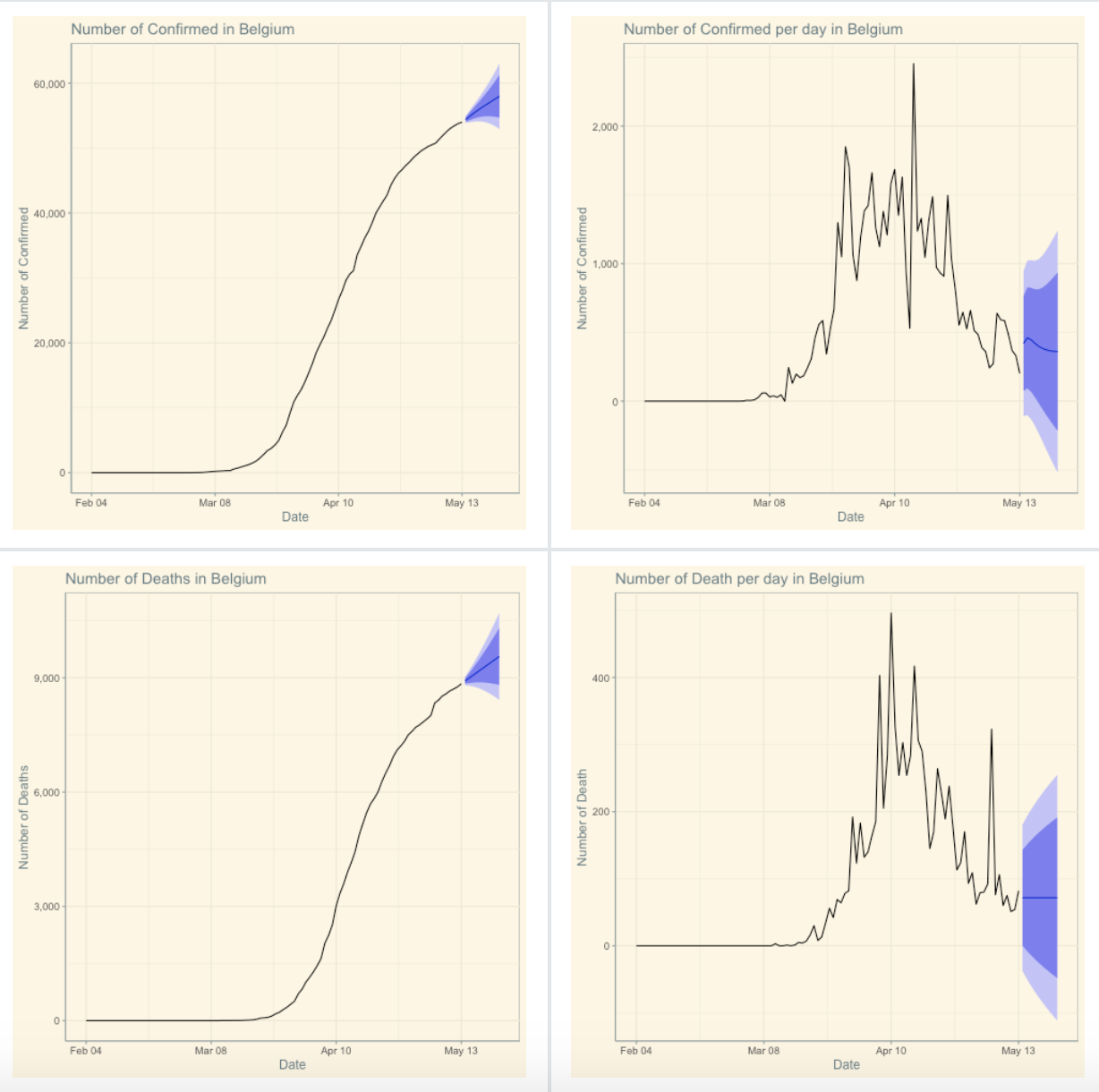
Created by Carl Sansfaçon, this Wordpress plugin associates R {ggplot2} graphics with ARIMA forecast and PHP coding to show evolution of the confirmed, death and recovered cases in different countries, states/provinces and US cities.
It uses data from the COVID-19 Data Repository by the Center for Systems Science and Engineering (CSSE) at Johns Hopkins University. The plugin can be installed as a Wordpress plugin.
CoronaMapper
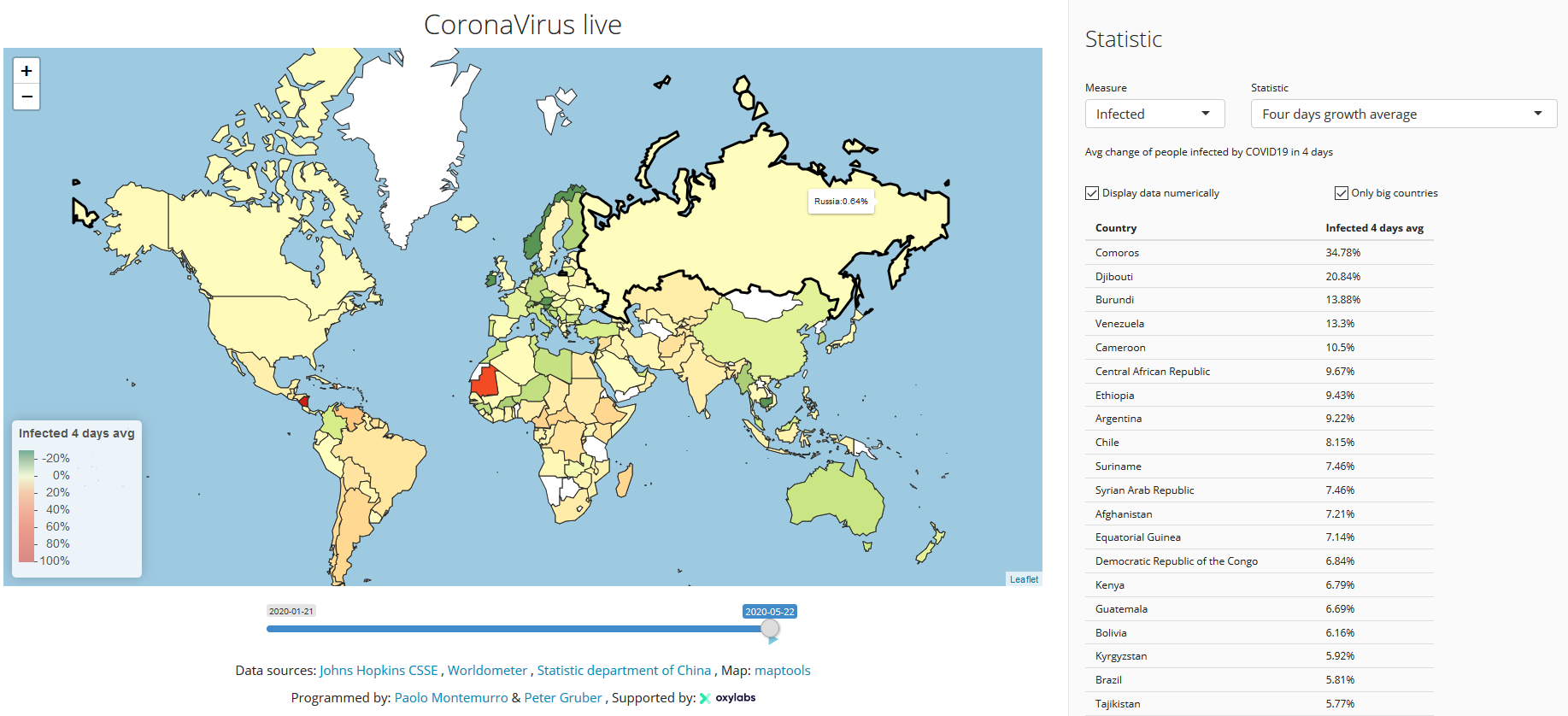
Supported by OxyLabs, created by Paolo Montemurro and Peter, this visualization displays the four days average growth indicator, which clearly shows how a certain statistic of the virus is evolving over time, filtering out the noise.
The website receives data each hour from several official data-sources, and visualizes the historical evolution of COVID19 in an intuitive & interactive way.
CoronaDash
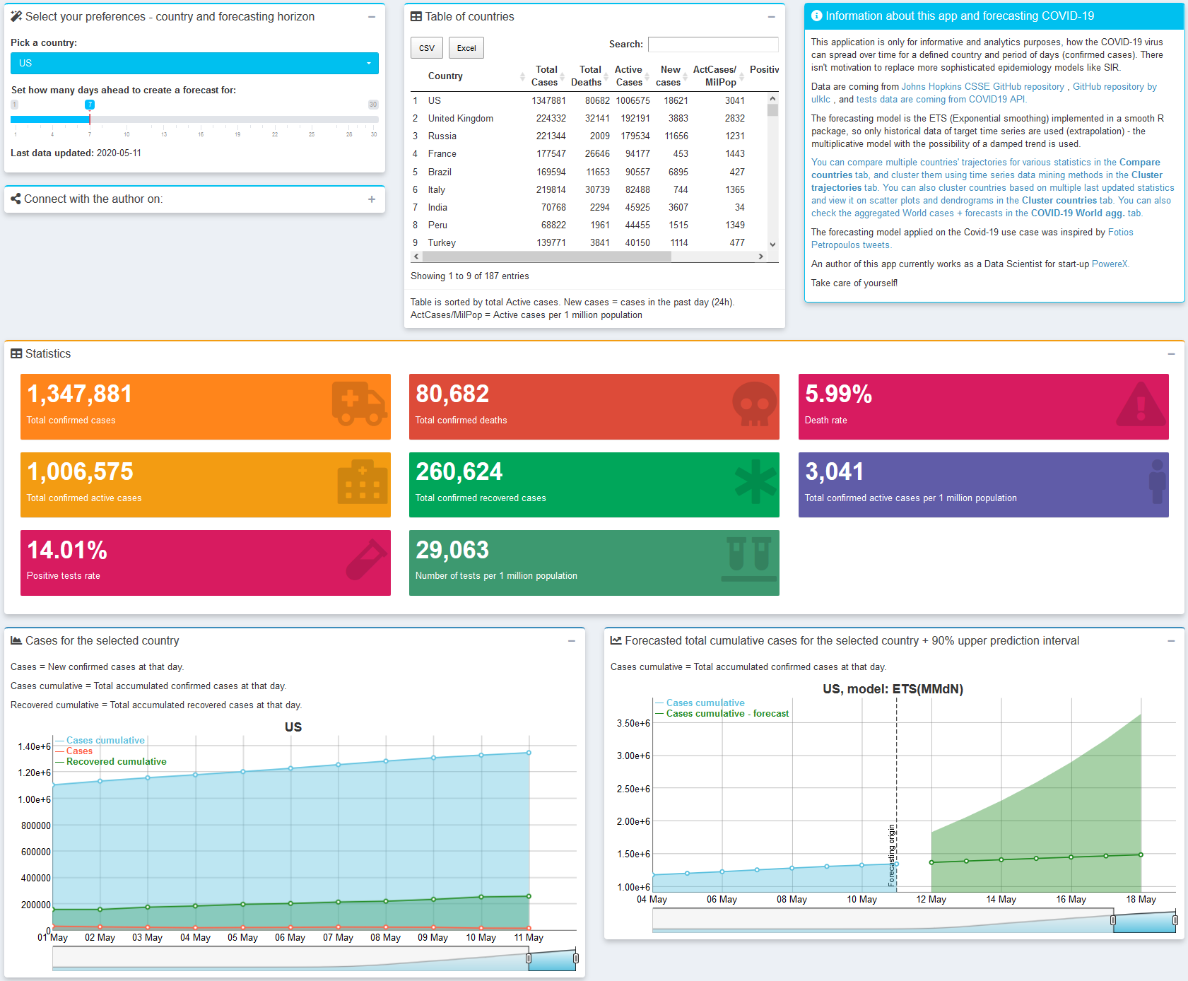
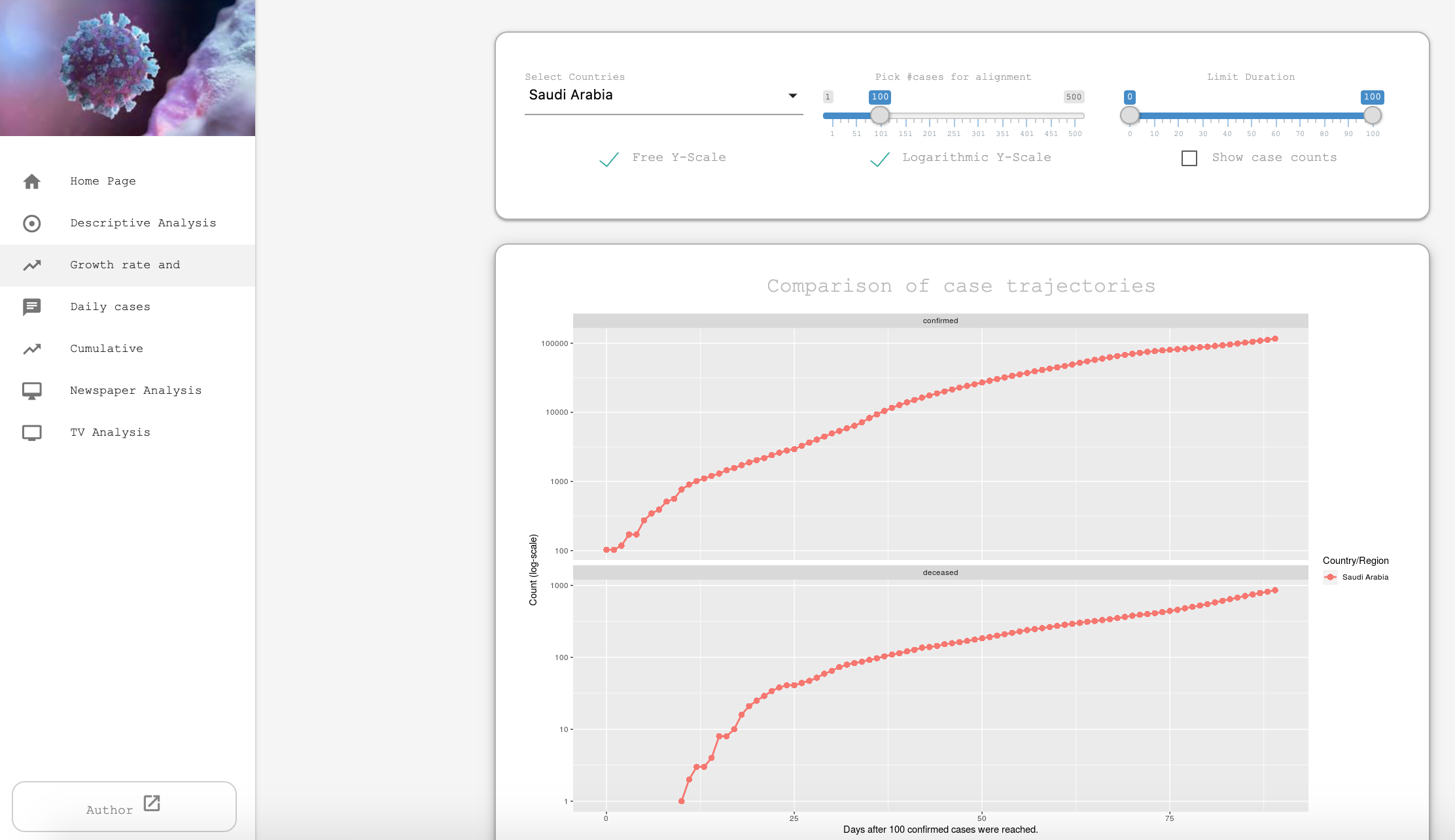
Developed by Peter Laurinec, this Shiny app provides various data mining and visualization techniques for comparing countries’ COVID-19 data statistics as:
- extrapolating total confirmed cases by exponential smoothing model,
- trajectories of cases/deaths spread,
- multidimensional clustering of countries’ data/ statistics - with dendrogram and table of clusters averages,
- aggregated views for the whole world,
- hierarchical clustering of countries’ trajectories based on DTW distance and preprocessing by SMA (+ normalization), for fast comparison of a large number of countries’ COVID-19 magnitudes and trends.
This blog post explained in further detail the last point of the above list. The code of the app is available on GitHub.
Covidfrance
Developed by Guillaume Pressiat, this Shiny app illustrates the evolution of number of hospitalizations, intensive care units, recoveries and deaths in France (by department).
This blog post presents the application and the code of the app is available on GitHub.
The Impact of COVID-19 on Mobility
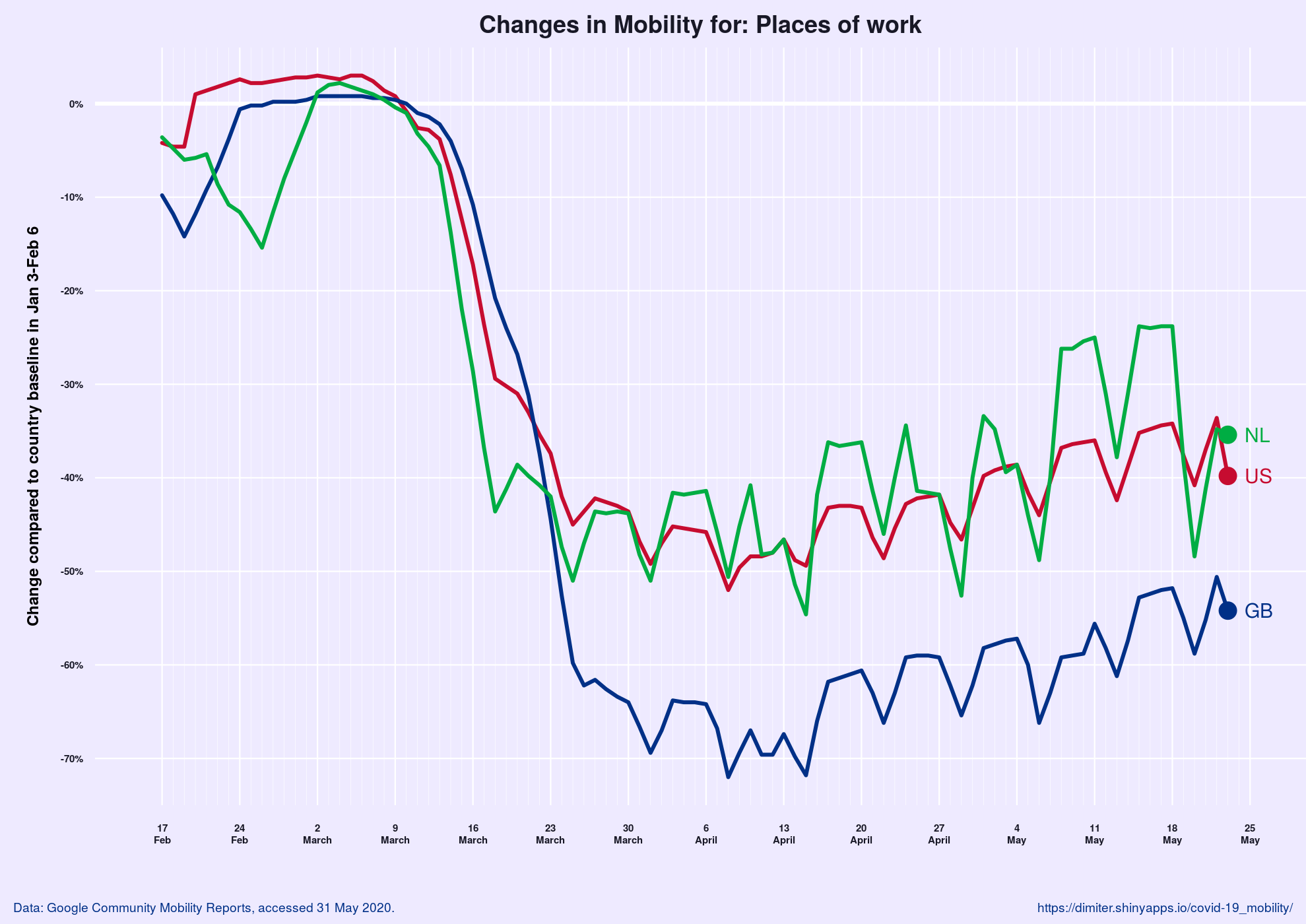
Developed by Dimiter Toshkov, this Shiny app shows relative changes in mobility (visits and length of stay) for a specific category of places within a country compared to a baseline. The baseline is computed as the median for the day of the week during the 5-week period between January 3 and February 6, 2020. Hence, the plot shows how mobility has changed relative to the situation in the same country in the beginning of the year.
The author also developed a version for the US states.
Data is from Google Community Mobility Reports.
COVID-19 Tracker
![]()
Developed by Dr. Magda Bucholc from Ulster University, this dashboard reports cases at the local government district in Northern Ireland and county level across the island of Ireland, providing gender and age breakdowns of reported cases, growth rates, and statistics per 100,000 of the population; it also has daily mobility data from Google and Apple.
More information about this dashboard can be found here.
COVID-19 Overview
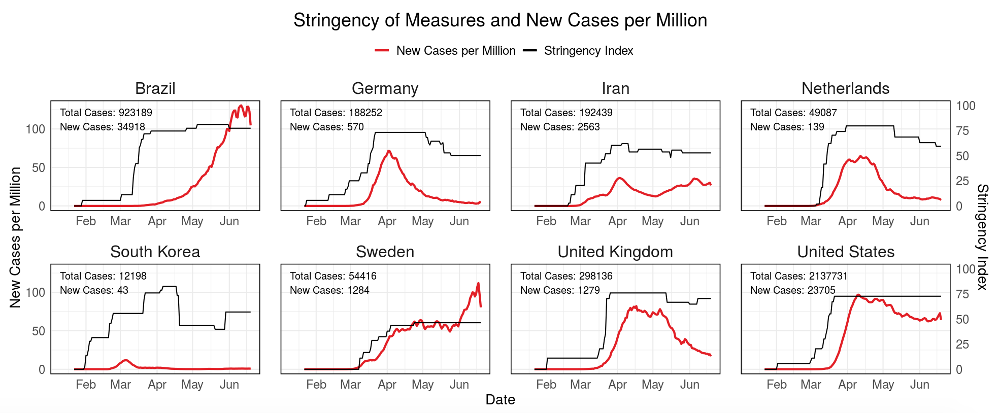
Developed by Fabian Dablander, Alexandra Rusu, Marcel Schreiner, and Aleksandar Tomasevic as part of the Science versus Corona project, this dashboard provides an overview of confirmed cases, deaths, and measures that countries have taken to curb the spread of the virus.
For a more information about this dashboard, see this blog post.
COVID-19 Exit Strategies
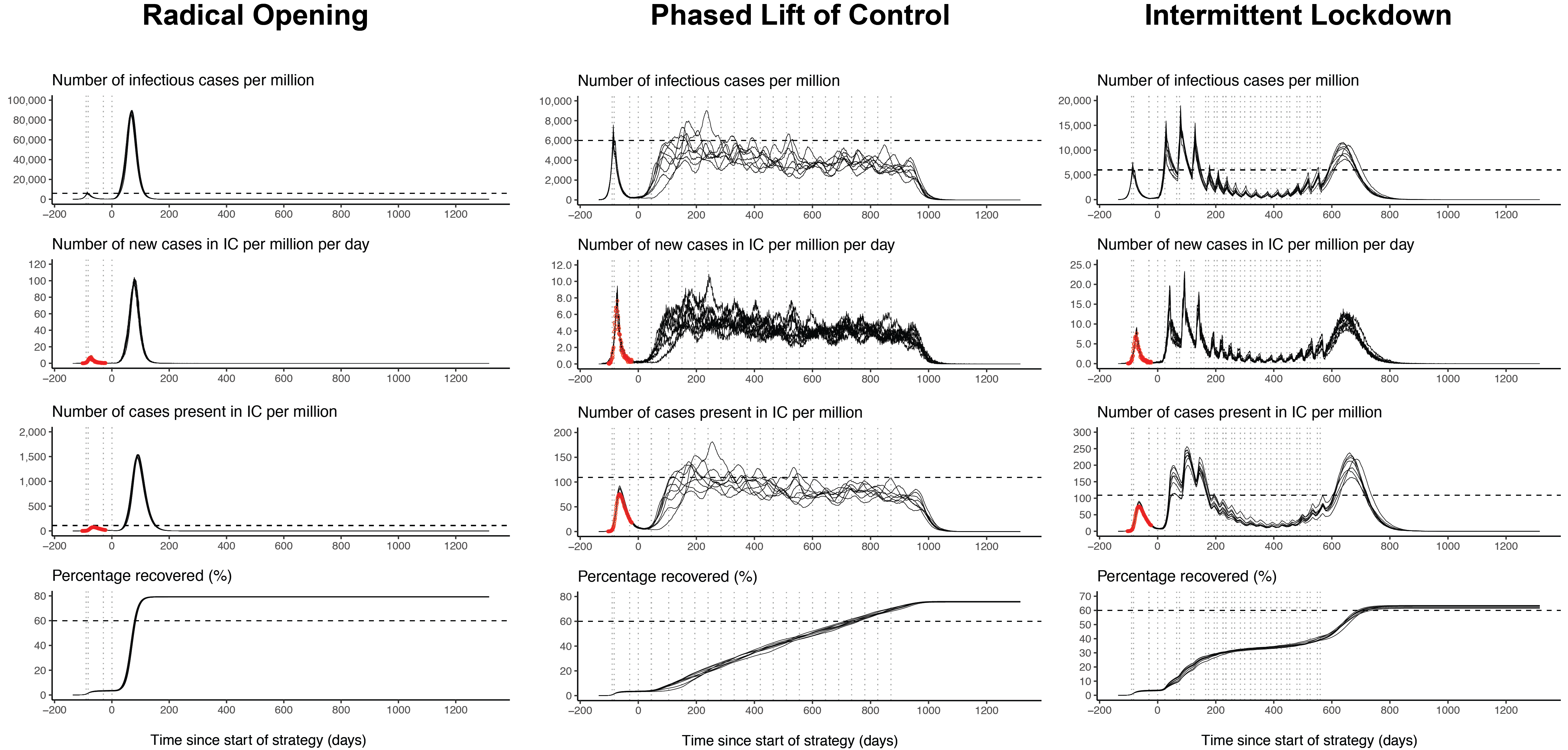
Developed as part of the Science versus Corona project, this Shiny app compares several alternative exit strategies that either aim to keep the number of infections as low as possible (e.g., contact tracing), or that aim to develop herd immunity without exceeding health care capacity.
The Shiny app is based on the stochastic individual-based SEIR model developed by de Vlas and Coffeng (2020). This post explains the Shiny app in more detail.
Corona Virus Statistics : COVID19
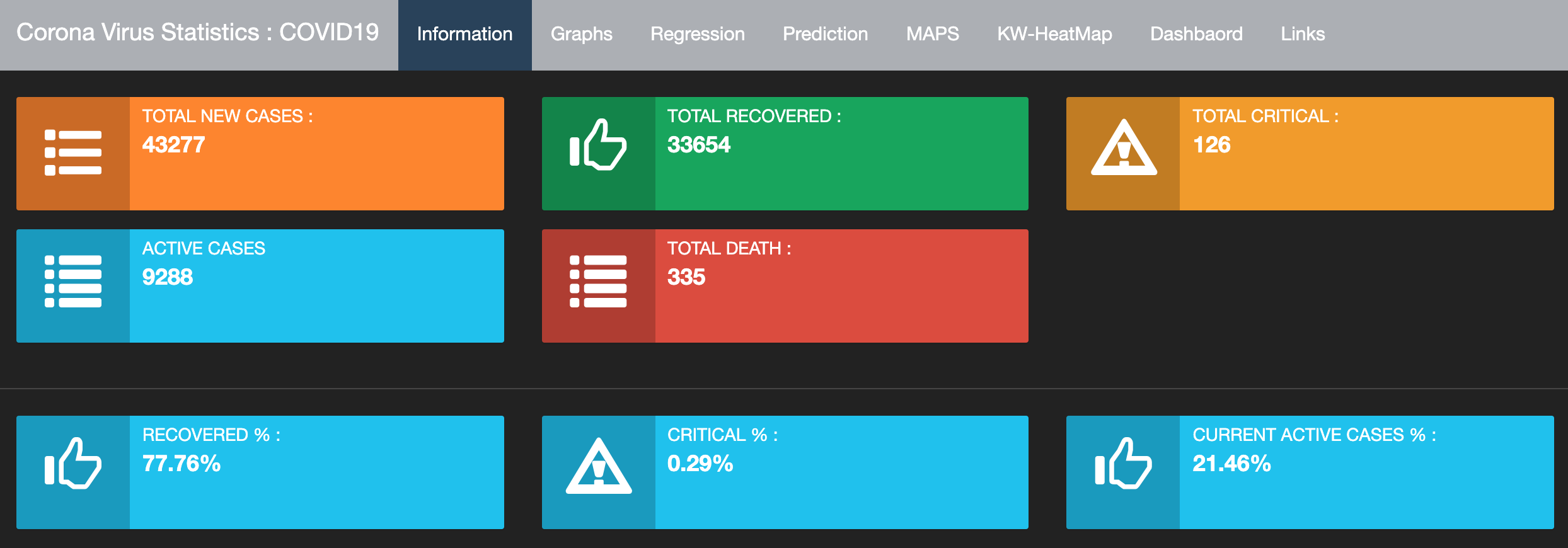
Developed by Dr. Mohammed N. Alenezi, this dashboard displays the latest information about Coronavirus for Kuwait, GCC, and the world. The dashboard contains a collection of different plots and models presented under 8 tabs.
Covid19 Data
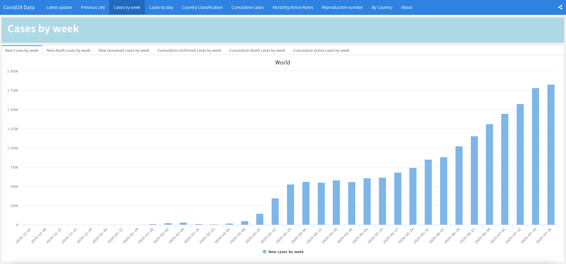
Developed by Dhafer Malouche, this dashboard presents statistics for more than 200 countries and regions, with the estimation of the reproduction number \(R(t)\) in the previous 60 days and a Covid19 country classification.
WHO COVID-19 Explorer
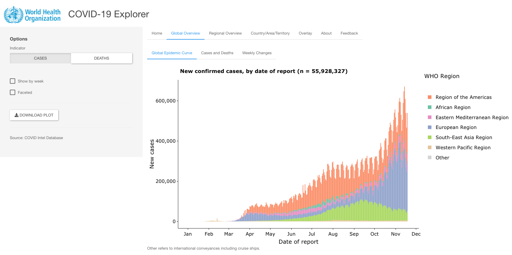
Developed by the World Health Organization (WHO), this Shiny app aims to provide frequently updated data visualizations about confirmed cases and deaths at the global, regional and country level.
COVID-19 Scenario Analysis Tool
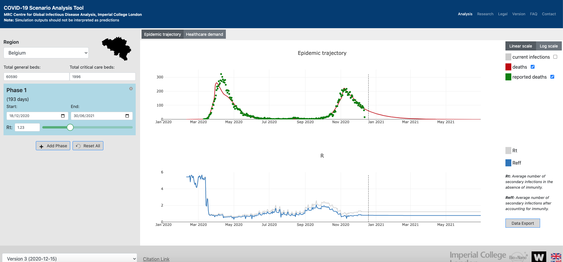
Developed by the MRC Centre for Global Infectious Disease Analysis (Imperial College London), this dashboard illustrates the epidemic trajectory, the healthcare demand and the \(R_t\) & \(R_{eff}\) measures for many countries over time in interactive plots.
The dashboard uses the squire R package, among others.
Covid-19 track

Developed by Redzuan, this Shiny dashboard analyses, combines and harmonizes the latest Covid-19 data into progress timeline, comparative analysis on various areas, mapping, latest news, forecasting using various models, prediction on Herd Immunity target, summary table, downloadable fact sheet and other features.
R packages
{nCov2019}
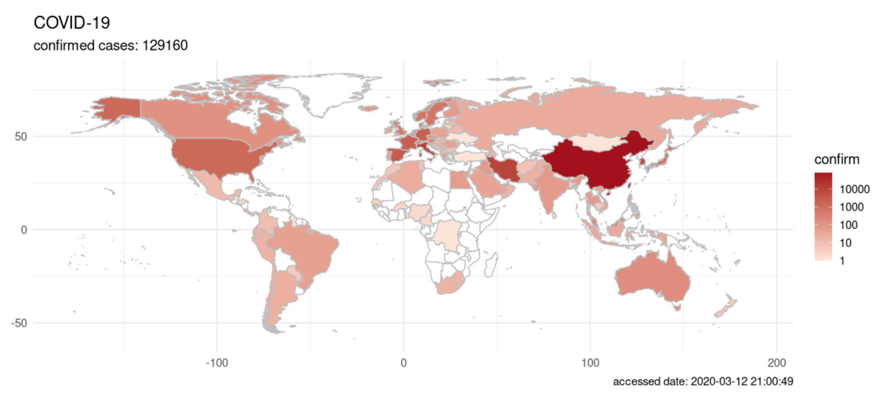
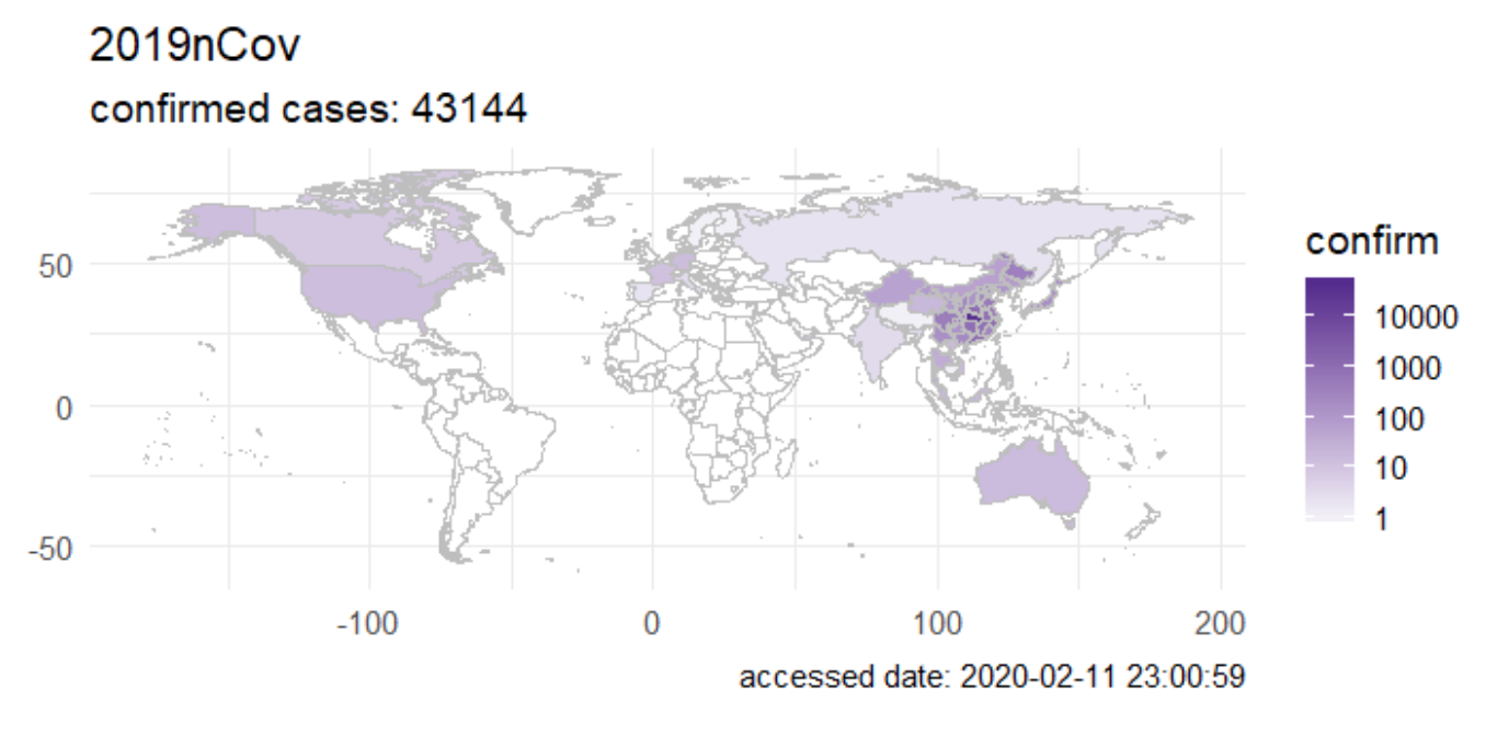
The {nCov2019} package gives you access to epidemiological data on the Coronavirus outbreak.1 The package gives real-time statistics, includes historical data and a Shiny app. The vignette explains the main functions and possibilities of the package.
Furthermore, the authors of the package also developed a website with interactive plots and time-series forecasts, which could be useful in informing the public and studying how the virus spread in populous countries.
{tidycovid19}
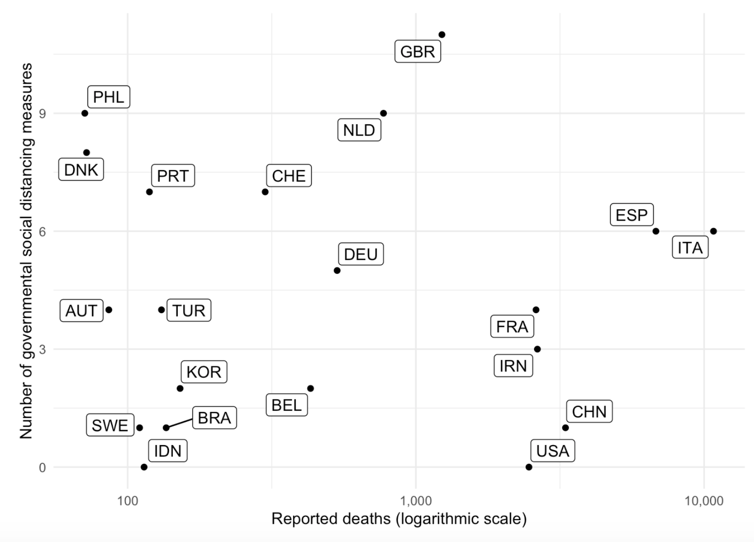
Developed by Joachim Gassen, the {tidycovid19} package allows you to download, tidy and visualize Covid-19 related data (including data on governmental measures) directly from authoritative sources. It also provides a flexible function and an accompanying Shiny app to visualize the spreading of the virus.
The package is available on GitHub and these blog posts here and here explain it in more detail.
R packages from R Epidemics Consortium
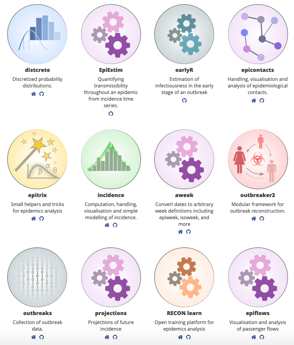
These R packages from R Epidemics Consortium allows you to find the most advanced tools used by professional epidemiologists and experts in the domain of analyzing disease outbreaks.
{covdata}

Published by Prof. Kieran Healy, the {covdata} package is a R package providing COVID-19 case data from multiple sources:
- National level data from the European Centers for Disease Control
- State-level data for the United States from the COVID Tracking Project
- State-level and county-level data for the United States from the New York Times
- Data from the US Centers for Disease Control’s Coronavirus Disease 2019 (COVID-19)-Associated Hospitalization Surveillance Network (COVID-NET)
- Data from Apple on relative trends in mobility in cities and countries since mid-January of 2020, based on usage of their Maps application
- Data from Google on relative trends in mobility in regions and countries since mid-January of 2020, based on location and activity information
The code is available on GitHub.
{covid19italy}
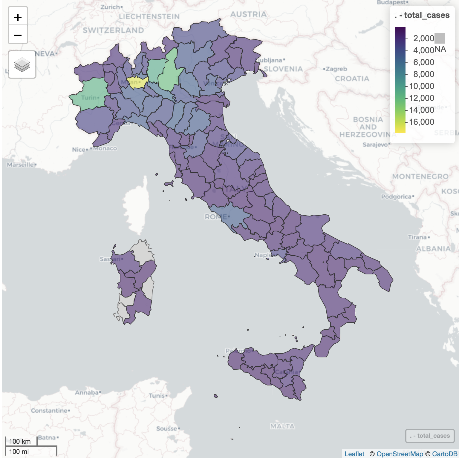
The covid19italy R package provides a tidy format dataset of the 2019 Novel Coronavirus COVID-19 (2019-nCoV) pandemic outbreak in Italy. The package includes the following three datasets:
italy_total: daily summary of the outbreak on the national levelitaly_region: daily summary of the outbreak on the region levelitaly_province: daily summary of the outbreak on the province level
More information about the package datasets available in this vignette, this blog post, and this supporting dashboard.
Data source: Italy Department of Civil Protection
{COVID19}

The goal of COVID-19 Data Hub is to provide the research community with a unified data hub by collecting worldwide fine-grained case data, merged with exogenous variables helpful for a better understanding of COVID-19. Featured by the University of Milano and funded by the Institute for Data Valorization IVADO, Canada.
The package collects COVID-19 data across governmental sources, includes policy measures from Oxford COVID-19 Government Response Tracker, and extends the dataset via an interface to World Bank Open Data, Google Mobility Reports and Apple Mobility Reports.
The package is available on CRAN, it is 100% open source and external contributors are welcomed to join.
{COVOID}

COVOID (for COVID-19 Open-source Infection Dynamics project) is a R package for modelling COVID-19 and other infectious diseases using deterministic compartmental models (DCMs).
It contains a built-in Shiny app enabling easy use and demonstration of key concepts to those without R programming backgrounds, along with an expanding API for simulating and estimating homogeneous and age-structured SIR, SEIR and extended models. In particular COVOID allows the simultaneous simulation of age specific (e.g. school closures) and general interventions over varying time intervals.
The code is available on GitHub.
{cdccovidview}
![]()
Published by Bob Rudis, the {cdccovidview} package can be used to work with the U.S. CDC’s New COVID-19 Trackers: COVIDView and COVID-NET.
{babsim.hospital}
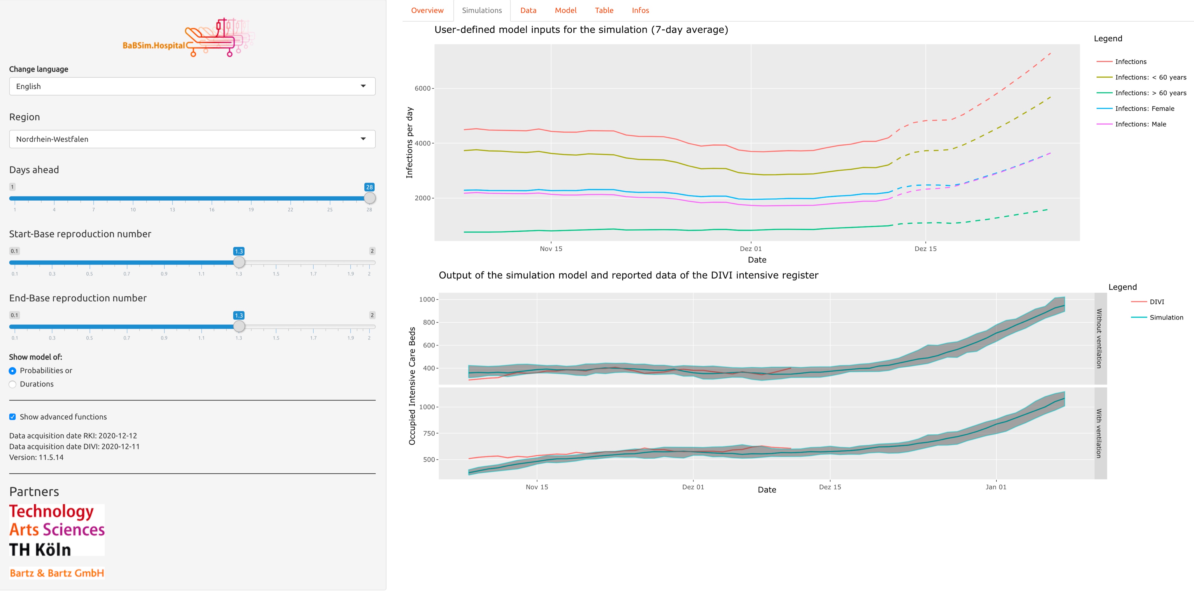
Published by several researchers from TH Köln, the {babsim.hospital} package implements a discrete-event simulation model for a hospital resource planning problem. It can be used by health departments to forecast demand for intensive care beds, ventilators, and staff resources.
The team also developed a Shiny app which predicts COVID-19 ICU bed resources in hospitals. The app is available in English and German.
{EpiLPS}
Published by several researchers working in the field of epidemiology, the package shows how to smooth epidemic curves and estimate the time-varying reproduction number in a flexible way.
More information can be found in:
- the research paper,
- the accompanying website, and
- this summary written by one of the authors.
R code and blog posts
Analyzing COVID-19 outbreak data with R
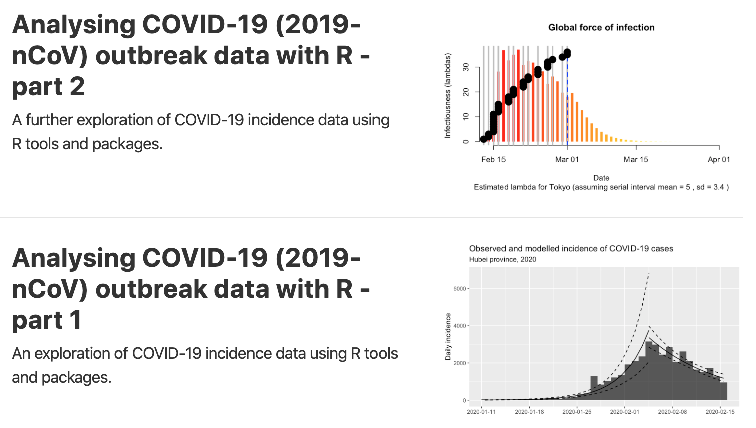
Written by Tim Churches, these two articles (part 1 and part 2) explore the R tools and packages that might be used to analyze the COVID-19 data. In particular, the author considers when the pandemic will subside in China, and then turns the analysis on Japan, South Korea, Italy and Iran. He also shows improvements on the cumulative incidence plots that are so common. Moreover, he presents R code to analyze how contagious is the Coronavirus thanks to the classic SIR (Susceptible-Infectious-Recovered) compartmental model of communicable disease outbreaks.2
The code is available on GitHub (part 1 and part 2).
Part 1 is actually based on another shorter blog post by Prof. Dr. Holger K. von Jouanne-Diedrich from Learning Machines. Read his article for a more concise analysis on how to model the outbreak of the Coronavirus and discover how contagious it is. Note that I have personally written an article analyzing COVID-19 in Belgium based on articles from these two authors.
More recently, Tim Churches published a series of other interesting articles:
- Modelling the effect of various public health interventions on the local epidemic spread of COVID-19 infection using stochastic individual compartmental models (ICMs) implemented by the
{EpiModel}package for R: - The use of simulations to explore the effects of various interventions on COVID-19 spread
- COVID-19 epidemiology with R: in this blog post, the author, using relatively early and partial US data, separates out inbound from community cases, and predicts the next few weeks of incident numbers. He also highlights several R functions to analyze a disease outbreak.
- We can “shrink” the COVID-19 curve, rather than just flatten it (in collaboration with Louisa Jorm)
COVID-19 Data Analysis with {tidyverse} and {ggplot2}
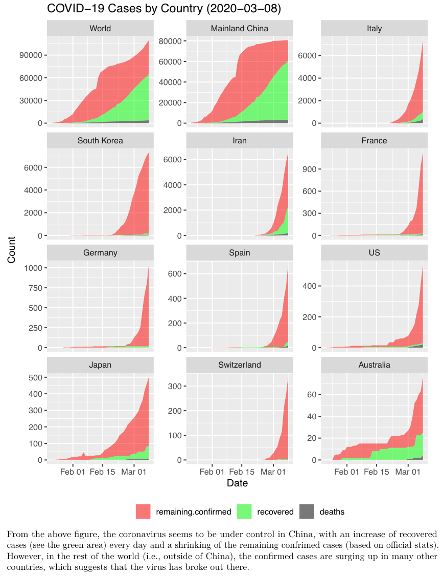
Dr. Yanchang Zhao from RDataMining published a data analysis around the Coronavirus with the {tidyverse} and {ggplot2} packages, for China and world wide.
Both documents are a mix of data cleaning, data processing and visualizations of the confirmed/cured cases and death rates across countries or regions.
COVID-19 cumulative observed case fatality rate over time
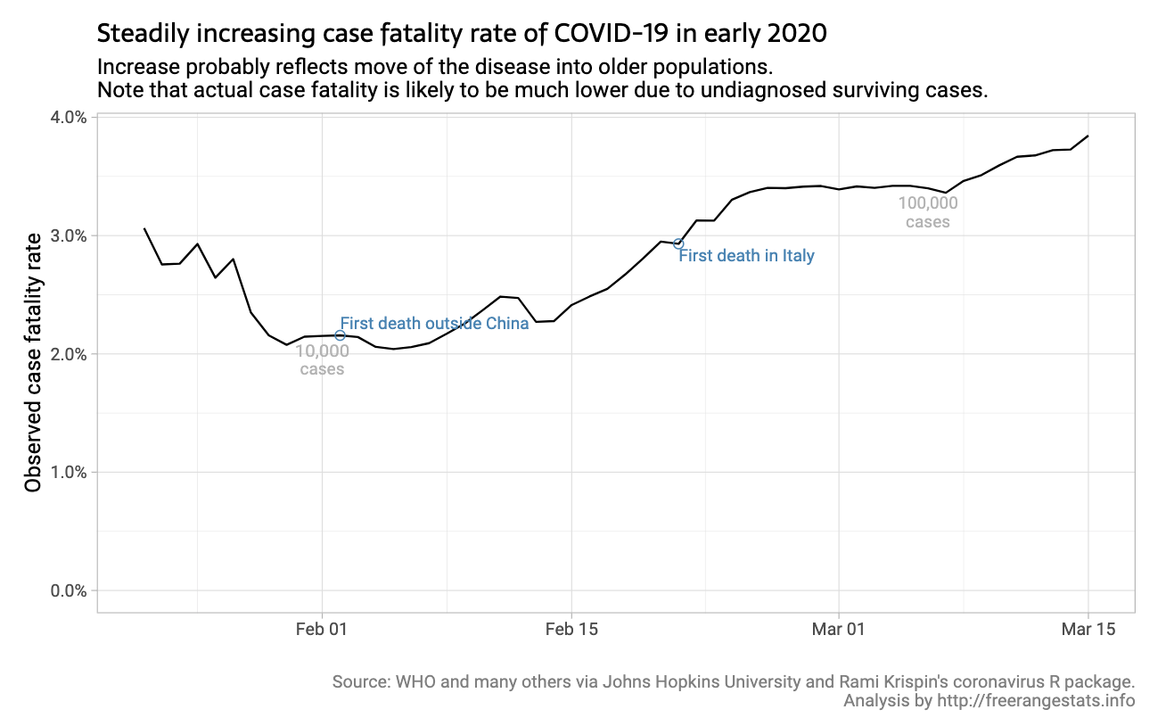
Written by Peter Ellis, this article focuses on how the observed case fatality rate of COVID-19 has evolved over time across 7 countries and comments on why the rates vary (low testing rates, age of the population, overwhelmed hospitals, etc.).
The code is available at the end of the article. The data is from John Hopkins and it uses the {coronavirus} package.
More recently, the author published a series of other articles:
- Impact of a country’s age breakdown on COVID-19 case fatality rate: it looks at estimated fatalities in different countries according to the age distributions in those countries (based on Italy’s data). The data is from The Istituto Superiore di Sanità (Roma) and all the code is shown in the post.
- How to make that crazy Fox News y axis chart with ggplot2 and scales: less about COVID19 than about how a bizarre Fox News graph can be re-created with the correct transformations needed to make its scale appropriate.
- Test positivity rates and actual incidence and growth of diseases: this blog post looks at several different ways of accounting for the information given to us by high positive testing rates for COVID-19 and looks at the impact on estimates of effective reproduction number at a point in time.
- Incidence of COVID-19 in Texas after adjusting for test positivity: the author examines the trends in COVID-19 cases in Texas, with and without being adjusted by a multiplier of the square root of the test positivity rate.
Covid 19 Tracking
![]()
Written by Prof. Kieran Healy, this article discusses how to get an overview of best-available counts of deaths, using the COVID-19 Data from the European Centers for Disease Control.
Code can be found in the article and on GitHub.
More recently, the author published three other articles:
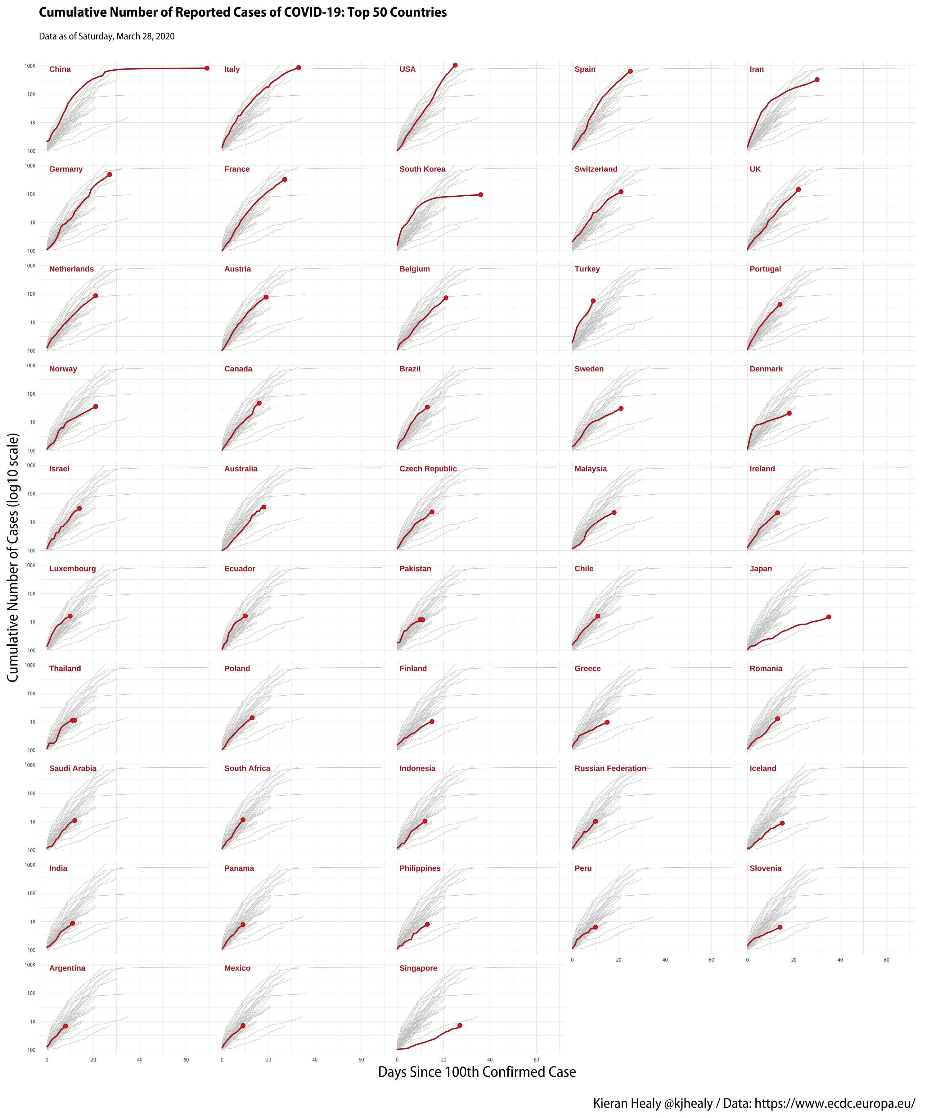
- A COVID Small Multiple: this article discusses how to create a small-multiple plot of cases by country, showing the trajectory of the outbreak for a large number of countries, with the background of each small-multiple panel also showing (in grey) the trajectory of every other country for comparison.
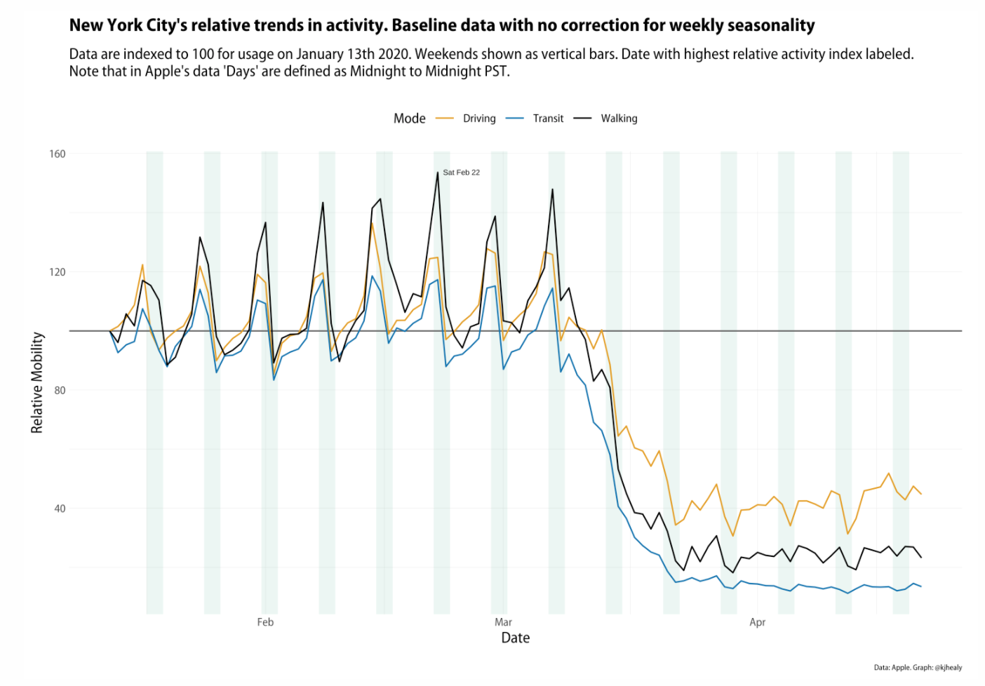
- Apple’s COVID Mobility Data: this article uses Apple’s time series mobility data for several cities and countries (via the
{covdata}package) to plot three modes of getting around: driving, public transit, and walking. The series begins on January 13th indexed to 100 at the beginning of the series, so trends are relative to that baseline.
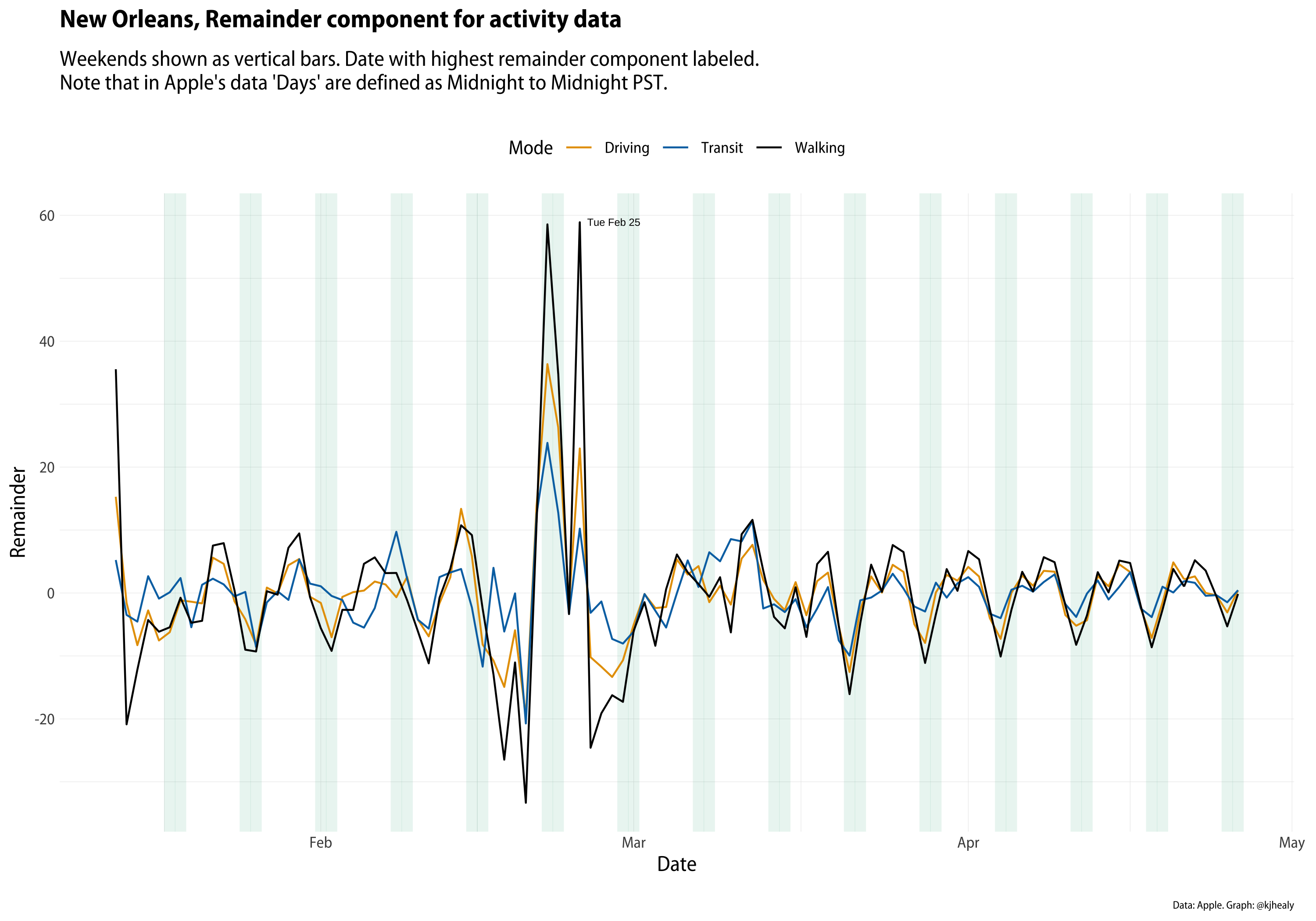
- New Orleans and Normalization: this article responds to a thoughtful post by Dr. Drang regarding an improvement in normalization of the data.
Infectious diseases and nonlinear differential equations
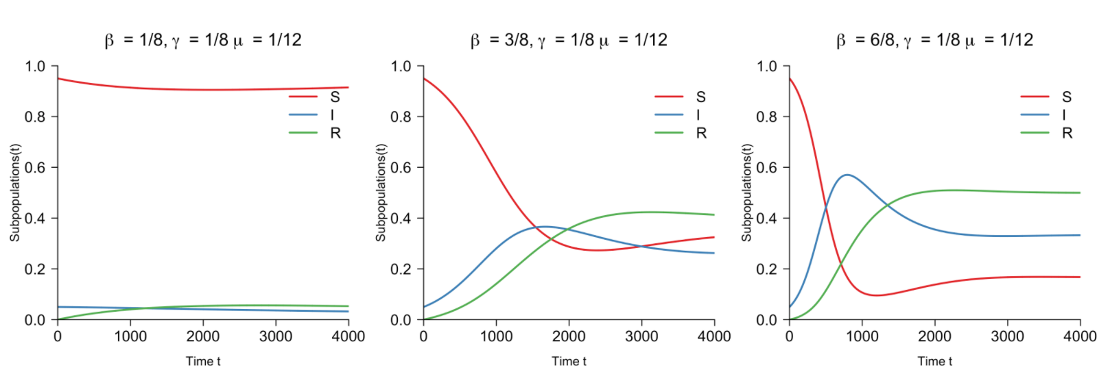
Published by Fabian Dablander, this math intensive blog post explains what SIR and SIRS models take into account and how they calculate their results.
From a pandemic perspective, the author writes “The SIRS model extends the SIR model, allowing the recovered population to become susceptible again (hence the extra ‘S’). It assumes that the susceptible population increases proportional to the recovered population”.
More recently, the author, in collaboration with other researchers, published another blog post outlining a number of excellent visualizations of the COVID19 pandemic, as well as presenting their own dashboard.
Epidemic modelling of COVID-19 in the UK using an SIR model
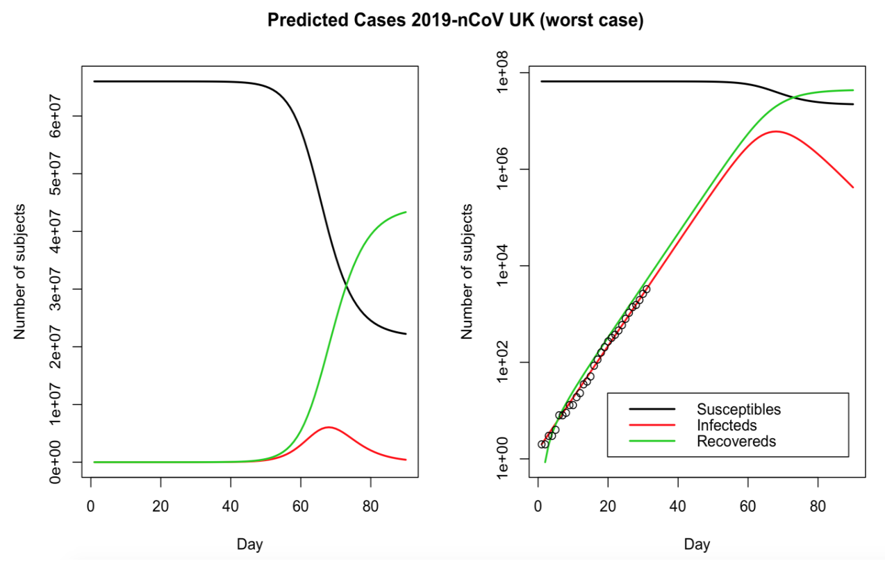
Published by Thomas Wilding, this blog post applies the SIR model to UK data.
As further extensions to the model, the author suggests:
- Using an SEIR model (adding an Exposed compartment for people who are infected but not yet infectious)
- Adding a “Q” layer since a lot of people are being Quarantined or isolated
- Considering the “hidden”” population that is infected but is denied being tested due to shortage of tests
- Feasibility of a second wave / outbreak of the epidemic later in the year (as seen in previous outbreaks, such as Swine Flu)
Data sources:
Modeling Pandemics
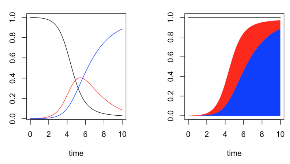
Published by Arthur Charpentier, this series of 3 blog post (part 1, part 2, part 3) walks through the SIR model and its parameters, how ODEquations solves it, and generating the reproductive rate. It also gives a mathematical explanation of a model for how quickly a pandemic will return, albeit with diminishing intensity. Last, it explains a model that is more sophisticated than SIR, the SEIR model, and illustrates it with Ebola data.
More recently, the author published another article which examines what proportion of the population in various U.S. states have been tested for the novel Coronavirus and tries to answer the following two questions:
- How many people are tested on a daily basis?
- What are we actually testing for?
Last but not least, this post reproduces one of his scientific paper entitled “COVID-19 pandemic control: balancing detection policy and lockdown intervention under ICU sustainability”.
COVID-19: The Case of Germany
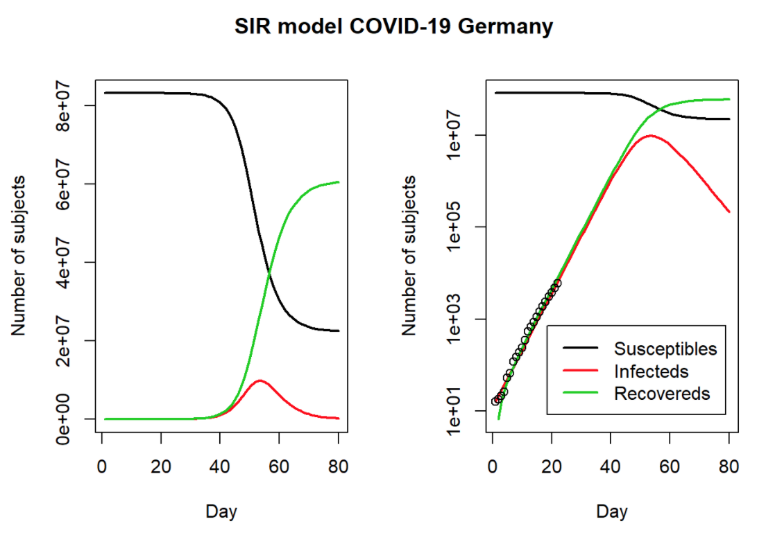
Published by Prof. Dr. Holger K. von Jouanne-Diedrich from Learning Machines, this blog post uses the SIR model and German data to estimate the duration and severity of the pandemic.
Download the data from Morgenpost.
More recently, the author published other articles:
- COVID-19 in the US: Back-of-the-Envelope Calculation of Actual Infections and Future Deaths: Working back from reported deaths from Covid19, the post shows how to estimate infections at a prior date, based on several assumptions about fatality rates and infected periods (and acknowledging many unknowns and data problems).
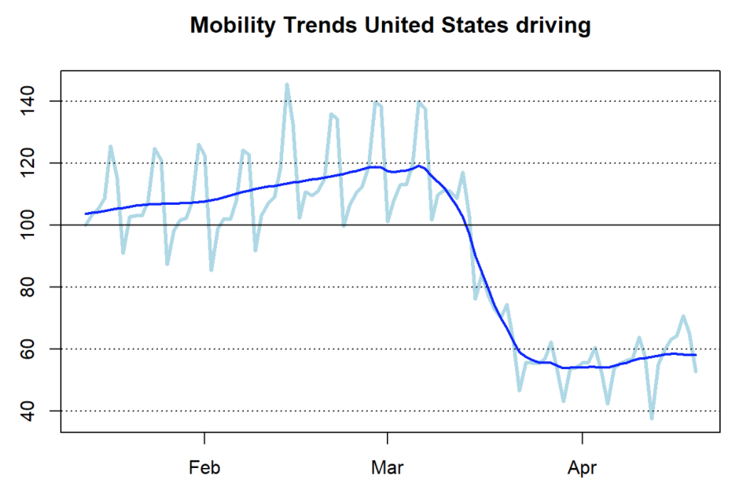
- How to analyze mobility trends with R using anonymized and aggregated Apple’s mobility data available to the public. The article presents a R function to return the data in a well-structured format for countries and major cities, and to visualize the drop in vehicular and pedestrian movement caused by the pandemic.
- COVID-19: False Positive Alarm, demonstrating the importance of infection rates on the likelihood that someone testing positive for the Coronavirus is actually positive.
Flatten the COVID-19 Curve
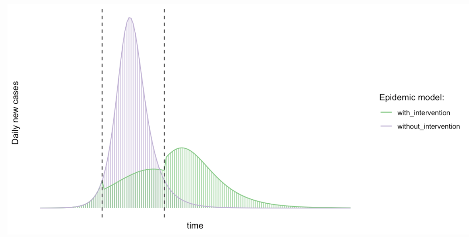
Published by Michael Höhle from Theory meets practice, this blog post discusses why the message of flattening the COVID-19 curve is right, but why some of the visualizations used to show the effect are wrong: Reducing the basic reproduction number does not just stretch the outbreak, it also reduces the final size of the outbreak.
From a pandemic point of view, the author writes “Because of limited health capacities, stretching out the outbreak over a longer time period will ensure, that a larger proportion of those in need of hospital treatment will actually get it. Other advantages of this approach are to win time in order to find better treatment forms and, possibly, to eventually develop a vaccine”.
A Shiny app has also been built upon this article to investigate different scenarios.
In a second article entitled “Effective reproduction number estimation”, Michael Höhle estimates with the {R0} package the time-varying effective reproduction number during an infectious disease outbreak such as COVID-19. Using a single simulated outbreak he compares the performance of three different estimation methods.
More recently, in this article the author looks at “superspreading” in infectious disease transmission from a statistical point of view. He characterises heterogeneity in the offspring distribution [who becomes infected by the superspreader person] by the Gini coefficient instead of the usual dispersion parameter of the negative binomial distribution. This allows us to consider more flexible offspring distributions.
Flattening vs shrinking: the math of #FlattenTheCurve
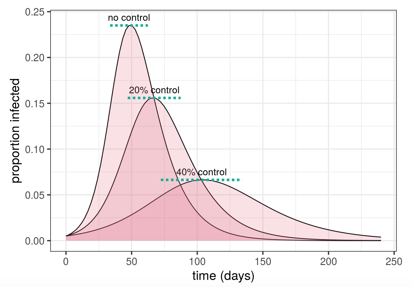
Published by Ben Bolker and Jonathan Dushoff, this blog post gives a clear explanation of physical distancing and explains how physical distancing makes several beneficial outcomes possible.
The code is available on GitHub.
explainCovid19 challenge
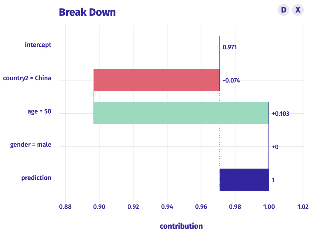
Published by Przemyslaw Biecek, this blog post gives an overview of a model that uses gradient boosting to predict survival based on age, country, and gender. It also shows how older people are more at risk and it lets you play with the model yourself with a modelStudio interactive dashboard.
Data sources:
- Google sheet (with most recent data at the end of February)
- Kaggle dataset
COVID-19: The Case of Spain
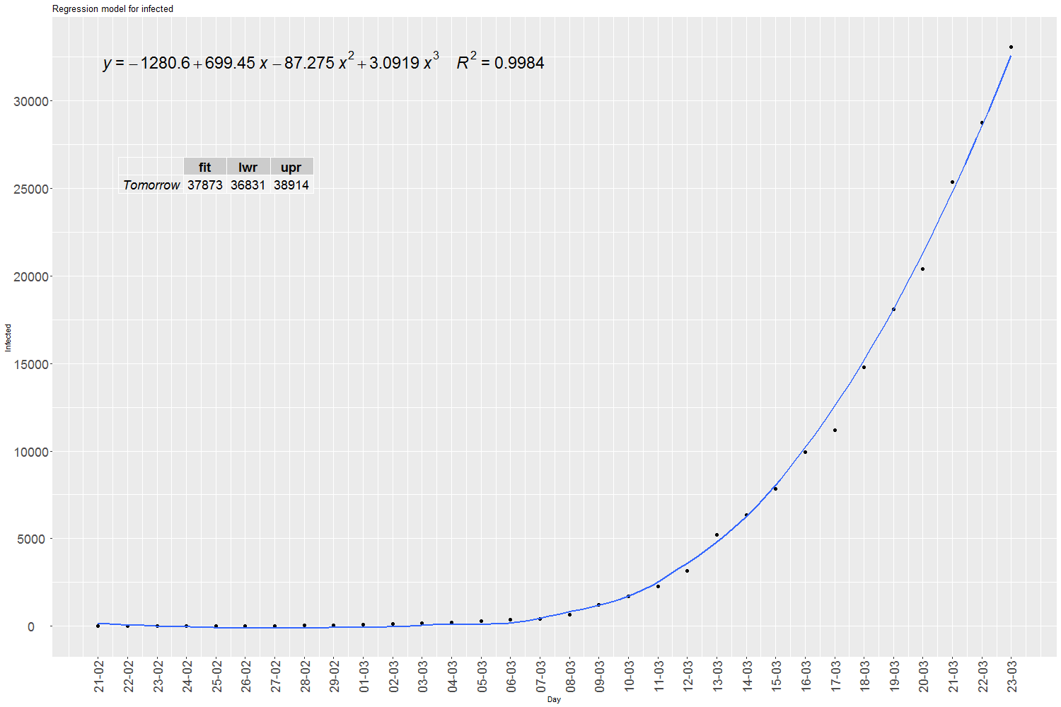
Written by Jose from Diarium - Statistics and R software, this blog post, using data for Spain, applies the SIR model, and then a cubic polynomial regression model to predict infections, hospitalizations, deaths and peak date.
Tidying the new Johns Hopkins Covid-19 time-series datasets
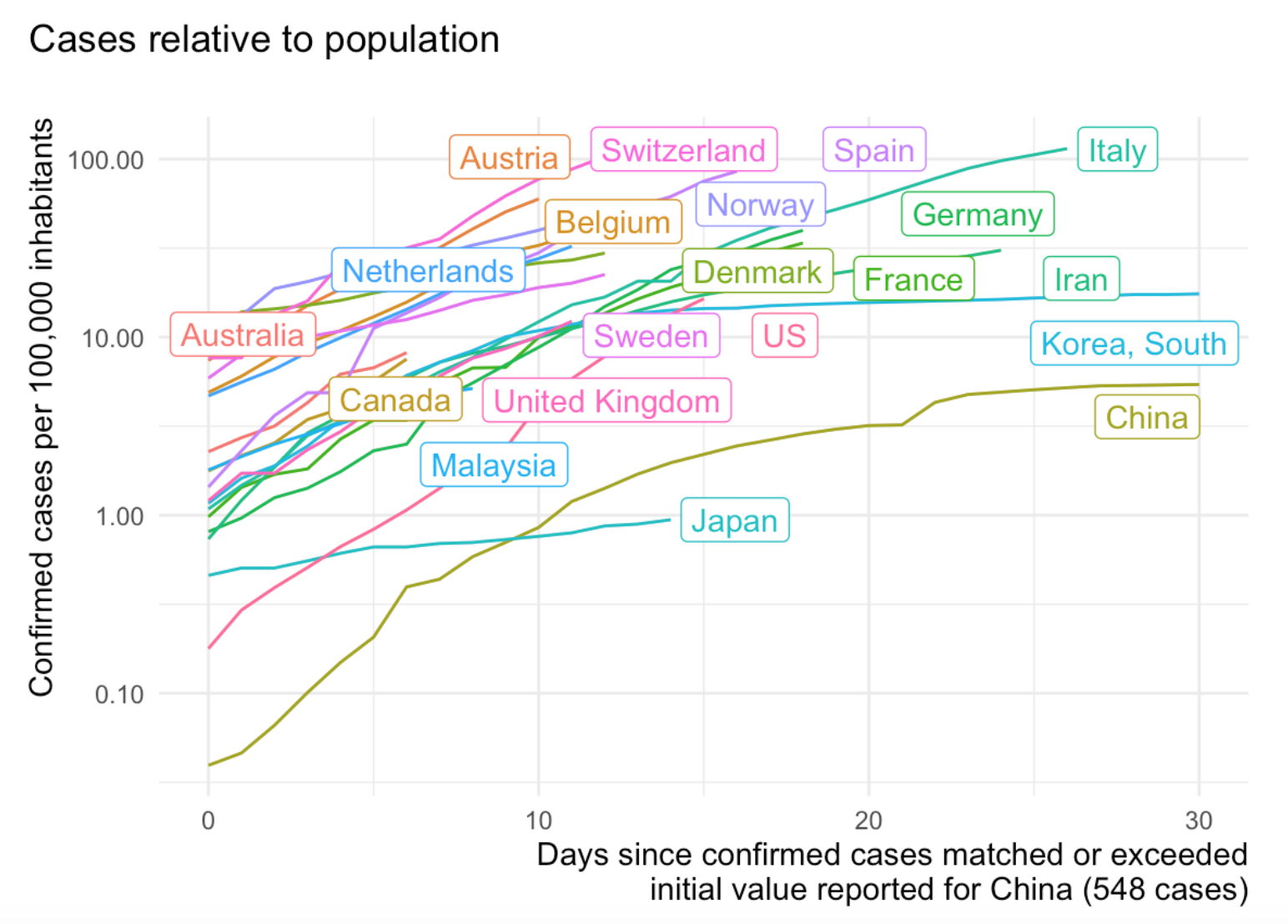
Written by Joachim Gassen, this blog post provides functions and code to deal with different country names and changes on the Johns Hopkins site.
More recently, the author published a series of other interesting articles:
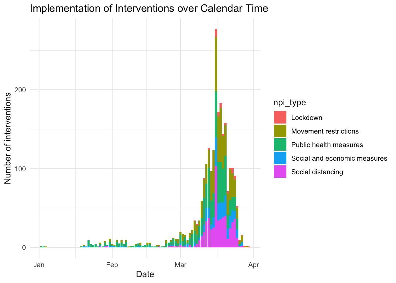
- Merge Covid-19 Data with Governmental Interventions Data: this article analyzes five kinds of intervention on the spread of COVID-19.
- Scraping Google Covid-19 community movement data from PDF figures: this article explains how to scrape data from a Google site that tracks movements of people. The author uses the
{tidycovid19}R package and prepares an analysis of Germany and then across countries.
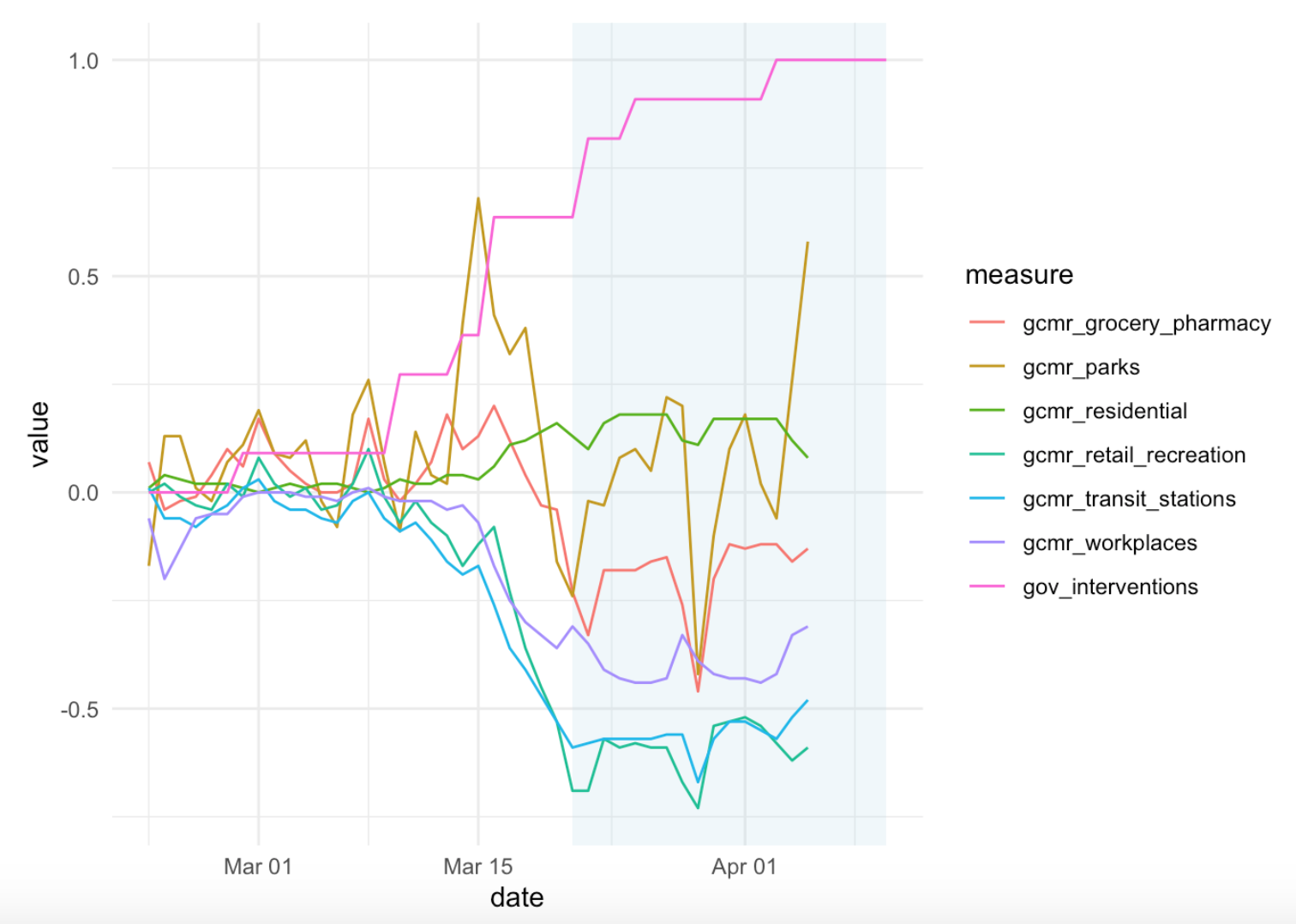
- Covid-19: Explore Your Visualizer Degrees of Freedom: in this article, the author uses COVID-19 data to demonstrate how graphs can communicate very differently, and be manipulated. He shows that getting a ‘neutral’ message to the reader is far from trivial and that visualizations without guidance can be particularly misleading.
- {tidycovid19} New data and documentation: A recent update to the {tidycovid19} package brings data on testing, alternative case data, some regional data and proper data documentation. Using all this, you can use the package to explore the associations of (the lifting of) governmental measures, citizen behavior and the Covid-19 spread.
- Exploring and Benchmarking Oxford Government Response Data: A post assessing the impact of non-pharmaceutical interventions on the spread of Covid-19 based on the Assessment Capacities Project (ACAPS) and the Oxford Covid-19 Government Response Tracker.
COVID-19 in Belgium
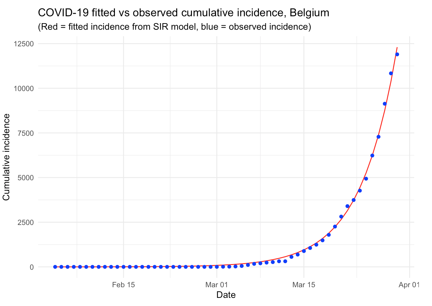
Based on Tim Churches’ article, I published an analysis of the COVID-19 specifically for Belgium. In this article, I also use the most common epidemiological model, the SIR model (to its simplest form), to analyze the outbreak of the disease in the case where there would be no public health intervention. I also show how to compute the reproduction number and I present some additional improvements that can be made to further analyze the epidemic.
The code is available on GitHub, so feel free to use it as starting point for an analysis of the virus outbreak in your own country.
Contagiousness of COVID-19 Part I: Improvements of Mathematical Fitting
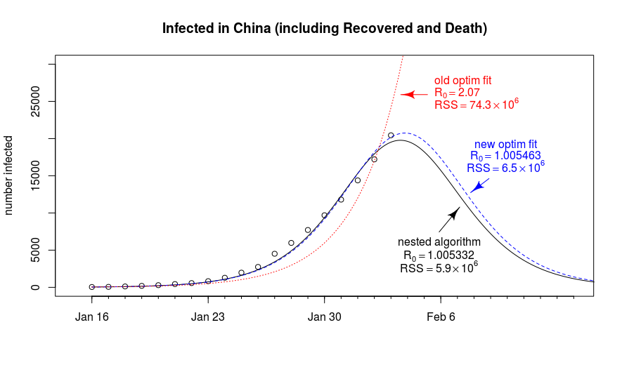
Written by Martijn Weterings on Learning Machines, this guest post describes the fitting of Covid-19 data with the SIR model and explains tricky parts of the fitting methodology and how we can mitigate some of the problems (e.g., early stopping of the algorithm or an ill-conditioned problem). It provides a very clear explanation of some tweaks to the standard model.
The code is available here.
Another “flatten the COVID-19 curve” simulation… in R
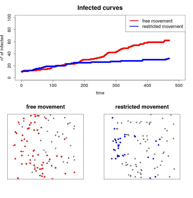
Written by Javier Fernandez-Lopez, this blog post shows R code to create static plots and then simulations to demonstrate how social distancing could help to “flat the curve” of COVID-19 infections.
Tracking Covid19 Cases Throughout NJ with R
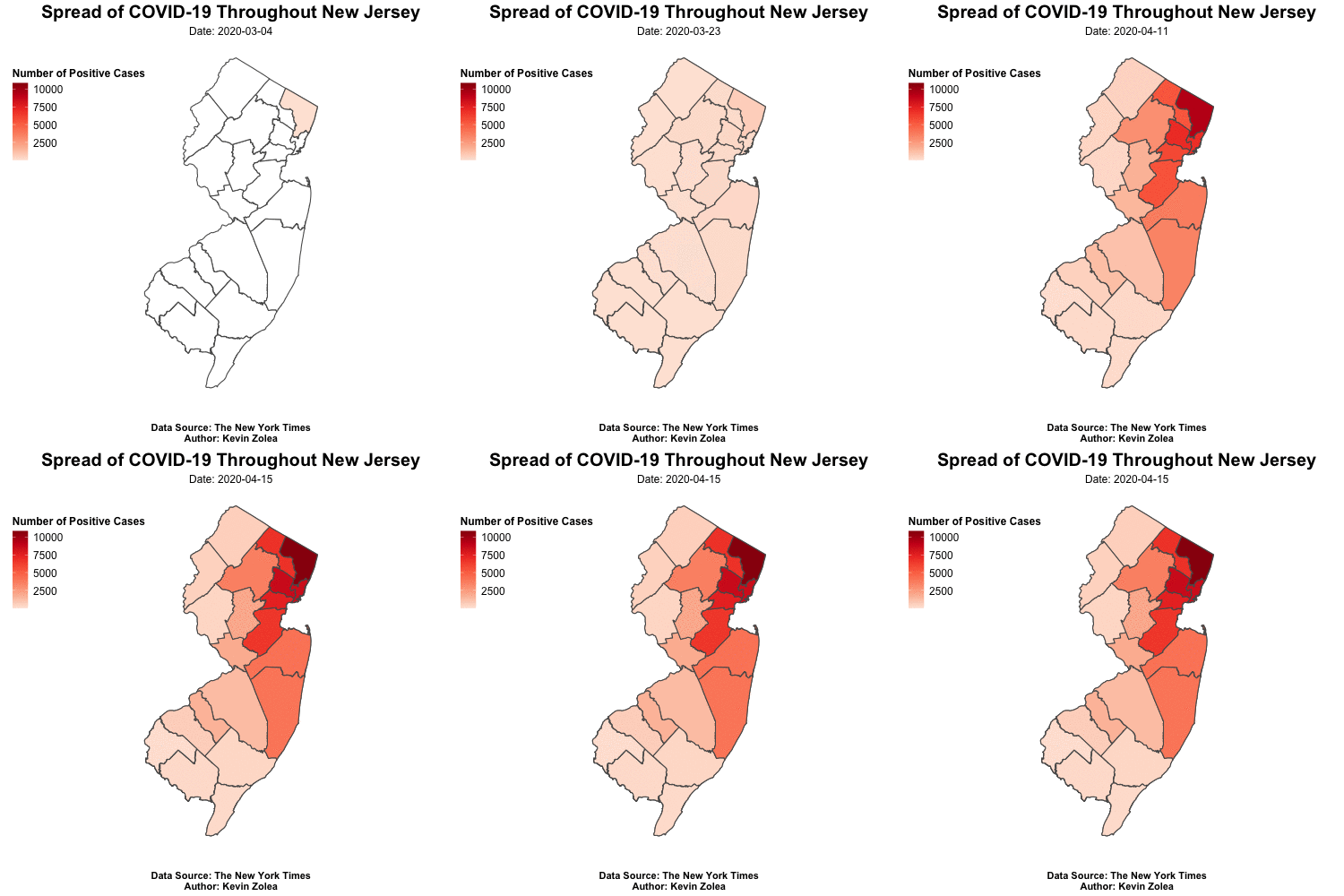
Written by Kevin Zolea, this blog post shows how to use the {gganimate} package to create an animated time series map showing how Covid19 spread throughout the U.S. state of New Jersey’s counties.
It’s fun to look at the YACM (Yet Another COVID Model)
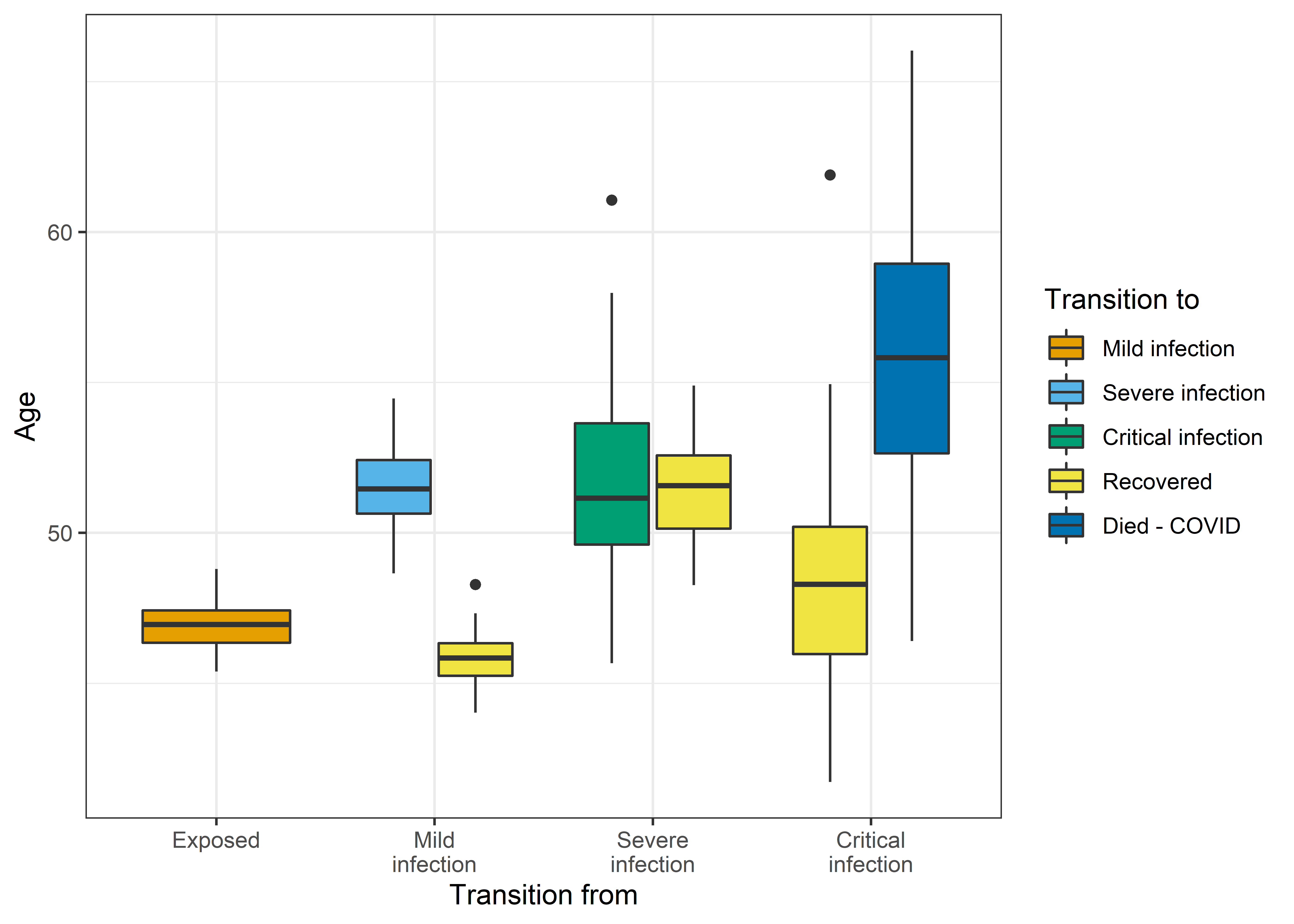
Written by Adrian Barnett from Median Watch, all the models in this blog post are based on the excellent ordinary differential equation models by Alison Hill. They are microsimulations of those models that make heavy use of the {MicSim} package for running microsimulations in R.
Is COVID-19 as bad as all that? Yes it probably is
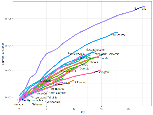
Written by Dr. Francis Smart from Econometrics By Simulation, this article explains clearly some of the factors that determine the infections and deaths from COVID19, with different scenarios of seriousness.
Potential Long-Term Intervention Strategies for COVID-19
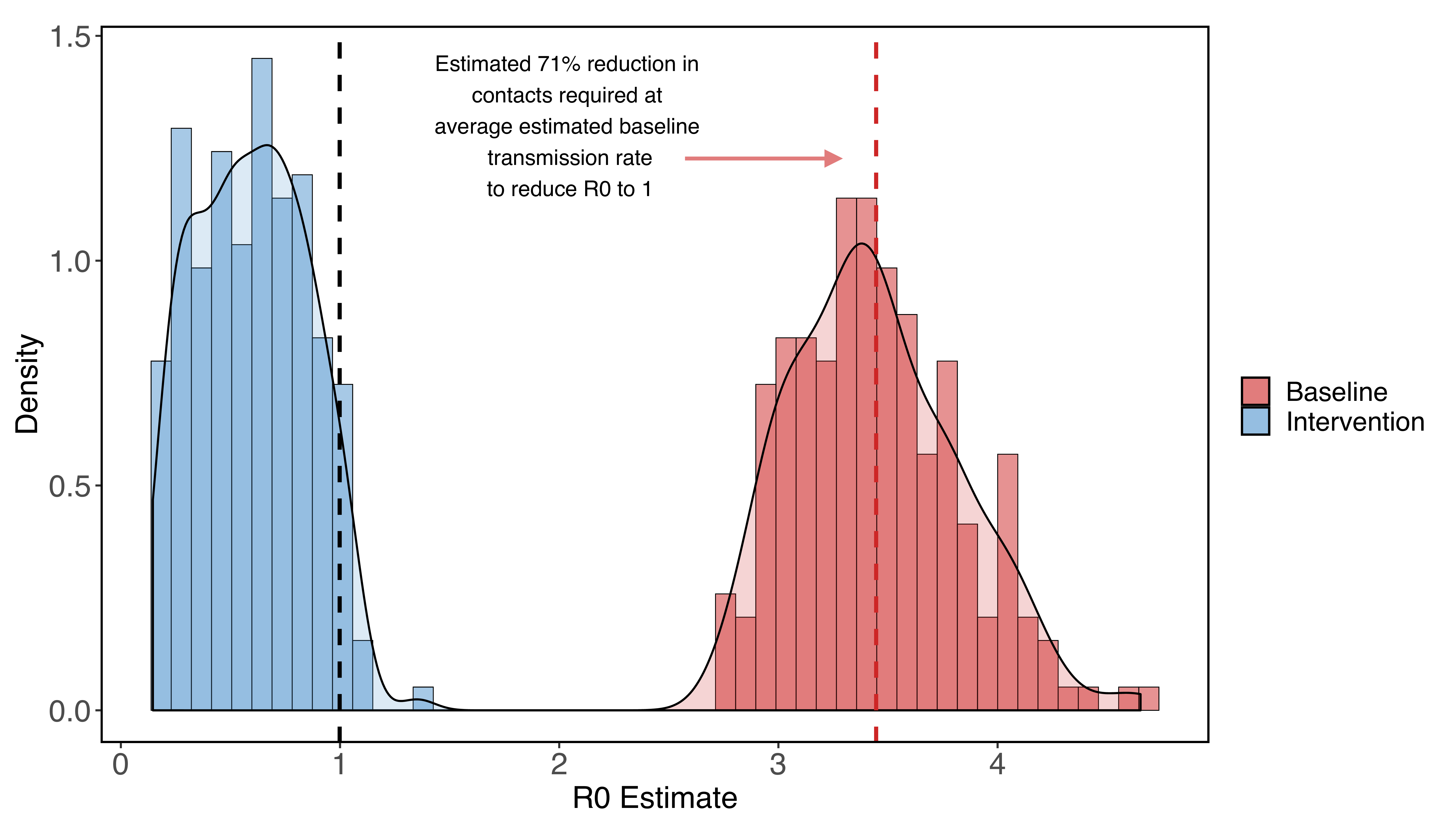
On this website, several professors and members of Stanford University (Marissa Childs, Morgan Kain, Devin Kirk, Mallory Harris, Jacob Ritchie, Lisa Couper, Isabel Delwel, Nicole Nova, Erin Mordecai) developed a compartmental model of COVID-19 to evaluate possible outcomes of non-pharmaceutical interventions such as social distancing.
The website presents an introduction to the problem, the possibility to play around with the model to predict the effects of COVID intervention strategies (thanks to a Shiny app), the model details, and predictions for Santa Clara County, California.
The code is available on GitHub.
COVID-19 Data and Prediction for Michigan
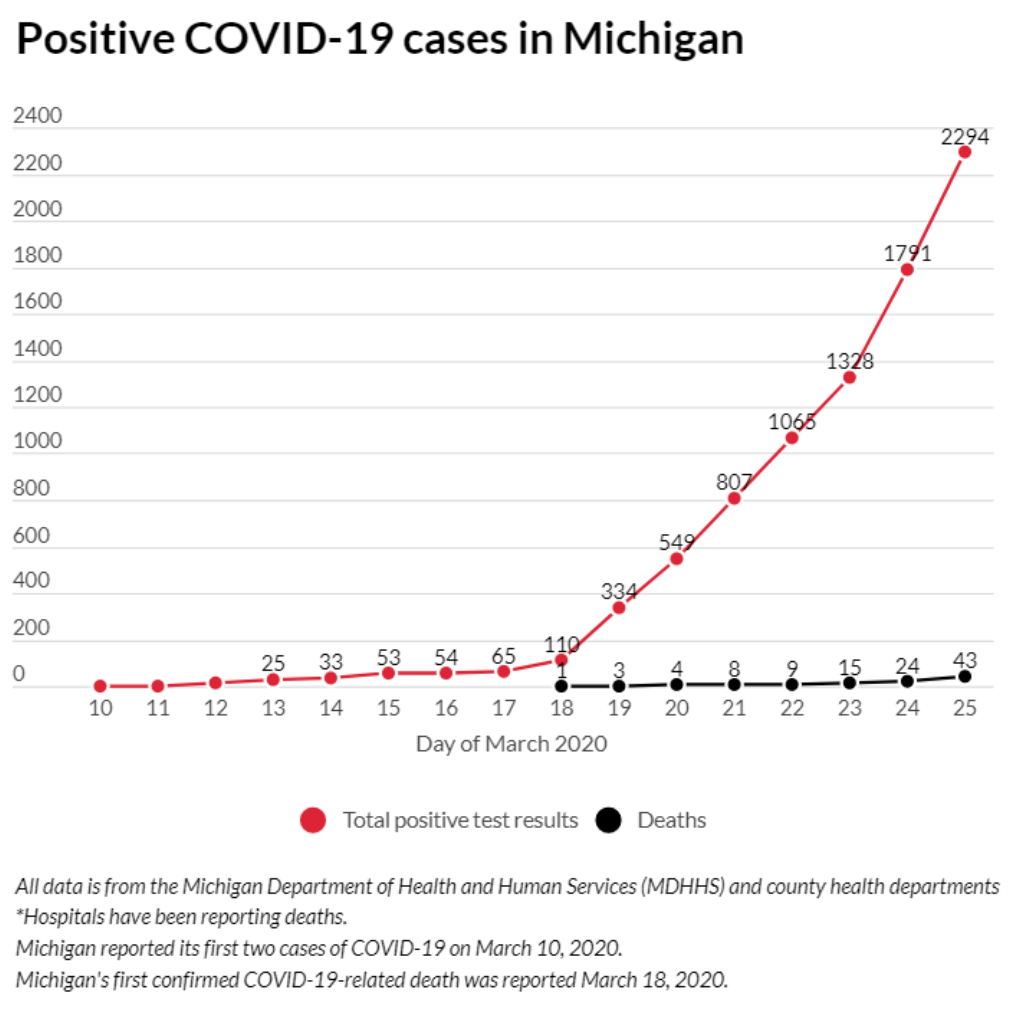
Written by Nagdev Amruthnath, this blog post builds and tests an exponential regression model based on (not much) State of Michigan data.
Data Visualization of COVID-19 in the US
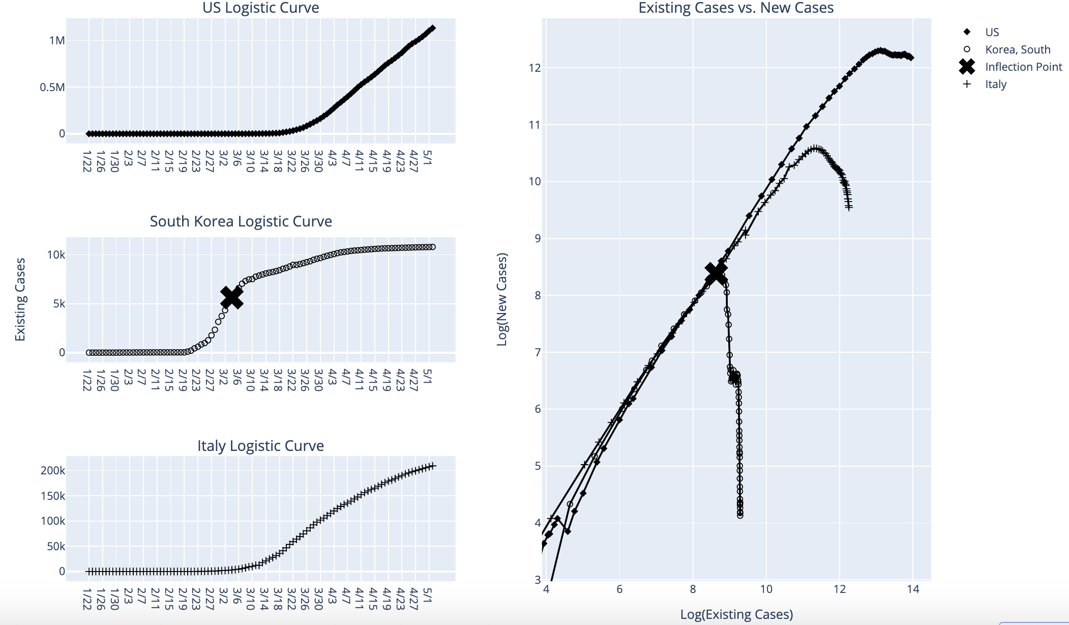
Written by Daniel Reiff, this article examines COVID-19 growth dynamics using exponential and logistic curves.
The spread of COVID-19 across countries visualization with R
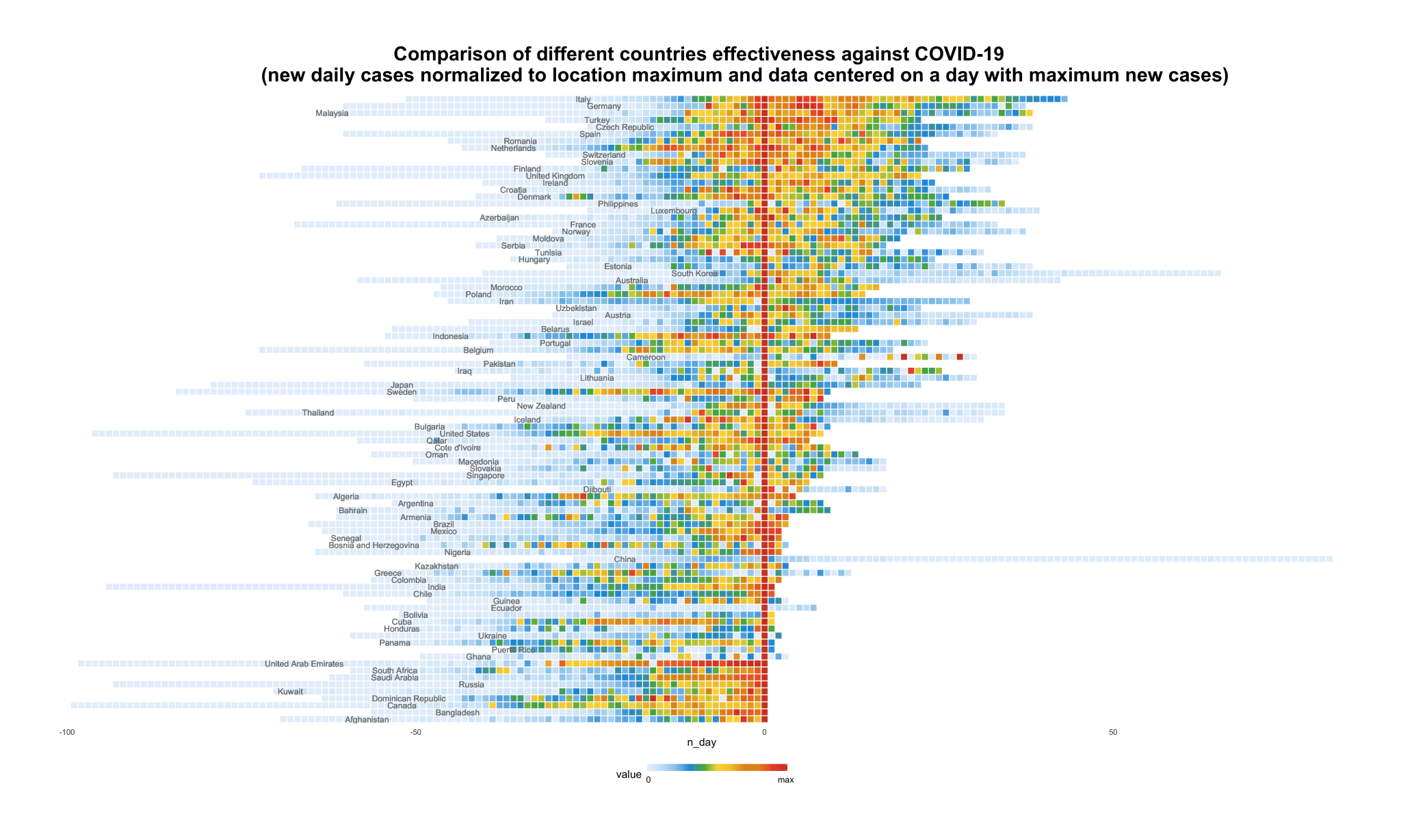
Written by Sergey Bryl, this article examines the speed and spreading of the virus across countries. One animated visualization and two stationary charts show:
- how long and intensive were previous phases and
- compare the effectiveness against COVID-19 for different countries
The code can be found at the end of the article.
Covid-19 and Rural Areas in the U.S
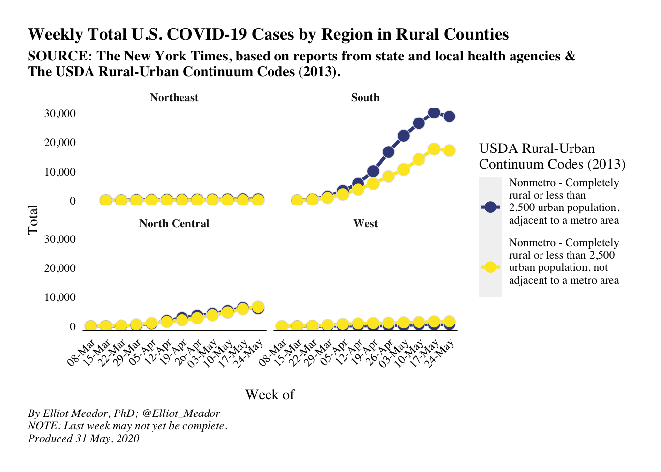
Written by Elliot Meador from Deltanomics, this blog post focuses on cases of Covid-19 in rural areas of the U.S, including whether in the South any particular state appears to be an outlier.
Covid Death Rates: Is the data correct?
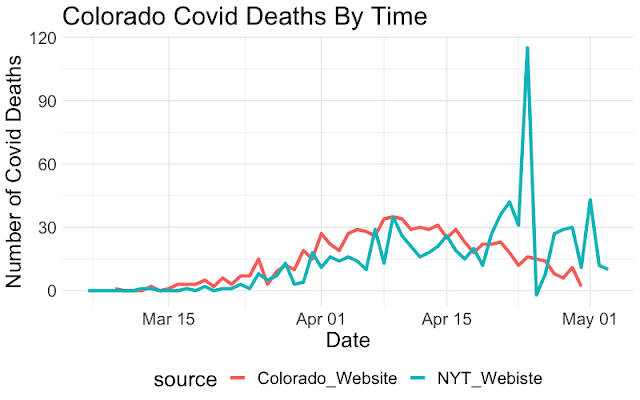
Written by Sam Weiss, this post raises questions about the accuracy of reports of case numbers, in that they may fail to backfill for corrected data.
More recently, the author published two articles (part 1 and part 2) in which he finds and visualizes an association between number of people that tested positive for COVID-19 in a country and imports from China. In addition he finds that there are particular industries that are particularly correlated with COVID-19 rates.
COVID-19 Risk Heat Maps with Location Data, Apache Arrow, Markov Chain Modeling, and R Shiny
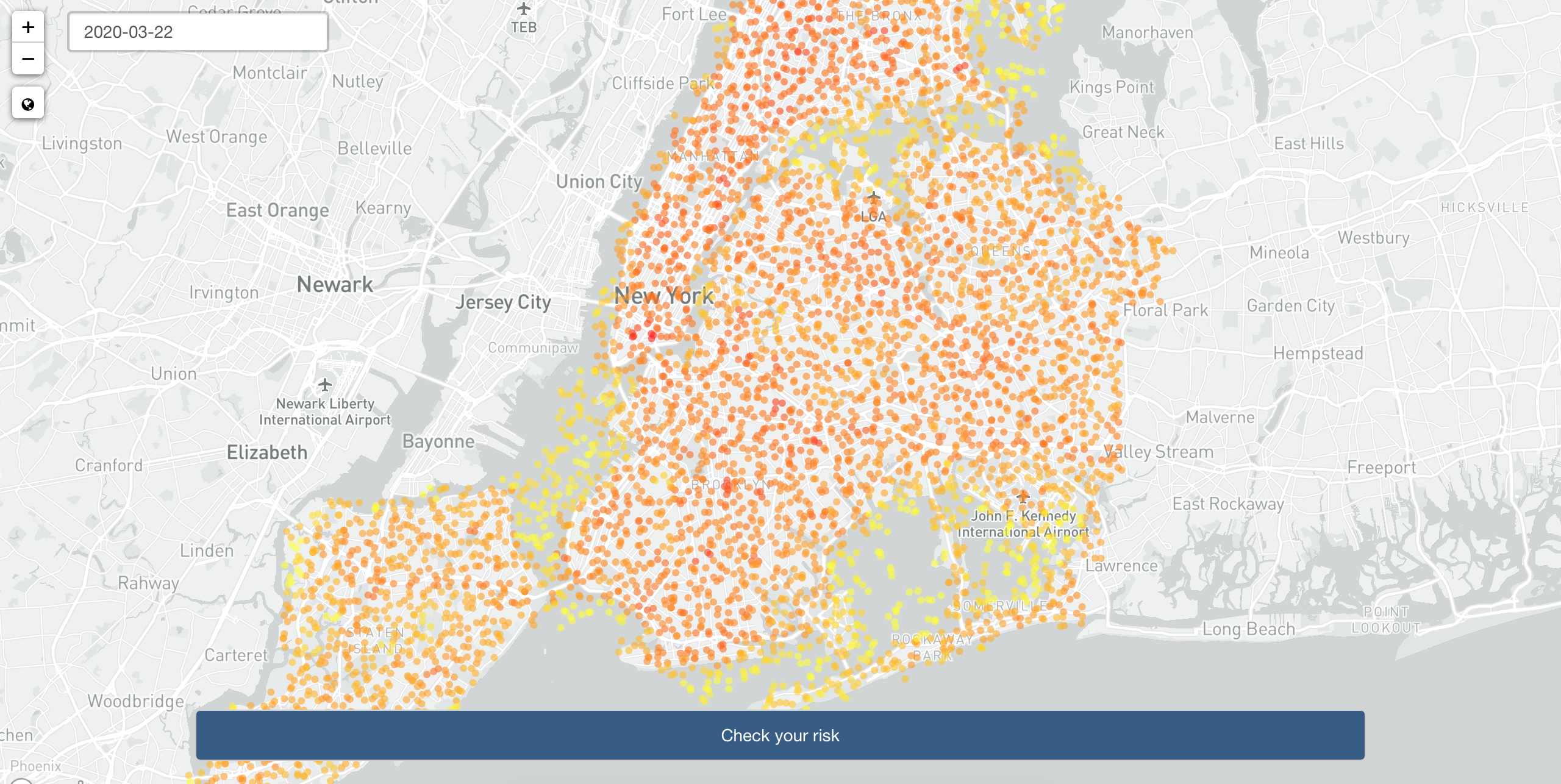
Written by Filip Stachura, this post describes Appsilon’s solution (CoronaRank) submitted to the recent Pandemic Response Hackathon. Inspired by Google’s PageRank, it uses geolocation data in the Apache Parquet format from Veraset for effective exposure risk assessment using Markov Chain modeling.
COVID-19 Tracker Indonesia
![]()
Written by Dio Ariadi from DataWizArt, this post shows some very nice plots on regional variation in COVID-19 cases and deaths in Indonesia, with very neatly integrated R code for each plot.
COVID-19 Projections Using Machine Learning
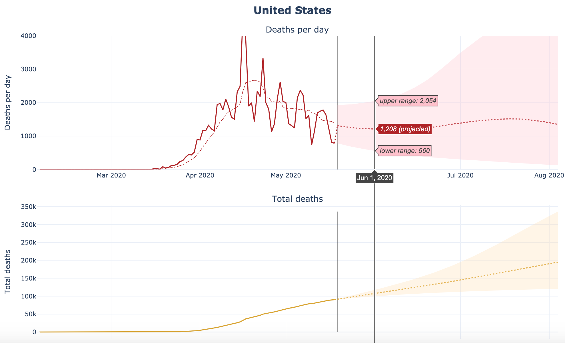
Developed by Youyang Gu, this website presents an intuitive model that builds machine learning techniques on top of a classic infectious disease model to make COVID-19 infections and deaths projections for the US, all 50 US states, and more than 60 countries.
The code can be found on GitHub.
COVID-19 in Belgium: is it over yet?
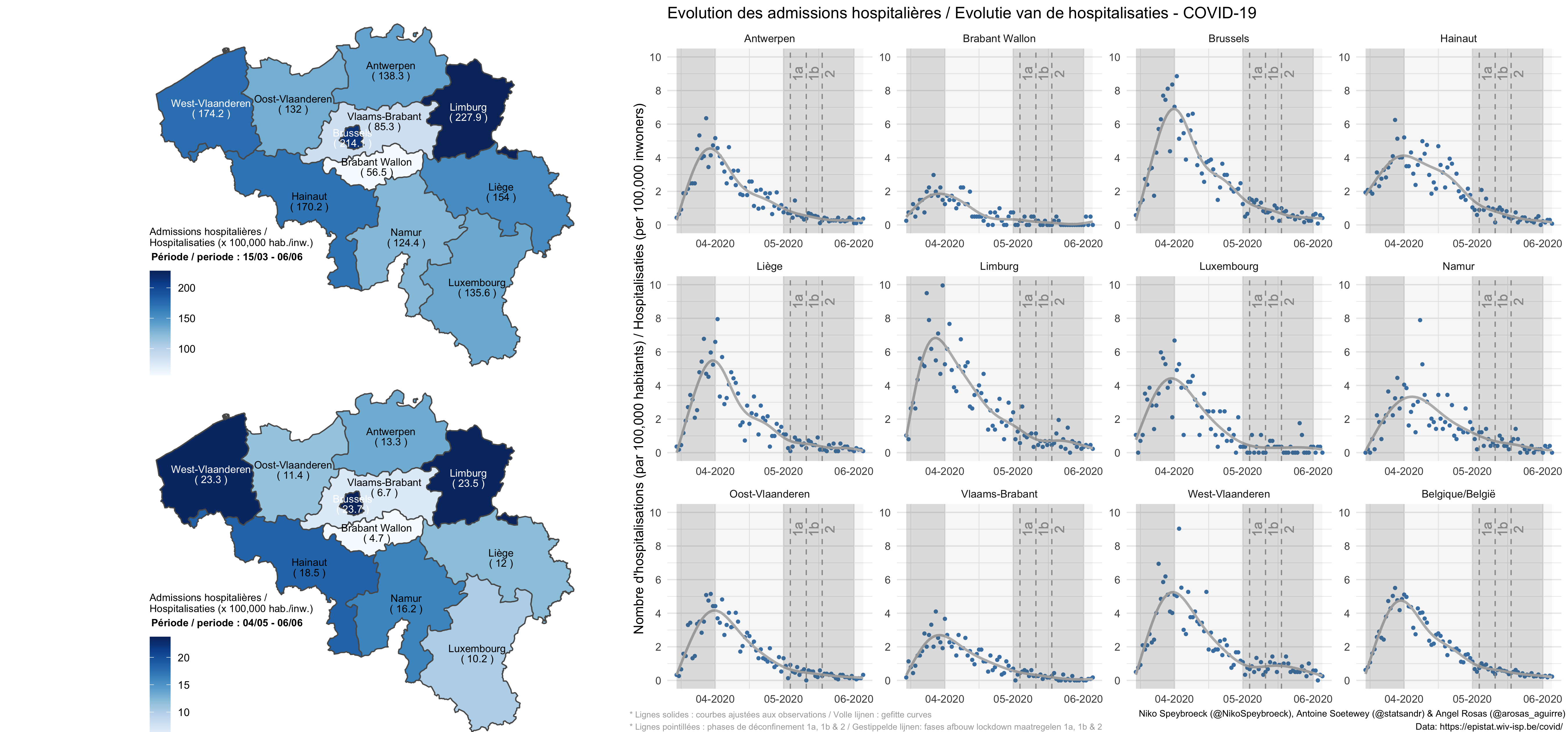
Written by myself in collaboration with Prof. Niko Speybroeck and Angel Rosas-Aguirre, this article shows the evolution of the number of hospital admissions and the number of confirmed cases in Belgium (by province and at the national level).
Code of the plots is available in the article.
COVID-19 Cases by Ethnicity
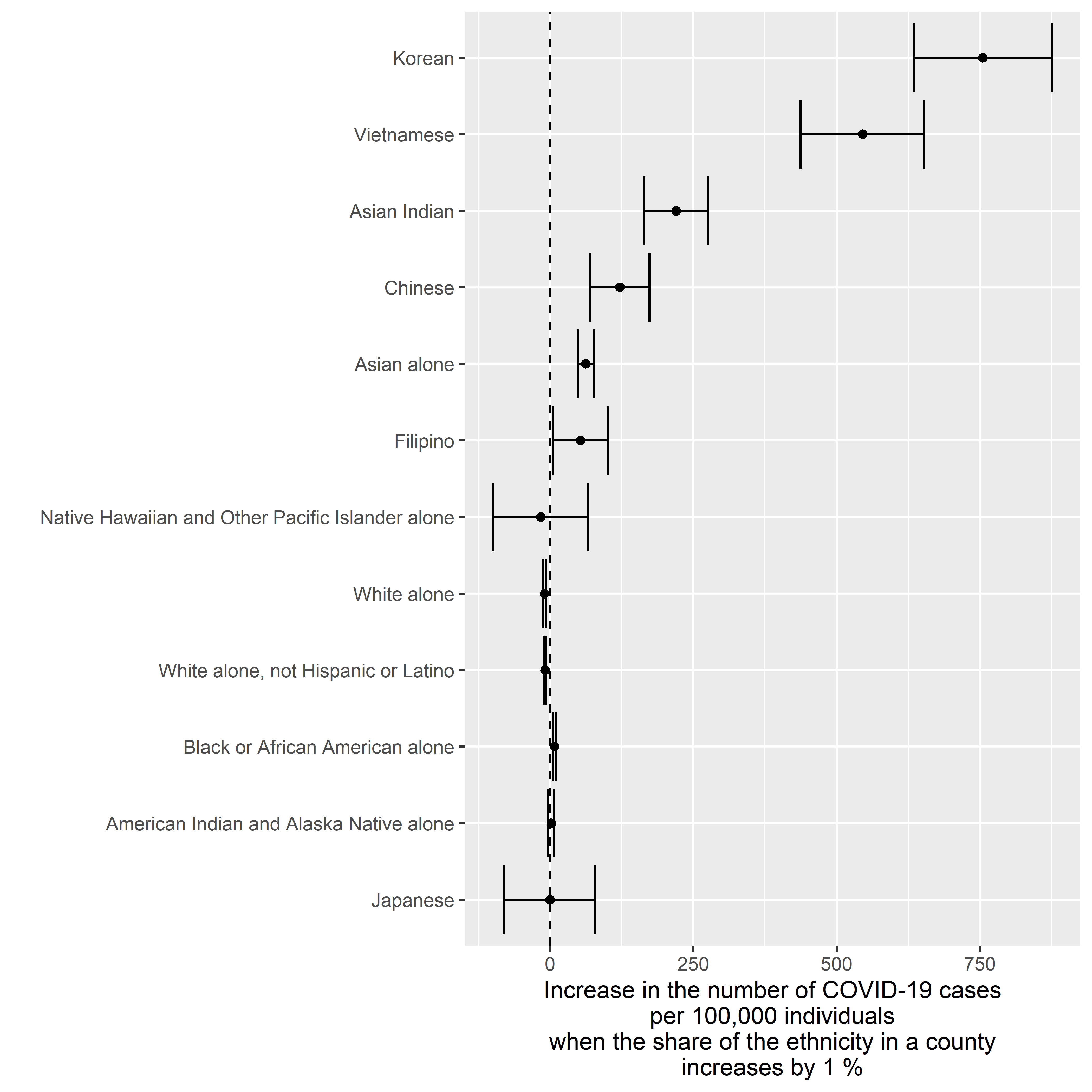
Written by Tommi Suvitaival, this article investigates Covid19 deaths as a function of the percentage of a county’s population that comes from various ethnic backgrounds.
Tennessee COVID-19 Update
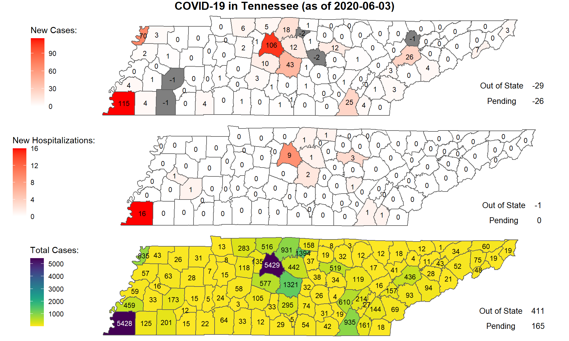
Written by Prof. James M. Luther, this document presents a summary of the daily data for the state of Tennessee. The author uses an interactive map, a seven-day rolling average of various metrics, and facet charts.
COVID-19 Population Mobility - How has human mobility changed under the COVID-19 Pandemic?
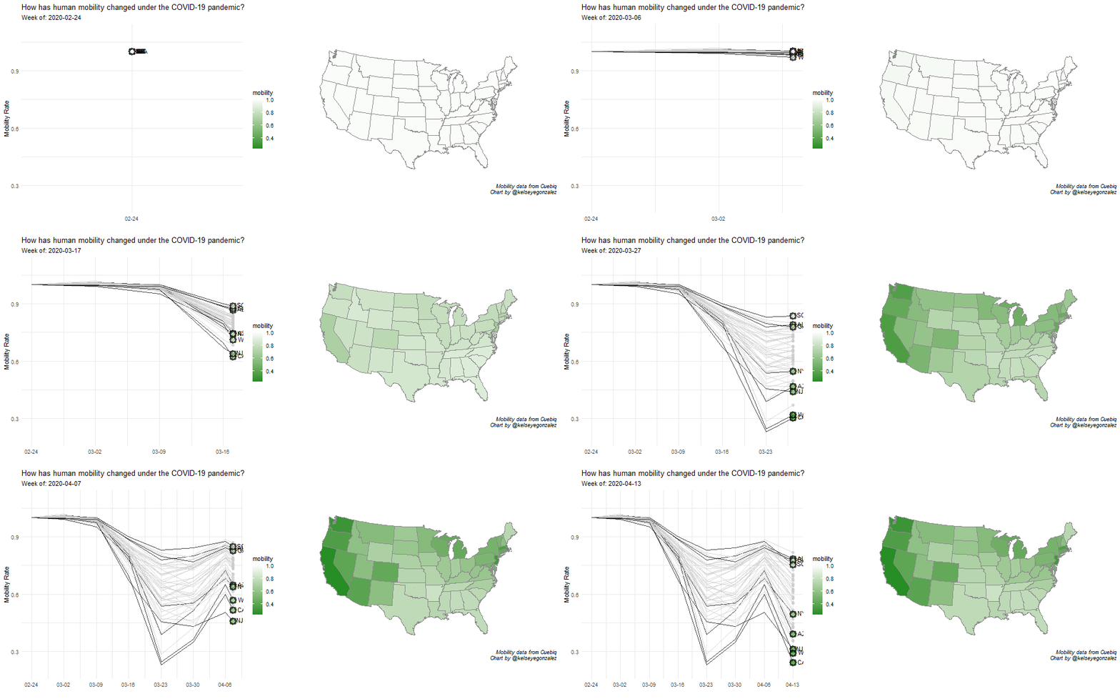
Written by Kelsey E. Gonzalez, this visualization aims to understand population behavior during the COVID-19 pandemic.
How to Build COVID-19 Data-Driven Shiny Apps in 5 minutes
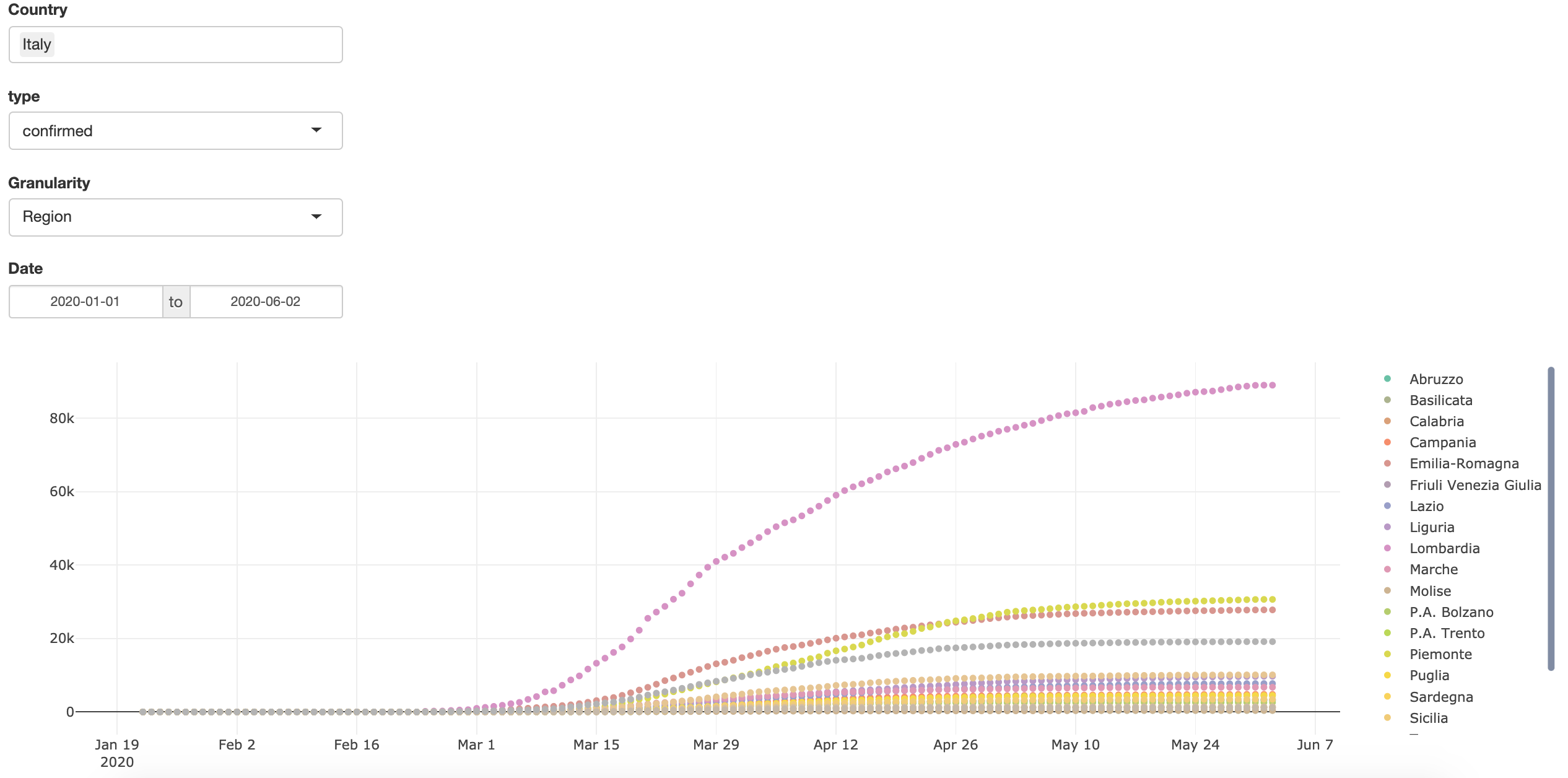
Written by Emanuele Guidotti, this tutorial shows how to build a simple yet complete Shiny application using the R Package COVID19: R Interface to COVID-19 Data Hub.
In another post, the author explores the R package {COVID19} in further detail.
Analyzing data from COVID19 R package
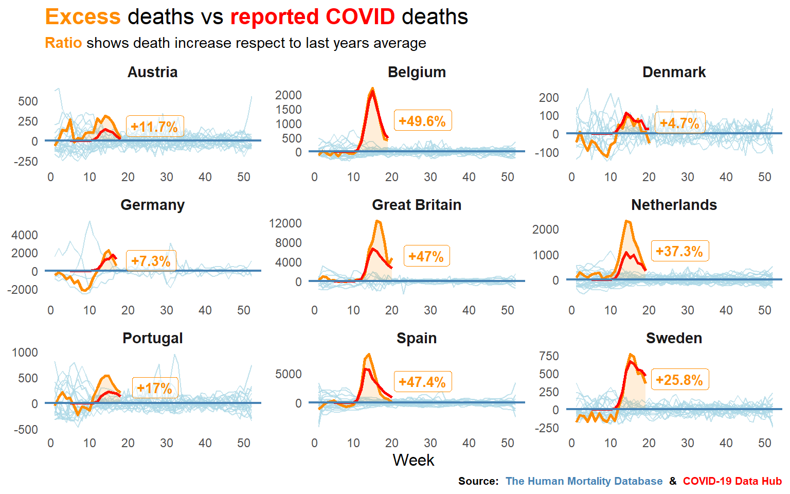
Written by Pablo Cánovas, this blog post explores whether deaths from COVID19 are being reported accurately.
It uses data from The Human Mortality Database and the COVID-19 Data Hub.
Body Mass and Risk from COVID-19 and Influenza
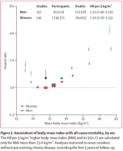
Written by Prof. Radford Neal, this blog post looks at data from flu-like illnesses and some preliminary Covid19 data. The author concludes that being underweight and being seriously obese are both risk factors for serious respiratory illness.
More recently, the author published a series of other articles:
- The Puzzling Linearity of COVID-19 discussing the fact that for many countries, the linear plots of total cases or total deaths go up exponentially at first, and then approach a straight line that is not horizontal
- Seasonality of COVID-19, Other Coronaviruses, and Influenza: this post looks at the evidence for seasonality in influenza and the common cold Coronaviruses, and to what extent one might expect COVID-19 to also be seasonal
- Critique of “Projecting the transmission dynamics of SARS-CoV-2 through the postpandemic period”: this post analyzes and criticizes an earlier paper by Kissler et al. (2020). See also part 2 and part 3
HMD – Weekly Data
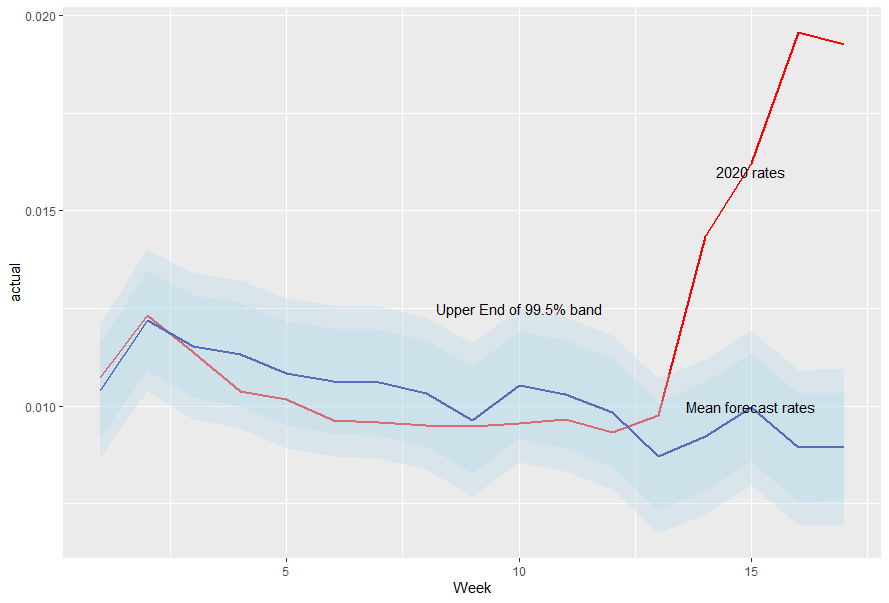
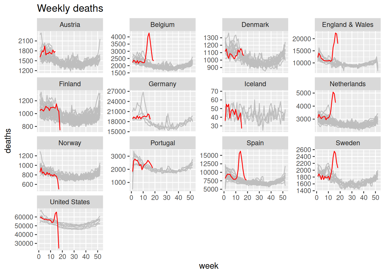
Written by Ronald Richman, this blog post explores the highly improbable level of deaths currently being reported using the Human Mortality Database and its recently begun special time series of weekly death data across 13 countries.
Guest posts on Chris Muir’s blog
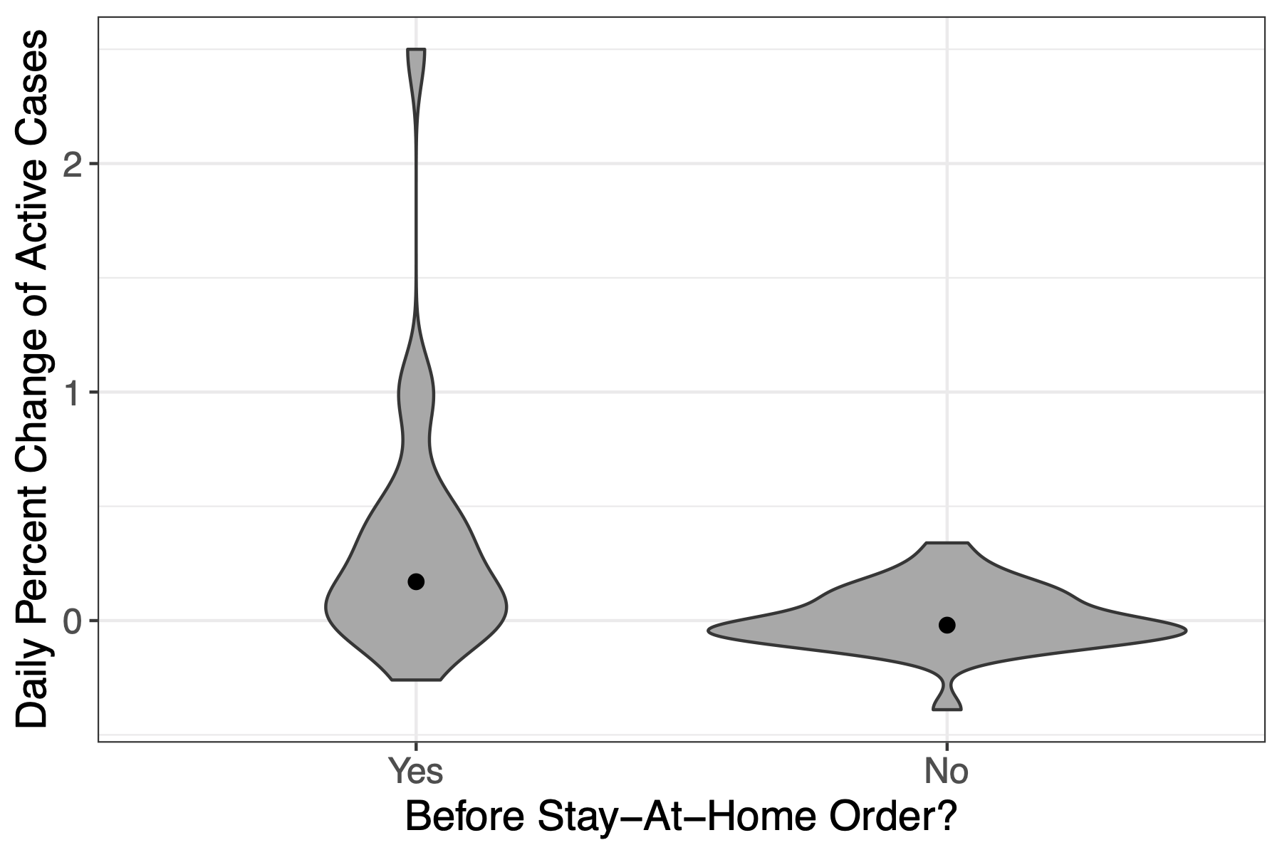
Written by Skylar Hara, this blog post examines whether the incidence of Covid19 changed after the Governor of Hawaii issued a stay-at-home order.
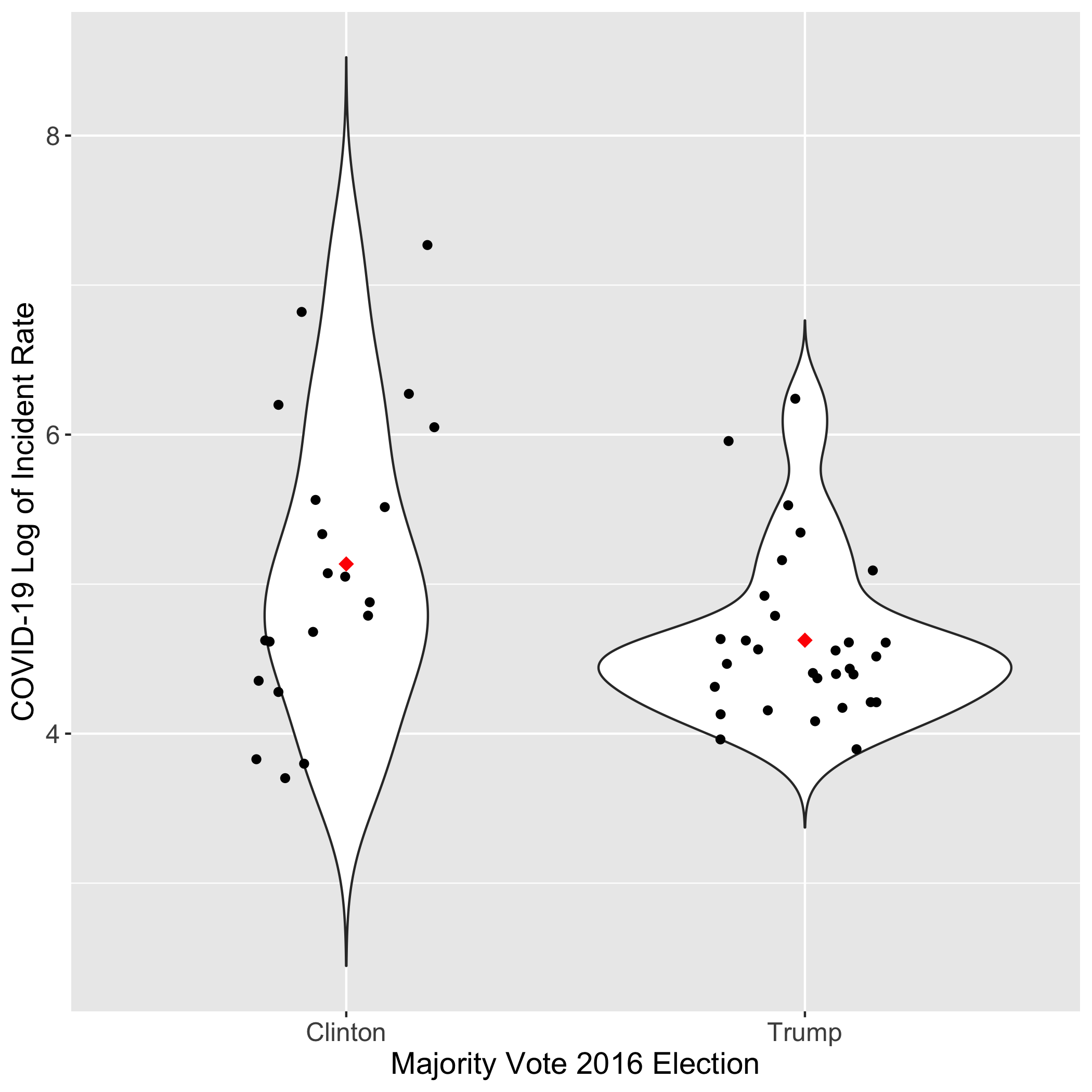
Written by Ronja Steinbach, this blog post gathers data on Trump or Clinton states, percentages of minorities, and median household income to answer the following questions:
- Does party affiliation of a state in the 2016 election have a significant impact on the incidence rate of the virus in that state?
- Does the proportion of the population that is minority and median household income affect the incident rate of the virus across states?
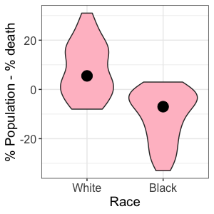
Written by Akemi Santiago, this post shows a statistically different mortality rate between African-Americans in the United States and white Americans.
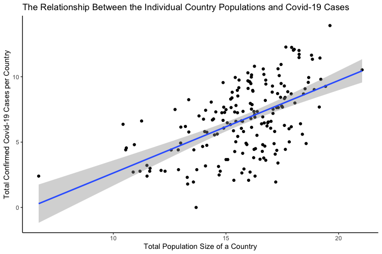
Written by Masha Rutenberg, this post focuses on the correlation between the population of a country and the number of confirmed infections in the country.
All authors are students of Prof. Chris Muir.
An R View into Epidemiology
Written by Joseph Rickert in R Views, this blog post tracks down R packages that help epidemiology research and shows the number of downloads in recent months for the five most popular packages.
Articles by Rob J Hyndman
Rob J. Hyndman, Professor of Statistics and Head of the Department of Econometrics and Business Statistics at Monash University (Australia), published a series of Covid19 related articles:
- Forecasting COVID-19: this blog post does not use R, although Prof. Hyndman is an expert with it, but it does explain some of the problems with time series forecasting or other methods of forecasting
- Why log ratios are useful for tracking COVID-19: this post presents the benefits of reporting log-scale graphics
- Excess deaths for 2020: the reported COVID19 deaths in each country are often underestimated. One way to explore the true mortality effect of the pandemic is to look at “excess deaths” — the difference between death rates this year and the same time in previous years
- Seasonal mortality rates: this post shows how the weekly mortality data published by the Human Mortality Database can be used to explore seasonality in mortality rates. Mortality rates are known to be seasonal due to temperatures and other weather-related effects
Turkey vs. Germany: COVID-19
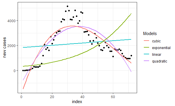
Written by Selcuk Disci from DataGeeek, this article compares efforts by Turkey and Germany to control the pandemic, and tests several regression models.
Hands-on: How to build an interactive map in R-Shiny: An example for the COVID-19 Dashboard
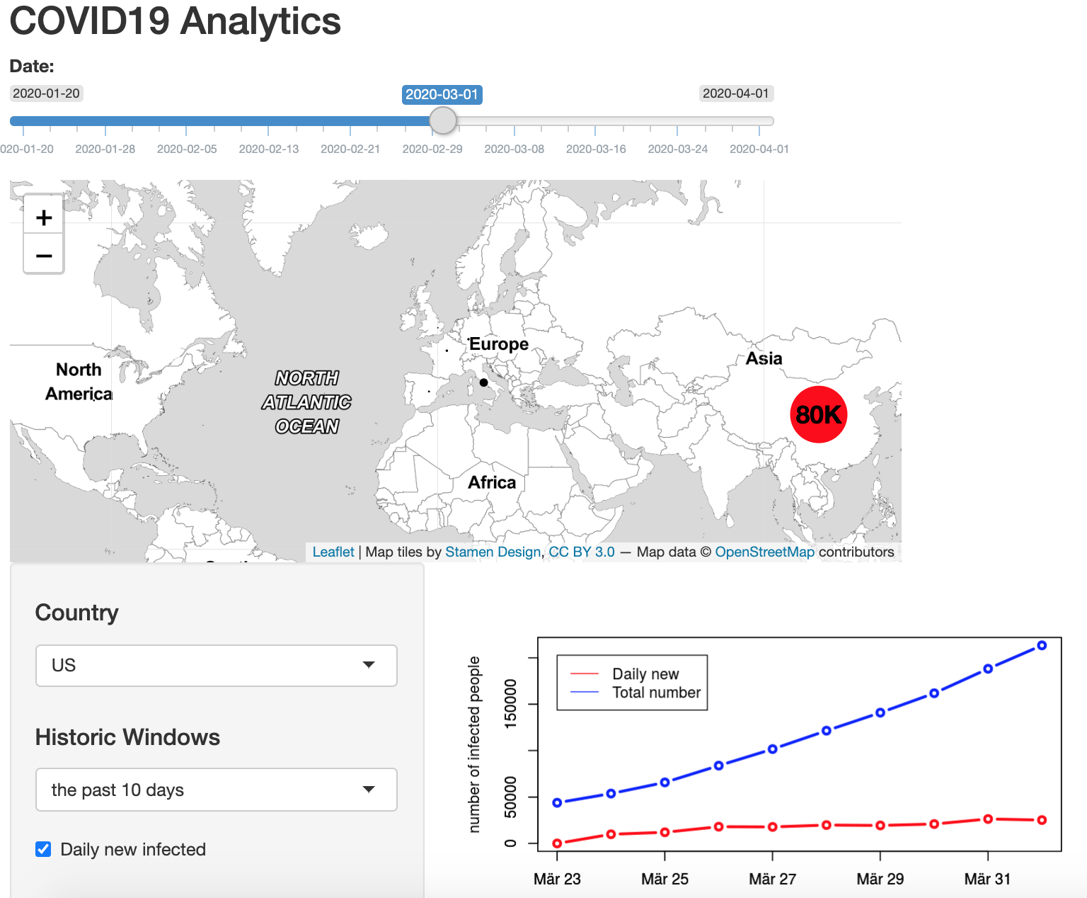
Written by Sangmeng, this post explains how to build an interactive dashboard with Shiny with an example for the COVID-19 Dashboard.
Modelling COVID-19 in Morocco
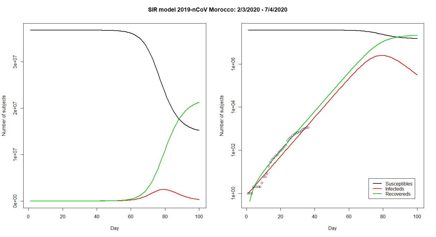
Written by Zakariah Gassasse, this blog post presents data on cases of Covid19 in Morocco and applies the SIR model to the data.
More recently, the author published two other articles. The first article provides a short-term forecast of COVID-19 cases and deaths in Morocco by using simple but effective time-series analyses. The second article maps the outbreak to see which regions are suffering the most.
SIR models with Kermack and McKendrick
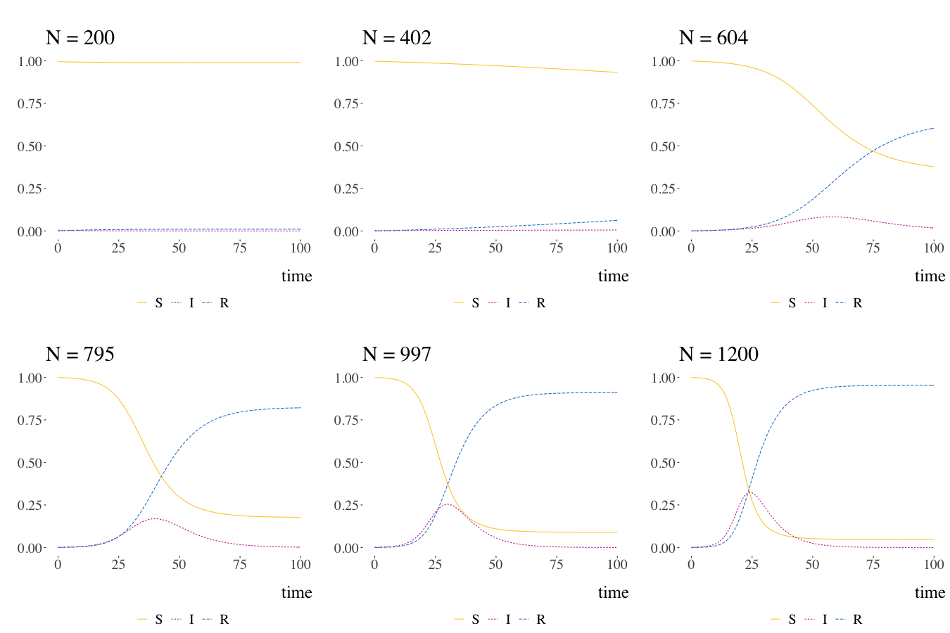
Written by Pierre Jacob, this blog post is mostly a retrospective look at the origins of the much-used SIR model.
Johns Hopkins Covid-19 Data and R
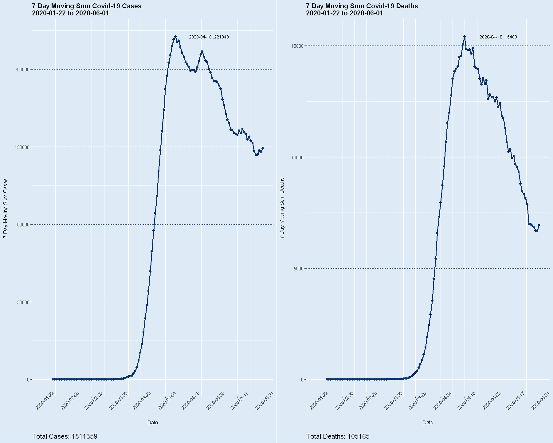
Written by Steve Miller, these blog posts (part 1 & part 2) showcase the handling of daily data of cases/deaths from Covid-19 in the U.S. published by Johns Hopkins University, and visualize moving averages of cases and deaths.
The author also published a blog post putting unemployment claims in the U.S. in perspective.
Estimating COVID-19’s \(R_t\) in Real-Time
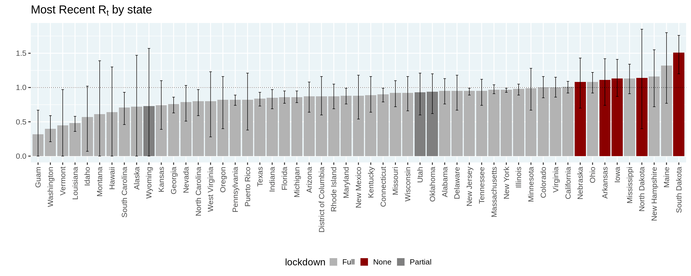
Written by Ramnath Vaidyanathan, this tutorial shows how to estimate \(R_t\), the measure known as effective reproduction number, which is the number of people who become infected per infectious person at time \(t\).
From static to animated time series: the tidyverse way
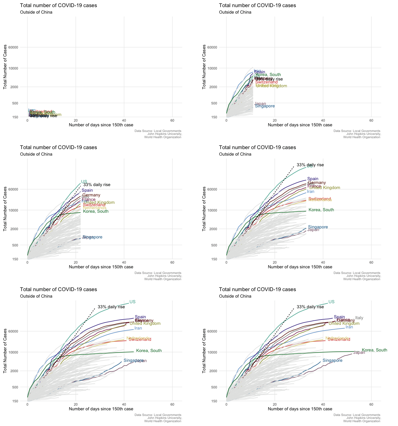
Written by Giulia Ruggeri, this post goes through the steps necessary to create an animated COVID-19 time series plot.
Sneak peek: new Summit data tool helps clients visualize US areas that are most heavily impacted by the COVID-19 virus

Written by Colby Ziegler, this blog post describes a tool (built primarily in R using the {leaflet}, {tidyverse}, and {tigris} packages) tracking and displaying the total number of confirmed COVID-19 cases and deaths by U.S. county, overlaid with the locations of Certified Community Development Financial Institutions (CDFIs).
How to Reproduce Financial Times Style COVID19 Daily Reporting?
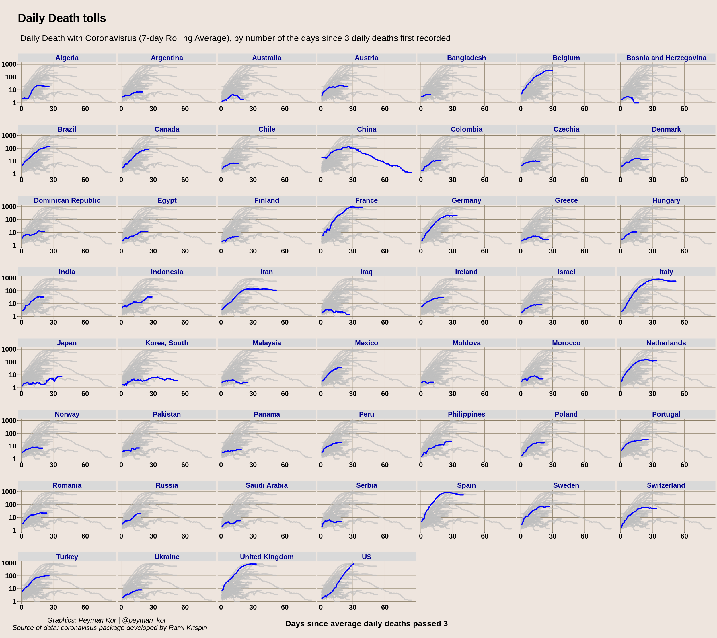
Written by Peyman Kor, this blog post shows how to reproduce in R the Financial Times facet plot by country.
What can tweets about contact tracing apps tell us about attitudes towards data sharing for public health?
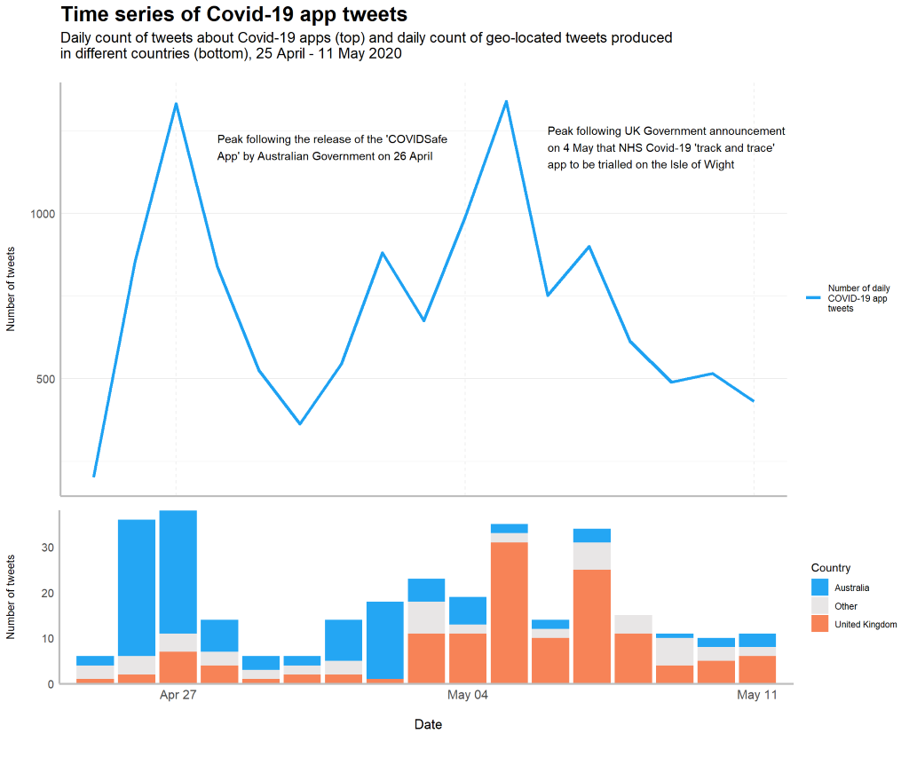
Written by Holly Clarke, these 2 blog posts (part 1 & part 2) discuss about attitudes towards contact tracing apps to manage the spread of Covid-19 and data-sharing for public health, using tweets, text analysis and natural language processing.
Visualizing COVID cases in Belgium
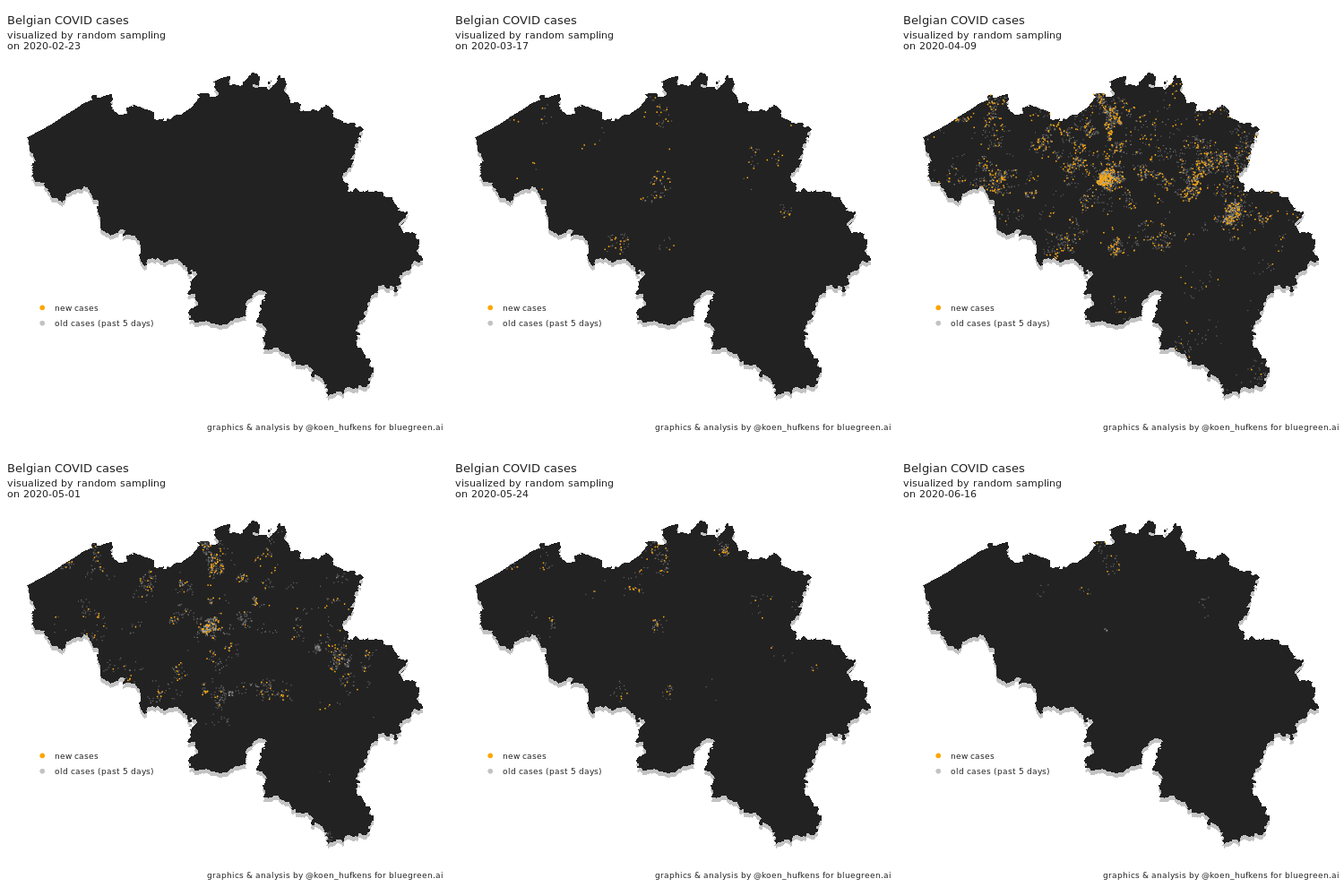
In this blog post, Koen Hufkens plots cases in Belgium and addresses a challenge in geo-spatial plotting.
A spatio-temporal analysis of the environmental correlates of COVID-19 incidence in Spain
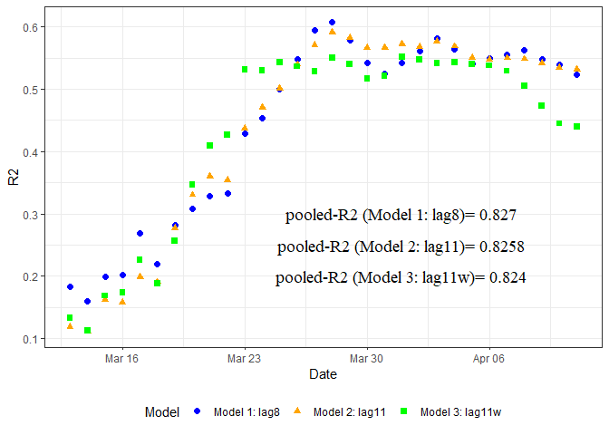
Written by Antonio Paez and several co-authors, this blog post looks at weather, humidity and other factors in Spain to create a SUR model.
Another post by Antonio Paez investigates the incidence of COVID-19 in the United States using Google Community Mobility Reports.
Covid-19 Analysis
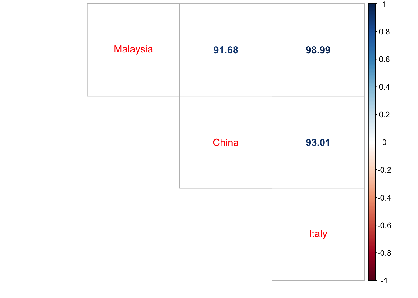
Written by Rizami Annuar, this post compares data on cases and deaths in Malaysia to other countries, including correlations.
Does Covid raise everyone’s relative risk of dying by a similar amount? More evidence
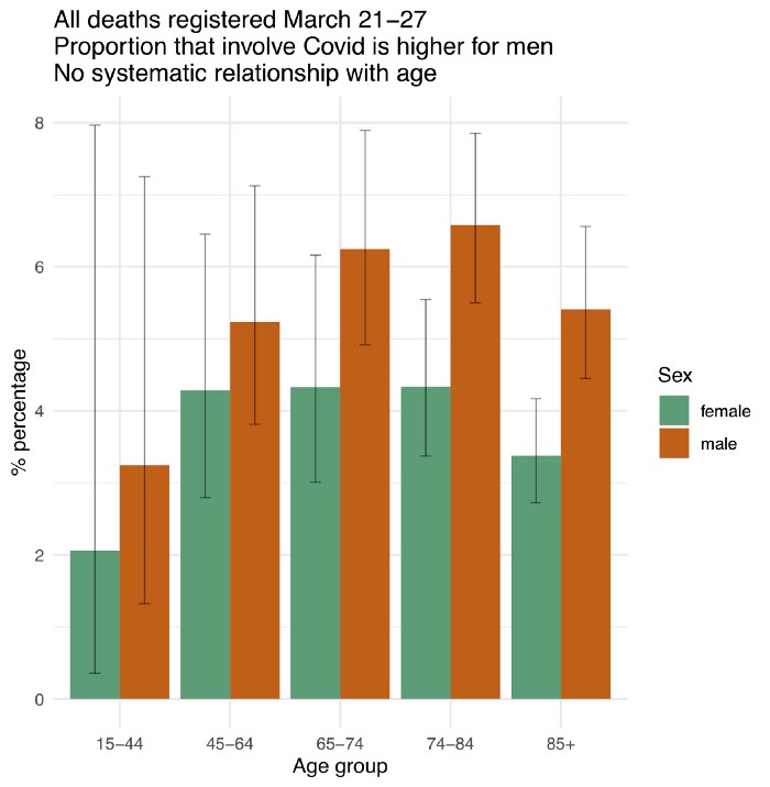
Written by Prof. David Spiegelhalter (author of the great book “The Art of Statistics”), this post looks at relative mortality rates by age and gender, using data from the U.K.’s Office for National Statistics.
Mapping NZ cases of COVID-19
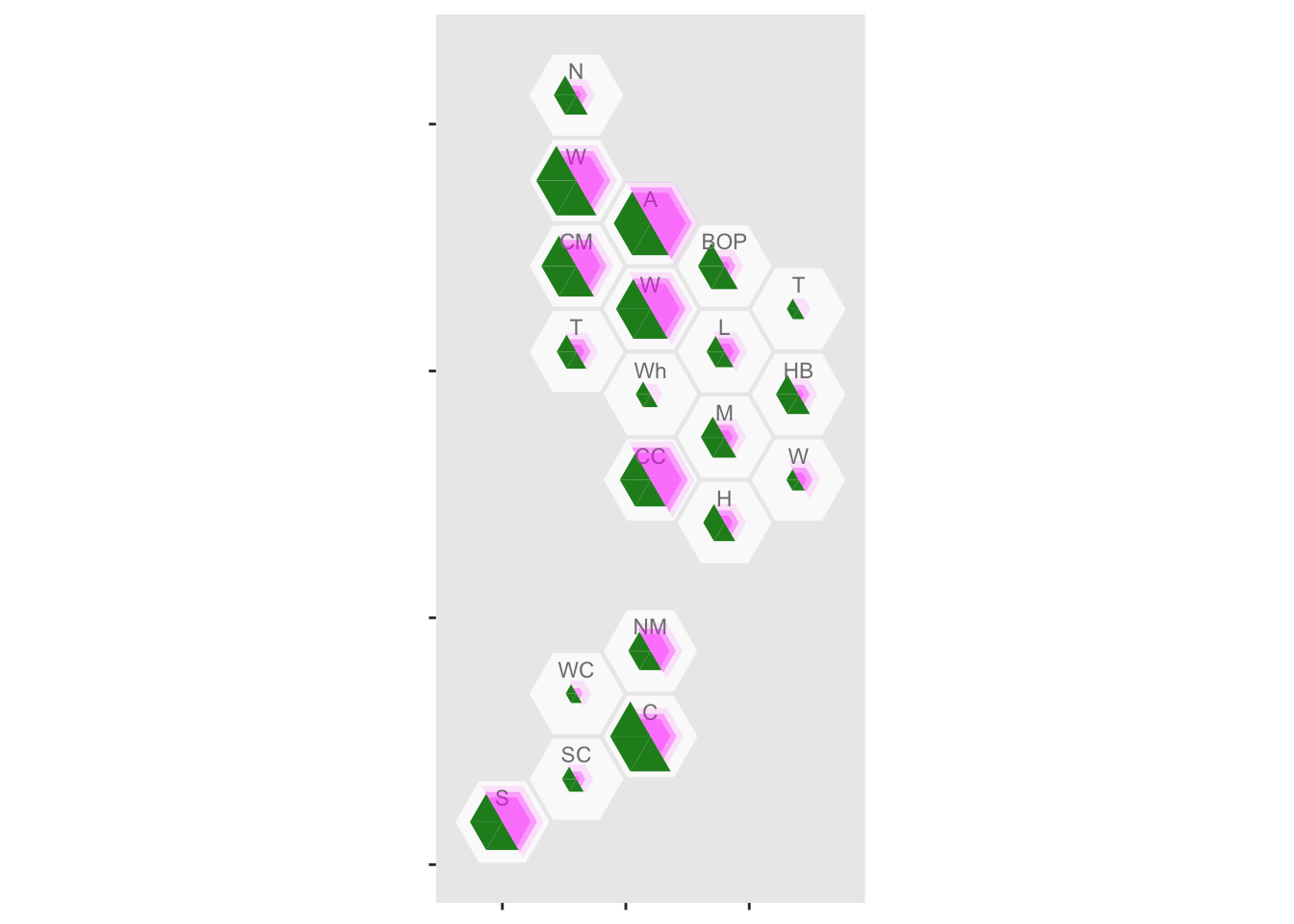
In this post, using his own choropleth package ({DHBins}) and its hexagonal bins, Thomas Lumley maps cases of COVID19 by Health Boards in New Zealand.
Visualize the Pandemic with R #COVID-19
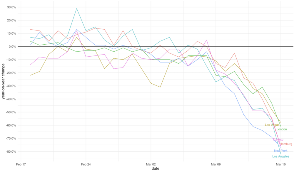
In this post, Xinhan Qian carries out a variety of explorations with Covid19 data, including the precipitous declines in U.S. movie box office revenue and restaurant reservations.
Exploring the Temporal Evolution of COVID-19 Cases in the United States

Written by Robert Winkelman and Colin Waltz, this post shows clearly how to create animated plots of the spread of COVID19 infections in the United States.
R Data Analysis: COVID-19
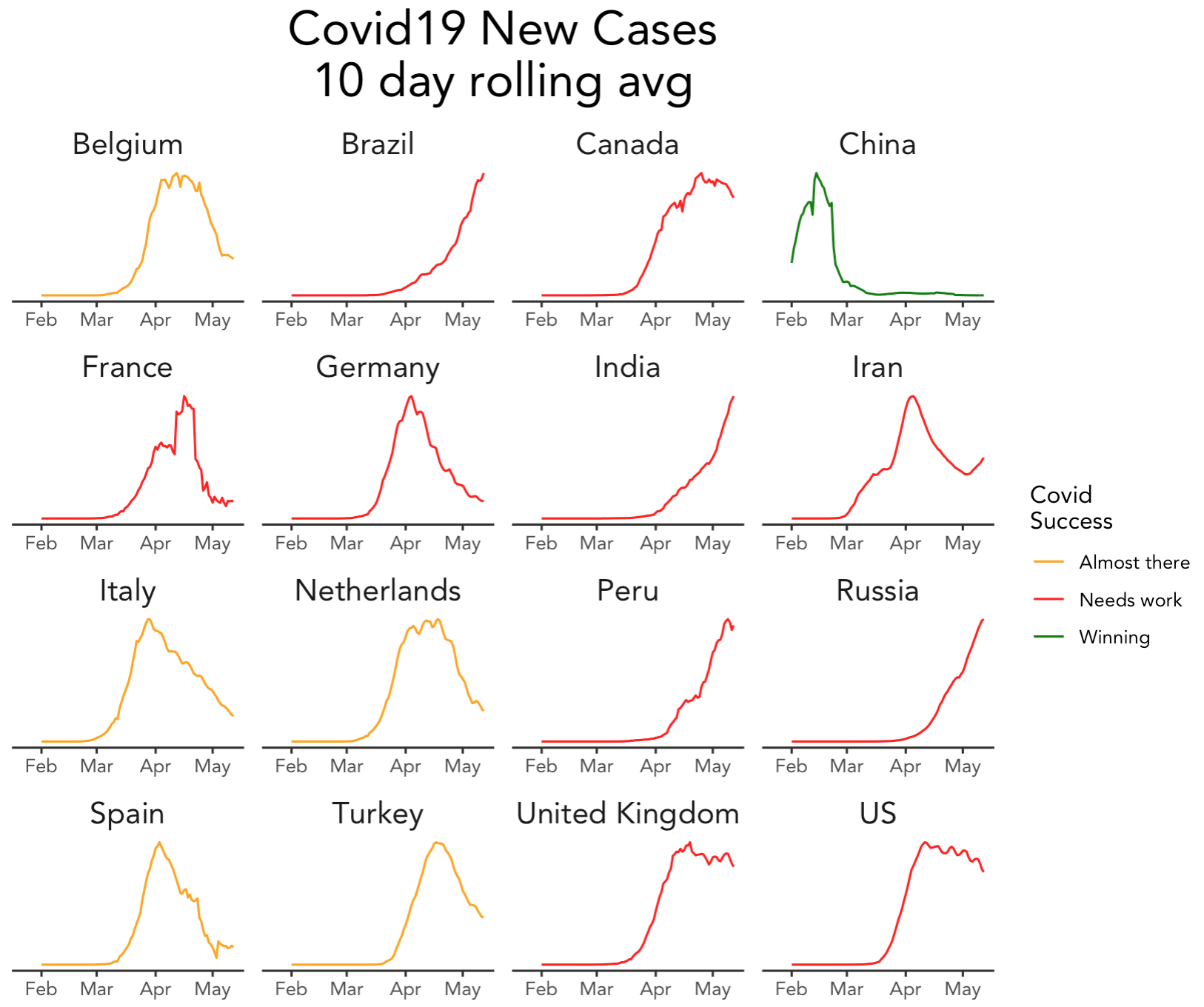
Published on the blog of Sharp Sight, this series of blog posts (part 1, 2, 3, 4, 5 and 6) explain how to rename and reorder columns, standardize dates (with the {lubridate} package), merge datasets, take other preparatory steps, plot with the {ggplot2} package and finally, reproduce in R a plot that shows the relative progress of 16 countries in coping with the pandemic.
All posts use the Johns Hopkins data and data from the company’s own collection.
GA COVID-19 Reports
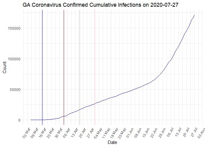
Based on data from the GA Department of Public Health’s report, Andrew Benesh posts a daily analysis of the U.S. state Georgia’s cases, deaths, ICU usage etc.
All his reports are posted on Medium and the code is available here.
Corona in Belgium
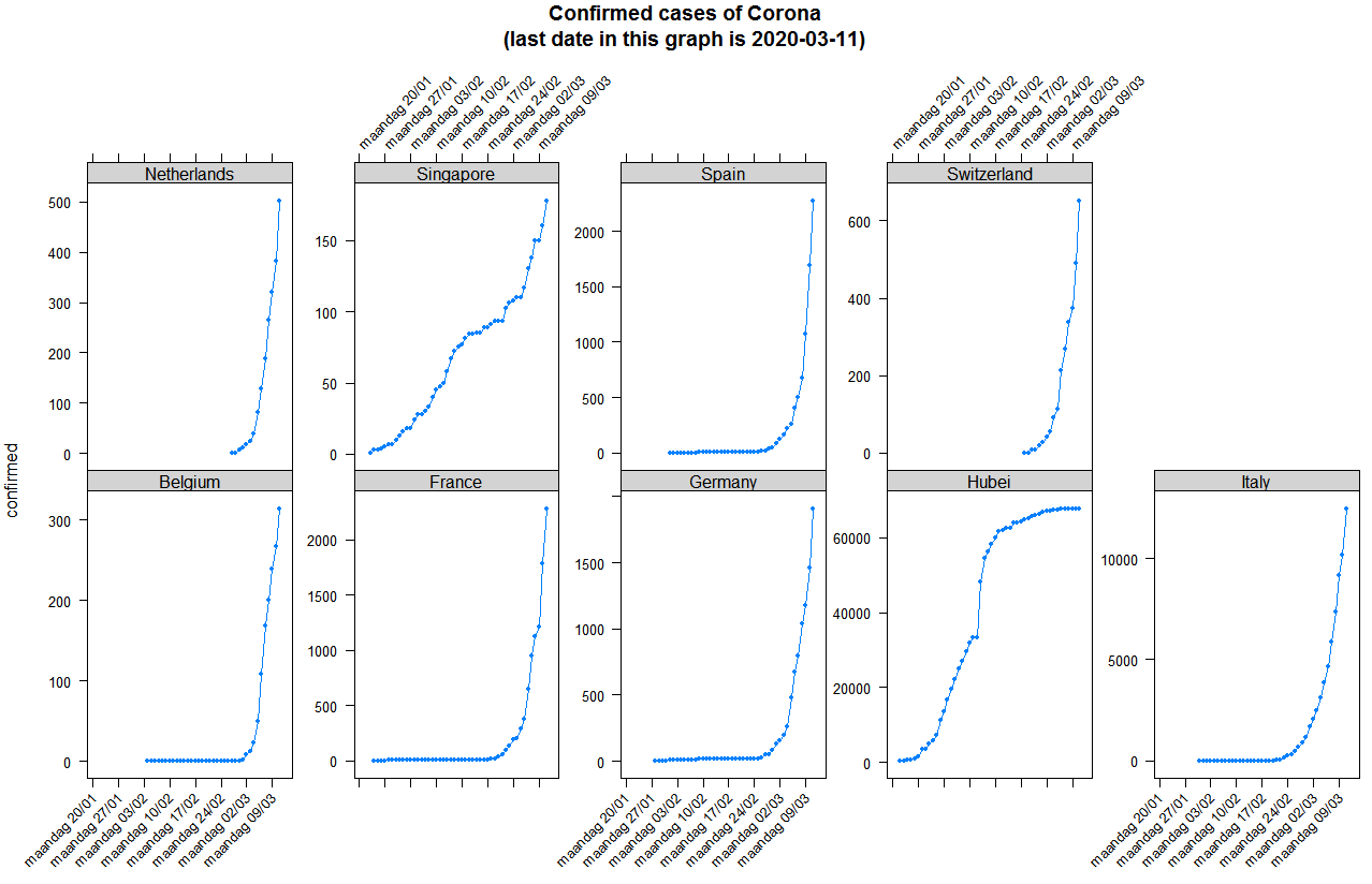
Published by bnosac, this post covers the early exploration of the exponential spread of Covid19, with a focus on Belgium and the Netherlands.
Use R and Tidycensus to Look at COVID-19 Risk Factors
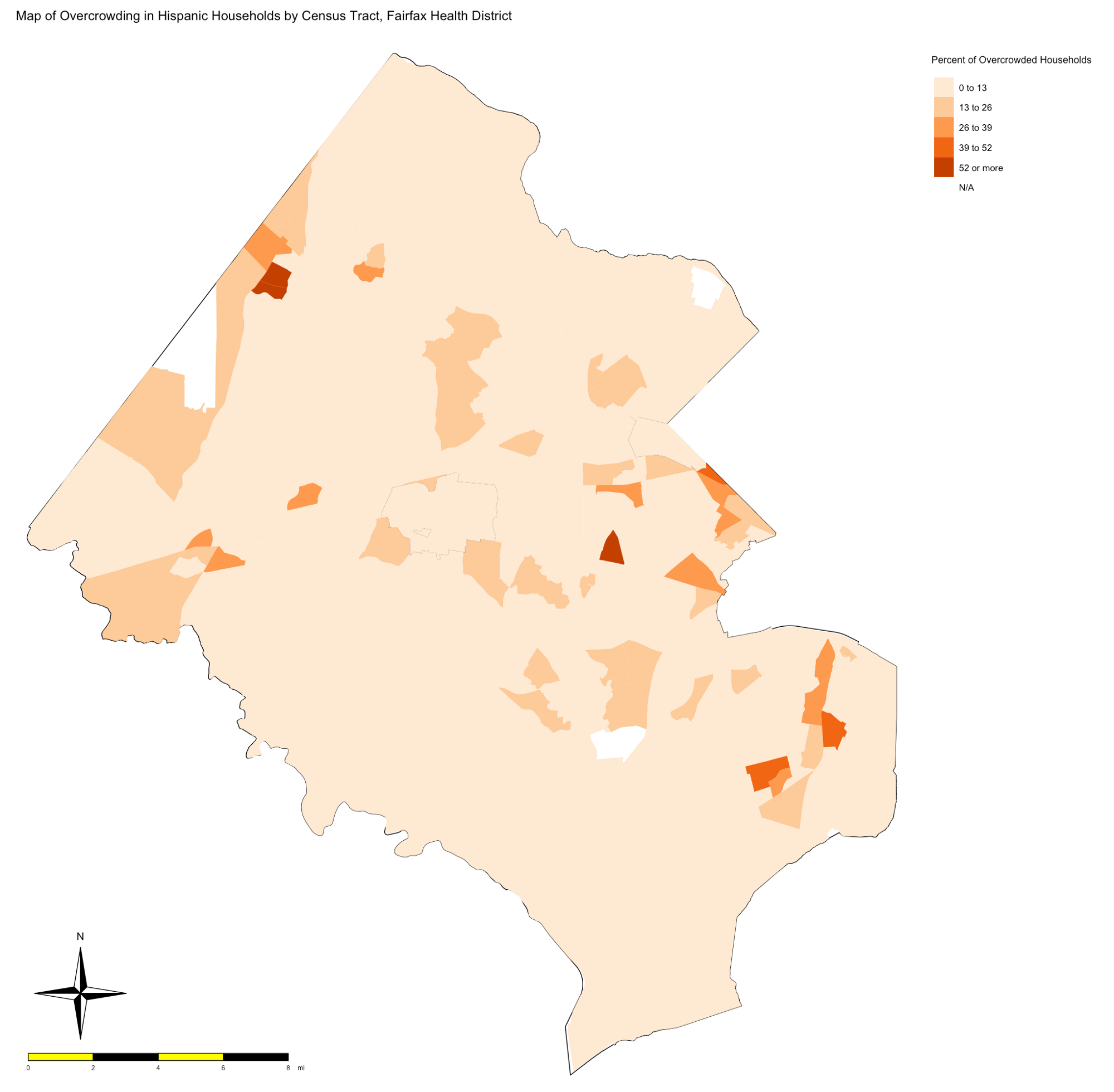
Written by René F. Najera, this post uses US census data to identify “overcrowded” areas and considers them in terms of Covid19 risk.
Animating U.S. COVID-19 hotspots over time
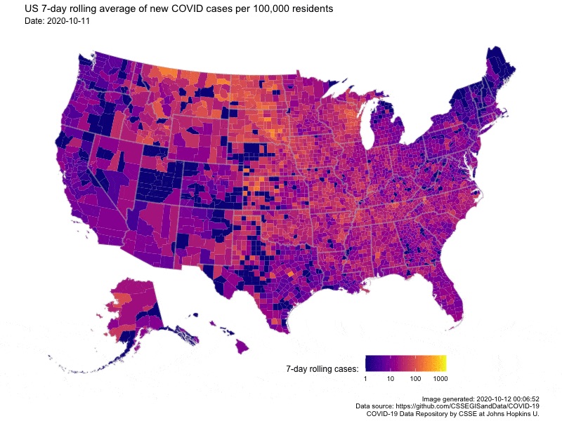
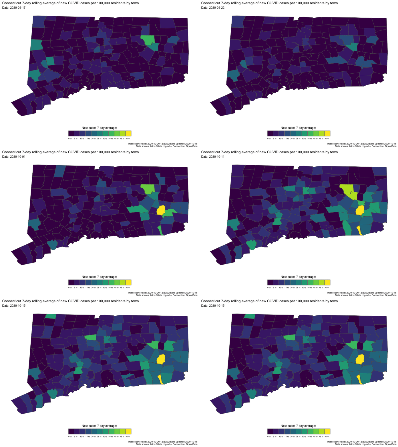
Written by Nathan Chaney, this post presents an animated map of the 7-day rolling average of new COVID-19 cases in US. Code for the animated map is available directly at the end of the post.
This post is an extension of his previous post on visualizing COVID-19 in Arkansas.
Data
- 2019 Novel Coronavirus COVID-19 (2019-nCoV) Data Repository by Johns Hopkins CSSE: this dataset is used by many resources mentioned in this article and has become the gold standard for COVID-19 modeling
- World Health Organization (WHO). See also their accompanying Shiny app
- COVID-19 Open Research Dataset Challenge (CORD-19) (via Kaggle)
- Novel Corona Virus 2019 Dataset: Day level information on Covid-19 affected cases (via Kaggle)
- COVID-19 Data from the European Centers for Disease Control
- The COVID Tracking Project
- Tidying the John Hopkins Covid-19 data to long format and merging some World Bank data
- A Short Review of COVID-19 Data Sources
- COVID-19 datasets by esri
- beoutbreakprepared/nCoV2019: one of the very few non-aggregated dataset available online. Such a dataset of individual-level information on patients with confirmed COVID-19, (including their travel history, location, symptoms, reported onset and confirmation dates and basic demographics) is important to understand, among others, transmissibility, risk of geographic spread, routes of transmission and risk factors for infection
- Fighting the Covid-19: All the datasets and data efforts in one place: this post gathers many relevant datasets and data efforts
- A Google Sheet which helps with tracking of the local lockdowns in the UK
Other lists or collections of resources
With so many great resources about the Coronavirus, other people also collected and organized similar lists.3 Below some collections I have been fortunate enough to discover:
- COVID-19 Blog Post Directory: developed by Connor Rothschild and Rees Morrison, this Shiny app lets users interactively search a collection of over 400 posts by primary topic, post title, date, and whether the post uses a particular mathematical technique or data source. See also the accompanying blog post.
- COVID-19 Modelling Resources, Data and Challenges by IDEA (not only R)
- GitHub repo covid19-r by Mine Cetinkaya-Rundel (only R)
- Amplifying people I trust on COVID-19: written by Jeff Leek from Simply Statistics, this article is a collection of trustworthy people and experts who share good information about the COVID-19 pandemic
- Some Select COVID-19 Modeling Resources and More Select COVID-19 Resources by Joseph Rickert, assembling dashboards, Shiny apps, blog posts, packages, datasets, videos and conference proceedings that pertain to the Covid19 pandemic
- CovidR Contest: launched by the European R users meeting (eRum), this contest is an open-source contest and pre-conference event, featuring any work done with R around the topic of the COVID-19 pandemic
- Turning COVID-19 into a data visualization exercise for your students: written by Daniela Duca, this blog post presents a variety of methods to visualize data, drawing on several blog posts, Shiny apps and dashboards
- Outbreak.info is an open source tool built by Scripps Research that standardizes and aggregates COVID-19 data. The interface aggregates journal articles, preprints, datasets, clinical trials, protocols, and other resources in one place, standardizing metadata and applying NLP to make these sources searchable and more accessible. The interactive data dashboards allow for quick comparison of countries, states, counties, and metro areas, and includes an API and R Package for researchers who want to access all of the raw data
I hope that, in addition to my collection, these rich lists done by others will give you enough background materials to analyze the outbreak of COVID-19 on your own (or at least some ideas)!
Non-english resources
This section may be of interested to only a limited number or people, but still, there are great resources in languages other than English. See a collection of them below listed by language:
- Japanese:
- Coronavirus infection bulletin: original version of this dashboard
- German:
- Developed by Prof. Dr. Helmut Küchenhoff, this CoronaMaps presents the situation of the Coronavirus in the world, in Europe and in Germany via a map and a table
- Spanish:
- GitHub repository with official government data and R code used to extract it, see here and here
- COVID-19 en Chile: this Shiny app shows the accumulated confirmed contagion cases and provides an estimate of the growth rate for each municipality
- Developed by Que Oferton, this Shiny app provides an overview of the 2019 Novel Coronavirus COVID-19 epidemic in Central America, including statistics, forecast, SIR and SEIR models. The data and dashboard are refreshed on a daily basis
- French:
- Written by Arthur Charpentier, this blog post shows how to quantify excess mortality using french mortality data
Conclusion
Thanks for reading.
I hope you will find these R resources on the COVID-19 Coronavirus useful. Feel free to let me know in the comments if I missed one.
A special thanks to Rees Morrison for his tremendous work on collecting and organizing several articles, which greatly helped in improving the section about blog posts. Read his articles (part 1 and 2) presenting a descriptive analysis of all the posts collected.
Although I have carefully read all resources, inclusion on the list does not mean that I endorse the findings. Moreover, some of the analyses, code, dashboards, packages or datasets might be out of date, so these should not be viewed, by default, as current findings. If you are the author of one of these resources, do not hesitate to contact me if you see any inconsistency or if you would like to remove it from this article.
As always, if you have a question or a suggestion related to the topic covered in this article, please add it as a comment so other readers can benefit from the discussion.
References
Liked this post?
- Get updates every time a new article is published (no spam and unsubscribe anytime):
%20Across%20The%20World.png)
%20in%20the%20US.png)
